Google Photos: The pros and cons of Google's new photo service
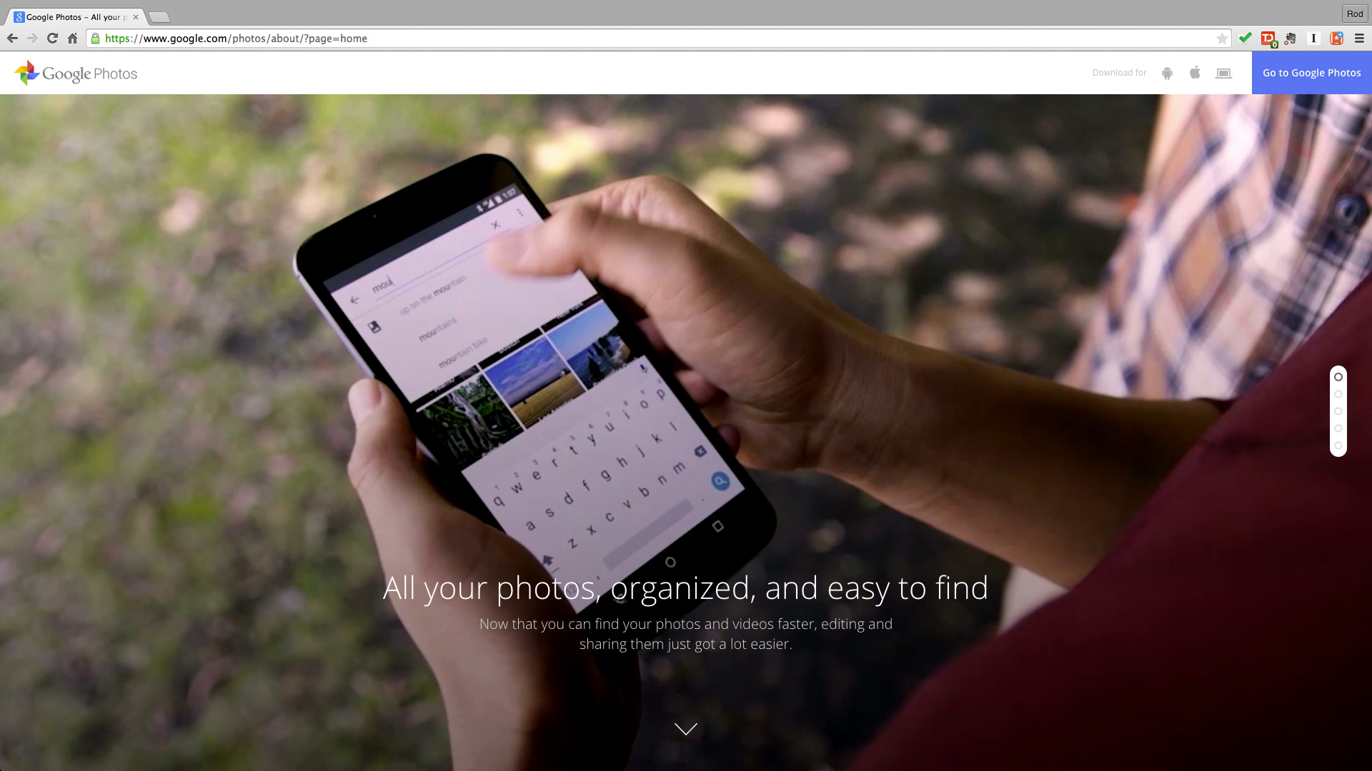
Unlimited and free photo storage. The prospect of image searching and automated organization, powered by Google's search engine machine learning smarts. Two things you can't get with competing services.
On the surface, Google Photos sounds not just good, but great. But what's the catch? And does it stand up to the test of thousands of images? That's what I set out to find over the past two weeks. And my results were, surprisingly, decidedly mixed. Google Photos does a lot really well, but it's not even close to the slam-dunk it sounded like when we first heard about it at Google IO 2015.
Why Google Photos
The ubiquity of good cell phone cameras and the rise of the selfie have led to an explosion in how many images all of us take. The stakes are high in this image gold rush: What's the point of taking all of these pictures if we can't find them? Finding those images again remains a challenge, given the arduous drudgery of manual tagging. Whether you're tagging baby pictures or the Olympics, it's a sentiment shared by both casual users and pros alike. Just ask any professional who uses IPTC metadata to manually embed image tags and captions for the massive stock image databases, and you'll get a universal look of chagrin over the necessary evil of tagging.
This is why Google, and others, are pursuing ways to make it easier for us to find, share and enjoy the images we take. And it's why the idea of Google Photos - with the potential of all of my photos in one place, with an automated tagging system - seemed so appealing. (Appealing so long as one is comfortable committing all of their memories to the Googleverse, but that debate is a conversation unto itself).
Other services have offered bits here and there, but I still refrained from going all-in. I'm a shutterbug both personally and professionally. I go through 2TB hard drive as often as some people change social media cover photos. For this reason (and others), services like Flickr, with its cap on 1TB of free storage, never appealed to me.
Likewise, while Adobe Photoshop Lightroom and Camera Bits Photo Mechanic each have their merits for assisting with labeling, neither assist with what you're looking for across disparate mobile, desktop and cloud.
This trifecta of challenges - storage, search and organization - are what Google set out to solve with its revamped Google Photos. And knowing these challenges first hand, I was eager to apply Google Photo's image search and categorization technology to a random selection of my own images. With unlimited photo storage, it meant I didn't need to be selective or cherry-pick the files I sent to the cloud; nor would I reach a point where the service would warn me I'm running out of space and I'd need to delete items to make room for new ones.
Sign up for breaking news, reviews, opinion, top tech deals, and more.
The immediate hook of the service that resonated when it was introduced at IO was its unlimited, free storage for images up to 16 megapixels. If your image is larger than 16 megapixels, it will be downsized to meet the filter; likewise, even 16 megapixel images will go through some optimization for storage on Google's servers (which means it will be a smaller file size when you export it from the cloud).
If you want to store RAW files, your original images, or images larger than 16 megapixels, you'll need to opt for the paid version of the account, at $9.99 (about £6.29/AU$12.89) a month for 1TB of Google Drive storage. That 1TB is shared across Drive, Gmail and Photos. If you start with the free account and decide to upgrade, you need to reload your images to get the full benefits of the full copy stored.
Ready, set, upload
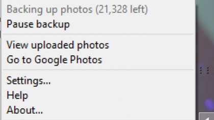
To get 31,041 - approximately, and at last count - of my images uploaded was a surprisingly arduous affair, one that required multiple overnight sessions of my laptop feeding photos up to Google's servers via a 12Mbps upstream Comcast cable modem. Two-thirds of those images came from my laptop's SSD, but the final 10,000 came from other sources. Most were JPEGs, but some folders had both the JPEG and RAW files (and in those cases, both got uploaded according to Google, not that I noticed this from my image library), and still others had videos mixed in with the still images. Photos will display videos as well, captured at up to 1080p.
The images I chose very purposely represented a large mix of sources. I shot the pictures over the years using various point-and-shoot cameras and digital SLRs. Only the images captured on my cell phones had geotagging. And the folders represented a variety of workflows: Some were images meticulously filed into subfolders by event, some were simply in generically labeled folders that represented the entire 64GB card's worth of pictures, which could have represented images from the same hour or images from multiple months. In still other cases, I had images grouped together as best shots, organized in a way where I may not know the date or the event, but just had them in a folder that I knew why they were organized together that way.
For my tests, I used a Samsung Galaxy Note 3 and Note 4 phone, a Google Nexus 9 tablet, and a Toshiba touchscreen Ultrabook. I started out using the desktop app first, and simultaneously began uploading phone images, too, via the phone app.
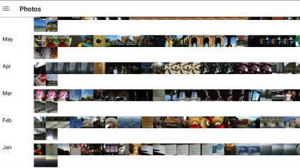
In demos, Google Photos looks streamlined and convenient. Pinch-and-zoom to sort the images by month, date and year. And scroll, scroll, scroll to find what you're looking for.
While I like the design conceptually, in practice I found it less useful to navigate with a large set of real-world images. The experience was superior on mobile vs desktop. On the phone or tablet, if I knew something happened in a given month and year, great. I'd pinch and zoom out to the year view, and then scroll, scroll, scroll, and wait for the thumbnails to redraw on the device, as they're fed from the cloud.
Find the right year and month, then pinch-and-zoom into that month, and then I'd keep scrolling through the hundreds of images there to find the specific shot or series shots I was looking for. Pinch-and-zoom further into the month to get images separated by day. When your library is packed with thousands of images shot on the same day, or cluster of days, this visual approach is not the most efficient way of finding images, but at least it gives you a starting point.
It's worth noting that while the initial thumbnail draws can be painfully slow, this redraw process did get faster the more often I rapidly scrolled through eight years of images over a Wi-Fi connection. I was impressed with how quickly and smoothly images opened on the phone, and how I could zoom into an image without waiting for it to redraw.
On the desktop, I was much less impressed. You'll access Google Photos via your web browser, at photos.google.com. Access is simple if you're already logged into Gmail - just type the URL and your most recently uploaded photos appear, with a search bar at the top. No additional log-in required. That's the good part.
The not-so-good: On the desktop, you lose that much discussed ability to visually browse images with pinch-and-zoom. According to Google, it was a choice to launch without browser-based touch touchscreen support for pinch-and-zoom, but it is possible we'll see that at an undetermined point in the future.
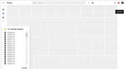
I'd go so far as to say it's not practical to visually browse for images on the desktop, not in the way you can by month, year or date on mobile. If a date or month is recent, and has a few hundred images, that's somewhat manageable. But up the game to thousands of images on a given date two years ago, and the repetitive and tiresome scrolling makes this interface infinitely less efficient. Or pleasant, for that matter.
It helps if you know the specific date to browse by. This can be useful in some instances, but rare is the occasion you remember the precise date you took a shot (weddings, birthdays, anniversaries are perhaps the common exceptions). For example, I knew that I'd taken some pictures outside of Bangkok, images that weren't being recognized as from Thailand, back in October 2014; but I didn't remember the specific date. By searching on the month of Oct 2014, I could scroll and eventually find the image.
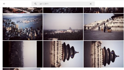
Another circumstance this approach worked for: Finding related images that weren't being tagged or picked up in other searches. For example, I did a search on Temple of Heaven, to find a series of old slide images I'd scanned back in September 2014, using an external scanner.
The search successfully found the three scan attempts of that image; however, not the other two images I remembered scanning at the same time. I searched on the date - oddly showing up as Jan 1, 2011, likely because of a setting in the scanner I hadn't changed at the time - and found the remaining photos. For one, a closeup, isn't hard to understand why Google missed the proper tag. The other, a distant view of the Temple, is harder to explain away. In other examples, Photos has shown it can detect and recognize objects, regardless of whether they're in the foreground or background. But it didn't in this case, and there was no way for me tag them as such without creating an Album, which isn't the same as tagging.
Another thing to note: Photos is fluid, and the presentation of which images are shown in the thumbnails for People, Places, and Things can change over time, without you necessarily realizing it. This is a mixed bag: it's good in that it seems like Google is learning and evolving in background, but it means if you were looking for something where it was before, it can be weird and jolting to have one image replaced with another as thumbnail seemingly out of the blue.
- We’ve picked out the best image hosting websites