This isn't a review. The first Yosemite beta has only just emerged, and so it's clearly not ready for prime-time. However, although some of the new features demoed at WWDC 2014 are absent or broken, enough are baked to the point you can get a feel for how OS X is going to be later this year.
Here are our first impressions on some of the highlights, after a day of exploring OS X Yosemite.
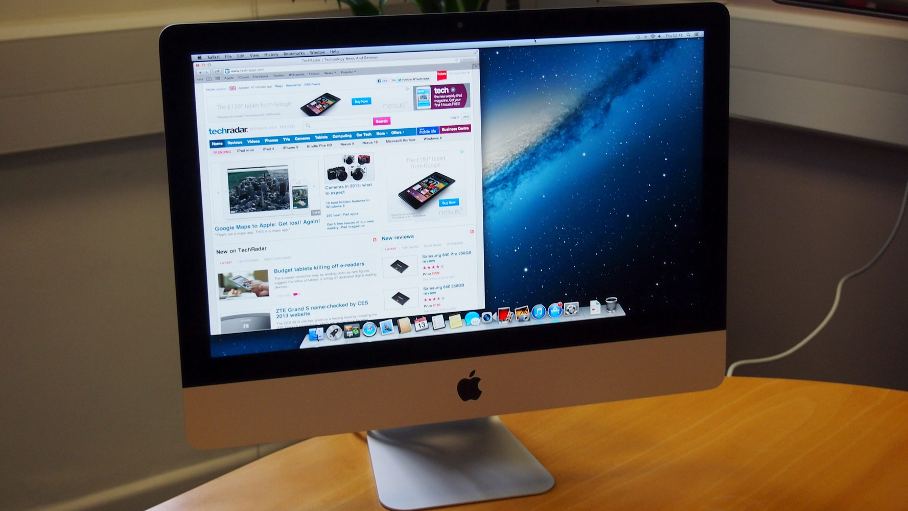
The OS X Yosemite interface
OS X's interface is now a strange combination of stark minimalism, subtle colour effects and cartoonish icons. The stripped-back interface typically works well, and transparency effects in sidebars and behind toolbars are (surprisingly) subtle enough to provide a sense of place without being a distraction or interfering with legibility. Performance seems unaffected.

The Helvetica variant used for the system font is generally legible, if lacking in character, but the spindly menu extras are less successful — it's now hard to tell whether the network indicator is showing a connection.
The simpler Dock is much smarter, but the icons are variable. They're more complex than their iOS cousins, but just as heavily colour-saturated, and the new Finder icon's leering grin looks a bit strange.
Mail and calendar in OS X Yosemite
Mail's main change is mark-up, enabling you to annotate images. The interface is smart and simple, providing tools to rapidly add shapes and text.

This is then burned into the image, meaning whatever you add cannot be edited by someone else, but also that any text is not accessible. If your image is large, it's worth noting the default text size will appear like ant tracks.
Calendar is one of the apps that utilises Apple's new skinny toolbar with buttons, which slows down drag actions but provides more space for content. Otherwise, Calendar now echoes its iPad cousin, which means a very different day view, designed to focus on the day's events.
Anyone who lived in the Mavericks day view that also listed upcoming appointments will shortly be scurrying towards Fantastical. But for anyone who wants to purely emphasise the current day, it's a useful change.
Spotlight vs Alfred
Spotlight now apes Alfred and similar launchers, in appearing at the centre of the screen rather than streaming a results list from the menu bar. Even in this beta, Spotlight seems fast when searching local content, and it handily provides previews of many files, without you having to resort to pausing over an item for Quick Look to kick in.

We couldn't get many of the extra features to work in the beta — our copy stubbornly ignored the internet, but the potential of the revamp was apparent in Spotlight immediately providing currency conversions, along with a small range of alternatives in the preview area.
It's clear, though, that devoted Alfred users wedded to that app's power and extensibility won't be swayed by Apple's admittedly impressive update.
Safari in OS X Yosemite
Already, it looks like this new Safari's going to be a big win for Apple. Like Calendar, the interface is designed to maximise space for content, but the big draw is in being able to find pages from within a sea of tabs.

The new Show All Tabs button provides a grid-based preview of every tab within the current window, along with access to open iCloud tabs. During testing, this was impressive and very responsive, unlike the finicky new favourites drop-down from the address bar, which eventually made us bring back the standalone toolbar Apple was so keen to hide.
OS X Yosemite's Notification Center
The OS X Mavericks Notification Center was a waste of time beyond the initial notifications themselves. Click the menu-bar button and your entire desktop was rudely shoved out of the way, only to display a bunch of old notifications.

Yosemite's update borrows heavily from iOS (7 and 8), with a Today view to which you can add custom widgets. In the default install, this includes a world clock, your calendar, stocks and weather, already showcasing the potential of the system.
Unlike in Mavericks, the new Notification Center is an overlay, so it's not as jarring when it appears; however, any attempt to interact with other on-screen content results in the panel closing, which is a pity. It's also curious Dashboard still exists, given the clear overlap with Notification Center.
Check out the beta
Apple's offering a million people the chance to access the open beta of Yosemite and provide feedback on features and bugs. This release isn't yet in the wild, but will be soon.

If you do sign up, though, be very aware that certain features won't work fully, and bugs may exist; on that basis, do not install it on any critical work machine unless you love living at the bleeding edge. Instead, if you've space on your Mac running Mavericks, you can use Disk Utility to non-destructively create a new partition into which you can install Yosemite.
We think doing so's worthwhile for the curious (and to assist Apple through providing feedback). Apple's clearly rethinking OS X, in a manner that boosts productivity and updates the visual appearance, yet still retains a familiar design language. We look forward to testing out the more advanced aspects of the system, not least iCloud Drive (which wasn't fully working during testing) and Handoff with iOS devices.