Designing Ubuntu
Jono Bacon, community manager for Ubuntu, explores the history of the distro's desktop design

On 20 October 2004, the first version of a new and unknown project called Ubuntu was released. It was called the Warty Warthog. The only thing that most Linux users knew about Ubuntu was that it was based on Debian and bankrolled by some millionaire they had never heard of.
Little did anyone know that said millionaire, Mark Shuttleworth, would invest so significantly in a much needed aspect of open source – the user experience. I'm not going to talk about how Ubuntu was formed, the impact it's had on Linux or the growth of the project and community; much of that has already been said.
Instead, I'm going to tell the story of Ayatana, the design project that powers Ubuntu, sharing some of the behind-the-scenes stories of what went on. So grab a cup of coffee, sit back and let's talk about how Ayatana might revolutionise Linux and bring it to the masses.
In the beginning
When I joined Canonical back in 2006 as the Ubuntu community manager, the focus was simple: to deliver the latest and greatest open source software in a simple and integrated fashion.
To achieve this, we made sure Ubuntu came with a large number of upstream projects. Some were underlying tools, such as the Linux kernel and the X display server, and some more user-facing, such as the Gnome platform and its suite of applications.
The Ubuntu team always had its nose to the ground looking for the next big thing that it could bring to users, often investing in pieces of development that would satisfy needs that weren't yet met. One example was the Jockey tool, which helps you install additional drivers if your hardware needs them.
Get daily insight, inspiration and deals in your inbox
Sign up for breaking news, reviews, opinion, top tech deals, and more.
Back in 2008, Mark Shuttleworth called me over to his desk to share some thoughts about something he referred to as "awesome attention management". Around that time, Matthew Paul Thomas, a well-respected user-interface design specialist, had been working on a new project with him.
Mark showed me a wiki page with an incredibly detailed set of guidelines around what looked like some rather cool notification bubbles, and told me this was going to be amazing for the community and for Ubuntu and that I should expect some work surrounding the idea. Mark is an excitable guy, but I'd never seen him like this before, and I knew his enthusiasm meant my job was about to get busier.
The project he was referring to ultimately became Notify OSD, the now-familiar black notification bubbles that appear in Ubuntu. While I was aware of the plan, I didn't know of any plan to put actual code into Ubuntu. It was currently being eagerly hacked on by Mirco Mueller and some other developers at Canonical.
As Mark's design project progressed, he began to recruit two teams: one for design and the other for development. One key appointment was the head of the development team; a chap called David Barth, who'd been working at Mandriva.
Mirco and co would be reporting to David, and his job was to take the designs from the team at Canonical and manage a set of engineers to deliver the work as free software. This would then be packaged and integrated into Ubuntu.
The notification area
In 2008, the twice-annual Ubuntu Developer Summit was held in Mountain View, California. There, Mark demonstrated the work that had been done on the new notification system in front of an audience. He talked through the considerations and inspirations behind the idea, and the incredibly detailed thinking that went into the design process.
The people listening were pleased: the demonstration looked impressive, even though code wasn't yet available. That was set to launch with the upcoming version of Ubuntu, the 9.04 release entitled Jaunty Jackalope.
Ultimately, the notifications did land in Jaunty, although much to the chagrin of some Ubuntu contributors. The code came late in the cycle, and this was seen as a faux pas. The community had a valid point; it did take too long, and we tried to assure our contributors that we would do better in future.
Fortunately, the issue was a tractable problem that could be solved, and was indeed fixed in further cycles. Despite the rocky initial responses from Ubuntu developers, the work was well received by the wider community and users.
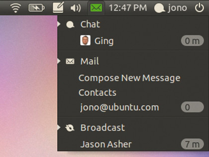
In addition to the notification bubbles, the Jaunty release also included the Messaging menu. The idea was to provide a single icon in the notification area of the panel that would contain any messages relevant to the user. For example, it would show social media updates such as Twitter or Identica messages, new emails, instant messaging chat and more.

MESSAGING MENU: Ubuntu's Messaging menu glows, alerting you to messages you should act on
The first iteration of the menu worked, but there was still a lot of development to be done to build support for different applications to talk to it, and to present further information that was relevant to Ubuntu users.
Many of these improvements landed in the Ubuntu 9.10 Karmic Koala release, including the Me menu; another addition to the top-right part of the panel that enabled users to shut down and restart their machines, and get access to some other features relevant to the current session.
Karmic was another positively received release, but many were asking some of the same questions – why is Ubuntu spending so much time focusing on the top-right part of the screen? Aren't there lots of other bits of the desktop experience that should be fixed and resolved?
It was a good question. While the design work being done was detailed and solved some important problems, other more visible parts of the Ubuntu experience hadn't been targeted. The team would get there, though – they just weren't going to sacrifice quality in the design experience, and would move on when they were ready.
Fortunately, many of the future ideas were already being developed; the design team was working ahead of the current cycle to ensure that the developers had completed concepts to work with.
In addition to the improvements in the top-right area of the screen, significant work had been done on the boot experience in the Karmic cycle. Mark Shuttleworth had made it clear that the Ubuntu boot time needed to be faster than ever, and Scott James Remnant took his existing work on Upstart and began optimising the many different parts of the process.
At a company event held in Dublin, he showed Ubuntu booting faster on a Dell Mini 9 netbook with a normal hard drive than Windows 7 on the same machine with a super-fast solid state disk.
In addition to this, extensive work was done to deliver an attractive graphical boot, using a tool called XSplash that was developed at Canonical. The idea was to get the X display up as quickly as possible, and to show the boot splash so that the transitition was smooth when you needed to switch to the login manager. All of this landed in the Karmic release, and was again well received by users.
Application indicators
With the Karmic release out of the door, the design and desktop experience team decided to focus on the top-right part of the panel again. Mark eagerly proclaimed that "we were going to finally fix the notification area", something that had been a common source of problems for Ubuntu users.
The issues were subtle, so let me explain why this work was performed. Traditionally, the notification icons in the top right of the Gnome panel had been something of a usability ghetto. There were numerous faults:
Messiness - There were a wide range of icons, many of which looked ugly on the panel with their multiple colours.
Limitations Applications - could only set one icon, and the same icon was displayed in the menu and the notification area. This made it impossible to set an attractive black-and white icon for the notification area while having a full-colour one in the menu.
No scrubbing - It was frustrating to have to click each notification icon separately to see the menu. You couldn't click once, slide your mouse over and then scrub to get the menus to drop down.
Inconsistent interfaces - Notification icons often had an incredibly variable set of interfaces. Some had left-click menus while others had right-click ones, and some had different menus for left-and right-click.
Accessibility - Existing notifications had accessibility issues, and often couldn't be controlled via keys.
The design team felt that these were significant problems that needed resolving, and thus the application indicators project was started. This was based on the same technology as the Messaging and Me menus, and provided some important changes.

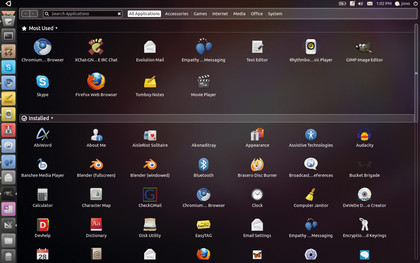
PLACES: The Places feature in Unity manages to provide a consistent experience for almost any kind of customisable content
Firstly, different application icons could now be set in the notification area and main menu. Secondly, notification icons could be clicked and scrubbed with the mouse. The interface was also much simpler – only menu items, checkboxes, radio buttons and labels were displayed, and only on a left-click menu; no right-click menus were supported. Because the notification interfaces were based on menus, they were far more accessible.
At a design sprint in Dallas, we got ready to ensure that the community had quick and easy access to this new technology, which was due to feature in the Ubuntu 10.04 Lucid Lynx release. We made sure we prepared documentation, and started working with upstreams to encourage people to use the technology. Many started porting their applications.
Cody Somerville, Ted Gould and Jason Smith all stepped up to help us integrate the indicator idea into the Gnome panel, creating an implementation with C, Python and C# bindings. Jorge Castro also made people aware of what we were doing, and Aurélien Gâteau continued to perform his excellent work with KDE.
Then there were the applications themselves: Brasero, Gnome Bluetooth, Gnome Power Manager, Gnome Settings Daemon, XChat-Gnome, iBus, Nautilus, PolicyKit, Empathy, Gwibber and more. These were all ported with notification indicators, and came with Ubuntu to the new framework.
The wider community also got really involved with the technology, much to our delight.
The system monitor, device mounting alerts and workspaces were all given brand-new indicators, as were the applets for weather and screenshotting, and we received patches for Lernid, LottaNZB, Banshee and Déjà Dup. What's more, we were provided with support for the indicator framework built into AWN and Lubuntu, among other things.
- 1
- 2
Current page: How Ayatana might revolutionise Linux
Next Page System indicators and Ubuntu 11.04