Gnome 3.0: the complete guide
The release that's redefining the desktop

Gnome 3 is the first major release of the popular desktop environment in over eight years. Many identify Gnome as being the face of Linux, because most early distros (and many current ones, of course) adopted the desktop in order to put bells and whistles on the ever-maturing kernel at the back.
Gnome 3 is radically different from previous releases. It's got a polished user interface that's been tuned for usability and a slicker code base to please application developers.
Gnome Shell is a new interface that replaces several key components of the desktop, such as the panel and the menus, and influences how you switch tasks, move between windows and more. Along with GTK 3 and the Clutter-based Mutter compositing manager, which serves to replace Metacity, the desktop as a whole has come a long way since the components started popping up in the repositories of many distros.
So without further ado, here's everything you need to know about the sparkling new desktop in town.
Gnome 3.0 development
The Gnome 3 desktop has been in the works for quite a while. The release team first announced to the world that they were working on Gnome 3 at the Gnome Users And Developers European Conference (GUADEC) in Istanbul back in 2008.
After the conference, several developers started evaluating the areas in Gnome 2 that needed to be redesigned for a pleasurable user experience. The discussions led to the Boston User Experience hackfest in October that year.
Get daily insight, inspiration and deals in your inbox
Sign up for breaking news, reviews, opinion, top tech deals, and more.

Vincent Untz, who was on the release team at the time, blogged that the designers and developers at the conference "tried to forget the current Gnome and see what we thought would make sense". They looked at several areas, such as window management, file management and desktop widgets, from a designer's point of view.
In an interview on the Gnome Journal, William Jon McCann, who contributes to several key areas of Gnome, notes that, at the hackfest in Boston, even before any kind of process emerged there was an intentional design-first ethic to the project. That's where the first mock-up of the Gnome 3 desktop was worked on.
It previewed a number of desktop refinements that are the highlights of Gnome 3, such as the integrated desktop search and a graphical interface for moving windows between workspaces.
Stepping out of the shell
At the hackfest, one of the key areas the team decided to re-think was window management. In the current Gnome release, tasks such as application launching, window management and task switching are handled by Metacity. This will now be delegated to Gnome Shell.
Put simply, Gnome Shell refreshes the visual experience of the desktop. Six months after the project began under the leadership of Owen Taylor, William Jon McCann joined as design lead. "The first thing I did when I started working on the Gnome Shell project was read. I spent a month doing nothing but reviewing usability research into desktop computing," says McCann.
Instead of just putting gloss over the existing desktop, the developers designed it after analysing fundamental usage patterns. Taylor outlines some of the questions they wanted to address with the new desktop: "How can we provide a workflow that assists the user in efficiently moving between different tasks, rather than making them do busy-work to manage their files and applications? How should the desktop be different if the user is spending most of their time in the web browser and chat program, rather than in word processor documents and spreadsheets?"
Allan Day, a member of the design team, adds that, "the Gnome 3 desktop was designed so that it would be usable and recognisable across a whole range of computing devices", which is why Gnome 3 is designed to work on everything from the limited real estate of a netbook to a touchscreen laptop or multicore desktop.
Gnome Shell uses compositing and is integrated with Mutter, which is an OpenGL-based window and compositing manager that leverages the Clutter toolkit. At the Boston summit, there were several presentations on using the Clutter toolkit in a range of Gnome applications.
It was there that Frederico Mena-Quintero presented his journal-based file management tool, now called Zeitgeist, which is an integral part of Gnome 3's Activity Journal.
Gnome 3 was set to be released in September 2010, but in July that year the team pushed back the release to March 2011. By the time Gnome 2.32 was released, version 3's release wasn't expected until April 2011.
Whistlestop tour of the Gnome 3 desktop
1. Panel
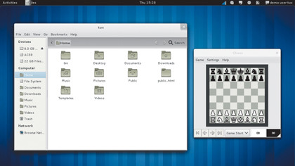
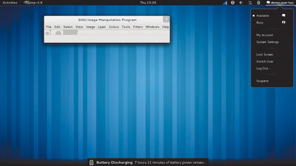
The main desktop is noticeably different and has made great strides towards being more newbie-proof. You don't have to be a veteran Gnome user to notice that instead of two panels, the Gnome 3 desktop now features just one at the top.

The panel has rearranged the clock and notification icons, but the menus for applications, places and system have been replaced by the solitary Activities menu. Active applications are listed next to this menu, and offer app-specific tasks, as well as options to close the application and open a new window.
2. Activities
This is where we can see most obviously the much-talked-about innovation of Gnome Shell. Activities offers you different ways to switch from one activity or task to another.
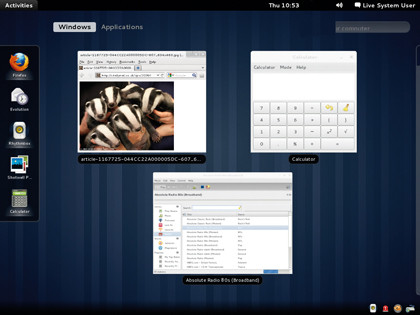
You can enable the Activities view by clicking the Activities menu or just moving your mouse to the top-left corner of the screen. The Activities view makes the workspaces more intuitive.
In it, you get a preview of all the open windows, as well as running applications, across workspaces. You can drag new applications, documents and windows between workspaces. It also lets you close multiple windows without having to switch to them. By default, you have two workspaces and can add more as required.
The Activities view also integrates search and browse functionality, which behaves similarly to Gnome Do and is useful in case the application or file you're after isn't immediately visible.
3. Apps-dash
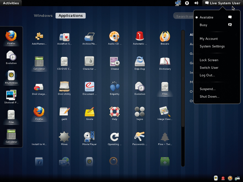
Like all aspects of Gnome Shell, the Applications view is designed to work well with touchscreens. The applications icons can be used to launch programs, and currently running apps are indicated by the addition of a glow underneath the name. Clicking on its name will either switch to the last used window of a running app or launch a new instance.

Another prominent feature is the dashboard on the left side of the screen, which lists currently running applications and also acts as a quick launch for favourite apps.
4. Notifications
Besides these always-on display features, Gnome 3 has also had some more subtle user interface redesigns. One of them is the new notification system, which has been developed to communicate events without distracting you.

The notifications appear at the bottom of the screen in order to avoid the usability issues encountered with the notifications system in earlier Gnome releases.
The new Gnome desktop also integrates messaging into the desktop. You can now reply to IM messages, and get a threaded view of a conversation, without launching an app or switching away from your current window.
With almost two decades of writing and reporting on Linux, Mayank Sharma would like everyone to think he’s TechRadar Pro’s expert on the topic. Of course, he’s just as interested in other computing topics, particularly cybersecurity, cloud, containers, and coding.
