How Microsoft developed Metro for Windows 8
It's not about the look, it's about how we interact with devices
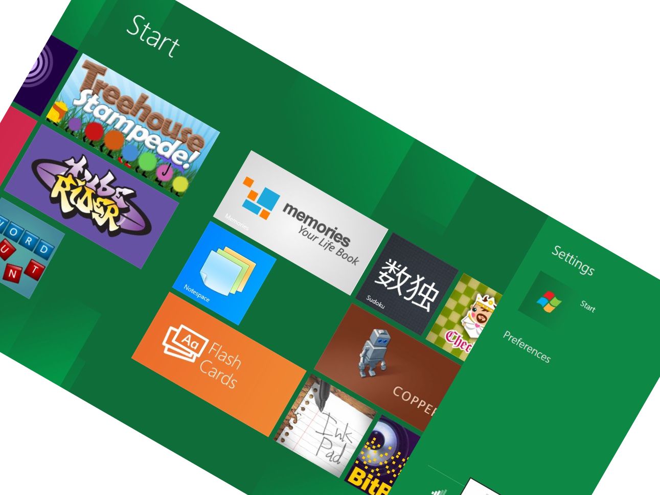
The not-always-positive reaction to the new Metro Start screen in the Windows 9 developer preview continues to bubble away in the comments to the official Building Windows 8 blog (whatever the topic happens to be).
We know that the interface we're seeing at the moment isn't the final look, so before you get hung up on how green it is, the question is how well it works for what it's supposed to do.
It's deliberately different, explains Jensen Harris, the head of the Windows User Experience team, also known as the man behind the Office ribbon.
"For years, Windows was always about adding stuff. We added bars and panes and doodads and widgets and gadgets and more bars and stuff everywhere and that was how we defined our user interface, based on what new widgets we added. Now, we've receded into the background and the app is sitting out there on the stage."
A big part of what Metro is supposed to do is about touch, and the principles there are about a lot more than just big, finger-sized tiles. Microsoft started by watching how people hold tablets.
How do you use a tablet?
Touch is very natural. "You've got fingers and you've been using them your entire life," points out Harris. But with a tablet, it's not just about touching the screen; you also have to hold it.
"Some people balance them on their knees, some people put them on tables, some people held them with two hands in front but the posture we saw being very common was people would take a slate and hold it in two hands."
Are you a pro? Subscribe to our newsletter
Sign up to the TechRadar Pro newsletter to get all the top news, opinion, features and guidance your business needs to succeed!
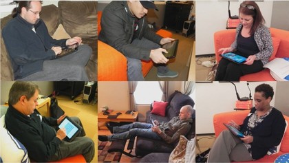
TWO HANDS: There are lots of different ways to hold a tablet but most need both hands
To find out what was easy to do on screen when people were holding a tablet like that, Microsoft researchers resorted to fingerpaint; they stuck sheets on paper on screen and asked people to paint with their thumbs the area they could reach easily and then another colour for where they could reach with a stretch.
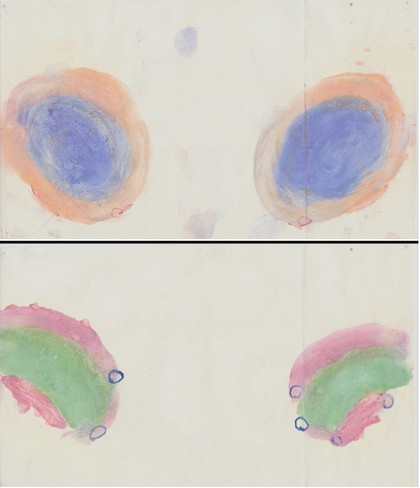
FINGER FRIENDLY: The colours show where you can easily reach with your thumbs when you're holding a tablet
"We looked at big hands, we looked at small hands, we traced their fingerprints. We matched that up with data about how big their hands were and we entered all this data into a program that helped generate heat maps on screen," Harris explained.
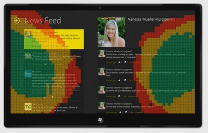
HEAT MAP: Overlaying where the majority of users can comfortably reach on an application screen
That's why controls on the app bar for the demo Metro apps are arranged at either side of the screen, not in the middle, and why the split keyboard first seen in Microsoft's Origami interface for UMPCs is back. "The keys are positioned exactly where most people are comfortable reaching them."
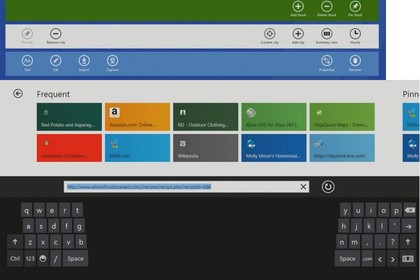
EASY REACH: Controls and keys in Metro are best where you can easily reach them without shifting the tablet in your hands
Your fingers don't work like a mouse, so neither should touch. "We realised early on in working on Windows 8 that pretty much what everyone was doing was moving the mouse cursor around with their finger.
The new world of touch was evolving to just be the same as the GUI; we just map right-click to press and hold. You pick up an icon, you drag it over to the other side; it's like driving a car from one side of the ocean to the other. We really weren't taking advantage of touch." That's why Metro has features like multitouch dragging and semantic zoom, where things don't just get smaller on screen – they jump from individual icons to whole categories.
But there are only seven gestures in Metro and no complex multi-finger gestures. " I don't know about you but I have limited memory for five finger double swipe from this side brings something forward; someone is going to know those things but we wanted it to be very simple."
Demanding app performance
Metro touch may be simple, but that doesn't mean users won't be demanding about apps. In fact, Harris claims, touch makes users more demanding, especially about performance. "When you have a mouse, it's indirect; you do something over here and you're looking at a screen over here. When there's a lag, it's kind of OK. When you're using touch it's so direct; if you touch the screen and nothing happens, it feels horrible. It feels like the machine is dead, it feels like the PC is broken."
Performance in Metro should be excellent, because only the apps you can see on screen – a maximum of two at once – are actually using processor and memory. The others are suspended (Microsoft tends to use the term 'dehydrated'), which means they're not using resources – or battery life.
But even when the machine is in Connected Standby with the whole system apparently off, they'll get updates and notifications, without using up battery; desktop apps jet get suspended until the PC is on again.
"I've worked on power management for eight years," principal program manager Pat Stemen explained, "and getting power management right for Win32 [desktop apps] is pretty hard to do and really hard to do well. It's doable but it's much more challenging than in the Metro app model, where it's much easier.
If you have an app that you want to be alive and fresh, you should do it in Metro. I guarantee it will be easier to do there than it would be in a desktop app."
Metro is also designed to make your PC feel "alive with activity". Microsoft's marketing experts worried that phrase would make people think of snakes and spiders and other unpleasant images but to Harris it means personalised, engaging and magical.
"Icons are yesterday's way of representing apps," he complains. "They're antiquated, they're not alive they're not interesting, they're not helpful - they're just a picture and text." Tiles, on the other hand, are more than just a button to launch an app.
"They're a front door to your apps. The best tiles draw you in, they're constantly summoning you back to the app because it's interesting or they make it so you don't have to go the app at all. Sometimes it's an extension of the app telling you what happened.
"They're not just an icon, like a graphically rendered awesome picture of a book, they're what makes the app feel like it's always running even if it's not. It's what connects people emotionally to the app."
That emotional connection has worked very well for the Metro interface on Windows Phone. If the final version of Metro can deliver the same charm, you might find you get attached to it – even on the desktop.
Mary (Twitter, Google+, website) started her career at Future Publishing, saw the AOL meltdown first hand the first time around when she ran the AOL UK computing channel, and she's been a freelance tech writer for over a decade. She's used every version of Windows and Office released, and every smartphone too, but she's still looking for the perfect tablet. Yes, she really does have USB earrings.