Linux desktop innovations to look forward to
2010 is shaping up to be a perfect year for the Linux desktop
For the first time in a long time, Linux might actually get easier to use
Both Gnome and KDE are putting a great deal of emphasis on something they call 'activities'. These are really an extension of the virtual desktop idea, but rather than each desktop being a disconnected extension to your screen's real estate, activities become associated with a certain task.
You might want to create a documentation activity, for example, and for that you'd need a desktop that provided quick access to a text or HTML editor, online resources and perhaps a dictionary or thesaurus. Like most other tasks, setting up this kind of environment would normally require the user to mess around with a launch menu as well as understand a certain amount about your computer's filesystem.
Most developers recognise that this process isn't ideal and that desktops of the future shouldn't require filesystem knowledge, or even an idea of how applications are organised and stored. The process of working with your data should be as intuitive as possible, and both major Linux desktops are trying their best to tackle this issue in their own special ways.

With Gnome, for example, one of the key aims of the upgrade to version 3.0 has been to streamline the user experience. And the central user-facing technology that's going to help this happen is called Gnome Shell. This is an application that has seen rapid development over the last 18 months after Gnome's Vincent Untz posted some observations from discussions at a recent hackfest in late 2008.
These observations mentioned that tasks such as finding a window was more difficult than it should be, that workspaces were powerful but not intuitive enough and that launching applications was too hard. Gnome Shell has been developed to address these problems, as well as take advantage of some of the latest Linux technology.
Like Moblin, Gnome Shell uses Clutter, a graphical library that can build smooth transitions and eye candy out of even the most humble graphics hardware.
Get daily insight, inspiration and deals in your inbox
Sign up for breaking news, reviews, opinion, top tech deals, and more.
KDE
The KDE team have been working on similar concepts throughout the entire KDE 4 development process. But it's fair to say that many of ideas touted before the first release were judged too ambitious and too difficult to implement within the first few revisions.
KDE 4.4 is designed to redress some of these issues by re-awakening the Nepomuk semantic desktop and by making desktop activities usable.
The Nepomuk semantic desktop, as we've written before, is designed to bridge the gap between online content and content in your hardware. Many components of the web can already be found in KDE applications like Dolphin, where you can add comments, tags and ratings to your own files, but until now there hasn't been a good reason to go to all this effort.
With the release of KDE 4.4, you can finally use these fields of rich information to search your content, just as you would search the internet through Google. Another important aspect to user experience on the KDE desktop is the use of activities.
Like Gnome Shell, this the ability to meta-manage the arrangement of virtual desktops and applications according to what you want to work on. It's a feature that has been part of the KDE 4 desktop for a while, but with version 4.4, activities also become first-class citizens on the KDE desktop, perhaps in an attempt to steal some of Gnome's thunder from the wonderful Gnome Shell.
But it's not quite as simple or as straightforward to use. Rather than attempting to replace the launch menu and file management duties of the desktop, KDE's activities are better at managing complex environments. It doesn't replace the panel or the launch menu, for example, it just lets you fire up a working environment in the same way that you click on a browser's bookmark. That's not a bad thing, it's just different.
The best thing about Gnome Shell is that you can play with it today. And we'd suggest you give it a go, because it might just change the way you think about Gnome.
Gnome Shell should be straightforward to install through your distribution's package manager. To run it though, you will probably need to open the command line and type gnomeshell --replace. If you've ever manually started Compiz, this command will feel familiar, as the replace argument is used to replace the currently used window manage with both projects.
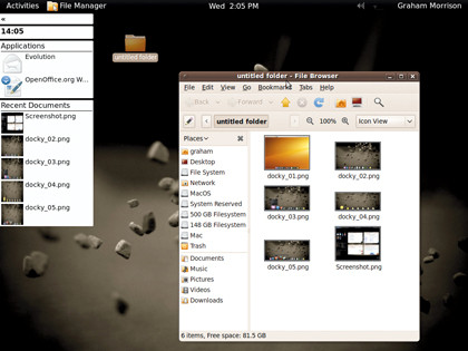
When Gnome Shell is running (depending on the version you've installed), you'll won't see any new windows on your desktop; the only indication that something has changed is the different style of window decoration, and if it's a recent version of Gnome Shell, a quick-launch dock attached to the top-left of your main window.
To see Gnome Shell in action, just move your mouse to the top-right of your screen. You should then see the current view zoom away into the middle distance, and the freed-up screen space used to display other virtual desktops to the right and a minimal launch menu on the right.
This launch menu contains applications and files, and you can either click on one to load the corresponding application into the current desktop or drag the icon on to the desktop on which you wish the application to appear. But it's also much cleverer than first glance might suggest.
If you drag a text file on to a new desktop, for example, Gnome Shell will automatically load that file into the default application for that file type. Each window on the virtual desktop will update to reflect any changing contents, and you can enlarge any window in the frame by using the mouse wheel while the pointer hovers over the window you want to enlarge.