Microsoft: We realised Metro was a better way to browse
IE10 head says Metro is great for touch and keyboard/mouse

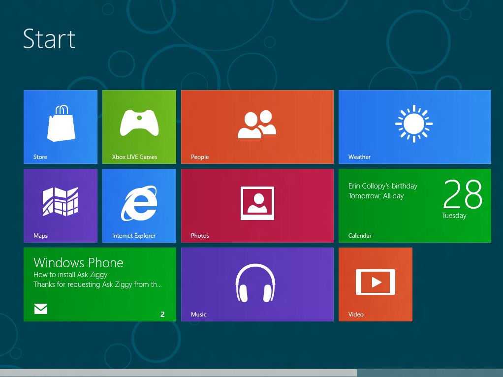
Microsoft says it realised during the development of the Windows 8 Metro interface that it provided a better way for people to browse the web.
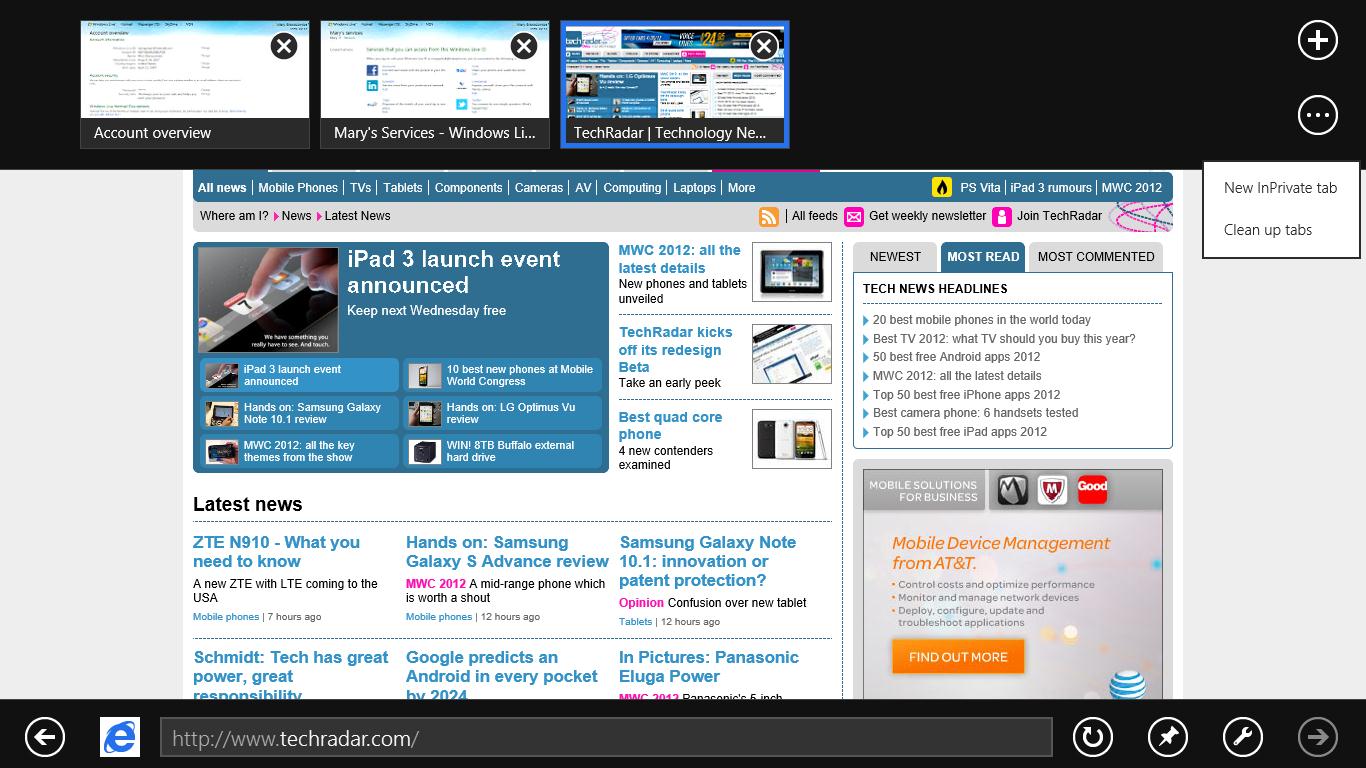
"To deliver the best browsing across all Windows 8 devices, we re-imagined the architecture and experience of the web browser," explains Rob Mauceri, the group program manager for Internet Explorer in a new blog post on the Building Windows 8 blog.
"While building and tuning the Metro style browsing experience for the Consumer Preview, we realised it is a better way to browse – whether on a desktop computer with a big screen, mouse and keyboard, or on a touch-enabled mobile device."
Mauceri says that as people browse more "chromelessly" on their phones (an interestingly choice of words), they've "become accustomed to a more immersive and less manual browsing experience compared with the desktop".

He also talked up the use of the Windows 8 charms (the pop-up icons on the side of the Windows 8 Metro screen or Windows 8 desktop) as an alternative to toolbars and menus.
"We've found that many people – even those with the most enthusiastic and intense browsing patterns – prefer Metro style browsing because it's less manual and more focused on what you browse than on how you browse."
"The result in Windows 8 Consumer Preview is a Metro style web experience. IE10 is designed to make website interaction fast and fluid for touch as well as for heavy mouse and keyboard use."
Get daily insight, inspiration and deals in your inbox
Sign up for breaking news, reviews, opinion, top tech deals, and more.
Dan (Twitter, Google+) is TechRadar's Former Deputy Editor and is now in charge at our sister site T3.com. Covering all things computing, internet and mobile he's a seasoned regular at major tech shows such as CES, IFA and Mobile World Congress. Dan has also been a tech expert for many outlets including BBC Radio 4, 5Live and the World Service, The Sun and ITV News.