The evolution of the Linux desktop
How we got to the Linux desktops we enjoy using today

Back in 1998 when I started using Linux, it was ugly.
In those days you installed it by inserting around 40 floppy disks into your computer and praying that one of them wouldn't be a duffer and make you have to start again.
After this lengthy installation process, you were typically presented with this not-entirely-intuitive interface:
darkstar login:
_
At that time, the dominant operating system was Windows 95, with Windows 98 just getting its wheels rolling – and Linux's Wargames-esque vibe clearly didn't cut it for a modern generation raised on the GUI.
As our beardy friends in the Linux kernel world figured out how to get graphics cards working, more and more effort was going into producing a graphical environment that the world was familiar with.
This effort started with X – the chunk of software that paints things on to your screen – but it wasn't enough. To get a truly usable GUI, you needed a good window manager to work with.
Get daily insight, inspiration and deals in your inbox
Sign up for breaking news, reviews, opinion, top tech deals, and more.
Unlike the Windows world, X enabled you to run multiple window managers, and a plethora of wacky and wonderful attempts were made. Some were simple, some were more complex, some tried to emulate Microsoft's operating system and some were just bonkers. Amid this creative explosion, two graphical environments emerged as the clear popular choices: KDE and Gnome.
While both were fully functioning environments and great for users, they were essentially two different walled gardens with little crossover. Both solved many of the same problems, such as presenting ways to launch files and manage fonts, but each did its own thing in its own way. Things had to change.
While our community was growing, it was madness that two developers could be solving the same problem in two different ways. Fortunately, the situation was about to get a lot better.
Unifying the desktop
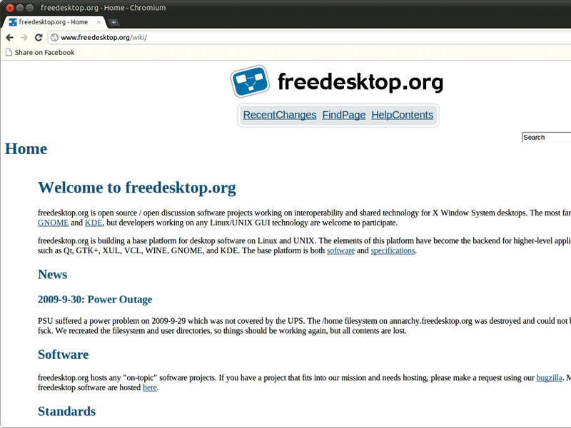
With more and more chatter about cross-desktop participation, the freedesktop.org project was announced as a desktop-independent place in which software could be developed to benefit any desktop that wanted to use it. The site provided a wiki, code hosting, email discussion lists, IRC channels and more.
It had a tremendous impact on desktops. A lot of software was created; some of it reached maturity quickly and solved real problems, while some projects got started but were ultimately never finished. Irrespective of which projects worked and which didn't, freedesktop.org also brought an important message: we should try to collaborate between desktops where possible. The message was popularly received and the desktop continued to evolve.
One of the most important pieces of software that came out of freedesktop.org was a unified messaging system. At the time, a key challenge desktop developers faced was how applications could communicate with one other; the web browser needed to communicate with the system keyring, the networking daemon with the icon in the panel, and so on.
KDE tried to solve this problem with a system called DCOP, which was an intuitive way for applications to send and receive messages to and from other applications. While DCOP worked well in KDE, it unfortunately didn't solve the wider problem between multiple applications across multiple desktops. And thus the D-BUS project was born.
D-BUS is, in a nutshell, a cross-desktop equivalent to DCOP. It provides a facility in which applications can communicate with one other via a common bus and using a common language. D-BUS went through a feverish period of development, ultimately became ratified as a freedesktop.org standard, and the technology was built into both the KDE and Gnome environments. This was a huge leap forward for the desktop, and another strong step in its evolution.
Refining the desktop
With all this cross-desktop work going on, we saw tremendous developments on the Linux desktop. Many of our long-suffering problems were getting addressed – USB devices were plug and play, wireless networking was only a click away, printing was a breeze, software was simple to install; things were getting better. It felt like we were really becoming relevant, and we had something the competitors didn't: an incredible global community working together.

In the world of Ubuntu, we were doing our best to be at the forefront of delivering this innovation to users. We were taking open source software and integrating it, and our goal was to deliver this content in a way that solved real-world problems for people; be it getting your music player to work, getting online or whatever else.
Back in 2008, Mark Shuttleworth, the founder of Ubuntu, was keen to ramp up this innovation and focus in Ubuntu, so he founded the Ayatana project. The idea was simple: to recruit a design team and an engineering team, and build a set of user-interface enhancements and improvements defined by a strong sense of quality in design.
This was new for both Mark, the company (Canonical), and Ubuntu. We had had a long history of shipping and integrating software, but such a design-centric initiative was uncharted territory.
Ayatana
When Ayatana was founded, a comprehensive design team was hired by Canonical. The team came from a variety of backgrounds: many came from brand, graphic design, product development, interaction design and other walks of life.
The term 'melting pot of personalities' is an understatement, and many were new to open source and still taking it all in, but all were enthused and inspired by the idea of great design infused with strong community.
The first project to come out of the team was called Notify OSD and provided a new approach to notification bubbles, which we were all too familiar with in Ubuntu. For years we had seen these boring yellow square bubbles appear in the top-right of the Gnome desktop when an application needed to tell you something.
Notify OSD was the same basic concept, but re-imagined. With it, an attractive black transparent bubble would appear, and instead of clicking it to dismiss it, hovering your mouse over it would cause the bubble to fade so you could interact with the application underneath it.

The justification for the design was that notification bubbles should present information to the user in a way that isn't intrusive. With the first version of Notify OSD released and shipped in Ubuntu, the Kubuntu team wanted the technology in KDE too.
Fortunately, the Ayatana team had created the Notify OSD specification in a cross-desktop way and the Kubuntu team simply worked on a different GUI that fitted well into the KDE desktop. Like the Notify OSD in Gnome, it was well received; a subtle and gentle improvement to the desktop.
- 1
- 2
Current page: The evolution of the Linux desktop
Next Page Fixing system and app notification areas