The Windows Start menu is back - how much of a difference does it make?
How different is Windows 10's Start menu from that in Windows 7?
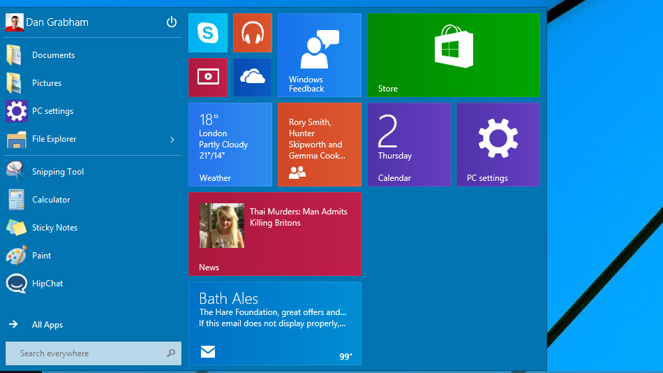
It might not be the key feature in Windows 10, but one of the most striking design changes in Windows 10 harks back to an old one – the Start menu.
The menu has been given a Windows Live Tile-style makeover, and you can now pin whatever you want to the panel on the right.
So, just like on Windows Phone, you could pin a preferred contact or favoured app. Remember that Live Tiles are dynamic, so they can show you the latest news or whether for your current location.
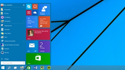
You could also pin a folder you regularly use; it's up to you. The left of the Start menu works like the old Windows 7 one used to – so you can search for whatever you want and it can be activated using the Start key on your keyboard, and you can see recently accessed programs and browse through other programs, too, via an All Apps menu.
The All Apps option now features a vertical scrollbar, so you don't get any of the multi-me menu stacking that you used to get in Windows. As with Windows 7 and 8, the best way to find anything is by searching for it rather than browsing for it.
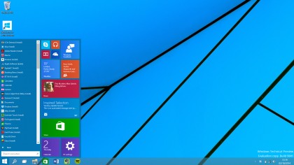
By bringing the Start menu back Microsoft is acknowledging that the Start screen went too far for some users, especially in the corporate space. But those Modern UI apps (now referred to as Universal apps we think) still provide the link with touchscreens.
But in reality bringing back the Start menu doesn't change the functionality of Windows – the Start screen was the Start menu of Windows 8 and Windows 8.1 and, while it was full screen, contained all of the same functionality (you could hit the Windows key and immediately start typing to search, for example).
Get daily insight, inspiration and deals in your inbox
Sign up for breaking news, reviews, opinion, top tech deals, and more.
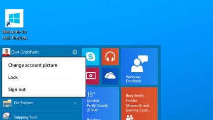
The top of the Start menu now has your user account icon at the top, so you can lock your PC, change your account picture or sign out. Another power button enables you to sleep, shut down or restart your PC.
A panel underneath this contains access to your files via the File Explorer as well as shortcuts to your Documents and Pictures. We actually ended up pinning the File Explorer icon to our taskbar just as it is in Windows 8. An arrow beside the File Explorer icon in the Start menu shows you your most recently accessed folders for quick access.
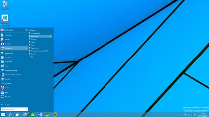
As in Windows 8.1 you can right-click on the Start button itself to get a 'power menu' – quick access to the Control Panel and other more advanced features such as Run, Disk Management and the Task Manager.
One big change is that you can now resize the menu itself. This doesn't work that well at the moment as you can only make it flatter (more of a horizontal bar) or higher vertically. You can't freely resize it to form a smaller version of the now-old Start screen.
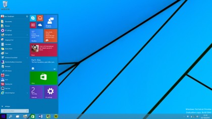
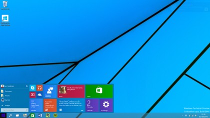
Right-clicking any item in the Start menu brings up other options, such as pinning to the taskbar, removing the app from the Start menu or, where appropriate, removing the app from your PC. As with the Windows 8 Start screen, you can drag the live tiles to rearrange them.
You can also turn individual live tiles off (perhaps you don't want to see your latest emails in the menu, for example) as well a change the size of the tile just as you can on Windows Phone and could in Windows 8 and 8.1. Small, Medium, Wide and Large are the various sizes available.
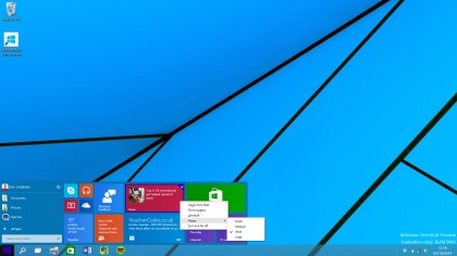
Right-clicking on blank space in the menu gives you two other options – Personalize and Properties. Personalization is currently about as useless as a chocolate teapot – it just takes you to a subset of the Control Panel that enables you to change the hue of the Start menu as well as your window borders. This setting will be overwritten if you change the theme, however.
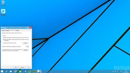
Properties is a lot more interesting. It takes you to the Taskbar and Start menu Properties applet in Control Panel. Strangely, you're put into the Taskbar tab by default. Clicking on the Start menu tab shows you a few options, the top of which is a checked box labelled Use the Start menu instead of the Start screen. We do wonder how many people will choose to get the Start screen back. A handful, we're sure.
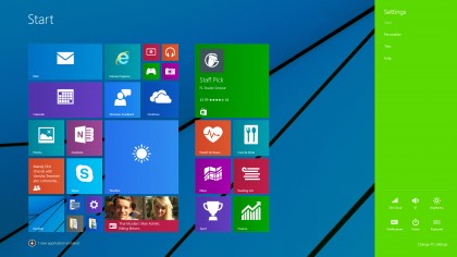
Some other options concern privacy for shared user accounts – you can clear the personal information from your live tiles as well as options to choose not to 'store and display' recently opened programs in the Start menu.
A Customize option provides more granular control over what is shown in the Start menu as well as behavioural characteristics such as whether sub-menus open automatically when you hover over them or whether dragging and dropping is allowed (both of these are permitted by default).
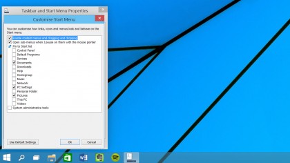
You can also choose to show System administrative tools in the menu and plenty of other things, too, such as the Control Panel itself, This PC (this is what My Computer used to be), your personal user folder or your music and video folders should you wish. It's all very customizable.
Whatever you think of the new Start menu, one thing is for sure – it makes Microsoft's insistence on not even having a Start button in Windows 8 seem ridiculous. Just think about it; Microsoft missed out Windows' key modus operandi for a whole version.
Dan (Twitter, Google+) is TechRadar's Former Deputy Editor and is now in charge at our sister site T3.com. Covering all things computing, internet and mobile he's a seasoned regular at major tech shows such as CES, IFA and Mobile World Congress. Dan has also been a tech expert for many outlets including BBC Radio 4, 5Live and the World Service, The Sun and ITV News.