Why Microsoft has got it right with the Windows Start screen
The brand new front-end interface in Windows 8 is starting to make sense
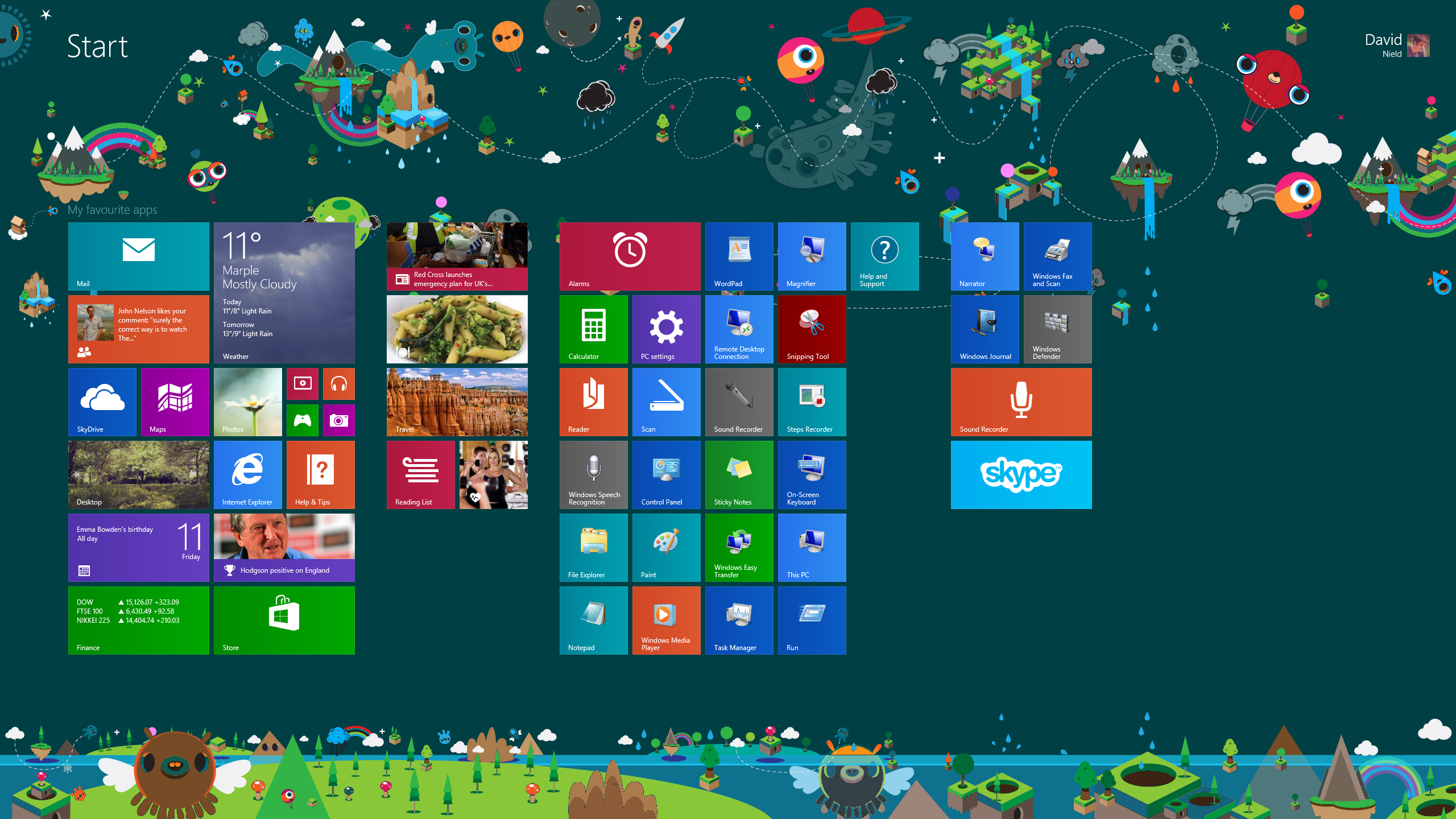
When Windows 8 introduced the Start screen at the expense of the Start menu, it certainly made the natives restless. "It's bigger, brighter, bolder, much more personal — and much more controversial" we wrote in our Windows 8 review.
And you only need to take a quick glance down at the comments underneath that article to see some of the anger directed at Microsoft.
Where was the hallowed Start button? Why had the desktop been demoted to app status? How does this new-fangled Start screen work?
From the Facebook news feed to iOS 7, big changes always generate a certain amount of opposing opinions. For many, it felt as if Microsoft was foisting an unwanted tablet interface onto its loyal user base, those who were already happy with the traditional Start menu, taskbar and desktop paradigm.
Start screen vs Start menu
For me, after a full year of use, it feels like the brave new world of the Start screen is one that I'm very happy to be in — the look of Windows 7 feels rather old-fashioned and one-dimensional in comparison.
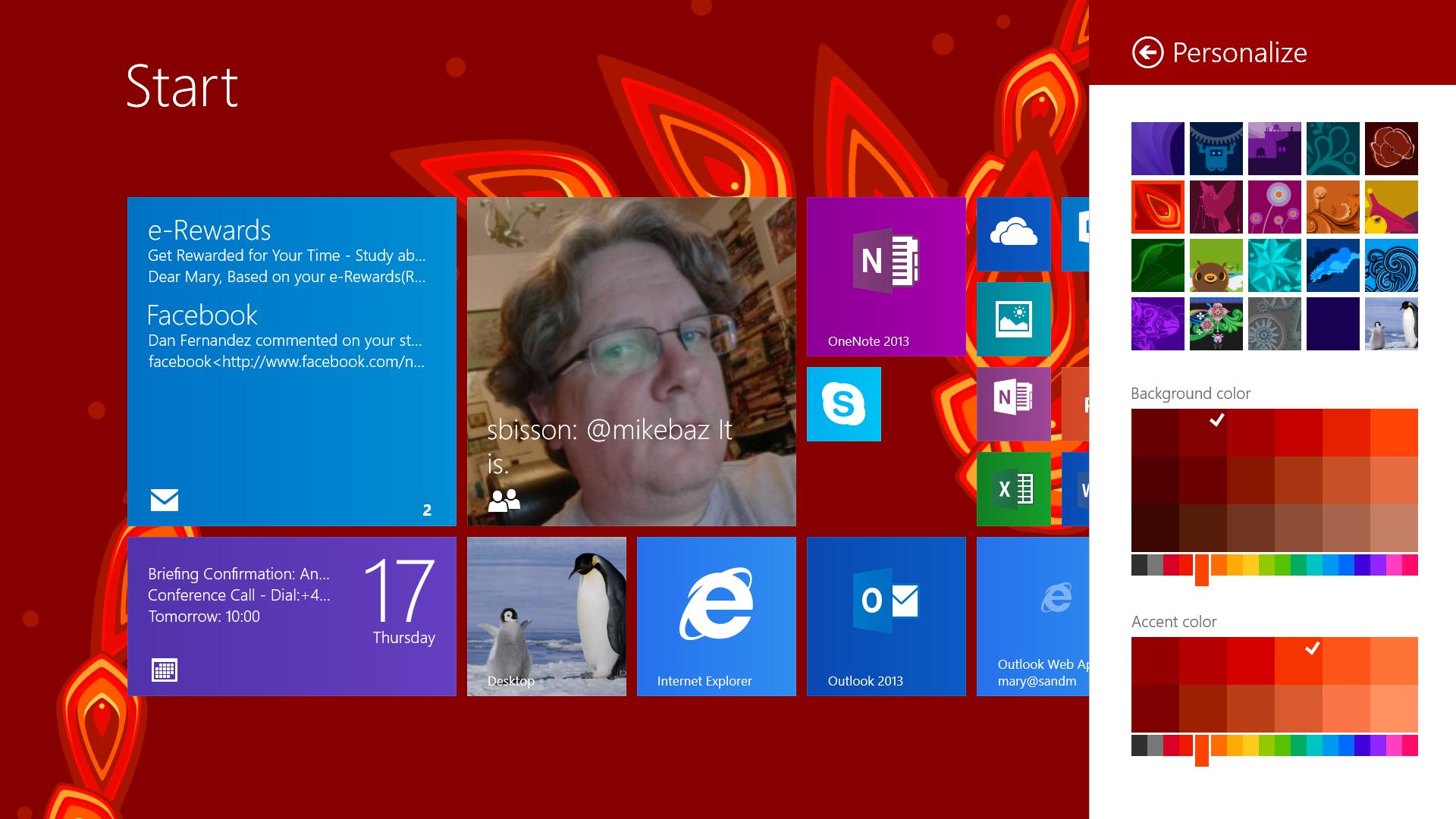
Once you've worked out how to operate the Start screen - which for most people, should be about 10-15 minutes - it's fast, intuitive and on the whole a pleasure to use. It's certainly better looking than its predecessor.
As soon as Windows loads, I'm met with news stories, weather updates, emails and social media feeds before I've even clicked anything, thanks to the Live Tiles. My most-used apps are right in front of me rather than buried in hard-to-find sub-menus.
Are you a pro? Subscribe to our newsletter
Sign up to the TechRadar Pro newsletter to get all the top news, opinion, features and guidance your business needs to succeed!
When it's time to open up the old faithful desktop, it comes across as somewhat static and cluttered, although perhaps I just need to organise my shortcuts better...
Improved Start screen apps
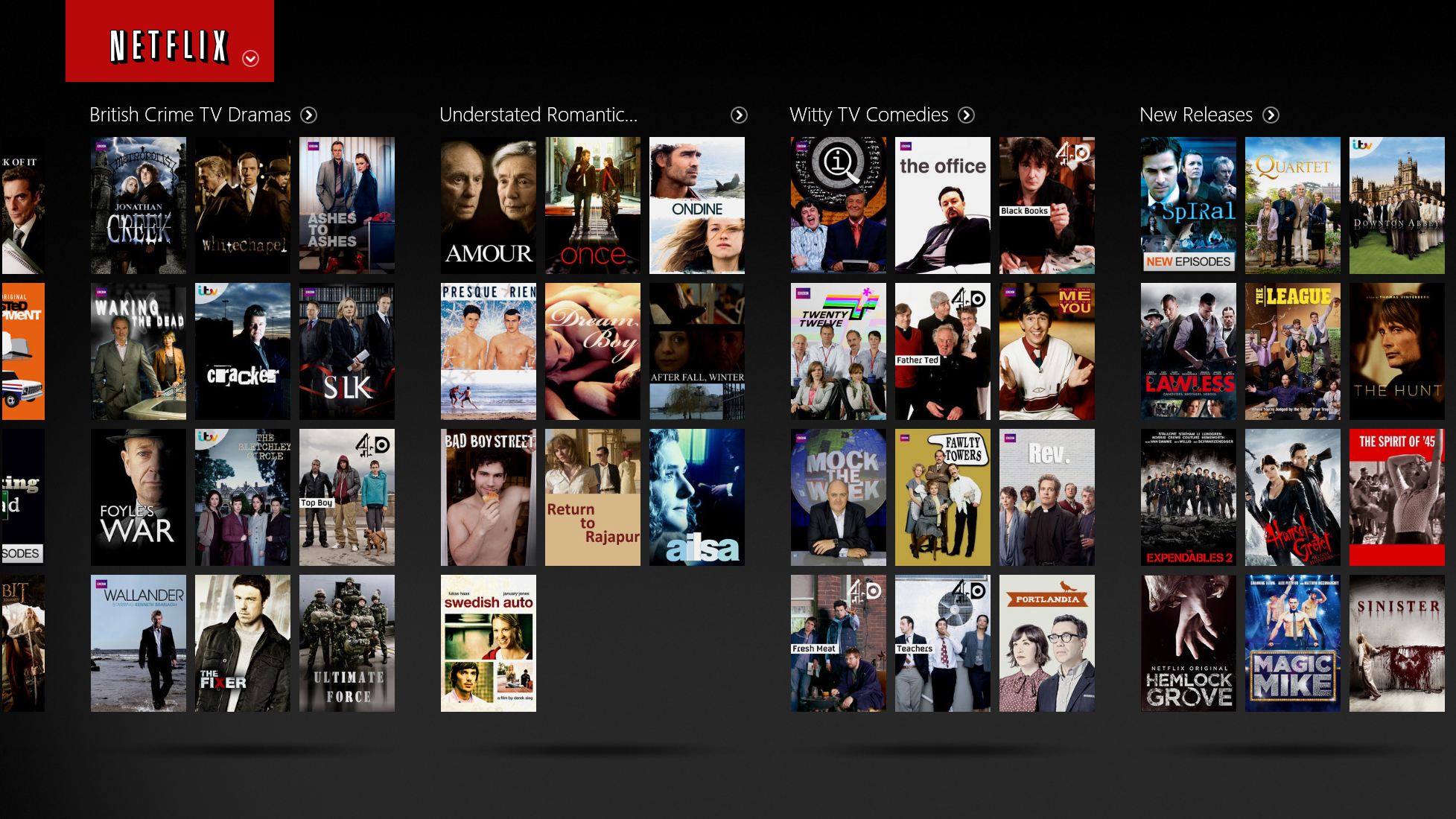
The Start screen apps - admittedly very basic and awkward when Windows 8 first came out - are fast improving in quality (although some issues remain). Netflix, for example, feels so much more intuitive and smooth when run from the Start screen rather than inside a browser, with its endlessly scrolling titles and chunky controls.
Most of my time is still spent on the desktop. But when I want to focus on one task (such as a movie or a video call) the simplicity and ease-of-use of the Windows 8.1 Start screen always appeals.
On the whole I'm still much more attached to desktop applications, but as a launcher and navigation tool the Start screen has won me round.
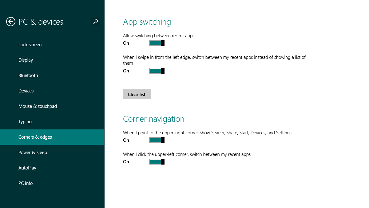
Viewing running apps as a cascade of thumbnails down the left makes much more sense than poking around on the taskbar, while the global Search and Settings charms are a huge improvement over grappling with File Explorer or Control Panel. The latter options are still there for the power users (and I make use of them often) but for quick, painless computing the Start screen makes sense more often than not.
Optimised for touch
I haven't used Windows 8/8.1 on a tablet, but I imagine the benefits are even more pronounced. The old desktop approach was never going to work on tablets - just look at the Windows XP slabs Bill Gates was pushing back in 2001 - and Microsoft needed something fresh.
Of course it was going to be a bumpy ride, with many of us attached to the Start menu and quite happy with that way of working. However, I'm betting that anyone whose first PC is a Windows 8.1 machine is going to look back at the Start menu and find it more than a little antiquated.
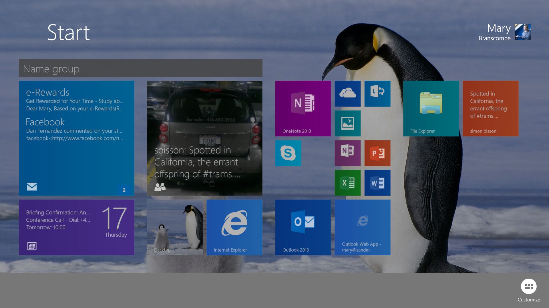
Windows 8.1 ironed out many of the niggling problems with the original Windows 8. Start screen apps can now be organised with greater ease and sorted into groups that are, in my eyes, an improvement on the nested maze of folders that the Start menu offered. You can even boot straight to the desktop if you want to.
There's obviously still work to be done - a Start screen app opening up a file you wanted to see on the desktop remains a jarring experience - but further refinements will follow. Don't rule out a Windows 8.2 update in 2014.
Rethinking Windows
If you're old enough to remember back to when Windows 95 arrived, you'll know that this isn't the first time Microsoft has had to rethink the way that we use our computers.
Eyebrows were raised and some quick changes of habit were required when the Start menu first appeared, complete with a Brian Eno sound effect. But before long we all got on with the new way of working and soon found it impossible to go back.
Then, as now, Microsoft was trying to introduce a new approach to applications and files while trying to stay faithful to its past (the legacy of MS-DOS and the needs of power users).
The Start menu was gradually accepted as the more modern and flexible approach, and Microsoft will be hoping that the Start screen can pull off the same trick, given enough time.
After using it day in and day out, I'm a convert. Try giving the Start screen a chance (or a second or third chance), and you might find yourself won over.
- Now why not read 15 Windows 8.1 annoyances fixed?

Dave is a freelance tech journalist who has been writing about gadgets, apps and the web for more than two decades. Based out of Stockport, England, on TechRadar you'll find him covering news, features and reviews, particularly for phones, tablets and wearables. Working to ensure our breaking news coverage is the best in the business over weekends, David also has bylines at Gizmodo, T3, PopSci and a few other places besides, as well as being many years editing the likes of PC Explorer and The Hardware Handbook.