Why Windows 8 should have been for touchscreens only
No good with trackpads

Imagine the scene if you will: Microsoft's top designers and execs are sat around in a room looking at the latest mobile operating systems and the desktop alternatives and wondering how they can take a proportional leap forward from the well-received Windows 7 platform.
They've looked at tablets and smartphones that work best with large icons, simple yet intuitive interfaces and considered how they could make Windows work well on these touch-enabled devices.
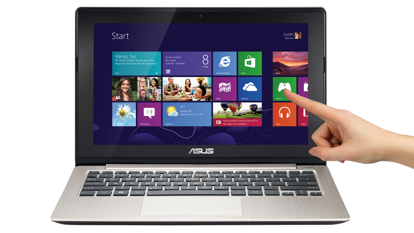
Of course, all of this research ultimately led to the previously-named 'Metro' interface that we now generally refer to as Windows 8 live tiles. It's a different take on an intuitive interface that has steered Microsoft around the patent-heavy seas that surround so many current devices, but does it really work across the broad spectrum of devices that run it? We're not so sure.
With the Microsoft Surface and Windows Phone 8 handsets, the tiles work well. The menus on the Surface also make a lot of sense - you can swipe from the right edge of the screen to access your settings, or from the left edge to multitask or access your recent apps.

Despite Surface's disastrous sales, there's some good if not great points to come out of Windows 8 on a touch-enabled device. Microsoft's research obviously pointed towards the fact that people primarily use their fingers to interact with mobile devices, and with that in mind, Windows 8 for the most part works a whole lot better than previous versions of Windows ever have in this regard.
Users have adapted to touch input incredibly quickly on smartphones and tablets, since the finger is the best available option for navigating content on a small screen (despite being responsible for greasy screens worldwide). There's no room for a trackpad or mouse on these products, and touch input was deemed the best form of navigation at the time.
It's likely that most user interfaces on smaller screens will some day include more use of voice commands and gestures, but touch will still be the main form of input and navigation on these smaller-screen devices for many years.
Are you a pro? Subscribe to our newsletter
Sign up to the TechRadar Pro newsletter to get all the top news, opinion, features and guidance your business needs to succeed!
Can't swipe, won't swipe
So with touch being the input of choice for most - particularly the younger demographic that is key to selling most new technology - why has Microsoft allowed the touch-focused Windows 8 to be loaded on to lower-end laptops and desktop PCs that gain nothing from its new features?
Most of these computers have no multi-touch trackpad, and likely only a mouse and keyboard to interact with the user interface, yet they're still expected to perform often bizarre movements and cursor placements to use simple parts of the OS functionality.
These movements may well work on a smaller screen with a swipe of the finger, but try transferring these commands to a poor quality trackpad and you're in for a whole world of confusion.

It's this experience, we believe, that has led to a lot of users revolting against Windows 8. It's not that the operating system is a terrible piece of software in itself - indeed we liked it - it's more that Microsoft was perhaps not strict enough in marshalling what devices the OS should be loaded on to so that users can experience the best of what makes it a worthy advancement from Windows 7.
We ordered a small HP laptop this year to give us the mobile productivity that a normal tablet can't afford. We were afforded with only one choice of OS, and that of course was Windows 8. We were a little hesitant, but bit the bullet thinking it would be familiar enough, having used Windows Phone handsets and seen how it worked on the Surface RT.
Non-touchscreen PCs are no good
Unfortunately, the small multi-touch trackpad on just doesn't perform as well with Windows 8 as a touchscreen. If you try to perform the same kind of gestures you would on a touch-enabled Windows 8 device you'll be sorely disappointed.
Coercing a cursor around this world of comparatively massive live tiles, ridiculous menus that require gestures and other elements that were clearly designed with touch input first in mind just doesn't feel right. We'd have considered going back to Windows 7 instead if Windows 8.1 wasn't around the corner and being heralded as the upgrade to change people's minds.
We just don't understand why Microsoft's designers thought the new interface would work well without a touchscreen.

Unfortunately this bad feedback on Windows 8 has left a poor taste with consumers, who aren't even picking up the touchscreen-enabled laptops and desktops that are around, with the IDC recently lowering its estimate that only 10-15% of all laptops shipped this year would feature a touchscreen.
Windows 8 should have been 'Windows Touch' or something akin to that. It would have shown that Microsoft is ready for the new generation of prodding, swiping gadget-enthusiast public and that it could build an operating system that works with the new generation of devices.
Unfortunately, having shoe-horned Windows 8 onto any computer that will physically run it has left the raft of consumers who upgraded from earlier iterations of the familiar Windows desktop interface feeling totally bewildered and confused, and we can't blame them.
- Why not check out all the Windows 8 tablets we've reviewed?