Windows 8 beta: more personalisation coming
Change the look of Metro, kill apps plus better mouse support
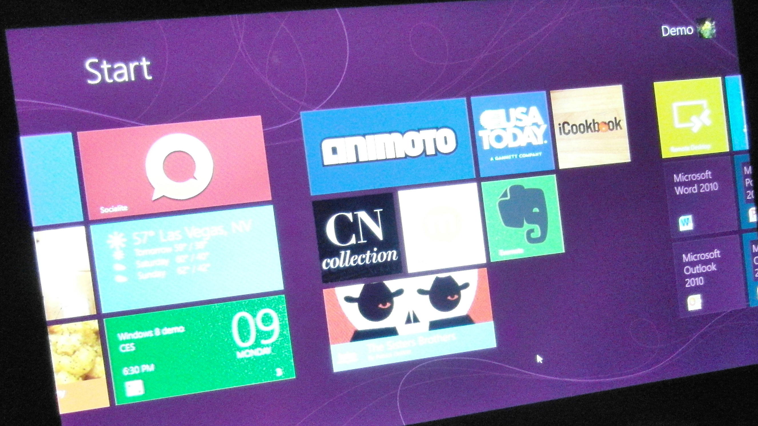
When the Windows 8 beta arrives at the end of February, it will have some widely requested features for killing Metro apps without going to the Task Manager, for navigating using a mouse rather than touch and for doing more with gestures.
You'll also be able to change that overpowering green background. But Windows 8 director of communications Chris Flores points out to TechRadar that you wouldn't want a photograph as the background of the Metro-style Start screen.
Not only would a photo not stretch and scale as you add more tiles and groups and zoom in and out of the Start screen, it would also be covered up so much by the tiles that you'd never see it.
Instead what you can do is pick from (at the moment) eight different styles, from swirls and curlicues to lines and squares, and choose the shade you want from a scrollbar colour picker.
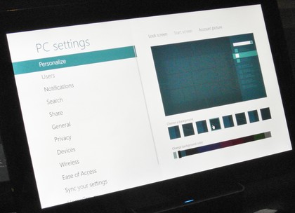
EIGHT STYLES: In current builds of Windows 8 you can choose eight different styles of background, and a range of colours
The background colour you pick is also used as the accent colour for selections in the Metro interface, for the settings panes and anywhere else you've been seeing the original Metro green.
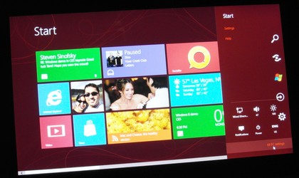
MATCHED SHADES: When you pick oxblood red you don't get it everywhere; the preview shows the toning shades you'll get for panes and selections
Get daily insight, inspiration and deals in your inbox
Sign up for breaking news, reviews, opinion, top tech deals, and more.
There's good news for mouse users, as there are now a lore more ways to control the interface without touching the screen. Use your scrollwheel to swipe sideways through the Start screen to get to the tiles you want.
And if you want to zoom out so you can move or rename groups of tiles, drag a tile a long way across the screen, or just get to the far end of your tiles in a hurry, you can click in the lower right hand corner of the screen to activate the same 'semantic zoom' as pinching with your fingers on a touch screen.
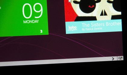
SEMANTIC ZOOM: Click the icon to zoom out and see your tiles as tiny tiles in groups
You don't have to remember that because there's an icon for it at the end of the scroll bar, and there are hints for what clicking the mouse in most of the other corners does too.
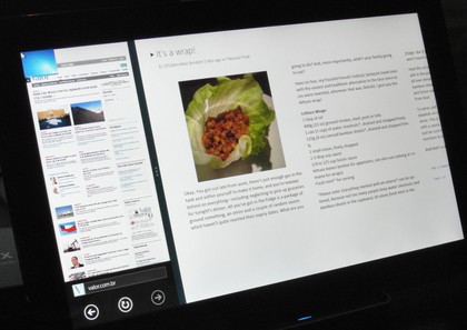
PICK APPS: Use the scrollwheel of your mouse to flip through the apps you can switch to
Clicking lower left on the Windows flag swaps you back to the Windows desktop if that's open and you can now click in the top right corner to open the charm bar; that works far better because you don't have to move the mouse all the way to the left, click and then race over to the right hand side of the screen to choose the icon you want.
Move your mouse into the upper left corner when a Metro-style app is on screen – full-screen or snapped to the left side – and you'll get a thumbnail of the next app on the Windows stack. Spin the scrollwheel to step through the thumbnails and click when you get to the one you want to switch to.
That's easier than the swipe in/swipe out/swipe in dance you have to do to pick an app that's not the next one in order when you're controlling the interface with your fingers (if you drag back towards the side of the screen before the thumbnail for the next app enlarges to fill the window, Windows 8 knows you don't want it and offers the following thumbnail, but the gesture requires precise movements.
There's also a minor change to the way the charm bar appears. When you put your finger on the single pixel strip at the right side of the screen, if you don't make a clear swipe gesture then the charm bar icons appear floating transparently on screen rather than on the usual black charm bar background. That way if you didn't mean to open the charm bar, they're not as intrusive.
If you don't touch them again, they disappear quickly; if you tap an icon, the charm bar draws in fully and the pane you tapped for opens. The same thing happens when you have your mouse on the right of the screen; it's much harder to open the charm bar accidentally.
There's a new gesture for killing Metro apps without going to the Task Manager; they're not using resources unless you can see them, but you don't want an app you're done with cluttering up the stack of thumbnails and apps you have to work your way through every time you switch what's on screen.
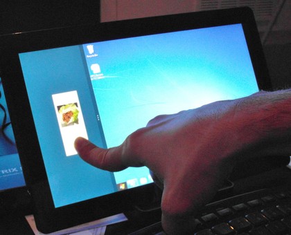
KILLING SWIPE: Drag down from the top bezel and the current Metro app shrinks down, ready for you to throw away by swiping to the bottom
When you have a Metro app running, drag your finger down from the top bezel of the screen; as your finger gets halfway down the screen the app switches to show a thumbnail so you know you're selecting it. Drag your finger all the way from top to bottom - which you can do in one smooth swipe – and the app closes altogether. That works much the same way to kill a Metro app with the mouse. Put the changes together and Metro is a lot easier to work with, especially for mouse and keyboard users.
And if you're wondering how many apps will be available for Metro when the beta comes out. Flores isn't giving any numbers, but he did reveal that it took only a day to turn the HTML5 version of Cut The Rope into a full Metro app.
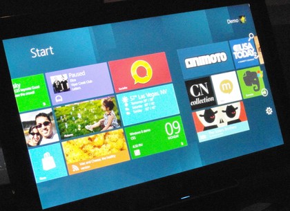
TRANSPARENT CHARM: Swipe or click hesitantly and the charms float over the Start screen, ready to disappear if you turn out not to want them
Mary (Twitter, Google+, website) started her career at Future Publishing, saw the AOL meltdown first hand the first time around when she ran the AOL UK computing channel, and she's been a freelance tech writer for over a decade. She's used every version of Windows and Office released, and every smartphone too, but she's still looking for the perfect tablet. Yes, she really does have USB earrings.