Windows 8 vs Ubuntu: battle of the operating systems
We pit Windows 8 against Ubuntu to see which OS comes out top dog
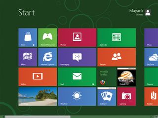
Both Canonical's Unity and Microsoft's Metro are unconventional desktops. So much so, in fact, that most of our testers first thought we were pulling a fast one on them when we invited them to give us their feedback for this feature.
Unity vs Metro
Windows Phone 7 users did recognise the Windows tiles interface, but having to navigate it with a mouse negated their familiarity with the interface. Others were simply at a loss as to how to proceed.
Everyone's first impulse was to figure out a way to "get to the desktop". Unity, too, was different from what most Windows (and non-Ubuntu) users were used to. But it still didn't appear to be as 'outlandish' as Metro. Many simply thought of Unity's launchers as shortcuts mounted on a panel, and then used them as such to launch their apps.
On the other hand, usability-wise, the Metro Tiles looked out of place on a 23-inch FullHD monitor. Even after we familiarised the group with the basic operations of the Metro desktop, many didn't discover some of its crucial elements.
For example, most users didn't realise that they could influence the tiles by right-clicking on them. A lot didn't know they could add tiles for things from within apps (such as their IM contacts), but they all appreciated the ability to do so when informed about the feature. Those who had read reviews knew about the Charms bar and how to bring it up, but others just discovered it by accident.
Obviously, not everybody had a smooth experience with Unity, especially first-time users. But their inconveniences with Unity's way of doing things were resolved easily after a quick glance at the Ubuntu Features page.
The most common issues were spotting the Lens icons at the bottom, especially on larger displays, and finding apps that weren't already pinned to the launcher.
Get daily insight, inspiration and deals in your inbox
Sign up for breaking news, reviews, opinion, top tech deals, and more.
The traditional-looking desktop in Windows 8 is labelled, aptly 'Desktop'. It behaves like Windows desktops have in the past, and looks almost the same, too - we say almost because it lacks the one crucial bit that most users identify with Windows, the trademark 'Start' button.
Thanks to this feature most were as lost at the Start screen as they were on the Metro Tiles.
Hot Corners
Once again, we jumped to the testers' rescue and showed them the Windows 8 Hot Corners. The idea of Hot Corners seemed sensible only to users familiar with their implementations in either Mac OS or Ubuntu Unity. However, much to their disappointment, the Start Hot Corner button returns them to the Windows 8 tile-laden Start screen, from which they had just escaped.
Not surprisingly, the first thing most Windows users tried to customise was to figure out a way to get back the traditional Start button and behaviour. Despite the fact that Unity was as foreign to most users as Metro, they could find and launch apps they wanted, and use the desktop as they were used to, irrespective of the OS they came from.
All apps under Unity had the familiar window controls to minimise, maximise and close them - something sorely missing from the full-screen Windows 8 Metro apps.
Customising the desktop
With 12.04, Ubuntu has refined further its simplified consolidated System Settings window. Users can now make the launcher a permanent fixture on the desktop, as well as tweak its behaviour for multi-monitor set-ups, which was a much-requested feature by Linux users.
This was well received by our bunch of testers, who had pre-conceived notions about the difficulty of setting up Linux.
Their experience with setting up Windows 8 was rather interesting. Their first instinct was to look for the Control Panel, which isn't readily accessible, at least under the Consumer Preview. It shows up when you bring up the Charms bar under the Desktop view, but not under the main Start screen. This discrepancy wasn't noticed by many users.
Like Ubuntu 12.04, Windows 8, too, tries to simplify its settings options, with the most common settings accessible from under the Charms bar. Other advanced settings, such as the BitLocker encryption, are still accessible via the Control Panel, or you can search directly for them from the Start screen.
While most didn't figure out the location of the Charms bar on their own, all our testers appreciated Windows 8's style of segregating its settings, making commonly used settings more readily accessible than less frequently used ones.
Accessing hidden features
Another similarity between Ubuntu 12.04 and Windows 8 is their focus on making less visible features, buried beneath nested menus, easily accessible.
Windows 8 is tackling this issue by adding an MS Office-like Ribbon to its Windows Explorer, while Ubuntu's solution is the Heads Up Display (HUD). Still, most of our testers preferred to stick to the Context menu when working with Windows Explorer.
According to Microsoft, Windows Explorer has more than 200 functions (a fact we shared with our testers), but many simply continued using it to just look at and launch files.
Surprisingly, HUD got more looks than we expected, even though it forces people to abandon the mouse and use the keyboard.
Linux users in general, and Ubuntu users in particular, appreciated the time-saving facet of HUD and how it seamlessly performs system-wide settings, such as setting up VPN, as well as app-specific actions such as saving a document or opening a bookmarked page.
With almost two decades of writing and reporting on Linux, Mayank Sharma would like everyone to think he’s TechRadar Pro’s expert on the topic. Of course, he’s just as interested in other computing topics, particularly cybersecurity, cloud, containers, and coding.

