Hands on: Sky News app for iPad review
Awesome but not broad enough in its coverage
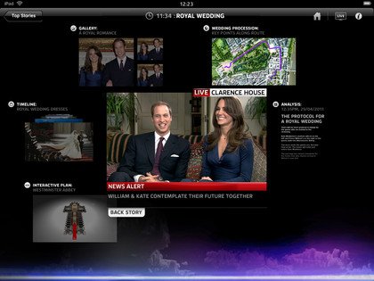
Back on to the hub pages, and we get a taste of just how powerful an experience the Sky News app for iPad provides.
The page groups the relevant content around the story. Obviously the top story today across the globe is the crisis in Japan, and the grouped coverage is comprehensive.
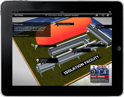
There is a central report and around the outside is a timeline of how the story unfolded, supporting graphics and graphs, galleries of the harrowing images and maps, along with other video reports on some of the other aspects of the story and text reports.

One criticism that is likely to be levelled at the Sky News app is that the text reports do feel a little after the Lord Mayor's show – this is an app that doesn't seem particularly fond of the written word, but it's been shoved in there for a sense of completeness anyway.
Throughout all of this content there is the option to have video running live, either blown up to full screen or in the corner as you take a peek at the supporting content.
The whole application feels futuristic; it's immediately nice to play around with and, as we said, easy to use. It is clear that this is a video-led app that is wonderfully suited to the fine screen on an iPad.

But there are three huge issues that have to be considered when you look at the Sky News app for iPad
Get daily insight, inspiration and deals in your inbox
Sign up for breaking news, reviews, opinion, top tech deals, and more.
First up, and perhaps not as critical as it seems on the surface, this will become a paid for app at some point this year, but only if you are not a Sky subscriber – subscribers pay nothing.
Is this a massive barrier? Definitely for those who are just after news and don't pay for satellite TV; but Sky is confident that it has enough subscribers with iPads to mean that the app will be a success.
Secondly,this is an online application. If you check out the news on the underground or on a train through areas with patchy coverage this may not be the app for you. Sky News has decided that it is all about the now (the app is updated every minute) and isn't interested in offering offline content.

Which is a shame, because you think the combination of the two would not only give an obvious boost in terms of commuter worth, but also give that pesky text a much-needed larger role.
And onto the third issue – which for many people is a potential dealbreaker: The Sky News app for iPad only focuse on the major news stories.
That means if you like tech news on a day when Steve Jobs hasn't taken to the stage, then you might as well not bother. If you are looking for the Chelsea score from last night, then you might not find it and if you are interested in anything from the world of entertainment, weather or the quirky section, give up now – they aren't going to be there.
It's a crying shame, but it appears that the sacrifice made in order to bring a brilliant experience to the main stories means that there is not enough in the tank to focus on anything else.
Unhelpfully, when TechRadar asked about this narrowing of the news agenda,Sky pointed out that there are other apps available – which rather missed the point of a news app.
This is a wonderful application, beautifully designed and fun to use – but by focusing so entirely on a few topics, it may well find that it's missing out on a huge audience who want to look beyond the headlines but not beyond the news.
But, presumably, that's something that can be rectified.
Patrick Goss is the ex-Editor in Chief of TechRadar. Patrick was a passionate and experienced journalist, and he has been lucky enough to work on some of the finest online properties on the planet, building audiences everywhere and establishing himself at the forefront of digital content. After a long stint as the boss at TechRadar, Patrick has now moved on to a role with Apple, where he is the Managing Editor for the App Store in the UK.
