Netflix: We are challenging the boundaries of what TV is
Redesign is the biggest yet for Netflix on television

Two years is a long time for any tech company but for Netflix it is an eternity. Back in 2011, Netflix had gotten itself into a predicament. Its CEO Reed Hastings had floated the idea that it should split its DVD rental and streaming service in the US in two.
Coupled with a mooted pay increase, and the fact that Starz was looking to pull its content from the site, the idea didn't go down well, with subscribers revolting at the fact that they would have to deal with two accounts.
Skip to 2013 and a swift scrapping of this split, 2011 turned out to be a slight bump in the road for Netflix – a company that is now as synonymous with streaming as Google is with search.
There seems to be no stopping Netflix in its bid to become not just the next HBO but get a handprint on the Hollywood walk of fame too, with news that it is now investing in its own movie content.
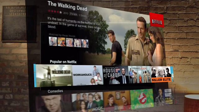
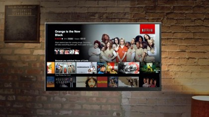
This week, Netflix has announced that it has completely overhauled its streaming service for television, making it much more visual and easier to use on the big screen.
And, according to Chris Jaffe, vice president product innovation at Netflix, it was during this tumultuous time that the idea for the new UI came about.
Redefining TV
"There was two years of incubation time for this redesign and finally now it is ready to go," he explained to TechRadar.
Get daily insight, inspiration and deals in your inbox
Sign up for breaking news, reviews, opinion, top tech deals, and more.
"We sat back and wanted to re-conceptualise what Netflix and TV was. TV is so important to Netflix, more than half of our users use Netflix on a TV or the set-top devices that are connected to the TV."
Much like Netflix as a company is consistently challenging how TV is made and watched – something that can be seen with the Emmy award-winning House Of Cards that was funded by Netflix with all episodes arriving on the service at once – the redesign of the user interface seems to follow this same ethos.
"We are constantly trying to challenge the boundaries of what the TV experience is," says Jaffe.
"So, we asked ourselves: could we be more contextually appropriate to TV? Could we do a better job with TV? We wanted to challenge ourselves and this is the result."

The new Netflix TV experience is definitely visually bolder. Instead of one smaller image to show off a movie or TV show, there are now three bigger ones. The main visual is there to help the viewer decide more easily if what they choose to watch is right for them.
"The new design of Netflix is richer and more engaging. We now have three large images for every title. These are there as we wanted to give you more context," said Jaffe.
"The idea is that you get Netflix out of the way and push the content that we have and the images are a big piece of this."
No spoilers
This visual flair has also been added to the episode selection side of the service. Each episode now comes with a visual cue. When asked whether this could offer up 'spoilers', Jaffe explains that this won't happen.
"The images are human curated, so there definitely won't be spoilers. It adds variety. We could always show Kevin Spacey's face but that would be boring."

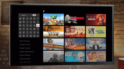
A visual element has also been added to search, where titles will appear as soon as you type a letter. And the new look has been extend to the Kids' section of Netflix as well.
Technology overhaul
While the new redesign offers a massive lick of paint, perhaps more significantly Netflix has also completely overhauled its software, putting it all on bespoke platform. This means that no matter what device, smart TV or set-top you now view Netflix on it should get any new updates at the same time.
"The new technology we are using for Netflix is really important and as significant as the redesign," notes Jaffe.
"There has been discreet applications on different devices. So, every time we had to update we had to do it across platforms and this slowed us down.
"This has now changed. We developed our in-house platform that can go on all platforms. This allows us to have one consistent upgrade. We no longer have to make sure that an update works separately on a Roku and a smart TV. We have worked for a long time to make this technology a single interface that runs everywhere on every application."
What that means for a Netflix user is quicker updates and, eventually, more features, explains Jaffe.
"It allows us to move much faster. You will be seeing more feature on more platforms much quicker. There is no doubt behind it."
Marc Chacksfield is the Editor In Chief, Shortlist.com at DC Thomson. He started out life as a movie writer for numerous (now defunct) magazines and soon found himself online - editing a gaggle of gadget sites, including TechRadar, Digital Camera World and Tom's Guide UK. At Shortlist you'll find him mostly writing about movies and tech, so no change there then.
