The Dark Mode craze may do more harm than good – this is why
Opinion: developers need to go dark on the feature

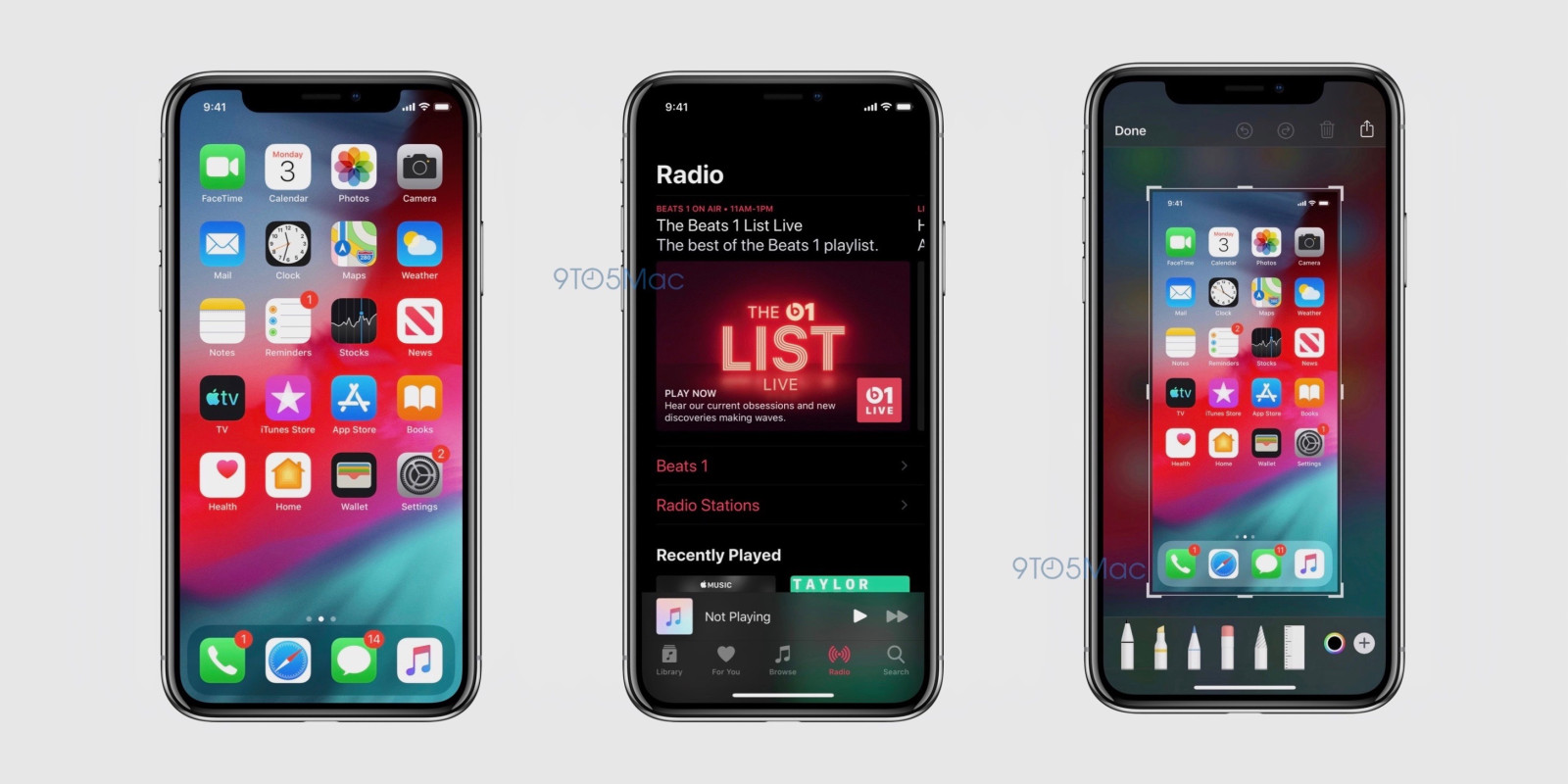
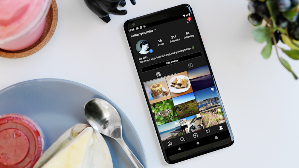
The hot new topic in terms of smartphone and computer software right now is Dark Mode, an optional system look that flips the colors of an app or operating system to make it, well, dark. Instagram has a dark mode, as does Chrome, WhatsApp, Gmail, and iOS 13, and it seems apps and developers are tripping over themselves to create a new dark mode for their software.
There's just one problem which none of these hard-working people seem to have considered that makes their work redundant, and the attention they've taken from other projects will be in vain: all in all, dark mode looks totally awful.
That's not a dig at any dark mode in particular, and no developers have implemented it particularly poorly (well, apart from Android 10). But in the rush for developers to see if they could implement dark mode on their apps, no-one asked if they should - and taken stock of how it might be reworked better rather than just following the trend.
Beyond that, there are legitimate reasons why developers shouldn't be focusing on Dark Mode. Here's why the Dark Mode craze is just crazy.
Dark Mode hurts to look at

Have you ever gone onto a website, typically an older forum page from back when web design really kicked off, and seen a black background with white text (usually in comic sans) and found it totally hard to read?
Pure black backgrounds with white font can be really hard to read, and it causes halation or visual distortion for many people. Having to look at this for long periods of time can cause serious eye strain, which means it's no wonder modern society uses white backgrounds with black or gray font for... well, everything. It's suggested that, for those with astigmatism, dark mode can cause said eye strain, as it causes them to squint a little harder to read.
Dark Mode is dark with white text, and it can cause the aforementioned eye problems. More than that, it just looks ugly, and when smartphones are trying harder and harder to look beautiful in terms of design and software, it makes no sense to create a horrible-looking dark filter.
Get daily insight, inspiration and deals in your inbox
Sign up for breaking news, reviews, opinion, top tech deals, and more.
Sure, ugliness is an opinion – but this is an opinion article, so that's to be expected.
No good for low-light

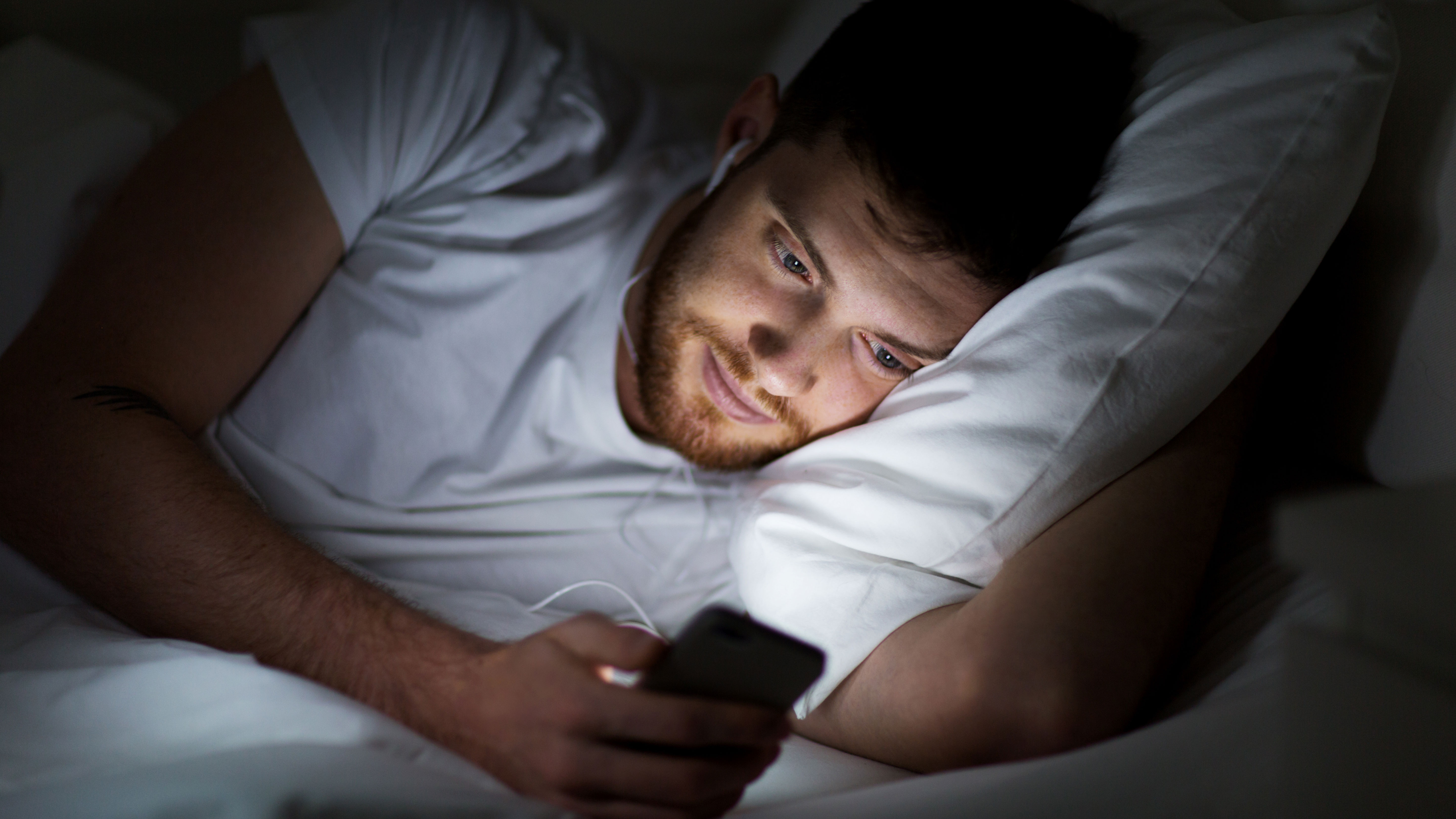
One of the main reasons behind Dark Mode (or excuses for its existence, if you're not feeling charitable) is that it's better for low-light settings, so you can use it in bed without blinding yourself or someone else. And there's merit behind that reasoning: the blue lights in phone screens have been known to stop people sleeping, as the brain misinterprets the blue light as daylight.
There's merit behind the reasoning, but not behind the execution, as Dark Mode would only be a useful way of cutting out blue light if functions to this end didn't already exist. But they do.
Many phones have blue light filters, which you can schedule to kick in at a certain time to reduce the blue light from your phone screens – typically this means between 10PM and 7AM, your phone display has a slight red hue. Some smartphones, like Sony phones, have more permanent options that let you customize the RGB makeup of your display to suit your vision.
Then there's the issue of bright lights in bed waking up your significant other (although if you're frequently using your phone in bed, that's a whole different issue). For years now, phones have had adaptive brightness, and before that you could manually change the brightness of your phone. In short, if your handset is too bright, dial down the brightness!
Dark Mode is a solution to a problem that already has a solution – and this second solution is just wasting time that developers could be spending on other projects.
Just turn it off

There are some perks to a dark mode, such as its battery saving potential. But since Dark Mode is surprisingly hard to develop (as Chrome for desktop shows), it would be more efficient for developers to work on battery optimization tricks.
There's also the great extra benefit that dark mode can help those with light sensitivity or visual impairment - to some, this new user experience is more about accessibility than anything else and it's a much better alternative to just inverting the colors of the screen in a phone's settings.
However, developers haven't been using this as a headline feature to sell in dark mode, often just focusing on the aesthetics or being able to improve productivity, rather than extolling the virtues of helping users with sight issues.
Of course, the obvious response to 'dark mode is bad' is simply 'just turn it off then', and I certainly will, but there's more to the issue than that.
With every developer around being tasked to create a hasty dark mode, seemingly just because everyone else is, that means manpower is going to be turned away from other tasks that are arguably more important for the longevity of operating systems and apps.
Operating system developers are in the midst of their own battles right now: Apple's MacOS Catalina is murdering nearly every computer it touches, and Microsoft's Windows 10 is tripping over basically every hurdle it gets near.
Similarly, apps and social media platforms have bigger issues that need addressing in terms of usability: YouTube needs to sort out the algorithm that its top content creators keep getting shafted by; Twitter needs editable tweets; Instagram needs to fix its auto-ban algorithm that many have ridiculed as overzealous.
In short, developers all have problems they need to face and address, but if they spend their time creating pithy dark modes instead of fixing problems, they're letting their platforms sink further down into the plughole that the internet is becoming.
Editor's note: Thanks to the reader emailing in to highlight the accessibility benefits of dark mode for some users - we've updated the article to add in this important perspective.

Tom Bedford joined TechRadar in early 2019 as a staff writer, and left the team as deputy phones editor in late 2022 to work for entertainment site (and TR sister-site) What To Watch. He continues to contribute on a freelance basis for several sections including phones, audio and fitness.