The macOS 10.14 Mojave changes you haven't heard about
Apple's desert update is anything but barren
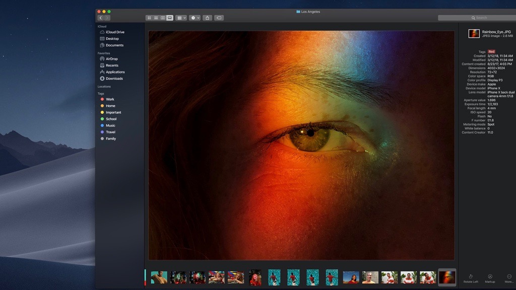
Apple's macOS 10.14 Mojave finally launched today after months in public beta, and can be downloaded right now—assuming your Apple computer is still compatible.
Swapping High Sierra for Mojave will net you some exciting user interface (UI) improvements. We’ve highlighted some of the best tools Mojave has to offer, from Dark Mode’s eyestrain-reducing color palette to Apple’s newest privacy, anti-clutter and quick action tools.
But once you’ve mastered the basics, dig deeper into Mojave’s new features and you’ll find some lesser-known updates that could have a major impact on your day-to-day computing.
We’ve spent weeks playing in the sandbox of Mojave’s Developer beta, all to list out the newest OS improvements and shortcuts that many Apple users might never notice.
Dark Mode’s dark secrets
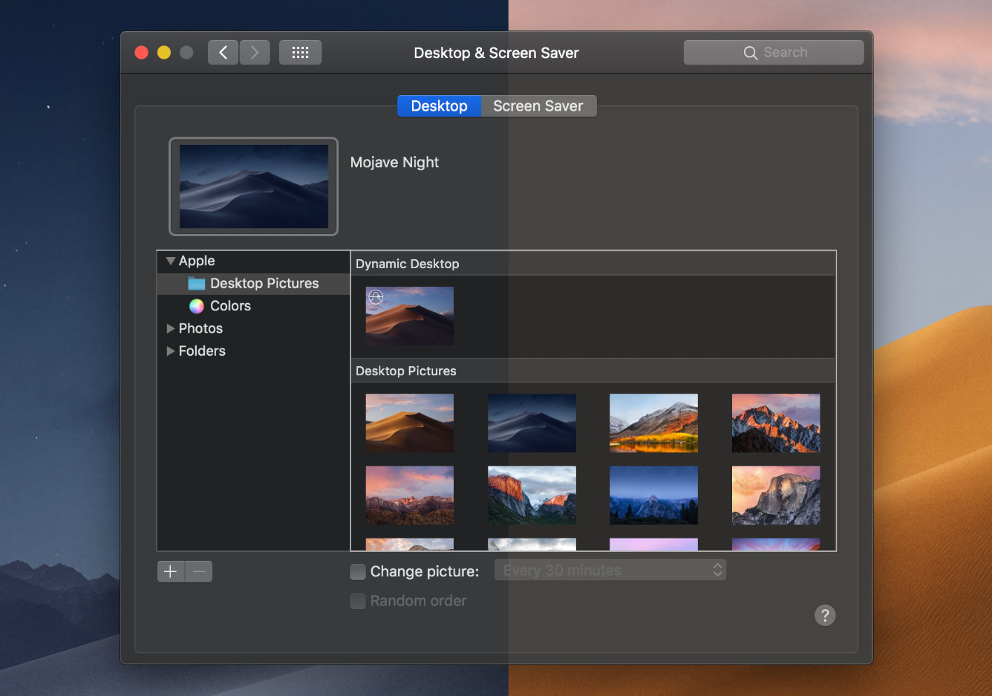
Pulling inspiration from the iPhone’s Night Shift mode, Dark Mode inverts your desktop’s color scheme, making the background dark and specific text elements pop with bright colors.
But Mojave tests out nighttime tools that your smaller screens don’t have. Desktop Tinting, for instance, which makes your Finder or browser windows pick up the color of the background behind them.
Tinting makes the black screens of Dark Mode less stark, and lets you see your cute background images while you work. But, for people working in apps like Photoshop where color fidelity really matters, you can use System Preferences to make your windows solid again.
Get daily insight, inspiration and deals in your inbox
Sign up for breaking news, reviews, opinion, top tech deals, and more.
Apple has also, finally, opened up the color pane of its interface completely. In System Preferences, you can pick the color that pops up behind menus, selected text and radio buttons while in Dark Mode.
This essentially splits the old highlight color option into two controls. Where this option used to affect selections in menus and whatever control had focus, along with whatever text was selected in a document, the former is now called the accent color toggle while the latter is the highlight color toggle.
With eight colors to choose between, you’ll want to stay in Dark Mode even during the day.
Apple has also advised app developers to give all of their text semantic coloring from now on.
This will ensure that text colors adjust automatically based on your background, maintaining a proper color contrast ratio to make text consistently readable.
Custom-made Dynamic Desktops
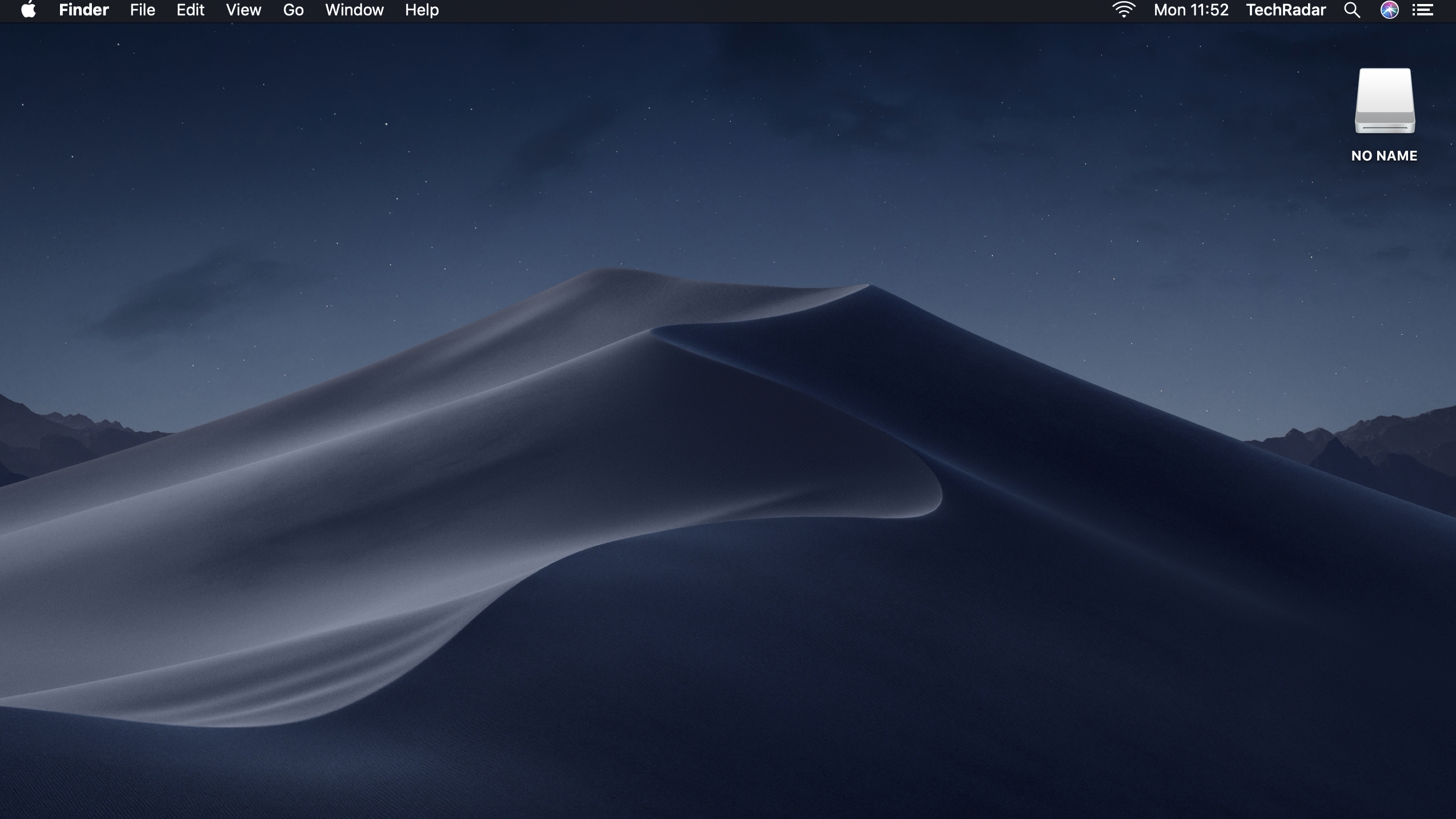
You may already have heard about Mojave’s new time-dependent desktop screens, which adjust the brightness and color of the background based on the time of day. While they aren’t animated video backgrounds, like the ones found on Apple TV, they nevertheless make your desktop much more diverting and context-appropriate.
You may not know that Apple has only released two Dynamic Desktops so far. However, some enterprising Apple users have already found a way to make their own.
This Github page provides a step-by-step guide for converting a series of images into a HEIC file (Apple’s Dynamic Desktop format). Set your custom HEIC as your background via System Preferences > Desktop and Screen Saver, and Apple will switch between each image as time passes, like an incredibly slow flip book.

Preserving your online anonymity
Apple and Tim Cook made Mojave all about information privacy and website security in the wake of the Facebook privacy scandal earlier this year. Now, the internet’s advertisers, cookie-makers and computer hijackers will have a harder time figuring out who you are.
Whenever an external source wants to access your camera, microphone, Messages history or Mail database, you’ll have to grant it permission first.
The Mojave OS also improves on 10.13’s anti-cookie measures with a system called Intelligent Tracking Prevention 2.0. It prevents a website’s cookies from tracking your activity on other websites for profiling purposes, unless you explicitly grant that site permission.
In Safari specifically, Apple will prevent websites like Facebook from compiling a device profile on you based on your likes and comments. It will see your computer as a generic, anonymous laptop.
“Siri, show me my Hulu password”
In both iOS 12 and Mojave, Apple has essentially turned Safari into LastPass. Whenever you’re creating a new website account, it will generate a strong, randomized password for you, then save it in your keychain so it can auto-fill without you having to memorize it.
If, for whatever reason, a site doesn’t auto-fill, you can ask Siri to search for a specific password, and it will check your iCloud Keychain for it. If Siri finds one, it will pop up the text so you can copy and paste it into the field yourself.
Apple also trained Safari to shame you into changing passwords you use on too many sites. In Safari Preferences, it will flag all repeat passwords and suggest new, stronger ones.
Targeted anti-autoplay
We’ve all dealt with them. You open a site and hidden videos start blabbing about medicinal side effects or breaking news you’ve already heard about. Sometimes, two videos play over one another. Oftentimes clicking the pause button sends you to a spam site.
Regardless of whether Apple considers these videos a security threat or just plain annoying, we’re grateful, because they’ve added a new option to turn off auto-playing content on specific sites.
In your Safari Preferences, you can enter a URL and select 'Never Auto-Play,' and you'll never have to rely on ad blockers or the mute button for peaceful web browsing again.
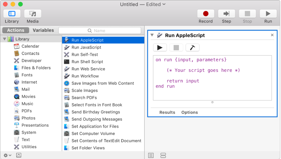
Integrated Automator shortcuts
For those unaware, Automator lets you use AppleScript or Javascript to create workflows or shortcut actions, so you can easily perform repetitive actions with a click. Converting a folder of jpegs into pngs, for example, or resizing photos automatically as you import them.
Mojave provides some great tools for editing files without opening an application. Within Finder’s Gallery View, you can annotate files, rotate images, trim your iPhone videos, and perform other saved quick actions. You can even cut out bits of your m4a music files with the Trim option.
Beyond those useful features, Apple users who like to play with programming in Terminal or Automator have plenty to get excited about with Gallery View, too.
With Mojave, though, you won’t have to trigger those actions in the Automator app. In the bottom right of Gallery View, select 'More', then 'Customize'. You’ll be able to add new Quick Actions to Gallery View’s options, including actions imported from Automator or other third-party apps.
If even that seems too arduous, you can give your Quick Action Workflow a custom icon and add it to your Touch Bar, so your shortcuts are only a tap away.
DVD https://t.co/S0XXfbkCGv got updated! Now in /System/Library/CoreServices/Applications, version 6.0 is 64-bit, re-written with AppKit, supports Touch Bar! Also has a super boring icon (the optical disc icon)@stroughtonsmith @ismh @the_jannis @siracusa pic.twitter.com/yzdqbSUtMAJune 5, 2018
DVD Player update
The OS after Mojave will abandon 32-bit apps, making 10.14 the testing ground for Apple to update some of its older programs (like Automator).
To the relief of many, Apple has made preserving its elderly DVD Player application a priority.
Apple may have ditched integrated disc drives years ago, but many people still use external drives to watch their favorite movies. Mojave’s update, which adds Touch Bar tools for pausing films with a quick tap, will make those folks very happy.
Recent apps in the dock
Finding applications you used recently on a Mac isn't hard: just look under the Apple drop-down menu at Recent Items to find them. Mojave gives you a couple of options that makes it somehow even easier.
First, your dock will automatically show your most recently used applications, in a partition between your saved apps and the folders like Downloads and Trash. No apps already in your Dock will show up here, and you can easily drag the temporary apps right into your main Dock.
If you think your Dock is crowded enough already, though, then you can go into the Dock menu of System Preferences and uncheck "Show recent applications in Dock."
Second, you can take advantage of Mojave's Stacks organizational tools. These de-clutter your desktop by stacking similar files on top of one another, but they also can be used to create smart folders that update over time based on specific categories—like Recent Applications Used.
You can then place that Stack folder into your dock, and then choose whether to display them alphabetically, by most recent use, or by another criteria. And unlike the other option, this will only take up one slot on your Dock.
- macOS 10.14 Mojave vs Windows 10 October 2018 Update: which OS is now ahead?
Michael Hicks began his freelance writing career with TechRadar in 2016, covering emerging tech like VR and self-driving cars. Nowadays, he works as a staff editor for Android Central, but still writes occasional TR reviews, how-tos and explainers on phones, tablets, smart home devices, and other tech.
