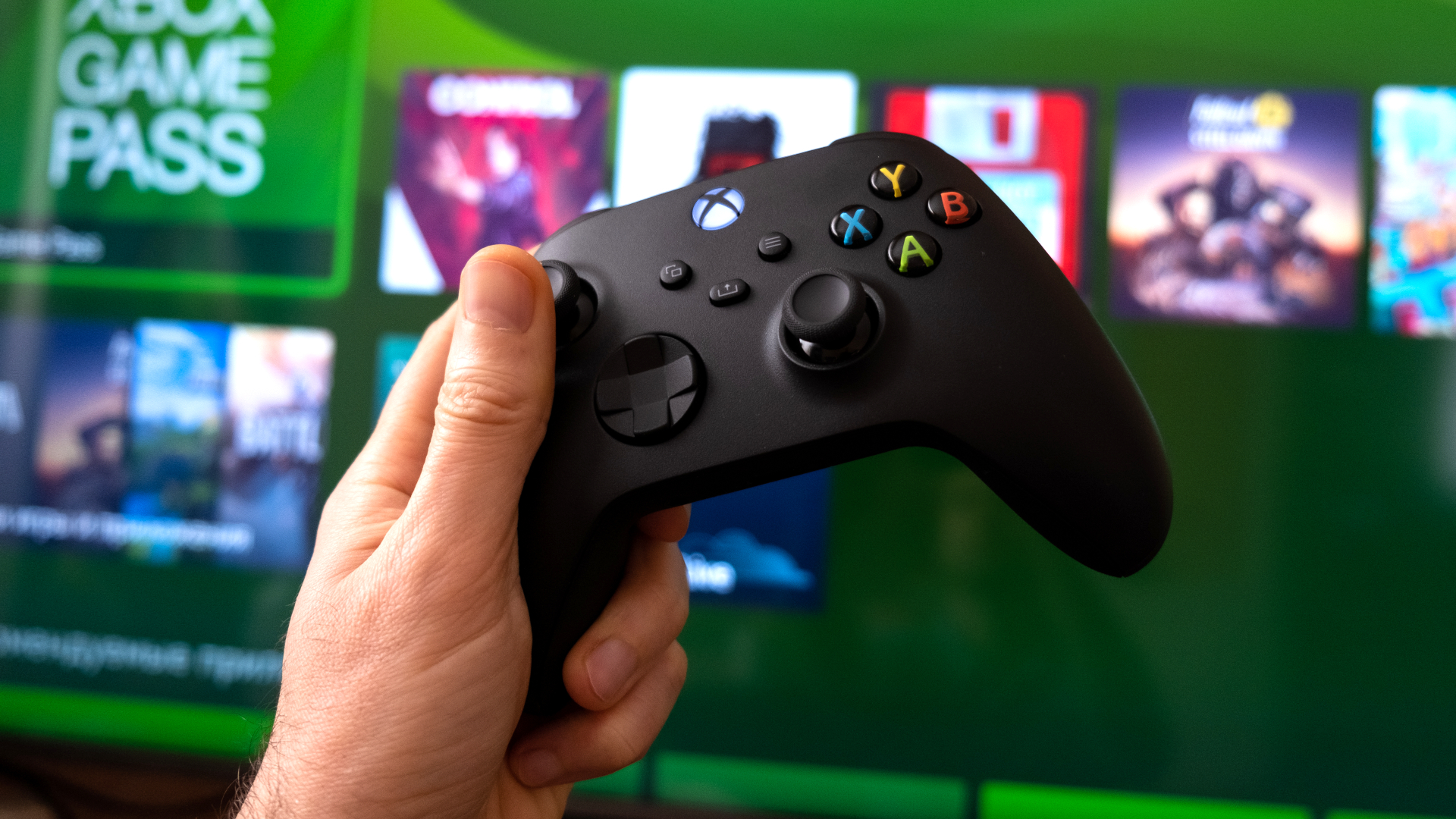
A new Xbox Series X UI is in the works, but tests show it's not much better
Baby steps

The UI of the Xbox Series X and Series S has been a hot commodity since the pair of consoles launched in 2020. However, despite the desperate pleas from gamers to make some changes to the dashboard, only a few updates have slightly altered the appearance, and each time one of these updates does roll around, players are quick to critique the features that should’ve been changed.
A new Xbox Home experience has recently been trialed, offering an alternative UI to the one players currently experience on Xbox Series X and Xbox Series S. However, unfortunately, it still hasn’t delivered the visual overhaul that most of us have been searching for.
The new and improved trial home screen has been called cluttered and hard to navigate by Alpha Testers alongside the Xbox Insiders program, as stated in a feedback overview update via the Xbox Insiders Blog, and adverts for Xbox Game Pass have been a cause for upset due to how much space on the screen is dominated by them, which subsequently covers the background image of the active game more than before.
Slow and steady

Thankfully, the feedback from players has been taken into account rather than distributing the UI update as is, and current experiments with the dashboard are being paused while feedback is being taken into account.
In the same blog post addressing the new home experience, Ivy Krislov, Senior Product Manager Lead, stated they are “working to balance the experience, accessibility, function, and the needs of our community” regarding the next potential update. In addition, the cluttering of the home screen and blocking of the background was acknowledged in the same blog post, which will be considered for the next update.
Since the home screen is a player's first experience with the console, it must be easy to use, navigate, and be personalizable, which many players have stated the console still needs to include. So while this update hasn’t entirely met the mark, it could be a closer step toward a more enjoyable experience.
Get daily insight, inspiration and deals in your inbox
Sign up for breaking news, reviews, opinion, top tech deals, and more.

Kara is an Evergreen writer at TechRadar Gaming. With a degree in Journalism and a passion for the weird and wonderful, she's spent the last few years as a freelance video game journalist, with bylines at NintendoLife, Attack of the Fanboy, Prima Games, and sister publication, GamesRadar+. Outside of gaming, you'll find her re-watching Gilmore Girls or trying to cram yet another collectible onto a shelf that desperately needs some organizing.