The Nike+ Apple Watch is surprisingly disappointing
Too many bugs in the app
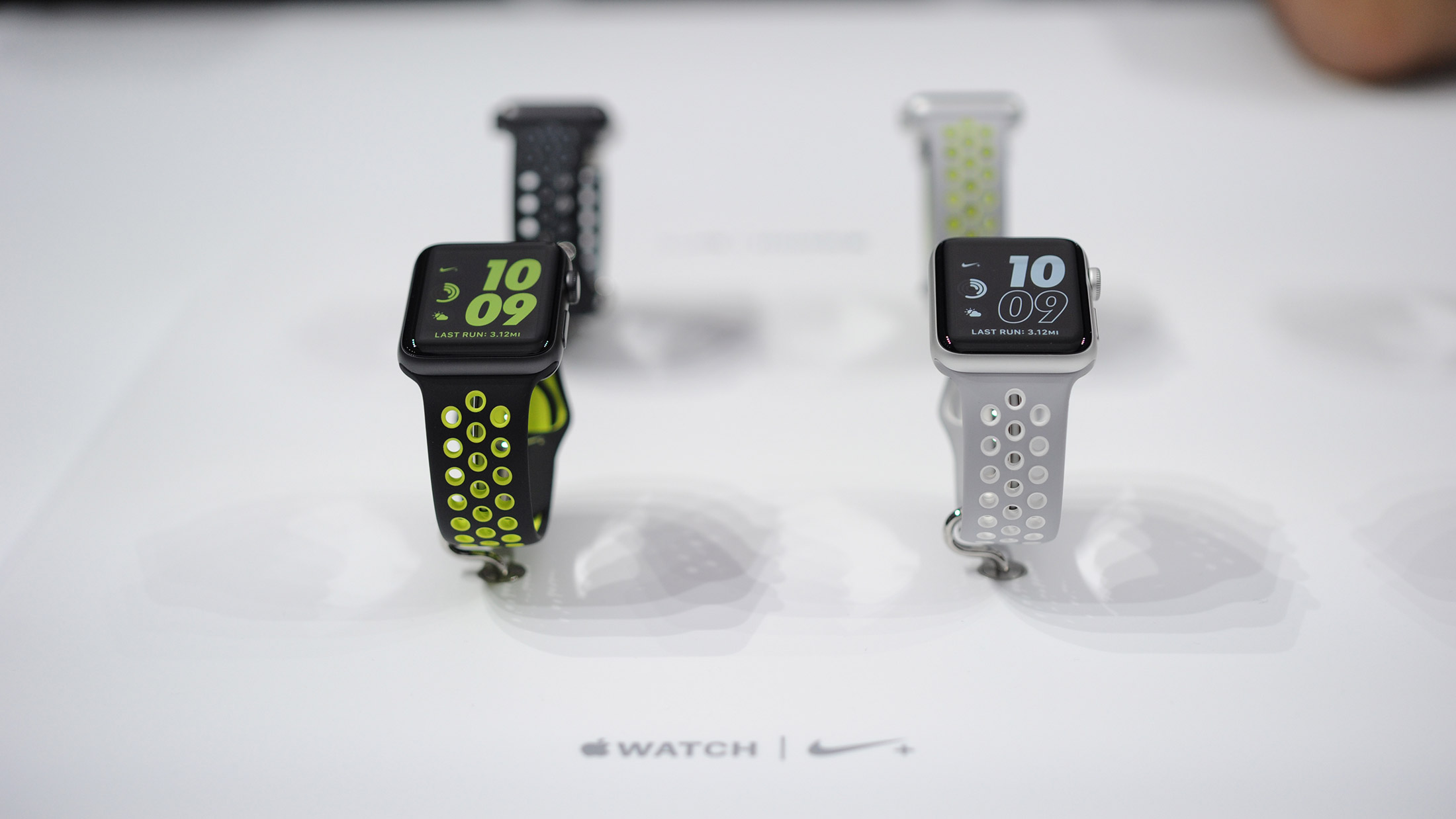
I’m still unsure why, out of all the gadgets I test for running, it’s the Apple Watch that gets the most interest for this column.
It’s not even a dedicated running device, but I get asked about it more than all the new Garmin, Polar, TomTom wearables - and even smart socks - I test combined.
So I can only assume that the fact I’ve now got my hands on the new Nike+ version of the Apple Watch 2 is going to send some into raptures - or at least pique the interest of more than a few gadget fans out there.
I’ll admit, the Nike version of the new Apple Watch has been something I’ve been looking forward to. It’s not so much the device but the app itself. Finally being able to use the GPS data and send it out to another service, rather than being locked to Apple’s own Workouts app, is massive.
The hardware itself (as you'll see later on) is virtually identical to the normal Watch 2, so it's really only the app that's worth checking out.
For the newer or occasional runner it’s fine. It’s just… some data is slightly useless.
But sadly, the Nike+ app just doesn’t match up to dedicated watches as a decent running platform. That’s hugely surprising given Nike is a leading player in helping normal runners quantify their performance… but the app has some major holes.
I picked up my Nike Apple Watch just before the weekend and decided to take it out on my Sunday long run to test it properly.
Get daily insight, inspiration and deals in your inbox
Sign up for breaking news, reviews, opinion, top tech deals, and more.
I knew that it was a rather basic app from when I saw it at the Watch launch in San Francisco, but what it offers up is even more limited than expected.
You’re only able to track pace, time and distance separately on the screen. You can enable advanced mode to see all three at once though - it’s hard to see why this isn’t the default. You can also see your heart rate, but that’s a tiny little readout at the top of the display.
Given heart rate is a great way to train, this should be an option for the main number on display.
The layout is fine though - it’s basic, but for the newer or occasional runner it’s fine. It’s just… some data is slightly useless.
The pace metric is just no use at all. On an 11 mile run, I was constantly checking the speed, and on a run that was done at 7:13 minutes per mile on average, I watched as the Apple Watch 2 would tell me I was going at 5:50 minutes per mile then drop to 8:30 for no reason while I held the same speed.
Every time I looked, it was bouncing all over the place. I know that there’s always some excuse - trees, buildings, trying to analyze pace on the fly being a strain on the processor - but what’s the point in putting these numbers on the screen if they’re going to be irrelevant?
What runner is going to get any benefit from not being able to accurately tell how fast they’re going? Nike either needs to sort this out or offer an 'average pace' option to make the data more useful. Looking down and being told you're doing a 5:30 mile when you're nowhere near that pace is a bit pointless.
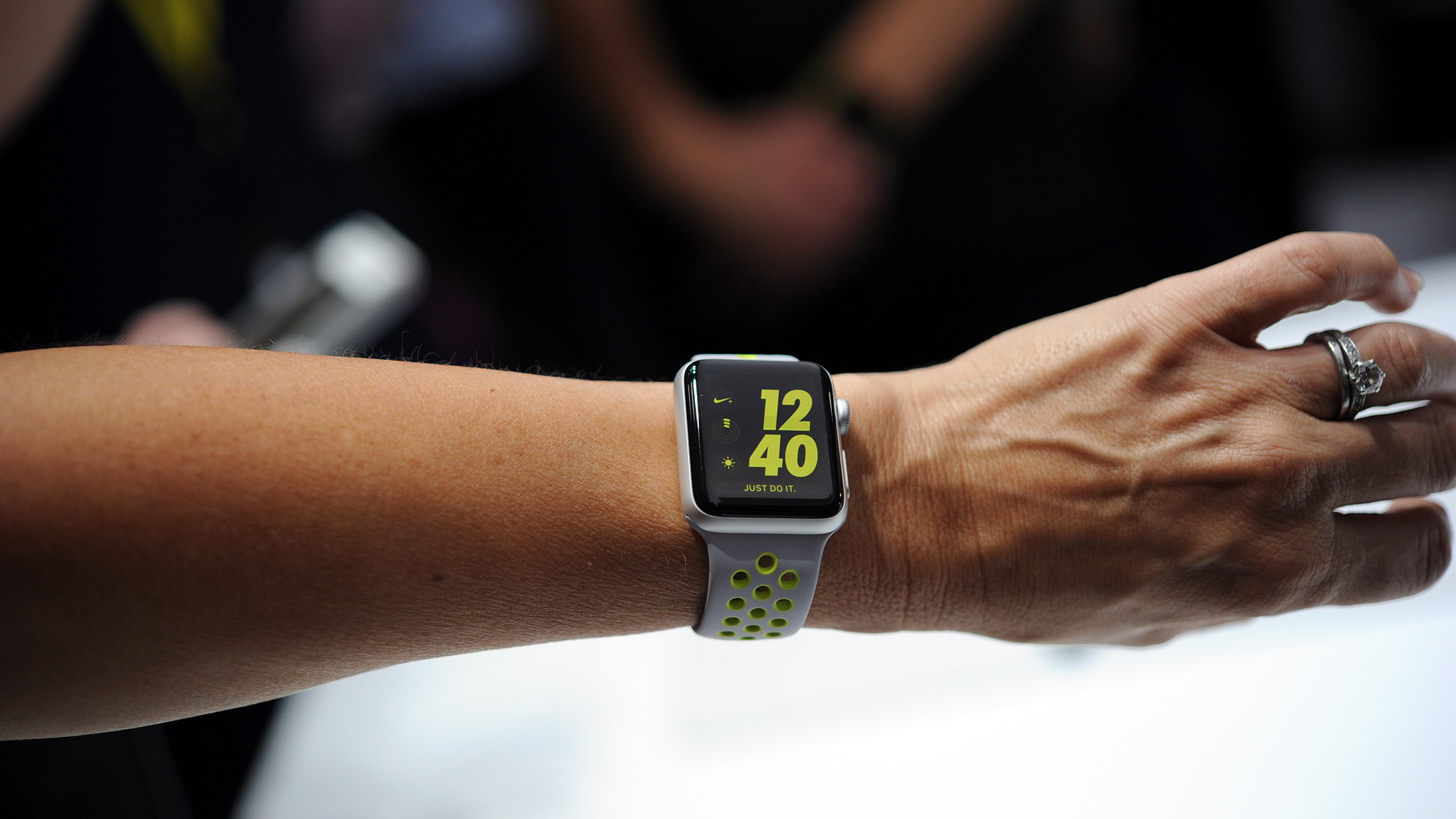
But, in fairness, it was correct overall in terms of distance and pace, so I decided to try again to really see how accurate the incoming data was while running.
The next day I took the Nike+ app out on my ‘rock solid run’ route. As part of my year-long challenge, I’ve got to log 10 separate 10km runs with a pace variance of 3% or less… basically keeping my speed as regular as possible.
It’s nigh-on impossible to do this, and the only way I've found to manage this is runing around an open lake with a music app that’s locked to a certain BPM.
This ensures I stay on a dedicated pace for the whole time, while not causing any massive changes in direction that would cause the GPS data to drop and then spike when it catches up, keeping things smooth.
Yeah… it’s not easy.
So I took the Apple Watch 2 and Nike+ app out for a trial on this course, one that I’ve done six times already ( see here, here, here, here, here and here for proof) and it’s always the same 2-3% variance in the pace once I've locked step with the music - this would be the ultimate test and would tell me how 'smooth' the GPS data is.
But doing the same run, with clear view of the sky and adhering to the same 165BPM rhythm for the entire time, the GPS was spiking all over the place. I appreciate that this is a very specific situation that most people won’t care about, but it proves that the data coming into the Watch is pretty erratic.
If you're a novice (or less interested) runner, then this app will be just fine for you. It'll tell you how far you've gone and how long it took. But given the cost and prestige of the companies that developed it, you'd expect the quality of data to be a bit higher at launch.
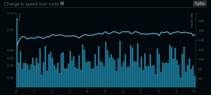
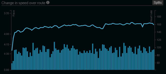
It’s important to remember that there’s a difference between pace and distance tracking when it comes to GPS - they’re monitored in two different ways, so while the pace bounces all over the place the distance is generally accurate.
(I’m also sure this run was clocked at far faster than I was running, but as I stupidly didn’t take another watch to test, I can’t be sure).
There are a few other bugs in the system that seem pretty out of keeping for a brand of Nike’s stature, too - which makes me wonder if there was a deadline to be hit to get the app out to coincide with the launch of the hardware.
For instance, when you’ve completed the run and look on your phone to see it in more detail… it’s not there.
It’ll take a few minutes to pull through, and for some reason the time of day will be wrong… so a lunchtime jaunt will be dubbed an evening run.
Neither of those things are terrible, but they’re not the sort of things you’d expect from a collaboration between two of the world’s largest brands.
What are the differences?
Let’s assume that some of these glitches can be ironed out (although the GPS tracking is something of a worry) and move onto the hardware.
A few people have told me that they’re going to wait for the Nike version of the Apple Watch 2, but without really knowing the differences, just assuming that it would be more ‘running-y’.
So here’s a rundown (sorry) of the key elements that have altered with the branded version… and don’t worry, they really won’t take long.
The first thing to know is that, well, the Nike and standard version of the Apple Watch 2 are pretty much the same thing.
They’ve got the same GPS and Glonass chips inside, the same Apple chipset and both have the same battery and screen to play with.
The materials used to make the Watch are the same, and the WatchOS hasn’t been tweaked at all.
In fact, the changes are almost all cosmetic. The obvious one is the strap: it’s the same fluoroelastomer that we’ve seen in the Sports Band, but with holes drilled in with colored accents.
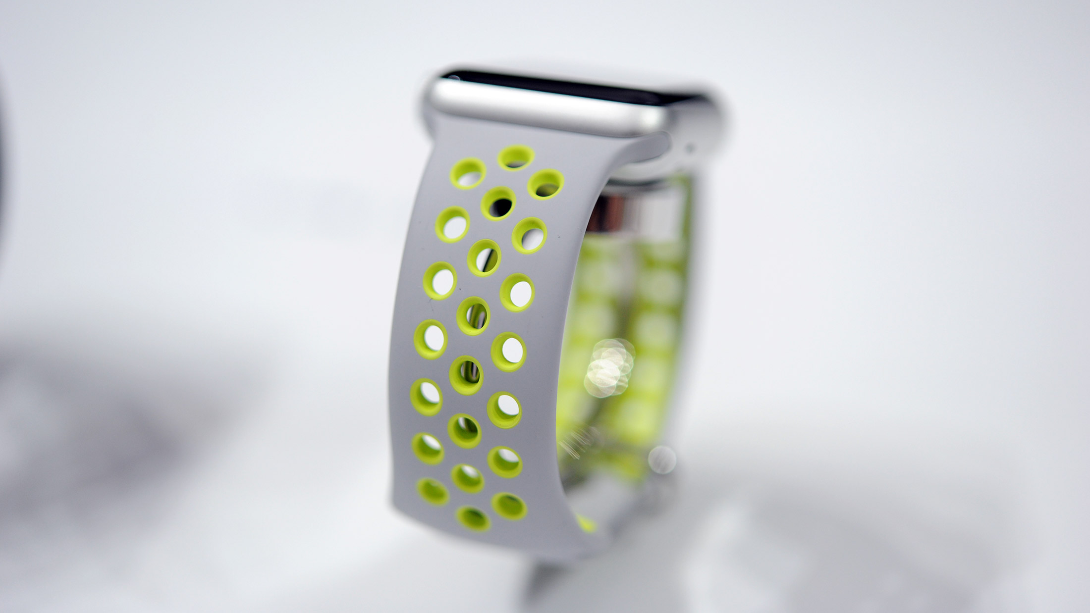
This is actually one of the best changes, as it makes the band lighter, more flexible and comfortable to wear during sport.
In fact, it’s so much better that it’s hard to work out why Apple didn’t use it for its own bands, as it’s nice and flexible, more in keeping with a high-end running watch.
There’s a Nike symbol on the rear of the device and the Apple Watch / Nike+ logo on the strap itself, but those are the only differences you’ll be able to see.
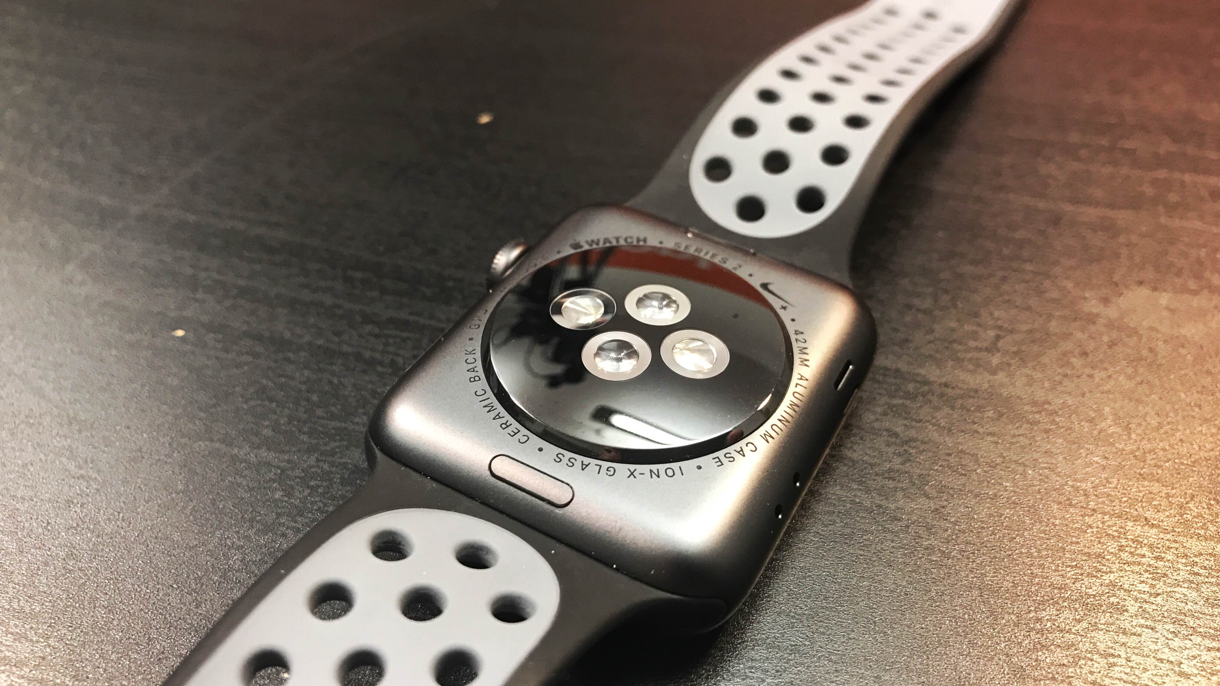
Turn on the Watch, and there’s an extra screen on the Watch setup that asks if you want to add Nike Running Club into the mix.
When your Watch 2 is alive and kicking, you’ll be presented with the new Nike+ Watch faces.
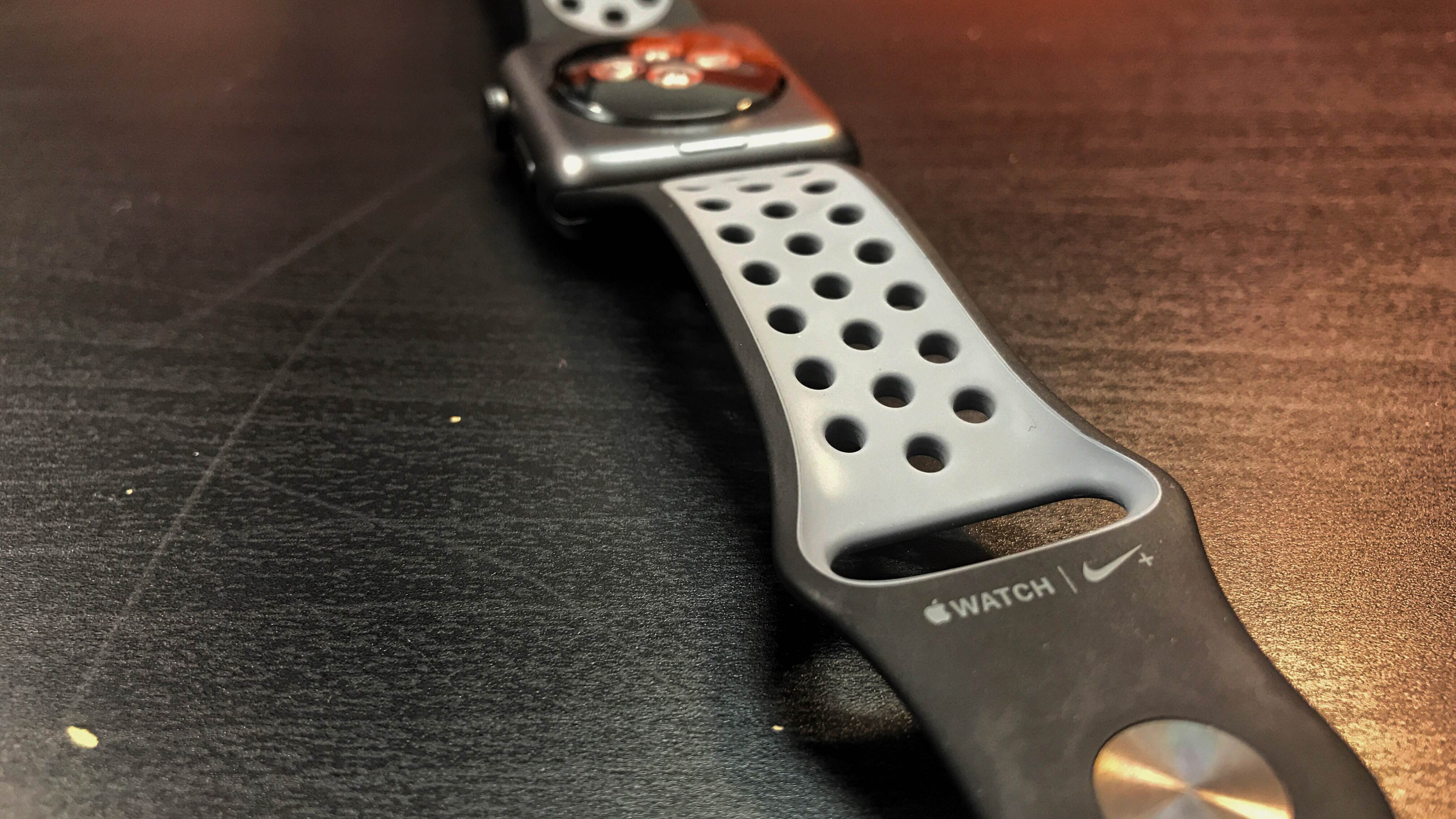
These are literally the only exclusive bits of content you’ll be getting with the new branded timepiece, and while they’re easy on the eye with Nike’s electric yellow and white coloring, they’re still just additional watch faces… and it’s easy to see these becoming available more universally in the future.
So given that the changes are: a new strap, a Nike logo on the rear and a different watch face when you turn the device on… what really makes this version of the Apple Watch special?
You can change the strap and download the Nike app, so are you really going to pay more for a logo and a watch face?
Except… they’re the same price. The base model of the Apple Watch 2 and the Nike+ option are the same price, starting at £369 / $369 / AU$529 for the smaller 38mm version and £399 / $399 / AU$579 for the larger 42mm option.
With that in mind, this feels like a no-brainer. While I think it’s ludicrous to pay extra money for branding, I’m still hugely surprised that the Nike+ version doesn’t cost any more - I’ve seen scores of phones with a random logo from a car manufacturer or football club simply stamped on the back and boggled at the extra cash charged.
So if you’re thinking of buying an Apple Watch 2 for sports, go for the Nike+ model… if nothing else, for the more comfortable strap.
But if you want a more accurate running experience, it might be worth waiting a little while longer until the experience is improved somewhat, unless you're just desperate to shed the phone and have a Nike running experience on your wrist.
- Gareth Beavis is TechRadar's Running Man of Tech, testing the latest in fitness technology in a never-ending quest to run further and faster and bringing you the results in a weekly column.
- If you want to say hi, he's @superbeav on Twitter
- You can see his stumblings on Strava
- And for more data, follow him on Smashrun
- And if you want to get the full lowdown on the latest and greatest running tech, read the rest of the Running Man of Tech story here
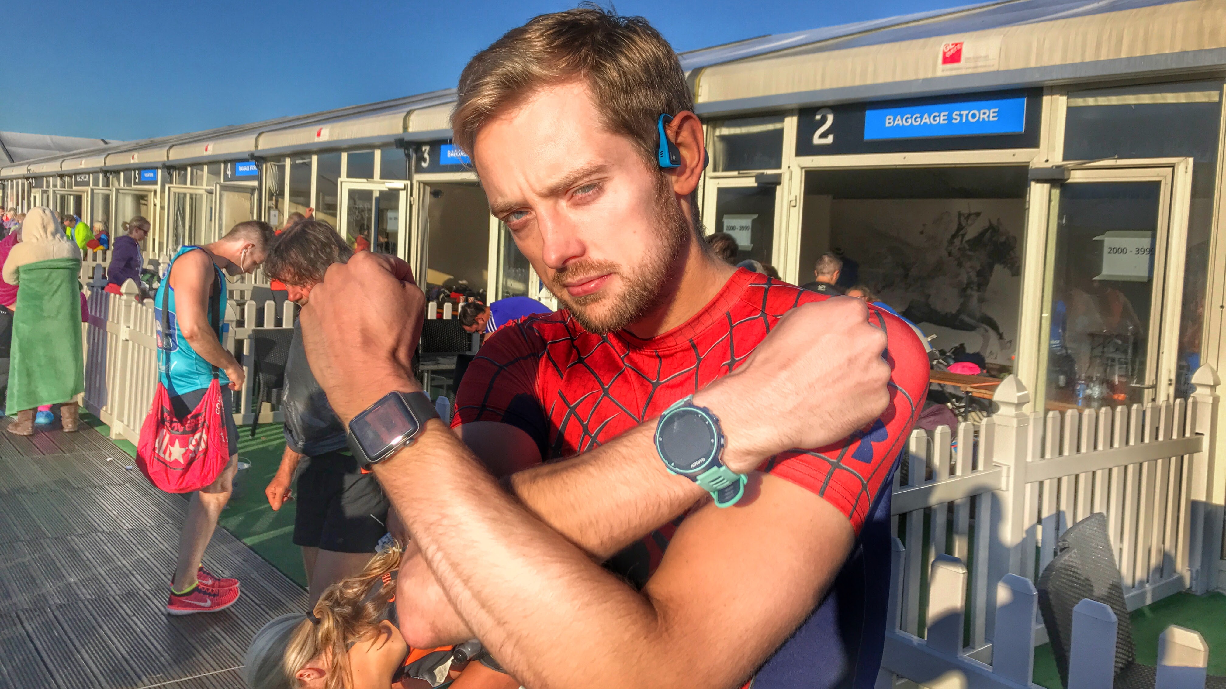
Gareth has been part of the consumer technology world in a career spanning three decades. He started life as a staff writer on the fledgling TechRadar, and has grew with the site (primarily as phones, tablets and wearables editor) until becoming Global Editor in Chief in 2018. Gareth has written over 4,000 articles for TechRadar, has contributed expert insight to a number of other publications, chaired panels on zeitgeist technologies, presented at the Gadget Show Live as well as representing the brand on TV and radio for multiple channels including Sky, BBC, ITV and Al-Jazeera. Passionate about fitness, he can bore anyone rigid about stress management, sleep tracking, heart rate variance as well as bemoaning something about the latest iPhone, Galaxy or OLED TV.