The ultimate gaming controllers for comfort: an expert’s guide
The gamepads that push all the right buttons
Introduction
Over the years, video game controllers have changed beyond all recognition. What started as a joystick and a single button with the Atari 2600 has changed to add extra buttons, joysticks, shoulder buttons and even triggers.
Controllers nowadays are complicated beasts indeed. They’ve still got the D-pads and face buttons that have persisted since the days of the SNES, but in addition modern controllers have two thumb-sticks, two shoulder buttons, and two triggers as well. As if that wasn’t enough already, some also vibrate and motion-track for good measure.
As gamers, we’ve gotten used to how controllers work. We’ve gotten used to how to hold them, and what prolonged use of them does to our hands and posture, but we wanted to know how well they’re designed from an ergonomics perspective.
Neil Mansfield is a professor of Design Engineering and Human Factors in the Dyson School of Design Engineering, a part of Imperial College London. He is a man that’s spent his entire life researching how to make products that are as comfortable and safe to use as possible, whether it’s someone using mining or military equipment, or an elderly person using a car after they’ve passed their physical peak.
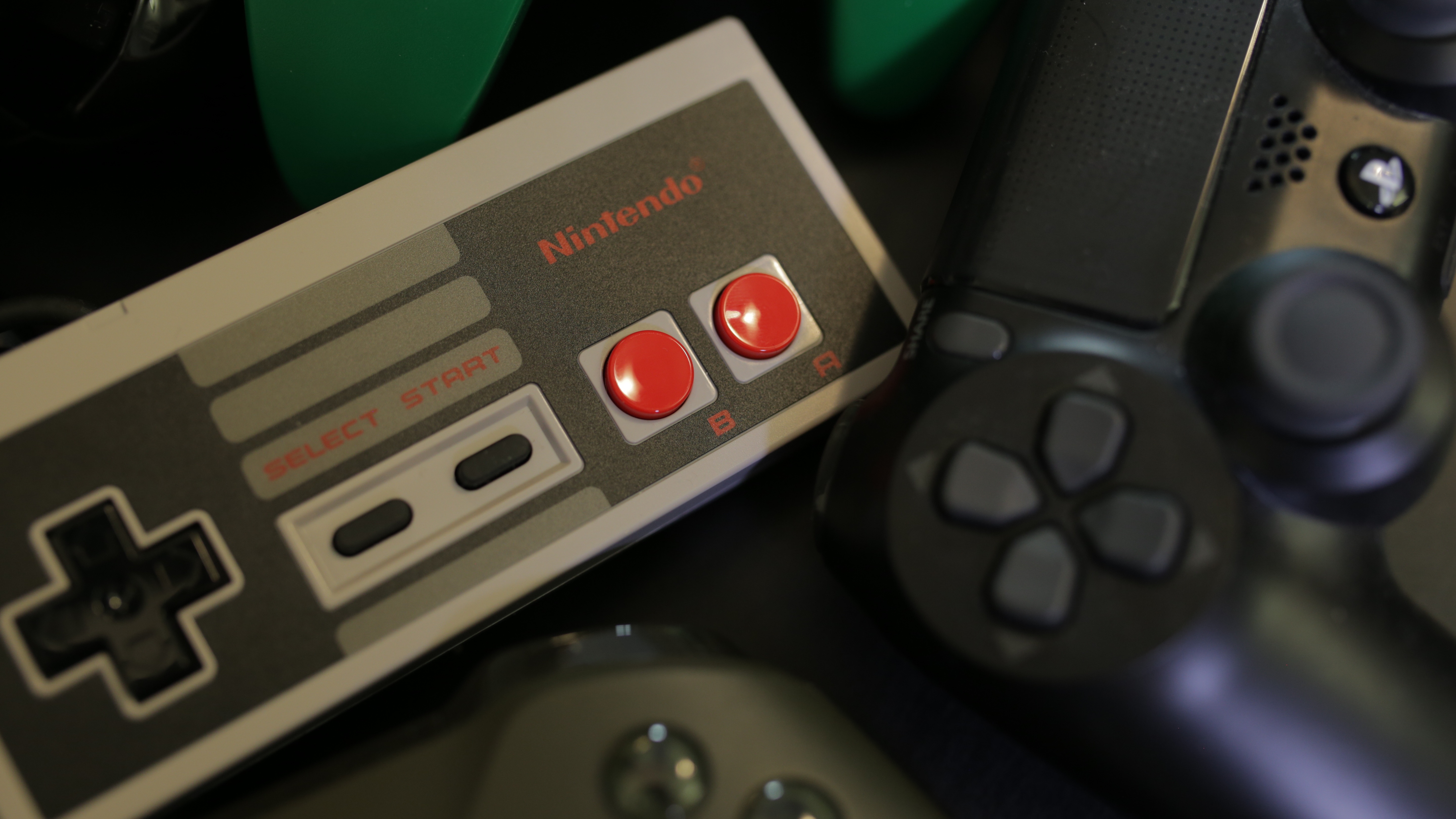
We presented Mansfield with a variety of controllers, from the NES’ iconic grey rectangle, through to the Nintendo 64, the Sony DualShock and the modern Xbox One pad, and he commented on everything from hand positioning, button design, and finger placement.
Mansfield is not a gamer himself, so he was unable to comment on how a proficient user might approach the controllers, but the point of the design that he specialises in is that whatever your level of familiarity with gaming, you should have the same understanding of how a controller works.
The most interesting observation of the session was perhaps Mansfield’s assertion that ‘curvy is not the same as ergonomic’. Although curves give you a better indication of where your fingers should sit, they limit the range of hand sizes that can use a controller. Curves might make a controller more comfortable for an adult’s hands, but it will have a negative impact on how easy it is for a child to use.
Meanwhile, more angular designs might not fit anyone’s hands perfectly, but they won’t be completely uncomfortable for any one hand size.
So without further ado, let’s jump right into raking the controllers, which we’ve done from worst to best. Click through for the complete run down.
- Welcome to TechRadar's Console Gaming Week, celebrating every single pixel of video gaming greatness. Head over to our hub for what you've missed so far.
The Wii U’s Gamepad: “I don’t like this at all”
Ranking: 3/10
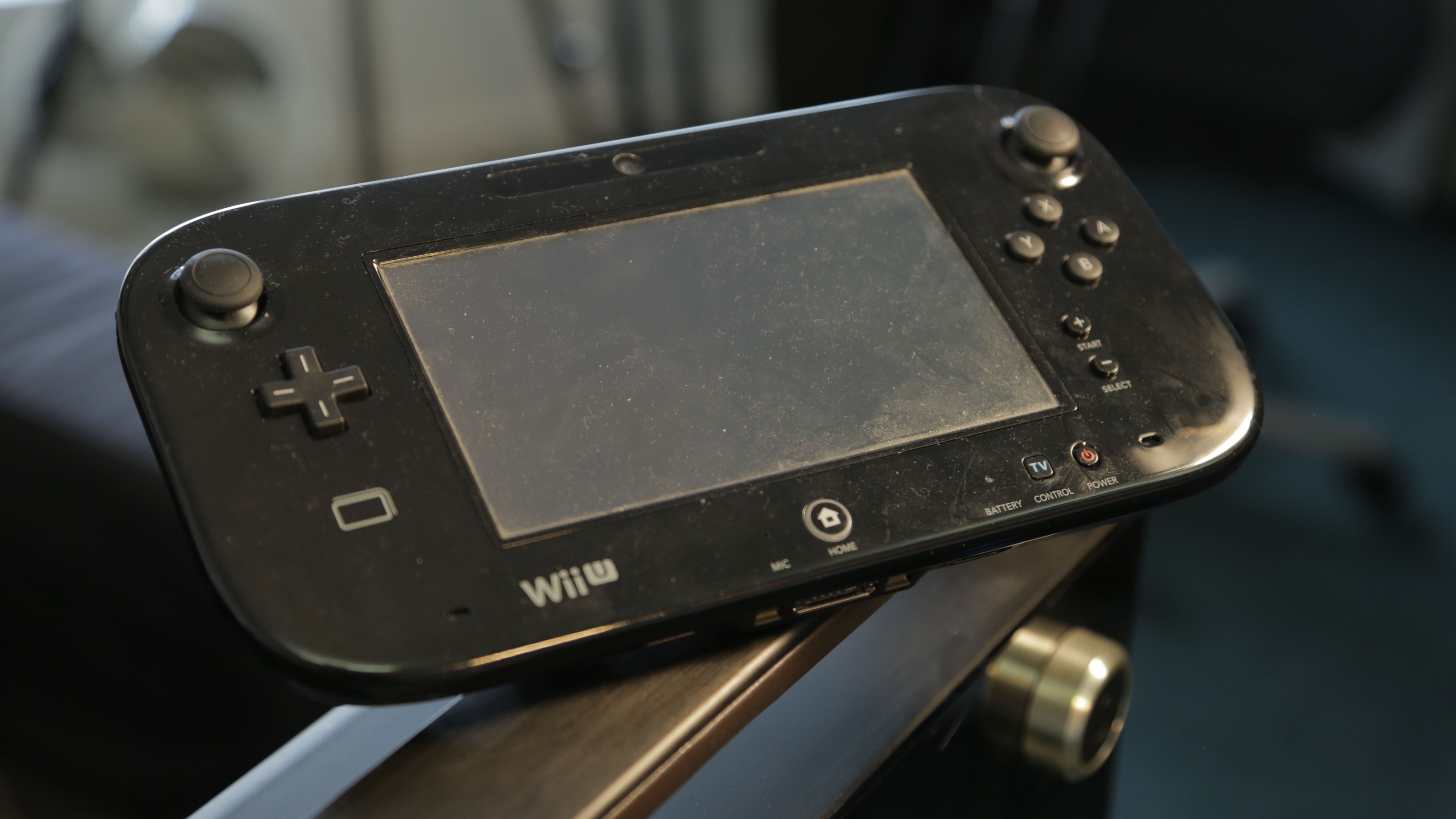
Mansfield had little love for Nintendo’s Wii successor, “There are so many reasons why this is worse than all of the others that we’ve seen.”
But rather than any specific issues with the shape and size of the controller, it was the GamePad’s core second-screen concept that he took the biggest issue with.
“The concept that you have a screen that is 40cm from the face and a screen that is some distance away means you’re already ruling gameplay out for people who don’t have glasses on who are 45-50 years old,” he explains, “The fact that the screen is so close means that someone who hasn’t got good short vision, someone who’s long-sighted like the entire population who are over 50, will struggle to see this at the distance which it is designed to be used.”
“In that case are you expecting someone to wear bifocals to be able to use this?”
“I would expect people using them would actually get very tired eyes from repeated changes of where their attention is.”
Though the buttons themselves were nice and tactile, Mansfield commented that he thought it might be easy for a user to lose track of which button their finger was on, “There’s not one of them with a dot on it, so there’s nothing on here to indicate which one’s which...If you’ve got the one with the nodule on, the smooth one, the rough one and the wavy one, then that gives you an extra way of remembering what they do.”
The controller’s one redeeming quality was that it has plenty of places for your fingers to grip the controller without accidentally pressing any of its buttons, meaning that your hands aren’t in a stressed position while holding the console.
But even that can’t redeem the GamePad for this ergonomics professor, who ranked the GamePad as the worst of the controllers he tried with us.
The Nintendo 64’s controller: “I don’t know how you’re supposed to use this joystick”
Ranking: 5/10
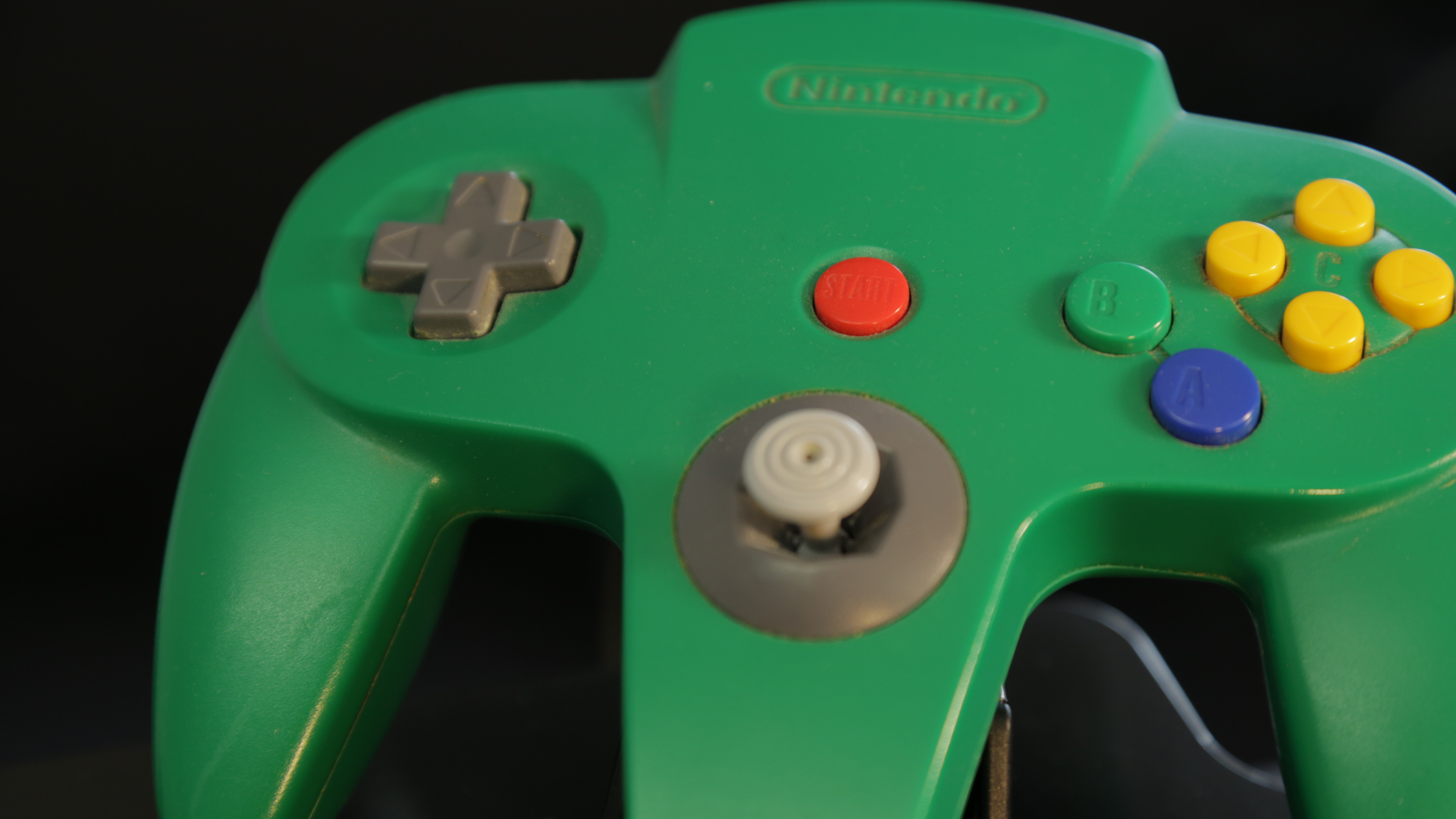
If ever there was a controller that would confuse a modern audience it’s the N64’s. Designed at a time when the industry hadn’t decided whether the D-pad or the Joystick should be the primary input, the controller compromised with a three-handled design which quite literally put the decision in the user’s hands.
After we clarified how the controller was supposed to be held with Mansfield, he began his discussion with the shoulder buttons.
“I can’t grip this with those [index] fingers, because I’m scared that I’d do something unintentional in the game. So at this point here I’ve got two fingers that are effectively in a stressed position...they haven’t given me a finger rest at the back here.”
He did however like the feel of the controller’s face buttons. Although the throw (the distance they travel when you press them) was large, and hence bad from an ergonomics perspective, this had the benefit of limiting the risk of accidental key presses, “You’re always compromising between accidental inputs and the ones that you want to be very sensitive and quick.”
The biggest problem with the controller was its size. Its small, curvy handles give the impression of a controller that’s designed for children, but the range of movement required by the user’s thumb to move between the console’s ‘A’ and ‘B’ buttons is very difficult with a smaller hand.
“It feels like it’s a child’s toy, that’s the key with this” he concludes.
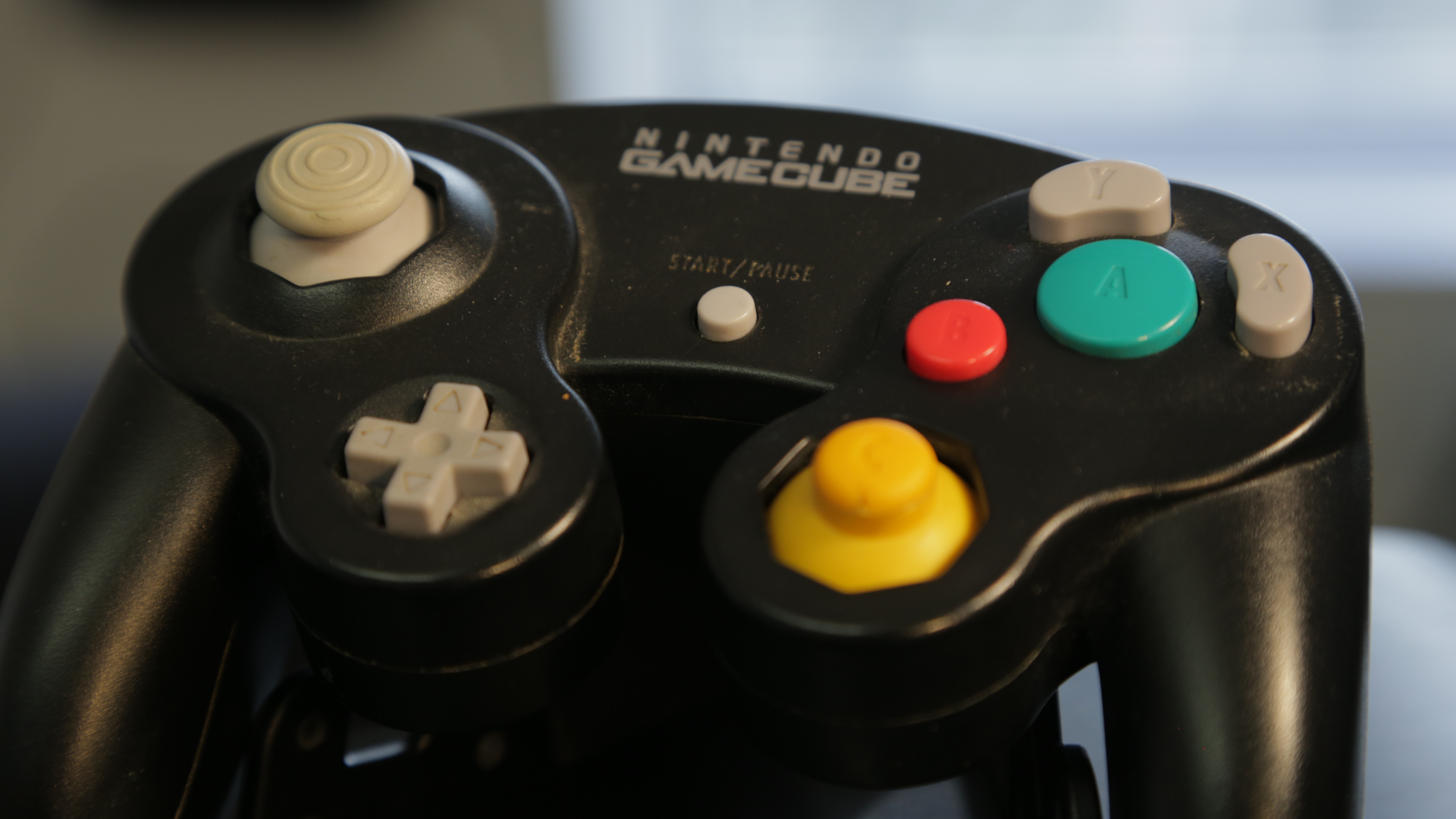
The GameCube’s controller: “I look at this and think that it may be better for children than for adults”
Ranking: 5/10
The GameCube controller’s size was the single biggest issue Mansfield identified, which affected the controller’s ergonomics by cramping the distance between the C-stick and the face buttons and the D-pad and the analogue stick.
In particular, the C-stick’s positioning at the extreme left of the right-hand thumb’s range of movement would make it difficult to operate over long periods of time.
Mansfield was however more positive about the shape of the face buttons. “You can distinguish between which button is which very easily without looking and that’s always a good thing.”
“You’ve got another channel; you can look at it or you can feel it, there’s a redundancy in that system, you don’t need to keep on looking at it to know where your thumb is.”
But that didn’t change the fact that the ergonomics professor simply thought the GameCube controller was simply too small for adult hands.
Sorry Smash players.
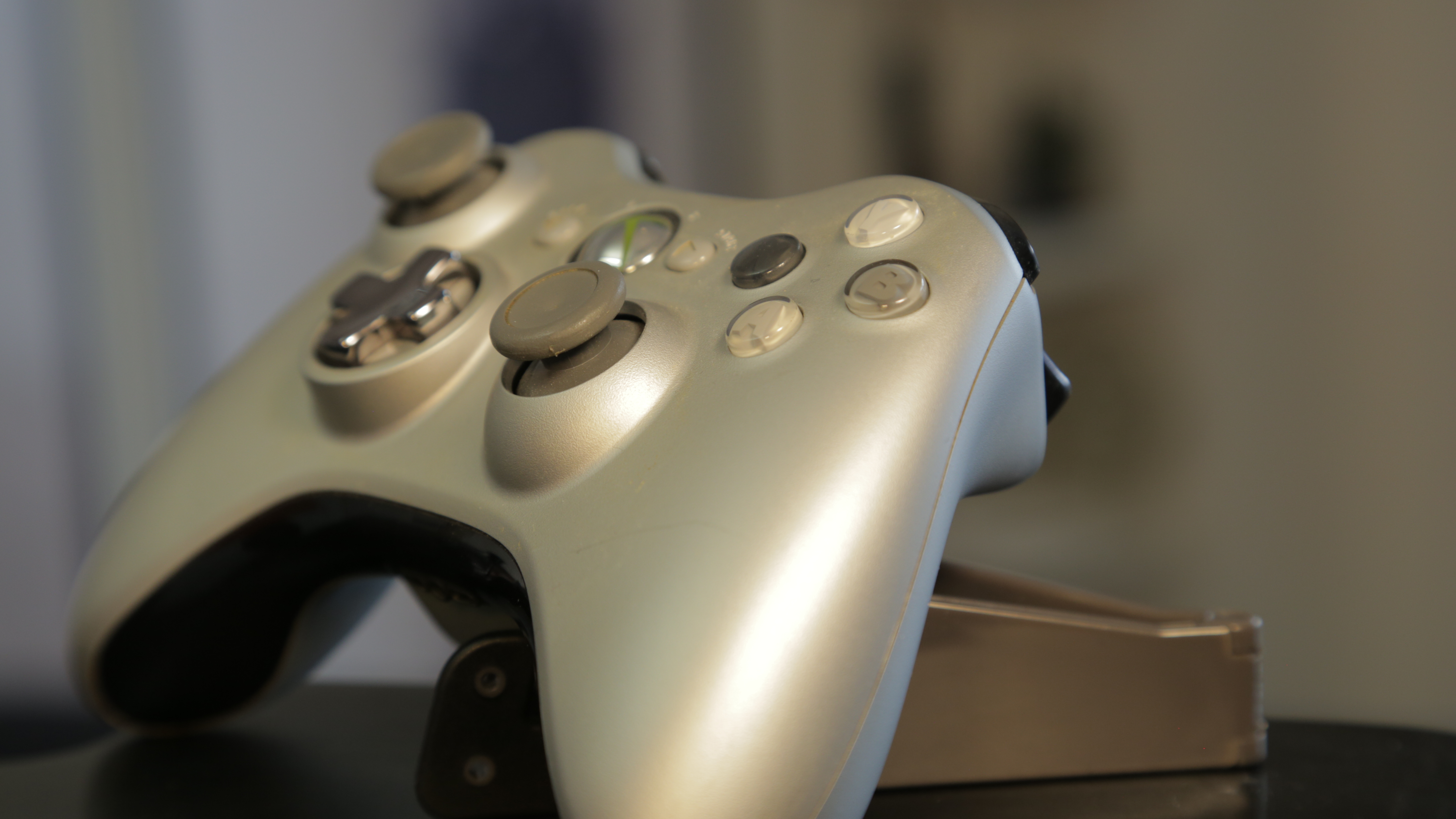
The Xbox 360 controller: “It weighs a tonne…”
Ranking: 5/10
Compared to the GameCube controller, the Xbox 360’s pad is a much better fit for adult hands. Mansfield liked the more limited movement of the thumbsticks which puts less of a strain on the hands, and the positioning of the triggers meant that he could comfortably rest his fingers on the top of them without fear of accidental presses.
He was less of a fan of the asymmetrical positioning of the analogue sticks, which he said creates an imbalance in how you use the controller.
“The difference that is quite apparent on here when using these two joysticks you do have to hold them in quite different ways.” He explained that while the left is operated with the tip of the thumb, the hand’s natural inclination is to operate the right with the thumb’s joint and this “needs much more motion because you’re effectively using one fewer articulation in the hand to be able to make the motion.”
But the biggest problem was reserved for the controller’s large battery compartment on the back, which limits the amount of space for the middle, ring and little fingers to rest.
“The problem is not the first five minutes, but it’s after you’ve played for an hour. You have no alternative, you cannot put your fingers anywhere else, there’s nowhere else for them to go.” he concludes.
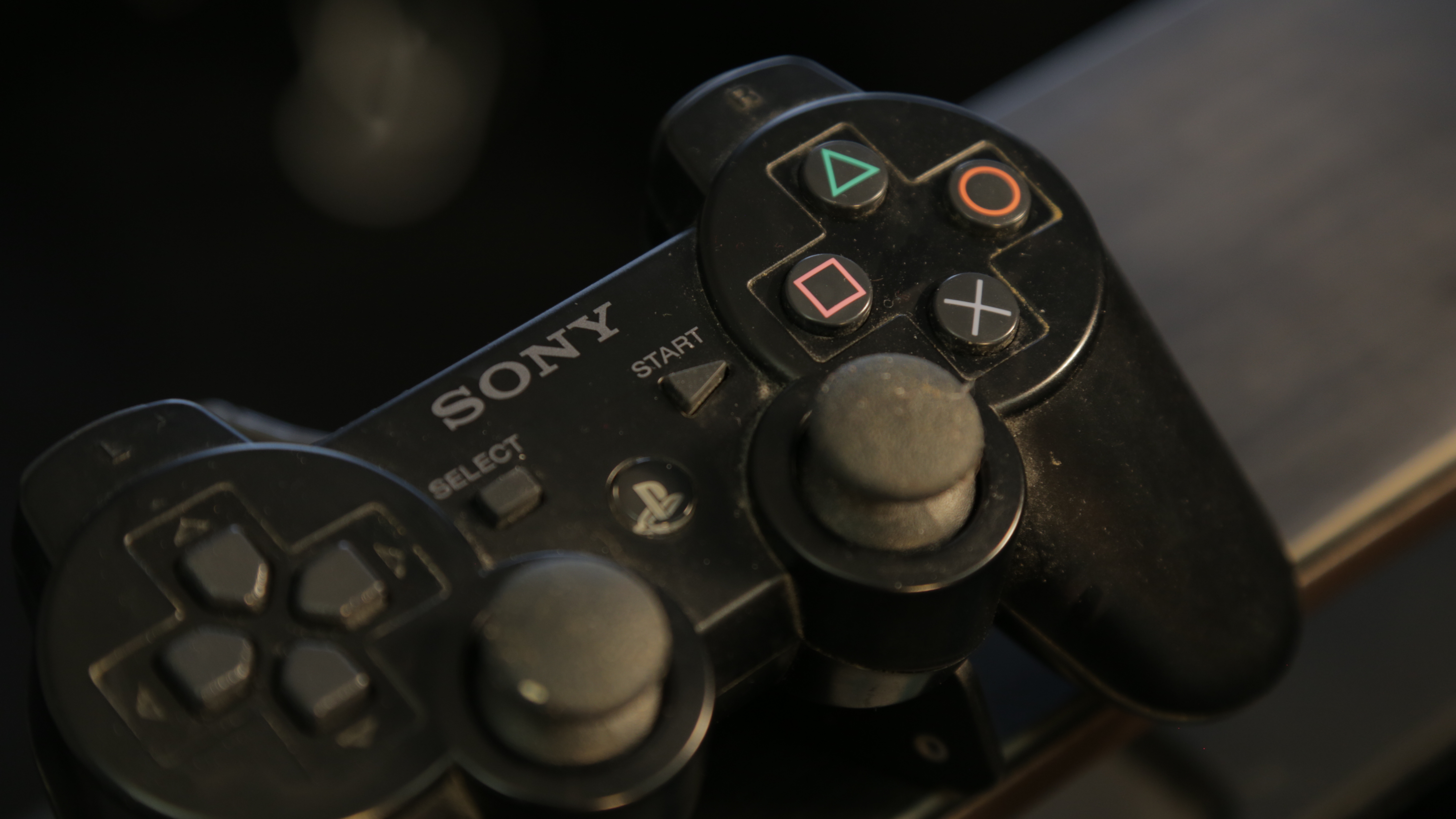
The PS3’s Dualshock: “I’m sure they have a reason but to me it looks strange”
Ranking: 6/10
There’s a lot to like about the Dualshock’s iconic design. It has much wider handles than its competitors, leading to a more relaxed holding position, and the difference in texture between the D-pad on the left and the face buttons on the right is another small touch to allow you to discriminate between them based on feel alone.
Mansfield’s main criticisms were levelled at the controller’s analogue sticks and their “significant” movement range, which would be even more sevre in a child’s smaller hands. Though better for smaller motions, he worried that the large travel would make big movements fatiguing.
He also levelled criticism at the face buttons, the iconic circle, square, cross and triangle, for being too far apart.
“If I was talking to Sony I’d ask them why they’ve put the buttons so far apart on the right, because I don’t understand why....it’s quite difficult to move from one to the other and they could be a lot closer.”
“I’m trying to hold it up to the light to see where they’re worn out, because I think they’re all worn out on the inside edge,” he joked.
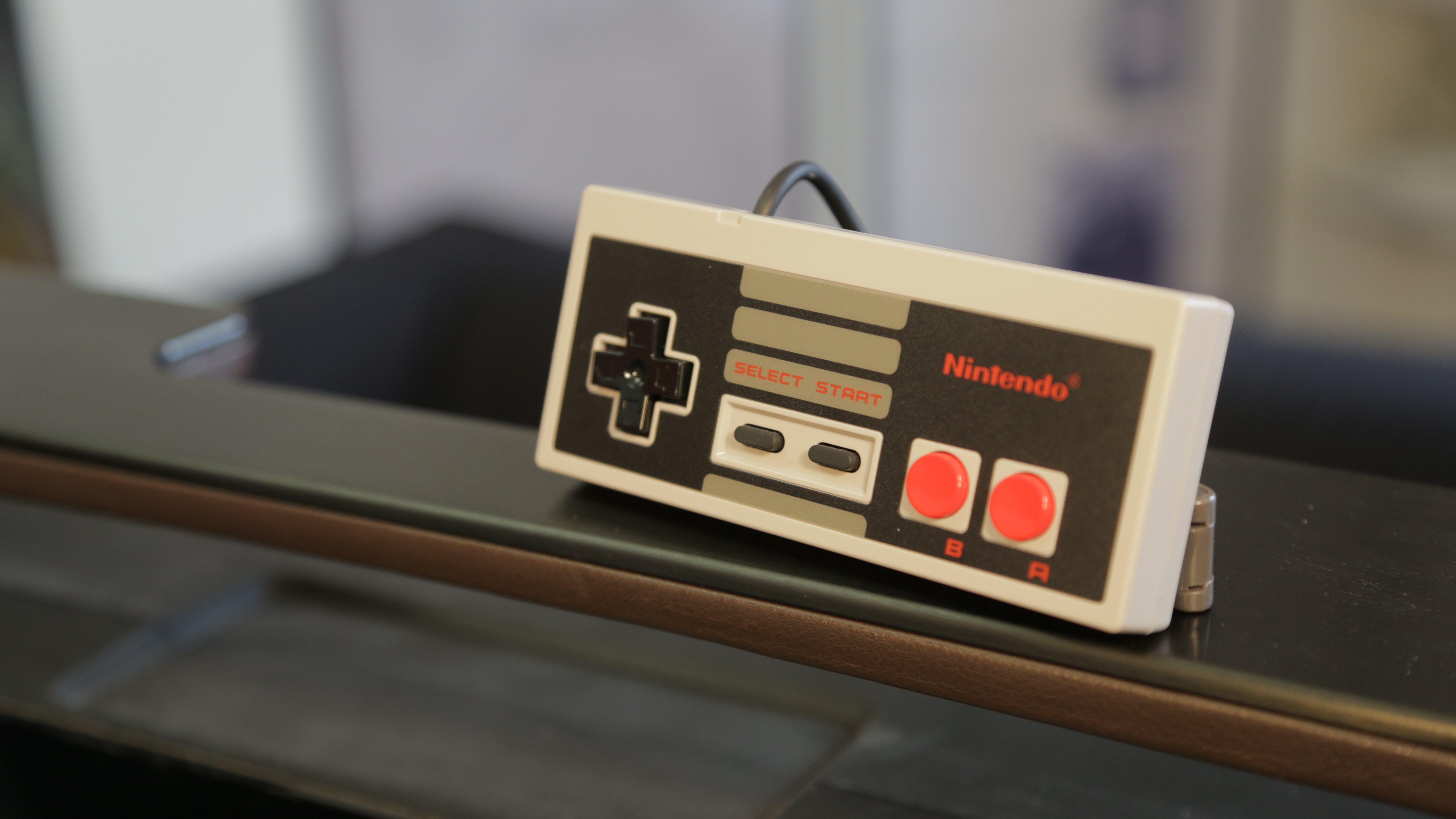
The NES controller: “There’s no complexity to this, it’s beautiful”
Ranking: 6/10
Of all the controllers examined on the day, the NES’s was the simplest. With just two buttons and a D-pad, Mansfield said that the controller could be picked up and quickly enjoyed by almost anyone, whether they were three years old or a hundred and three years old.
“I know what every one of these buttons does by looking at it,” he explains.
From the short throw of the buttons, to the controller’s light weight (note: we were using controllers produced for the NES Classic Mini in 2016 rather than originals) Mansfield had a lot of love for the retro pad.
Mansfield’s biggest criticism was levelled at the controller’s D-pad. Textbook product design would say that the D-pad should be orientated to match the direction of the hands. Since the hands are holding the NES controller at an angle, Mansfield reasoned that ideally the D-pad should be rotated to the right by around 45-degrees to match this.
However in the longer term he conceded that you’d end up “mapping your finger movements into a different dimension to the way the controller moves.”

The Xbox One controller: “It has its own identity”
Ranking: 7/10
Compared to the Xbox 360 pad that came before it, Mansfield was much more positive about the Xbox One controller. In particular, the disappearance of the battery pack on the back to “find their own comfortable position.”
But it was the smaller developments that ended up making the bigger impact to its overall usability, “It’s lighter, the joysticks themselves are slightly smaller so I think they would work better for all hands, and the grip is a really nice tactile surface.”
Overall Mansfield thought the Xbox One controller had a much clearer identity than the 360 pad we showed him, but he wasn’t as much of a fan of the triggers which didn’t present as clear a resting position for the index fingers.
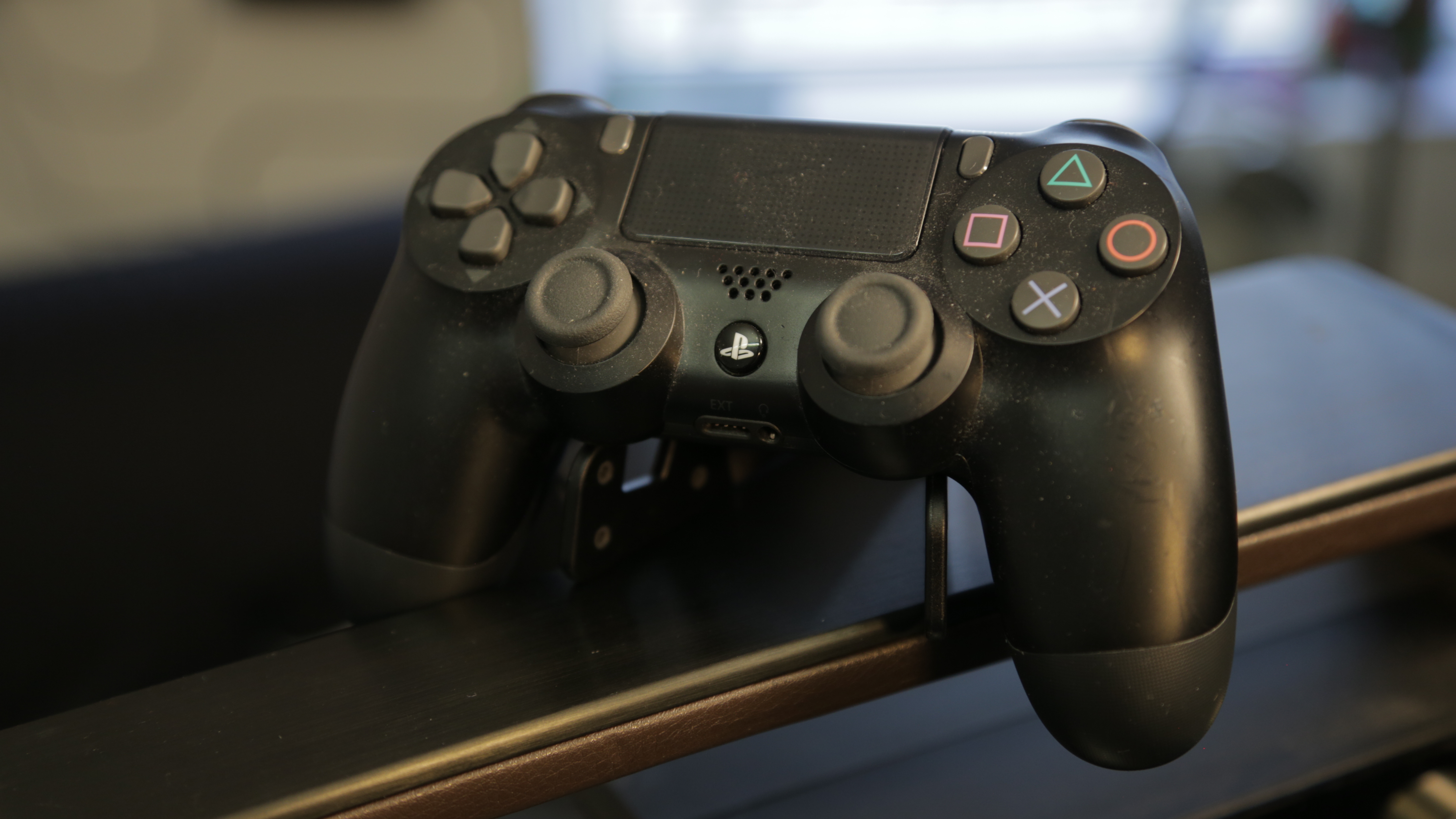
The PS4’s Dualshock 4: “This is a big improvement over the previous generation.”
Rating: 7/10
After Mansfield criticised the DualShock 3 for its analogue sticks and face buttons, the DualShock 4 appeared to have taken those exact criticisms on board with its changes to the classic DualShock formula.
“The movement on each of these joysticks is smaller from one to the other, which I think is progress...the distance between these buttons on the right is closer. So this is a big improvement over the previous generation,” he explains.
The controller’s grips are also longer, meaning more fingers can spread the weight more evenly throughout the hand.
Continuing, Mansfield says, “the angle of the handles has been designed to be much more neutral...it’s emphasising that neutral position, so I think that works really quite well.”
Though the DualShock 4 was one of the most complicated controllers examined, these design decisions prevented it from becoming overwhelming. Mansfield rated the controller as a significant improvement over prior versions, noting, “The differences are quite subtle but from an ergonomics perspective they’re quite important.”
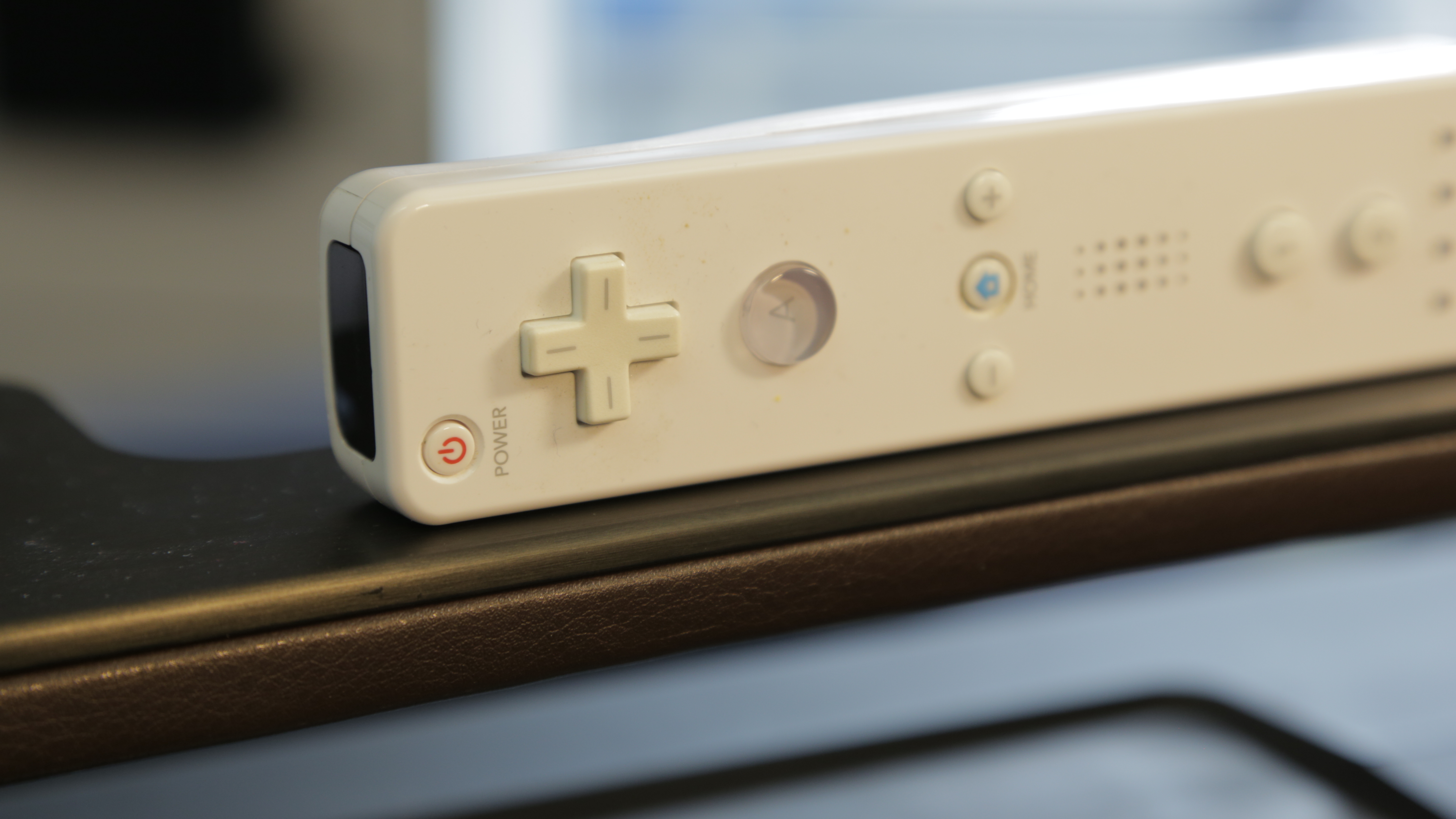
The Wii's WiiMote: "Simple, inclusive, lots of complexity hidden in it but you can engage with it from day one."
Ranking: 8/10
As such a radical departure from traditional game controllers, the Wii suffers from few of the ergonomic complaints levelled at its predecessors.
The biggest change is the way you hold its two portions, the Wiimote and Nunchuck in separate hands. This means your hands can be nice and wide apart as you use the console, in a neutral ‘shoulder-width apart’ position.
It’s also ambidextrous, meaning that it works with left-handed and right-handed people equally as well.
The WiiMote has a flat back, but Mansfield emphasises that this doesn’t make it un-ergonomic. “Good ergonomics doesn’t mean it’s curvy,” he says, “Good ergonomics means it fits everyone, and sometimes, for something like this, the fact that it hasn’t got contouring on the back of the battery compartment means that it fits everyone's hands much more comfortably than if it was designed for a five year old’s hands.”
Although its use of batteries means the WiiMote was a little heavier than the others on test, but Mansfield explained that this wouldn’t put as much of an unnatural strain on your body because of the comparatively larger motions you’re making with the controller.
“It’s simple, inclusive, lots of complexity hidden in it but you can engage with it from day one,” he concludes.

Jon Porter is the ex-Home Technology Writer for TechRadar. He has also previously written for Practical Photoshop, Trusted Reviews, Inside Higher Ed, Al Bawaba, Gizmodo UK, Genetic Literacy Project, Via Satellite, Real Homes and Plant Services Magazine, and you can now find him writing for The Verge.
Sign up for breaking news, reviews, opinion, top tech deals, and more.
You are now subscribed
Your newsletter sign-up was successful
Join the club
Get full access to premium articles, exclusive features and a growing list of member rewards.
 Become a TechRadar Insider


