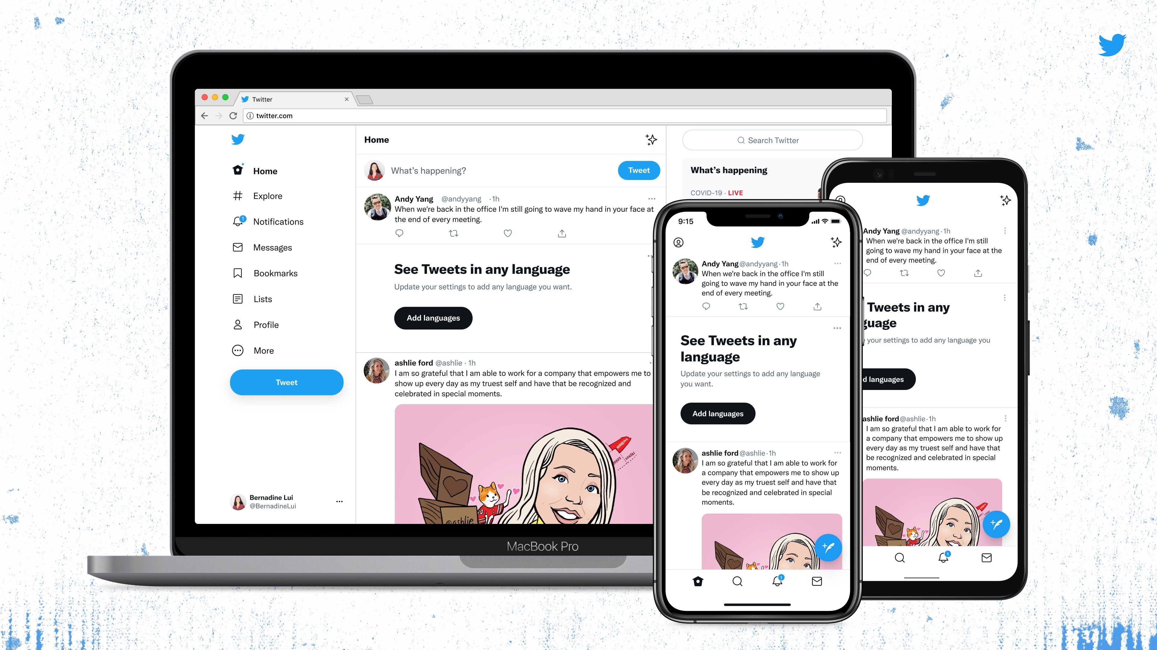
Twitter rolls out a refreshed design across web and mobile, but is it needed?
New font, new colors, fresh criticism

Twitter has brought out yet another feature to the platform, but this time it's a refreshed design across the web and its apps, featuring a new color scheme, slightly updated layouts and a new typography that the company has designed itself.
The company has been working on a multitude of features lately, with paid Spaces, the discontinued Fleets and Super Followers all created with an aim of expanding Twitter and its use to the millions of users that go on each day.
However, while the design has been welcomed by many, some aren't too happy with the new font, which the company has named Chirp.
- Could Twitter Spaces take on streaming?
- What is the best iPhone for you in 2021?
- Twitter has written off fleets as a 'failed experiment' - here's why
High contrast and less visual clutter
Twitter introduced its Chirp font in January as part of its branding update, but there was no release date for when it would start appearing. That time is now, with the first stage of its redesign taking effect to both the website and the apps on both Android and iOS.
While it can take a moment to adjust your eyes to the new font, it's reminiscent of Apple's San Francisco font, seen across the iOS and macOS platforms.
Notice anything different? Today, we released a few changes to the way Twitter looks on the web and on your phone. While it might feel weird at first, these updates make us more accessible, unique, and focused on you and what you’re talking about.Let’s take a deeper look. 🧵 pic.twitter.com/vCUomsgCNAAugust 11, 2021
The company added that it has updated the color-scheme to feature high contrast and be a lot less blue across the user interface. This is being done to draw attention to the photos and videos that appear on the timeline.
"There are fewer gray backgrounds and unnecessary divider lines. We also increased space to make text easier to read," the company said.
Get daily insight, inspiration and deals in your inbox
Sign up for breaking news, reviews, opinion, top tech deals, and more.
In order to give a fresh color palette, Twitter is also planning to add new colours soon, most likely when more features are brought out of testing and released to all users.
A cold reception so far, but it will get warmer
As is usually the case on Twitter when any change occurs, the response was swift and scathing. People were instantly critical on the design and the font in their droves.
But some forget that when Twitter moved from 140 character limit to 280 characters, the response was even more fierce. However after a few days the criticism died down, and the 280 character limit had been fully embraced.
So, Chirp has nothing to worry about - after a day your eyes adjust, and we can all get back to reading memes and viral tweets about the world around us.
Analysis: was a redesign needed?
However, one can argue that this redesign may be better served to roll out later this year. Instead the focus could be used on making sure Spaces can grow even more, alongside further improving the verification process.
Many users are still being declined that iconic blue tick beside their name, while troll accounts are being granted it with no issue. While the verification form has been improved in the last month, declines are still occurring, raising the question of why there's a verification process at all.
While the first stage of this design is fine, it could really benefit from more color. There's more black and white across the platform, and when you switch the app to dark mode on both Android and iOS, the colors simply invert, making everything seem boring.
Other social platforms like TikTok feature splashes of color that help it set apart from other apps, making itself unique. With Twitter, while the logo is a blue bird, there's not a whole lot of blue seen across this new design.
Perhaps once Ticketed Spaces and Twitter Blue are both rolled out to everyone, we may see some more elegant and fun color choices here, but for now, it's a muted reception.

Over three decades as a journalist covering current affairs, politics, sports and now technology. Former Editor of News Today, writer of humour columns across publications and a hardcore cricket and cinema enthusiast. He writes about technology trends and suggest movies and shows to watch on OTT platforms.