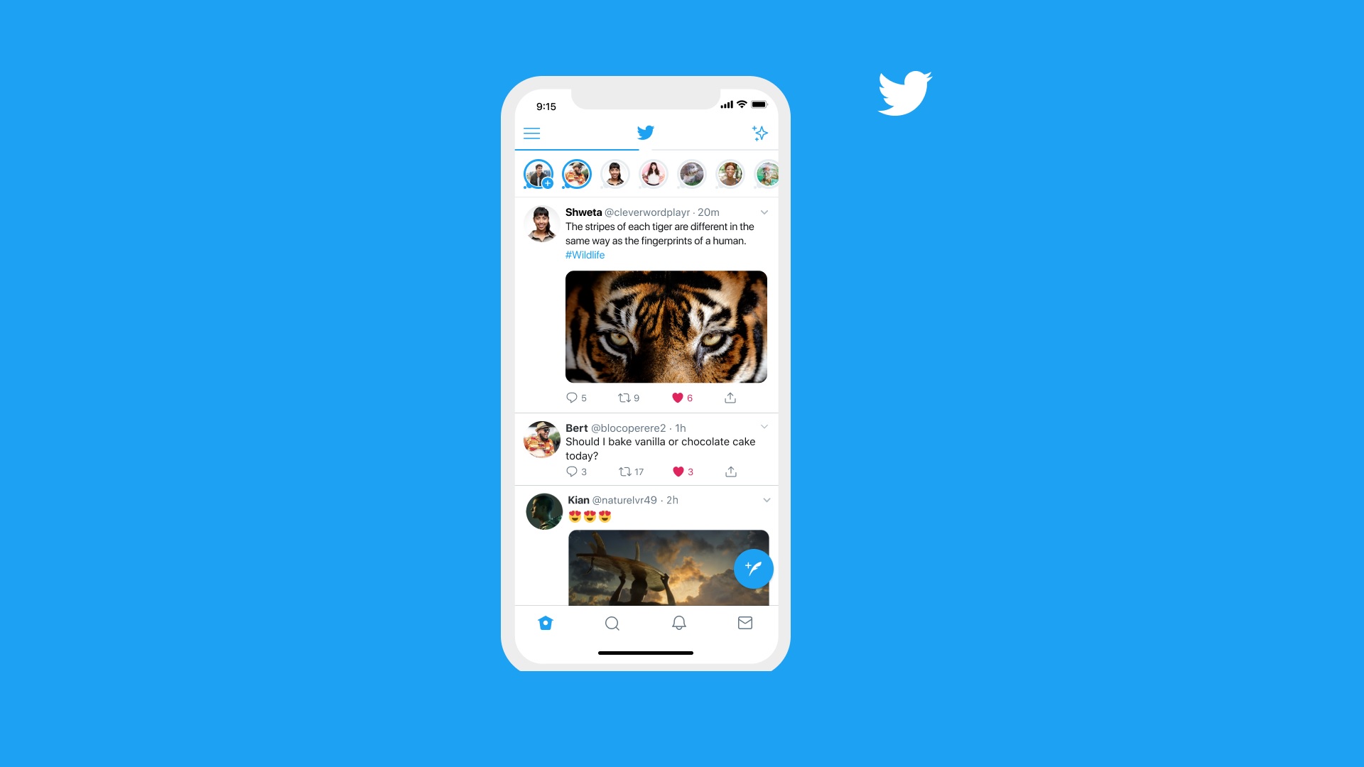
Twitter redesign set to get redesign, as users complain en masse
Chirp has riled users up

Twitter rolled out a new, refreshed design across its browser and mobile apps, introducing a new color scheme and branded 'Chirp' font set to give Twitter applications a more unified feel – but the move seems to have backfired.
Only days after introducing the changes, Twitter has been forced to backtrack, promising to undo aspects of the redesign in response to user feedback.
On August 11, the Twitter Accessibility account posted about the new updates "for colors & typography", including "higher color contrast of buttons, links, focus [and] easier reading with left-aligned text and more space between text."
- Could Twitter Spaces take on streaming?
- What is the best iPhone for you in 2021?
- Twitter has written off fleets as a 'failed experiment' - here's why
Despite aiming for "easier reading," though, the main criticism appears to be around the font causing headaches, having apparently reduced readability and made users more likely to experience migraines or eye strain.
This has moved Twitter to announce another redesign, altering the levels of contrast that appear to be causing issues, saying that it is "listening and iterating."
We're making contrast changes on all buttons to make them easier on the eyes because you told us the new look is uncomfortable for people with sensory sensitivities. We're listening and iterating.August 13, 2021
Analysis: how did Twitter misfire on accessibility?
Twitter has been awash with complaints over the past few days over the changes, while some users have seemingly lost their ability to resize font in their Twitter apps.
So how did things go so wrong? We're told by ex-Twitter staffer Sana Rao – a former Senior Product Designer at the company – that Chirp is really only a slight variation on an existing typeface, but that the platform will have wanted to create a more unique typeface to stand out from default system fonts.
Get daily insight, inspiration and deals in your inbox
Sign up for breaking news, reviews, opinion, top tech deals, and more.
She also tells us that ramping up the contrast of text was likely intended at improving visibility for those with impaired vision – even if the stark nature of that high-contrast redesign is now causing grief (and headaches) for others.
"Accessibility is a spectrum, and this seems well thought-out, well-designed, but only for one part of that spectrum, not all of it," says Rao. "It's impossible to make one design work for that whole spectrum, though; that's why it's more important to give people the tools to do it themselves."
Twitter is clearly addressing the issue, and this clearly goes beyond run-of-the-mill grumblings about iterative design changes – while the Follow button has inverted its usual colors, viewing as white if you do follow someone, it's a change that we'll likely adjust to in time. Twitter users having headaches while they try to parse through posts, probably less so.
One user also asks why Twitter doesn't design the app to give users the option to change the contrast, font, size", which may be a better route forward.
We expect to see some "contrast changes" soon, and Twitter is certainly showing a willingness to respond to these issues, saying that "Thanks to everyone who's sent us feedback about the design updates. We're tracking all of it so keep it coming." Twitter has had a dedicated Accessibility account on the platform since March of 2013, too, and it doesn't seem like an afterthought for the company, even if the latest redesign misfired.
It adds in another Tweet that "if you continue to experience painful eye strain or headaches/migraines because of the font, please check-in with us again" – a good sentiment, though using the platform to raise issues while that very platform is causing you a migraine may be a difficult task for some.
Henry is a freelance technology journalist, and former News & Features Editor for TechRadar, where he specialized in home entertainment gadgets such as TVs, projectors, soundbars, and smart speakers. Other bylines include Edge, T3, iMore, GamesRadar, NBC News, Healthline, and The Times.
