We used an original iPhone in 2022… and it’s basically useless
15 years later, you can’t really go back
Sign up for breaking news, reviews, opinion, top tech deals, and more.
You are now subscribed
Your newsletter sign-up was successful
We’re already hearing rumors about an upcoming 5G iPhone and what the next-gen iPhone 14 series will look like. No SIM card or notch? Who knows (aside from Apple), but as we wait - and speculate - it’s fun to remember just how far we’ve come.
It’s been fifteen years since a man in black gave us three shiny new things: a widescreen iPod with touch controls, a revolutionary mobile phone, and a breakthrough internet communications device.
And those were all one device. Whether you’re Team iOS or Squad Android (there really isn’t anything else to write home about these days), there’s no denying that this one announcement revolutionized the industry.
Article continues belowWe just got our hands on a first generation iPhone and thought we’d go back in time to see just how hard it is to use an original device - designed for 2007 - now, in 2022.
(Spoiler alert: It’s pretty impossible from the get-go, and you probably expect that.)
Build and design
'Iconic', 'beautiful', 'stunning' - journalists ran out of adjectives when the iPhone was announced. We did too when we first felt it in our greasy paws in 2007.
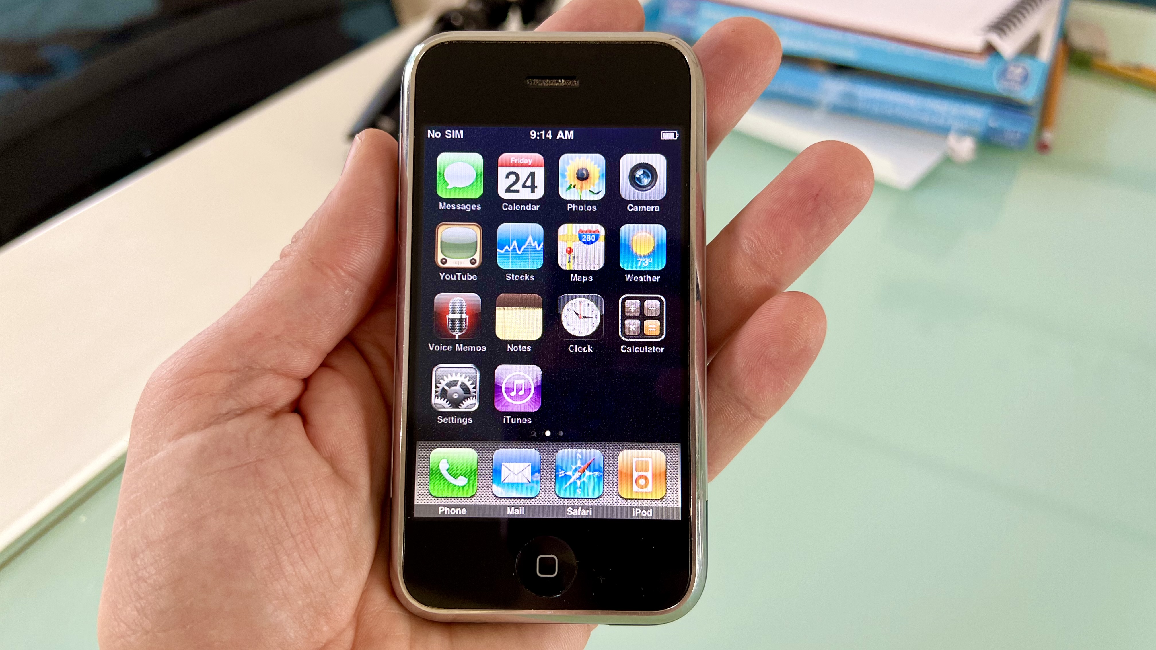
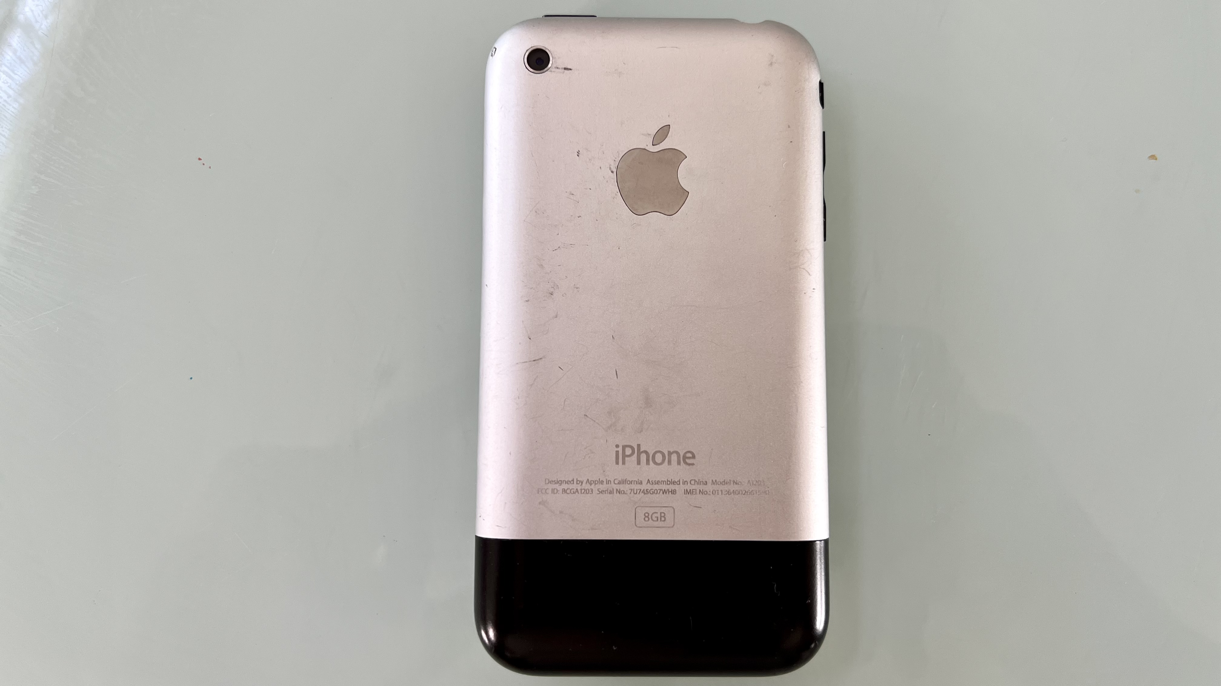
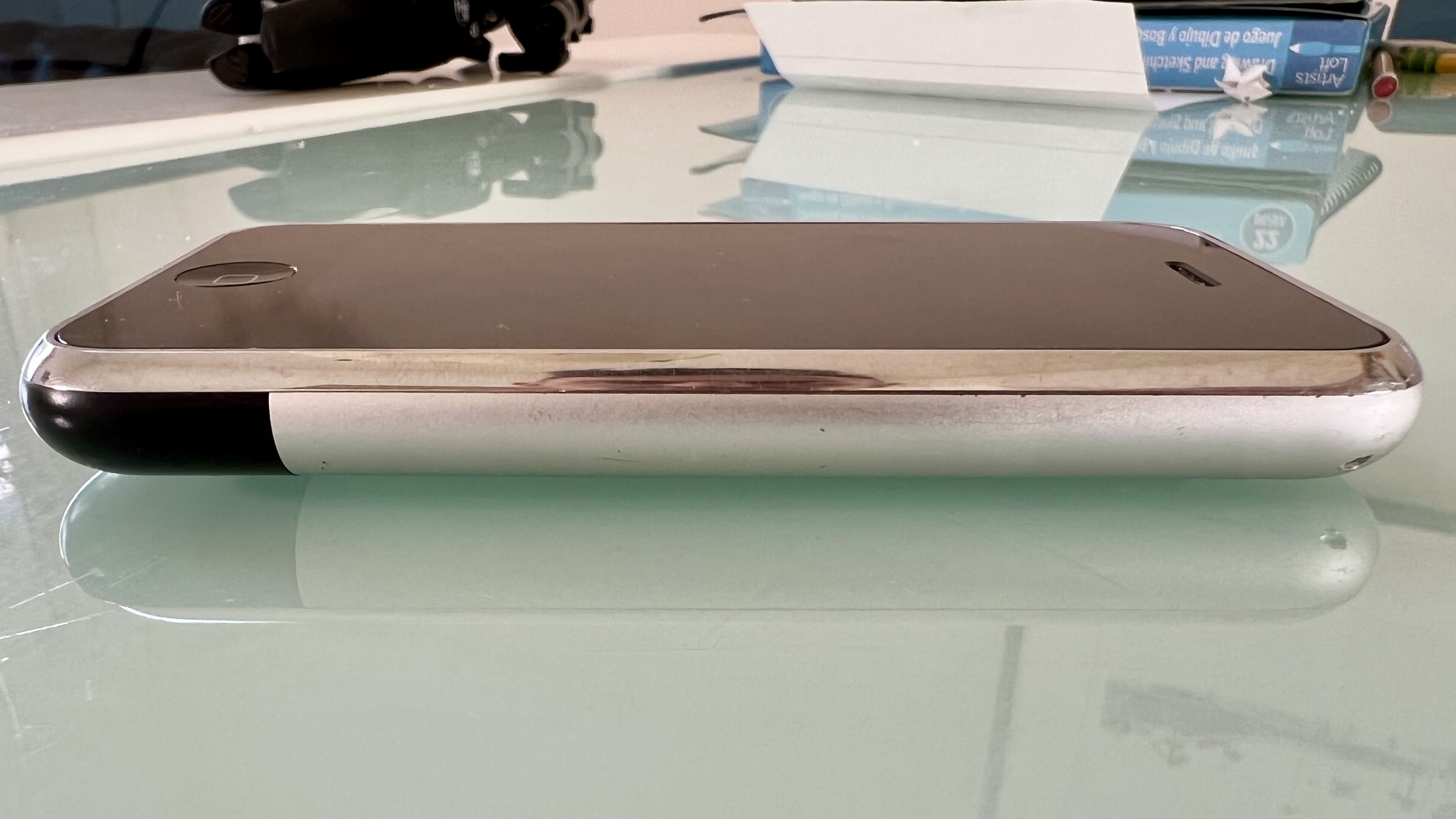
And this baby’s still got it. Our tastes have matured since, we worship slabs of glass with stainless steel or aluminum sides these days: phones that feel like jewelry. But the original iPhone now feels… cute. No longer supermodel-grade. More sweet old lady. Beautiful in its own, classic way.
Sign up for breaking news, reviews, opinion, top tech deals, and more.
It still feels incredibly premium too - heavy enough to be substantial for its size but not to the arm-snapping extremes of something like the iPhone 13 Pro.
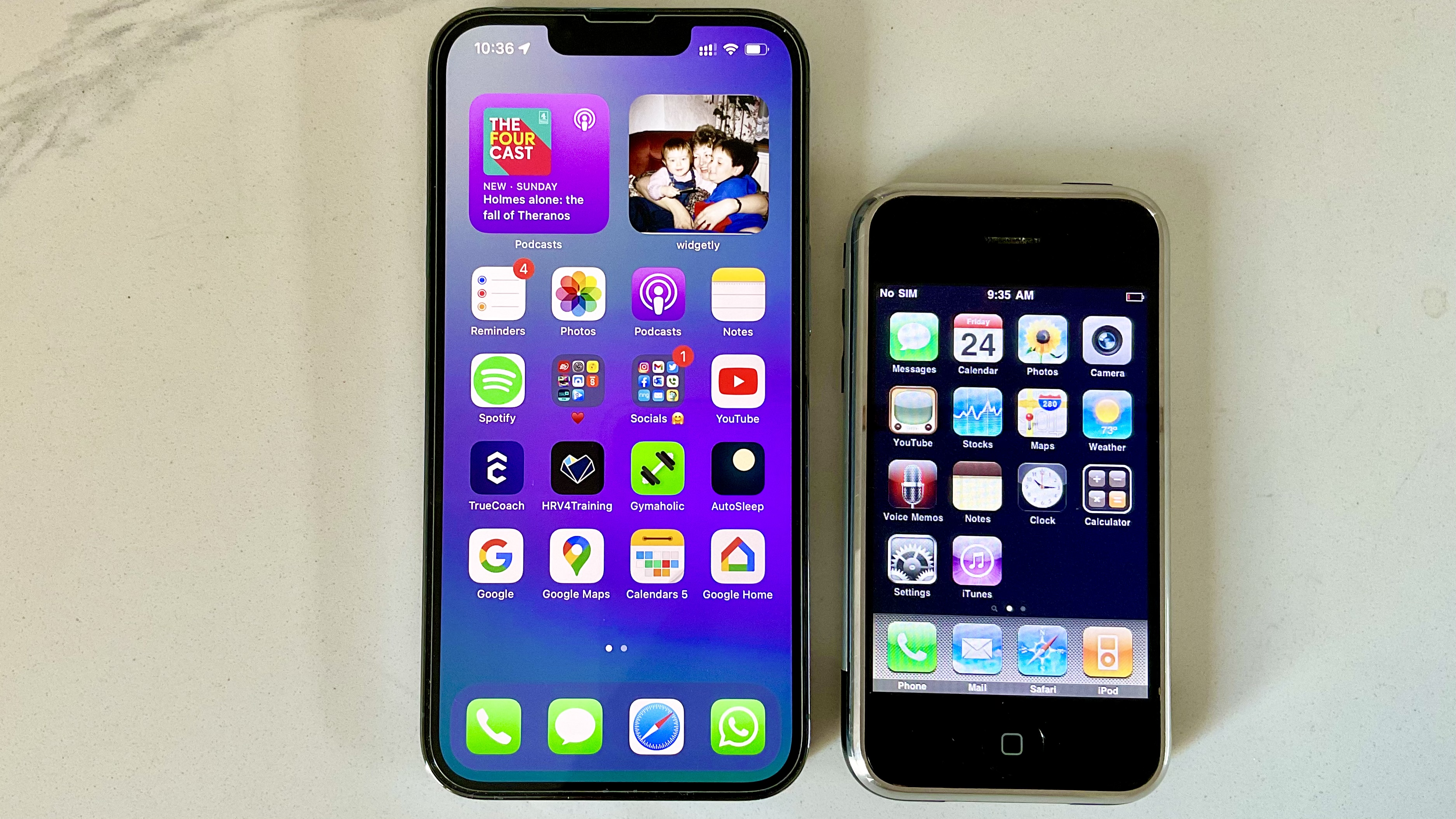
Speaking of the Pro models, we can’t help but be amazed at how tiny this thing is by comparison. We've been using an iPhone 13 Pro recently and this thing feels like a matchbox in the hand next to that. Even those still rocking an iPhone 5 would be amazed at its teeny footprint. This was the classic one-handed device: no finger gymnastics needed.
And it makes us feel slightly nostalgic for the old home button. No Touch ID. No haptics. Just a good old fashioned key that feels solid and purposeful. We miss it - although we’d be outraged if Apple brought it back at the expense of screen real estate (we’re fickle like that!)
Getting connected
This is where our 'highly scientific' experiment fell down at the first hurdle. We felt so proud for getting past obstacle number one: finding a charging cable. Which was no mean feat.
Fans have spent years pushing for Apple to give us USB-C (there are rumors that the company may even ditch the charging port altogether), but we’ve got to go back to the era before even the Lightning connector, which has been around for a decade now.
Preceding it was the pretty ugly 30-pin connector. And there’s only one place you’re going to find one of them: the drawer (the one we all have with a spaghetti infestation of cables we never use but can’t quite bring ourselves to chuck).
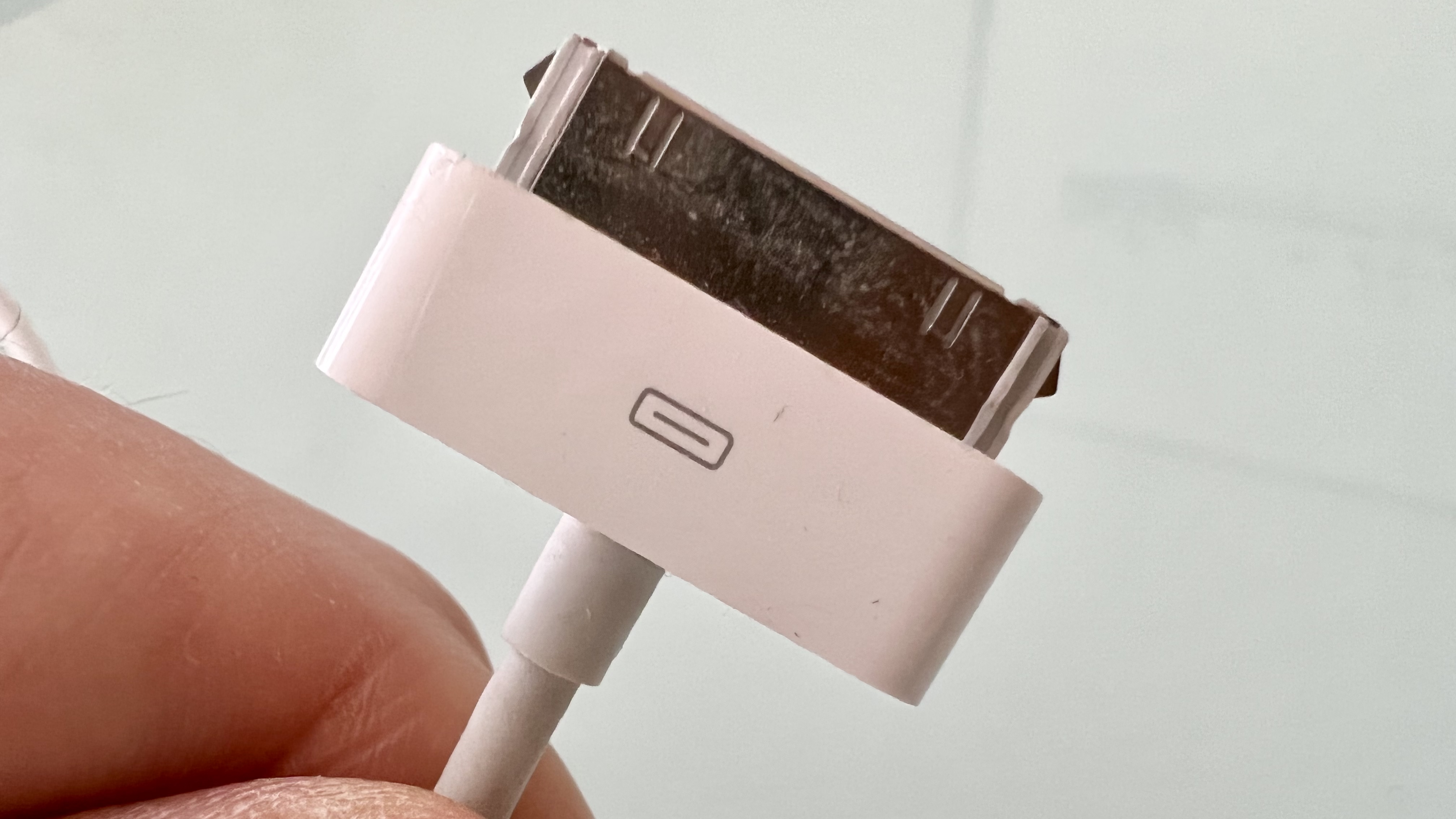
Plugging the phone in to power up and hearing that nostalgic and familiar chime made us feel pretty good about the journey ahead. But we weren’t about to get much further.
It’s as basic a rule as they come: iPhones - all phones - need a SIM. But the large SIM that powered the original phone is a fossil. It was superseded by the microSIM, which itself is a relic (we got those from the iPhone 4 onwards).
These days almost all of us are rocking nanoSIMs, and even though there are adaptors and home-made workarounds (sticky tape, cardboard, scissors and sheer determination), there’s another obstacle: the first iPhone ran on 2G GPRS internet speeds with Edge if you were lucky enough to be in a hot zone.
AT&T turned off its 2G networks years ago - in fact, even the 3G networks that came later are heading to the grave - meaning this phone, sadly, will soon never get service bars ever again.
We do have hideous memories of iPhones taking 30-60 seconds to load a web page back in the day, so perhaps we’re better off without anyway!
(Side note: We did try Wi-Fi which the iPhone thankfully gave us from day one, but were unable to find any networks to join. We couldn’t verify if it was due to a faulty chip or the fact that old iPhones aren’t compatible with modern Wi-Fi networks, since we didn’t have a second iPhone 1 to hand for comparison. In the way that Apple infamously sandboxes its apps, it’s pretty ironic that this iPhone was sandboxed from the world for our experiment.)
Screen
Okay, so we’ve gushed about how beautiful the design of the first iPhone was, but that does not extend to the screen. Was it always this bad?!
There are certain caveats here: we’ve been spoiled ever since - initially by Retina and latterly by Super Retina, and OLED displays. We haven’t seen a pixel in more than a decade. And this is a 15 year old phone, so there could be some wear here. Although, anecdotally, we can’t see any.
But..!
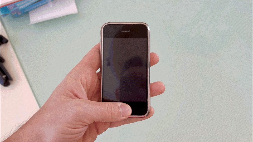
When we turned it on and that light shone through, we let out an audible gasp.
What we'd on a modern iPhone be met with is a solid black screen with a white Apple in the middle, but the backlight here makes it look so fuzzy, you can’t unsee it. In fairness, this goes away (or at least we notice it less) once the home screen appears and those colorful icons draw us in. But it’s a mess by 2022’s standards.
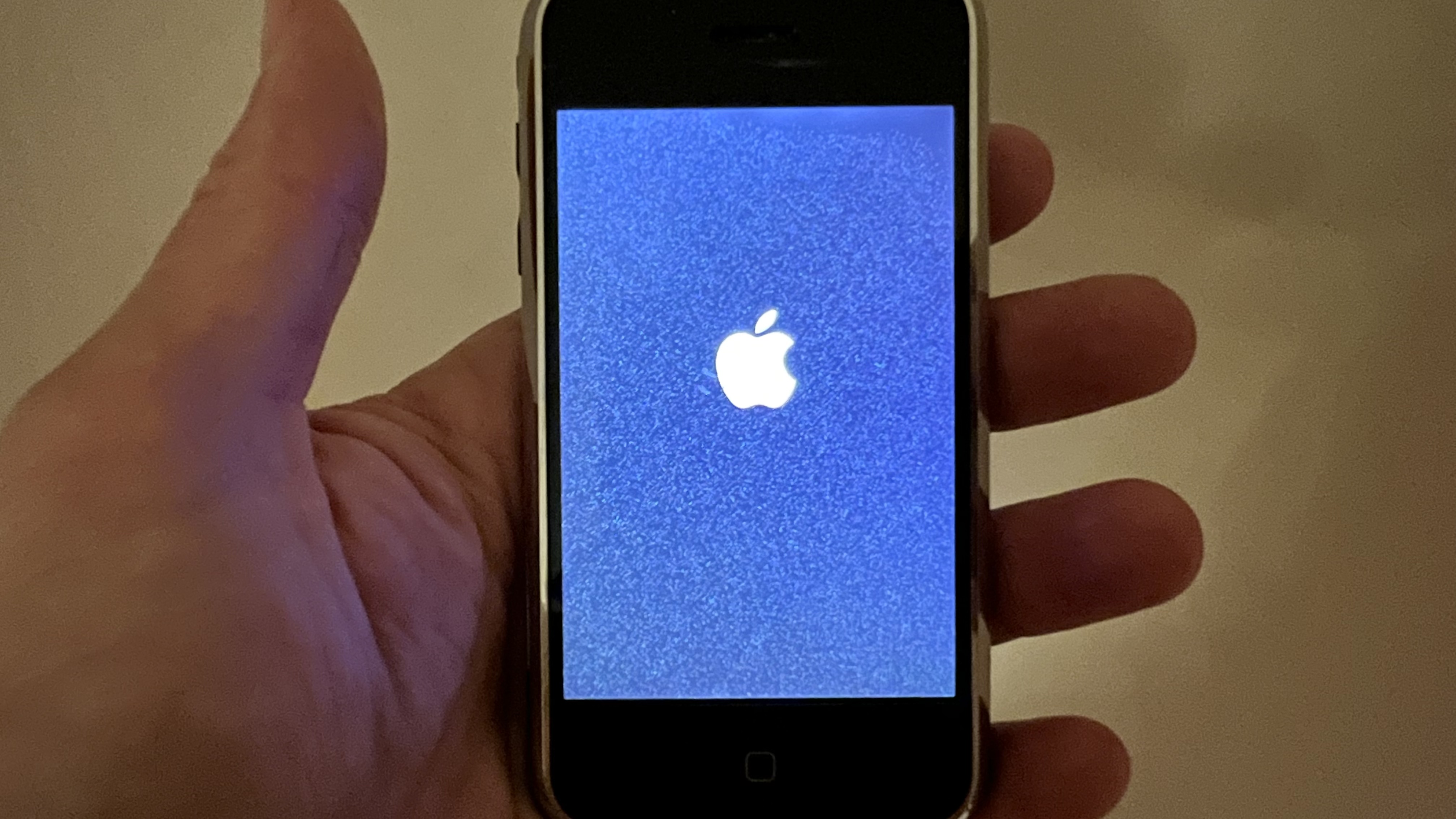
This could also be an issue with the pixels degrading - it has been fifteen years, after all. But the issue doesn’t appear to extend to once the phone is in use.
That said, one plus point the first iPhone’s screen has going for it is that it has not been butchered in any way. No cut-out, no notch, just a display that fits the space it was meant to, even if it is way smaller than our modern tastes expect.
We won’t get into the whole argument about how divisive the notch is - most of the time we don’t notice it these days - but we do wonder what Steve Jobs would have had to say about it all had he held an original in one hand and a 2021 model in the other. Which way would he have gone?
Speed and use
Apple’s silicone gets faster and faster every generation, and the company makes a big play of it at its annual iPhone launch event. So, it’s no surprise that the first iPhone feels snail-like by comparison. Man, is it slow.
Okay, fair enough - it’s all relative. We’re not running any apps or web pages here that require a huge amount of processing power (chance would be a fine thing since we couldn’t even get online!) and this phone does only have 128MB of RAM. Retro.
But still, from the six weeks (slight exaggeration) it took to boot up to the very noticeable delay in sliding to unlock and waiting for the home screen to appear and populate, everything feels like it takes forever.
We’re not talking wading through treacle or unresponsive in the way that early Android models could be when they had too much on their minds to process and just froze. But like our 12-year-old dog who takes half an hour to walk across the room, this is a device that is not in a hurry.
We suspect this is down to animation speed (therefore software) as much as technical ability, where the device feels slower than it probably is.
We laughed at the available memory too - this device has 8GB of storage, which is a snip of the baseline 128GB of storage we get on today’s iPhone 13.
In fairness, this wasn’t the smallest model available at the time - Apple gave us a meager 4GB option too (many wondered why it even bothered), so this was top-end by the standards of launch day.
But considering we just sent a 1.3GB file from our iPhone 13 Pro to our iPad Pro, we chuckled at the thought of how quickly we’d fill this 8GB model. Then again, with today’s reliance on streaming rather than local access, if the apps were available for early iPhone software variations (and we could get the thing online), maybe we’d be surprised!
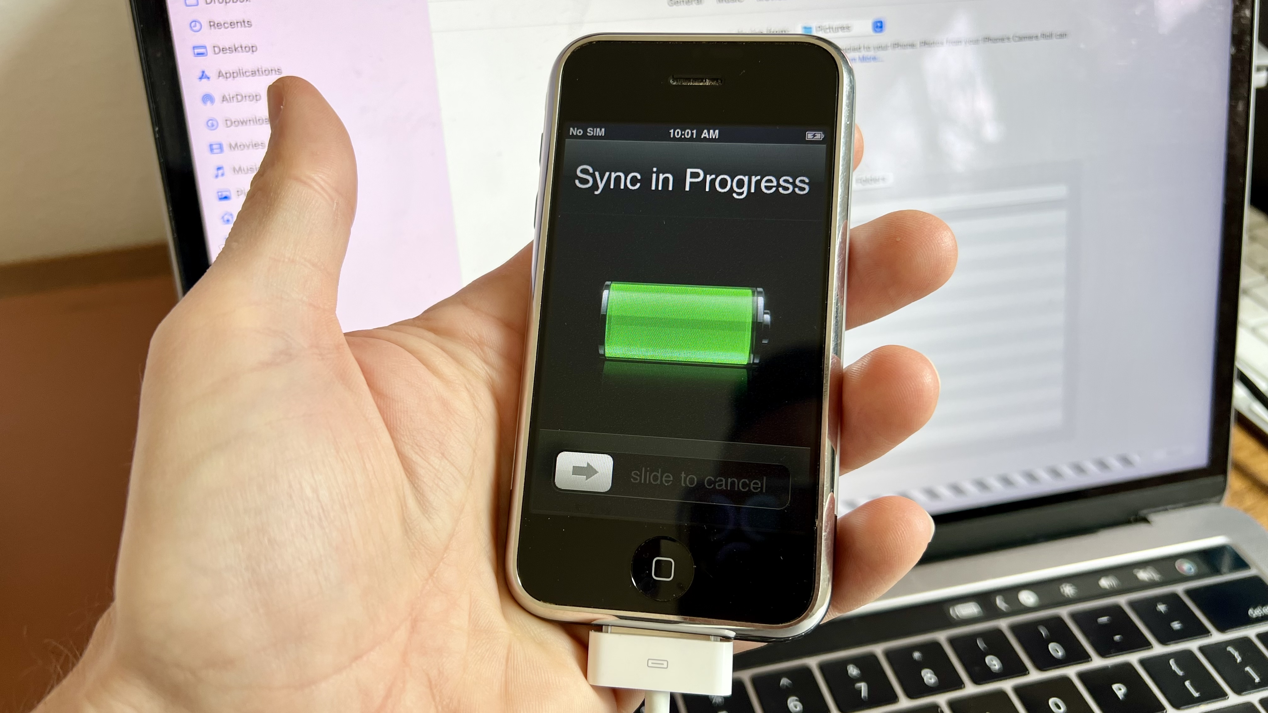
The other hurdle to filling that memory would be how you get your media onto said phone. And for that, we have to take you back to the bad old days of iTunes. How we loved to hate it. The program that we were forced to use to not only activate the iPhone (it literally couldn’t be used without this step), but also to transfer music and photos onto it.
We decided to send a few tracks across just for old time’s sake using Finder, since - on Mac at least - Apple packed iTunes off to hell a number of years ago. And then it hit us: bad idea!
The memory we’d tried to bury, recalling just how much we hated the sync process. Thank goodness Apple got rid of the dreaded ‘Sync in Progress’ screen which sat there smirking at us back in the day as we willed it to hurry up, unable to do a thing until it had decided it was finished. We really don’t miss those days at all.
Software
There’s so much to get through in terms of software - almost too much - and we find ourselves feeling a bit torn here.
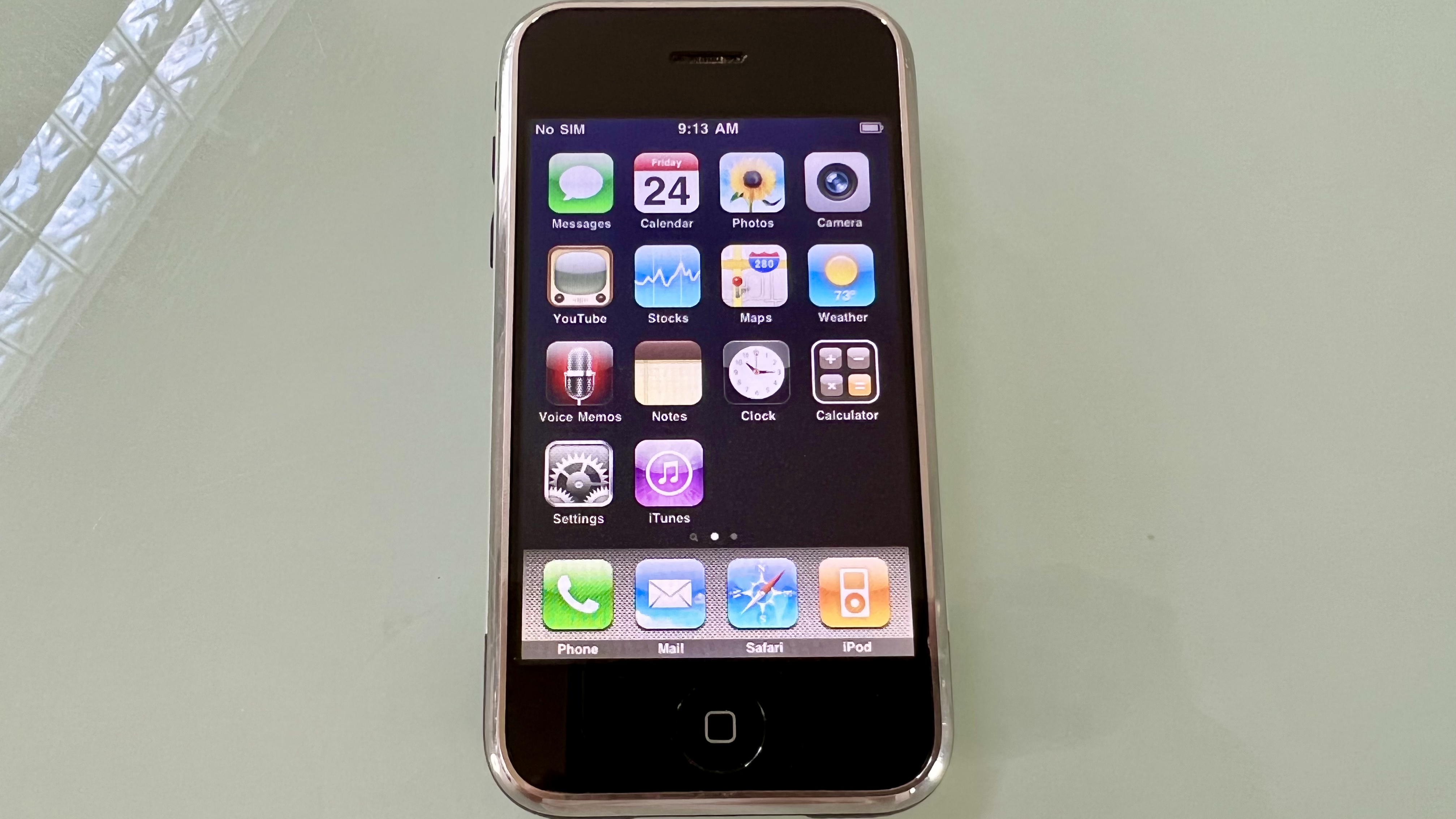
On the one hand, this is a revolutionary operating system. That’s not hyperbole. Apple gave us innovations that we don’t even think about now but were genuinely industry redefining when they came out. Think pinch to zoom, think slide to unlock, think scrolling through lists by swiping up on the screen, and the rubber band effect when you reach the end.
And on that same hand, there is, of course, some nostalgia when you see elements you haven’t for years. Like the old iPod app. It takes us back to a moment in time - to a different place in our lives in the way that smelling something might spark a memory, or hearing a track on the radio we haven’t heard in years may make us feel a certain way. That’s here in spades when you pick up an iPhone 1.
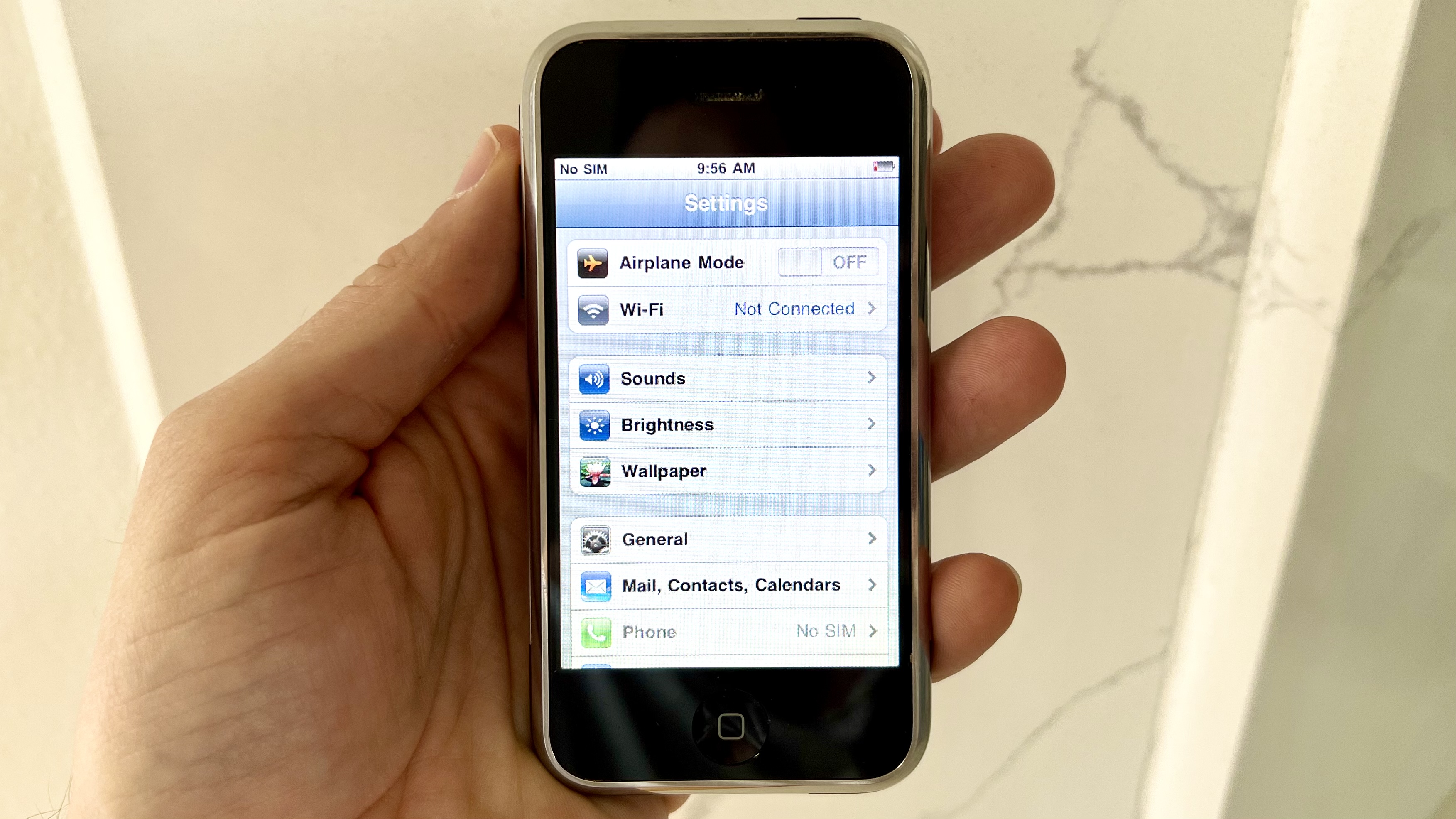
But (and you know it’s coming) there was a lot that Apple got wrong here. For one thing there's Scott Forstall’s insistence on skeuomorphic design (hands up - we didn’t know what that meant either until Jonny Ive pulled a face and told us he was ditching it once Forstall left).
This really feels dated and out of place alongside the hideous striped background of the settings menus. Kind of like when you see an 80’s family photo and all of the furniture is brown and beige. Seemed like a good idea at the time, not so much now.
Then there's Apple’s own bizarre omissions, like not being able to change the home screen wallpaper but being able to change the lock screen background. Or a notes app that was literally just one list with no categorization options. Or the fact that you can't take a screenshot - something we rely on heavily these days.
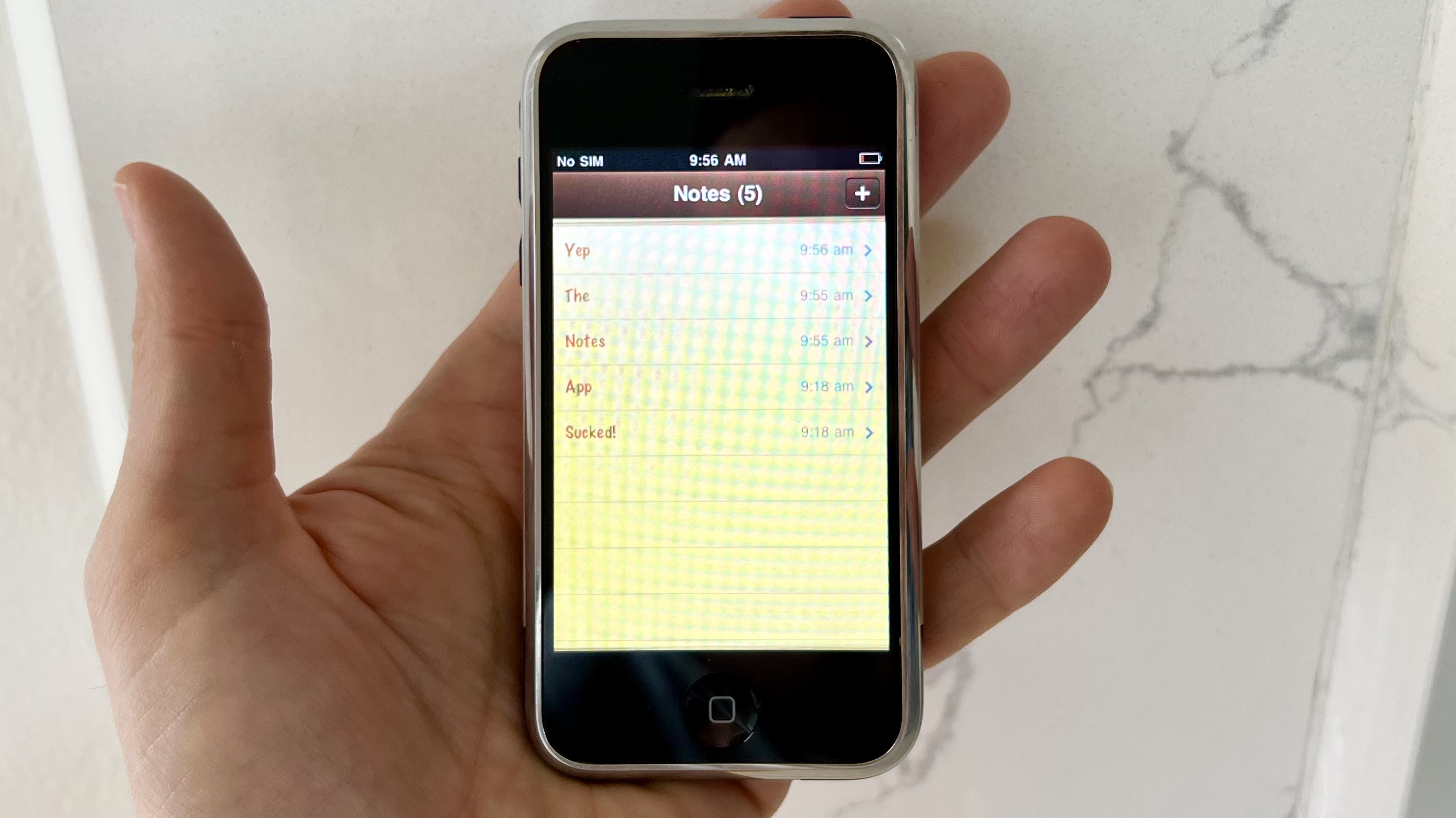
Or the biggest - almost criminal - factors that still give us shivers: NO COPY AND PASTE. And no video recording! What on earth?! Even Nokia candy bars could do that!
Sure, we accept that innovations like Siri were a long way off. Even some form of multitasking or app switching was a bit of a pipe dream on a device with 128MB of RAM.
But we do really get the sense that there was a lot missing from this iPhone that - in hindsight - shouldn’t have been. And we just accepted it at the time because we knew no different.
Apple's approach
And that leads us to ask: what on earth was Apple drinking?! Love him or hate him, Steve Jobs was a visionary. Known for being abrupt, borderline rude, and uncompromising, his reality distortion field was legendary. But he got the proverbial done.
That said, there are some aspects he just got completely wrong, and we’re not ashamed to call him out on it.
Maybe time has numbed the pain, but instantly, we’re reminded here that Apple made a major misstep when it came to messaging. We were shocked at the time (and we’re still shocked now) that the first iPhone gave us no ability to attach anything to a message in the messaging app (the bit of software Apple later went on to say was the most used app on the majority of iPhones). What an own goal.
Those of us coming from Symbian smartphones, Windows Mobile devices or even just dumb phones from the likes of Nokia, Motorola and Sony Ericsson had grown accustomed to MMS.
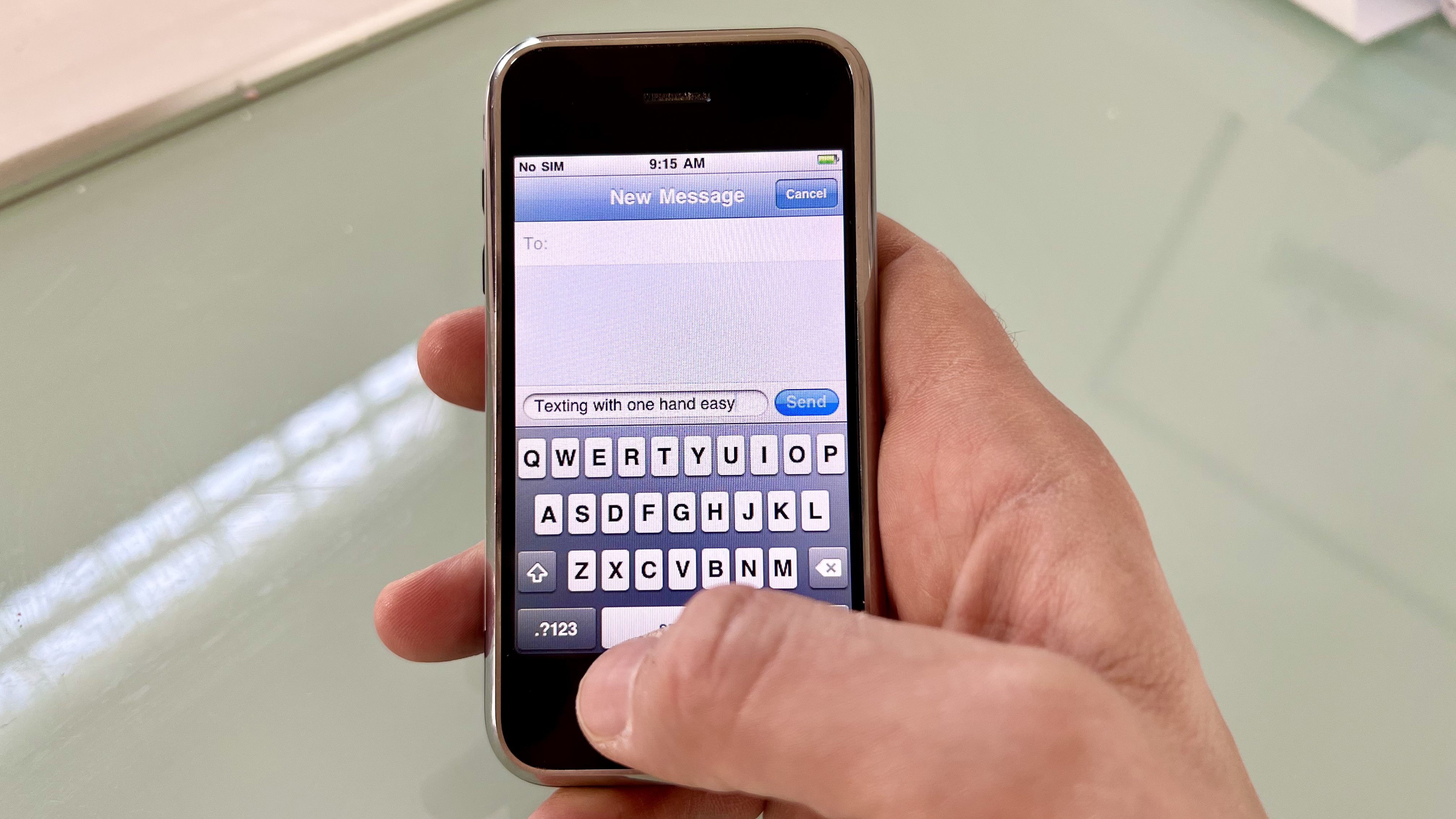
Sure, it was awful quality: the images were grainy and even more compressed when sent over a network, .3gp videos were limited to around 15 seconds, and the whole system was notoriously unreliable. It sucked.
But it was an option. And boy did we miss it when it was not there on a phone that could do other things so well. Steve Jobs said it was tech for the past, while email was the future. And for that reason, Apple would only let you send photos by email.
It wasn’t a policy that would last - and we have fond memories of running MMS on a jailbroken device and showing all of our friends that it could be done even without Apple’s approval. Apple went on to rethink this - but not straight away. And nowadays, you can attach everything but the kitchen sink to a message on iOS. Funny how times have changed.
Perhaps the biggest omission though was the App Store. Apps sell phones now as much as phones sell phones - perhaps even more so, and yet Steve Jobs famously resisted allowing developers access. He wanted them to write web apps via Safari which could be pinned to the home screen for quick access. We know devs hated that approach and eventually, Jobs relented in time for the launch of the iPhone 3G.
Maybe he had a point - apps on 2G would have been hideous. And for a time, it was fake lighters and fart apps that captured our imaginations. And torches. Lots of torches. Until the likes of Instagram, WhatsApp and Uber came along. The rest is history, but not having the App Store on an iPhone seems like such a gaping hole.
One other thing we notice is just how much Apple relied on its partners: the Weather app, for example, pulling in data from Yahoo! (Apple still relies on third parties for some meteorological data, but you have to hunt to the very bottom of the weather feed to see it, compared to the prominent ‘Y!’ logo on the original iPhone.)
And we’re staggered to remember just how in bed Apple was with arch-rival, Google: that’s despite the fact that Google was also in the process of developing and launching its first smartphone, the Android-powered HTC Dream, at the time.
Google’s YouTube had a proud space on the home screen (with a comically retro TV icon), as did Maps, which was also powered by Google. And it’s funny to think that these devices didn’t even have GPS to allow turn-by-turn navigation, which came later. You could only plot a route. It's so basic.
What this gives us is two very different narratives on one device - Apple keen to keep developers out, whilst also allowing outside influences in, and - like today - holding all the cards and controlling that access very tightly.
Other fails (by modern standards)
Camera
Steve Jobs famously described the best camera as being the one you always have with you, which is arguably true, but let’s call it out - at least by today’s standards, the camera on the first iPhone was a shocker.
It’s hard not to have high expectations based on the phenomenal lenses on current models - we’ve had full Hollywood movies shot on iPhones, while some TV broadcasters use them for news-gathering and live shots.
So we do have to cut the original model some slack here, because it is very much of its time. But it’s dim, it’s dark, it takes forever to focus and, as we noted earlier, there is no video recording. Outrageous.
And perhaps the most obvious flaw (which was rectified years later) is how long it takes to get to shooting: we had to press the home button, slide to unlock, wait for it to populate, go into the camera app, then wait for the app to open... the whole process took 6-7 seconds when we tested it.
Far too long for spontaneity. It’s no wonder the photos of our kids and dogs are a blurry mess! Not the case anymore, thankfully.
Headphone jack
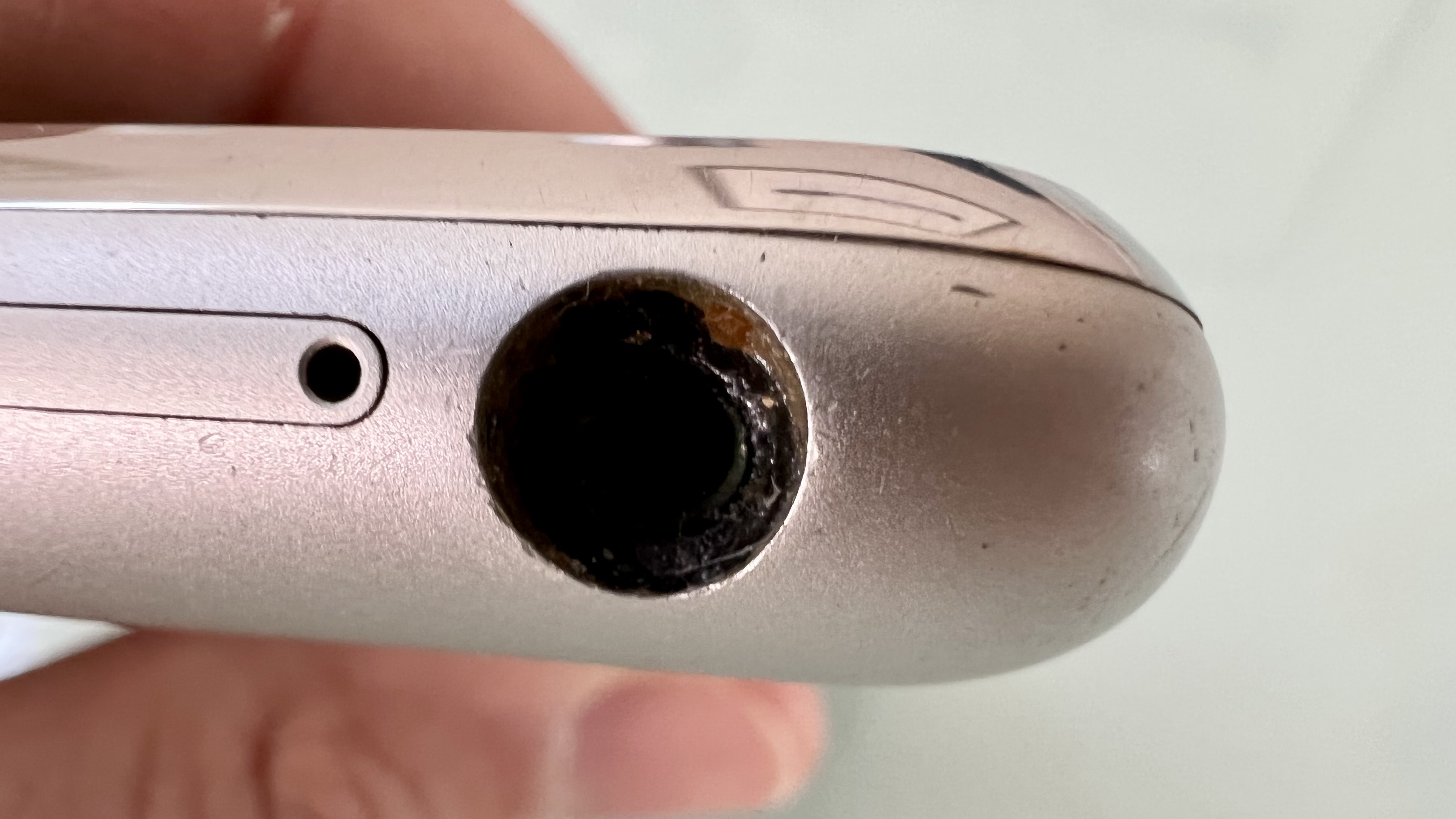
Apple had the 'courage' to remove the old technology (or, cynics may say, to sell us AirPods) many years ago - and it’s a controversial move even to this day, with lots of fans mourning the loss of the 3.5mm port (although Apple still gives us said jack on the latest MacBook models, so maybe the courage wore out?)
But we don’t miss this iteration of the headphone jack. The jack on the original iPhone was the worst ever, no doubt, for one simple reason: Apple deliberately recessed it so that you could only use the white earphones that came with your phone.
Part marketing ploy (the white earphones were iconic thanks to a previous iPod marketing campaign) and part cynical (you had to give Apple more money to buy a dongle to fit your own headphones in), it was a big and unpopular misstep, and one that rightfully earned the company a lot of criticism.
Final thoughts
The original iPhone will struggle against any modern device, and that’s to be expected. But when we look at it, when we hold it, even after all these years, we remember why we fell in love.
This was a device that cost an arm and a leg and then some. A device that meant we ditched our carrier like an old sock to go exclusive with the likes of Cingular in the US or O2 in the UK. We had no choice if we wanted it.
And we willingly signed our lives away for two years on extortionate coverage plans just to be able to say we were part of the iPhone family.
Would we do that all again? For a device like this when nothing else exists?
You bet!
Steve Jobs famously said consumers didn’t know what they wanted until they were shown. Perhaps he had a point.