Moto 360 (2015) vs Moto 360 (2014): is it worth the upgrade?
Moto 360 compared with its predecessor

The new Moto 360 is an update to one of the first and best looking Android Wear smartwatches, with new specs and more stylish choices.
As much as we liked Motorola's first circular timepiece, the company did cut some obvious corners a year ago.
At the same time, the second-gen Moto 360 isn't perfect and it raises the price a bit. Is it really time to upgrade your Bluetooth-connected Android watch?
Here's the comparison to help you decide between sticking with the older ticker and upgrading to the new version.
New Moto 360 vs Moto 360: Design

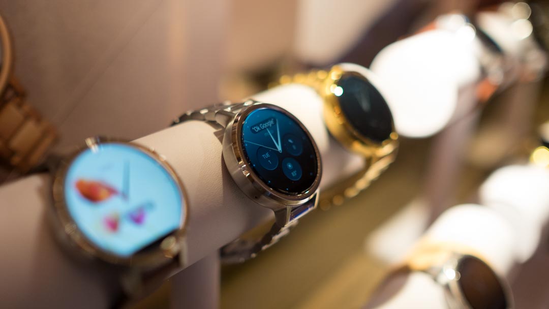
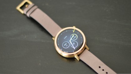
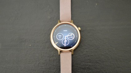
It's hard not to like the design of the either Moto 360 smartwatch. Both have attractive, circular displays, stainless steel casings and genuine leather and steel bands.
This helped the first Moto 360 stand apart from plastic-clad Android Wear watches, the LG G Watch and Samsung Gear Live, at launch. But the New Moto 360 goes a step further in design.
New dimensions consist of the same 46mm and smaller 42mm sizes that now rise off the wrist by 11.4mm. That's a hair thinner than the 11.5mm depth of last year's 46mm watch model. There's also a woman's 42mm size that offers narrower 16mm bands.
Get daily insight, inspiration and deals in your inbox
Sign up for breaking news, reviews, opinion, top tech deals, and more.
The smaller 42mm size for men and woman lets Motorola compete with the Apple Watch, which comes in 42mm and an even smaller 38mm size. With almost every other Android Wear watch considered chunky, this is a relief for small armed folks.
New Moto 360 vs Moto 360: Colors and bands
The new Moto 360 also adds a color and two styles. Black, silver and gold are now joined by newcomer rose gold for the woman's watch, and options of a polished peak bezel or sundial-like micro etch. The men's watch cut is either chamfer with its 45 degree angle, or a textured micro knurl bezel. Both the micro etch and micro knurl options are an extra fee.
The bezel and the case can be different colors for the first time, too. This makes the Moto Maker store even more customizable. The second-gen Moto 360 bands include the same leather and steel options, along with a classy mono link steel choice - but that isn't available just yet.
That's okay. New top and bottom lug designs allow for quick-release bands so any third-party options can fit as long as they're 20mm, 22mm or 16mm, depending on the watch size and gender you select.
I really liked the no-visible-lug-look of the first Moto 360, as the band seamlessly slipped behind the watch case. But I had to go digging for a hidden pin and cracked the watch's ceramic back in the process. Judging from the online troubleshooting response from others, I wasn't the only one who had that problem.
New Moto 360 vs Moto 360: Display

The new Moto 360 display has a higher pixel density than last year's version, no matter which watch size you chose. It's still a backlit LCD, but there's now less screendoor effect.
The men's 46mm watch is the same 1.56 inches with a resolution of 360 x 330 and 233ppi, which contrasts with the original Moto 360's 320 x 290 resolution and 205ppi.
The 42mm watch for men and women has a 1.37 inch display with a resolution of 360 x 325 and 263ppi.
All watches are protected by Gorilla Glass 3, and sadly, contain that flat tire with a black cut out at the bottom of the not-really-a-circle circle. But that's in favor of a thinner bezel, so it's a matter of preference among smartwatch owners.
