Pebble Time 2 vs Pebble Time
Is it time to upgrade?

There was a time when Pebble had the smartwatch space almost to itself, but with the rise of Android Wear and the Apple Watch it's had a tougher time competing.
Its wearables have long-lasting batteries and always-on e-ink screens, giving them unique selling points, but they're less powerful and in many ways less premium than rivals.
In the face of that fierce competition Pebble is back with a trio of new wearables, including the Pebble Time 2, which builds on the Pebble Time and Pebble Time Steel in a number of ways. We've put it up against its predecessor to see just what's changed and just how much of an improvement it is.
Screen and battery
The screen on the Pebble Time 2 is a big upgrade on the Pebble Time, coming in at 1.5 inches with a resolution of 200 x 228, which makes it 50% larger and with 80% more pixels than the 1.25-inch 144 x 168 display on its predecessor, so no more squinting and room for 'twice as much text' on screen.

That upgrade is welcome, as the Pebble Time has both a smaller and less sharp screen than most rival smartwatches like the Moto 360 (2015).
It does have some benefits though, as being a color e-paper display it can be always-on without sucking down too much battery and the same is true of the Pebble Time 2.
In fact, Pebble claims its new wearable can last for up to 10 days on a single charge, which would be an improvement on the already-impressive 7-day battery life of the Pebble Time.
Get daily insight, inspiration and deals in your inbox
Sign up for breaking news, reviews, opinion, top tech deals, and more.
Design
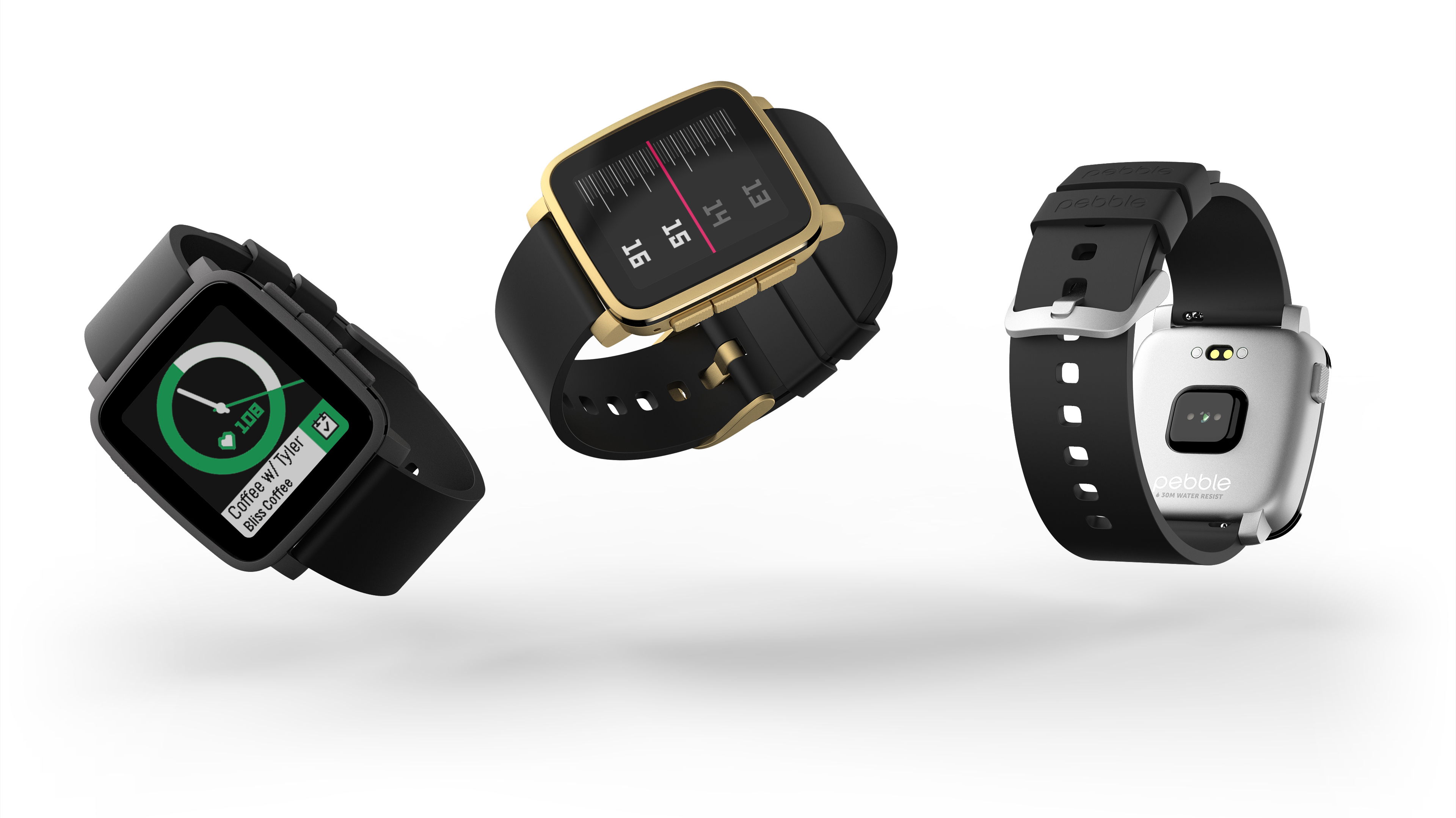
The Pebble Time 2 has more in common with the Pebble Time Steel than the standard Pebble Time, as it's clad in stainless steel, rather than being plastic with just a steel veneer.
The front of the Pebble Time 2 is more glass and less frame than the Pebble Time, which gives it an altogether less chunky look than its predecessor when viewed front-on.
That said, the Time 2 is actually slightly bigger and heavier, coming in at 10.8mm thick and 64.6g, while the Pebble Time is 9.5mm thick and 42.5g, though the remaining dimensions of 40.5 x 37.5 are identical.

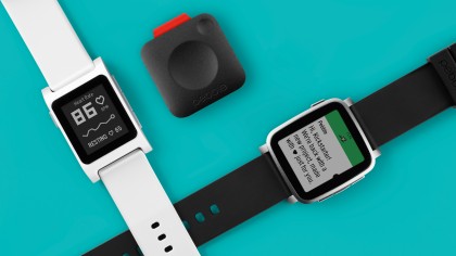
The Time 2 comes in gold, silver and black, just like the Pebble Time Steel, while the standard Pebble Time is available in black, red or white. In the red shade especially the older watch looks more colorful and playful, but also more toy-like and less of a serious bit of tech or a fancy wristwatch.
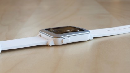
Otherwise the design of the Time 2 is similar to before, complete with a back button on the left and up, down and select buttons on the right of the frame.
It also has a silicone strap with a steel buckle just like the original Pebble Time, rather than the leather and metal straps you can get with the Pebble Time Steel.
Power and features
You can expect slightly better performance from the Pebble Time 2 over the original Time, as it has an ARM Cortex M7 processor, in place of the slower ARM Cortex M4 in its predecessor - not that Pebble OS needs a huge amount of power anyway.
The Pebble Time 2 might have a style conscious exterior, more suited to the office than the gym, but it's not neglecting fitness either, thanks to a built-in heart rate monitor.
The original Pebble Time can't read your heart rate, but both watches have step tracking skills and both are water resistant. Neither of them can truly replace a fitness band though, as they lack GPS.
If you like talking to your wrist you're in luck whichever of these watches you opt for, as both have a built-in microphone.
Price and availability
The Pebble Time is out now and retails for £149.99/US$149.99 (around AU$210), while the Pebble Time 2 is available now on Kickstarter from US$169 (roughly £116/AU$236), but won't ship until November.
But that's a backer price, so if you wait to get it in shops you'll have to pay around US$199 (roughly £136/AU$278).
Verdict
The Pebble Time 2 looks to be a modest upgrade on the Pebble Time, but could be worth it for the larger, sharper screen alone.
The more premium design, faster processor and heart rate monitor are the icing on this particular cake and while we'll need to put it through a full review it sounds like one of the best Pebbles yet on paper.
However, given that it's only got an improved screen and heart rate monitor it may not be enough of an improvement on the Pebble Time to tempt owners to ditch their current model.
James is a freelance phones, tablets and wearables writer and sub-editor at TechRadar. He has a love for everything ‘smart’, from watches to lights, and can often be found arguing with AI assistants or drowning in the latest apps. James also contributes to 3G.co.uk, 4G.co.uk and 5G.co.uk and has written for T3, Digital Camera World, Clarity Media and others, with work on the web, in print and on TV.