WhatsApp dark mode is nearly here, having now arrived for beta testing on both iOS and Android, but personally I think it could use a little tweaking, which got me thinking about dark modes in general. What makes a truly good one, and which apps get it right
Give us a choice
Google’s Material Design guidelines for dark themes recommend avoiding pure black as a background color to make the contrast between interface elements less stark, but many users actually prefer their apps to be as black as possible. This is particularly true of OLED phone owners, as OLED panels simply switch off any pixels that need to be rendered as black, helping save a little extra juice.
That said, many people will agree with Google’s suggestion that dark gray is a safer choice, so giving users the option to choose between two variations is a good choice.
This is something Twitter achieves well, giving users the option to choose between ‘Dim’ and ‘Lights out’ modes depending on their own preferences. Assets found in earlier beta version of of WhatsApp suggested it might offer a similar choice, but that hasn’t come to pass.

Consider contrast
If your light interface uses gray boxes or buttons on a white background, aim for the same degree of contrast with your dark mode to avoid confusing regular users.
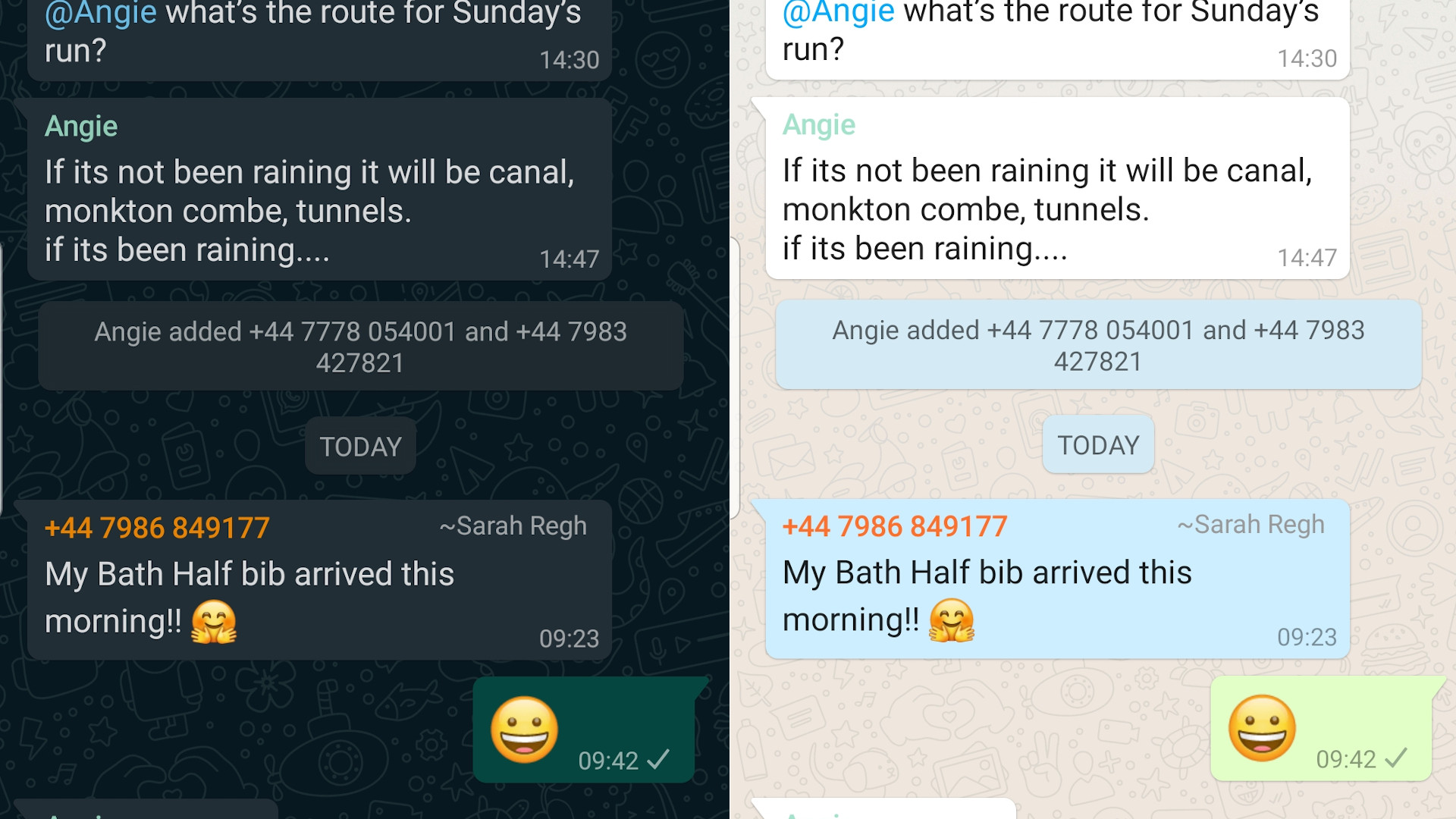
One issue with WhatsApp’s new dark mode is that the speech bubbles for conversations are nearly the same shade as the wallpaper, reducing the illusion of depth and making them much trickier to see than they are if you pick the lighter interface.
This is another area where Twitter excels, keeping roughly the same color variance between areas, though its choice of accent colors brings us to our next point.
Get daily insight, inspiration and deals in your inbox
Sign up for breaking news, reviews, opinion, top tech deals, and more.

Remember saturation
Used against white backgrounds, saturated yellows, reds and greens look fresh and appealing. Against a darker backdrop, however, they can be hard on the eyes, seeming to ‘vibrate’ on the screen
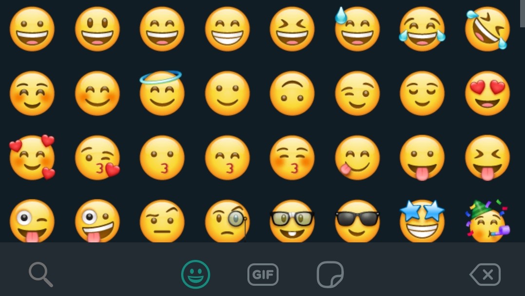
While much of WhatsApp’s new dark mode uses mellow shades of gray and blue, your friends’ names are still rendered in gaudy shades, and the emoji menu is a dazzling array of yellow icons. Toning these shades down a few notches would have taken extra work, but would have made the app more pleasant to use.
Likewise, Twitter’s vibrant accent colors look great against white but are too harsh against darker backgrounds.

Allow customization
You won’t be able to satisfy everyone, so if possible, a degree of customization will allow users to tailor your app to suit their preferences. Gmail for desktop lets you choose from Google’s own light and dark modes, but also offers a wealth of other color options that you can use with your own background image.

Make it easy to find
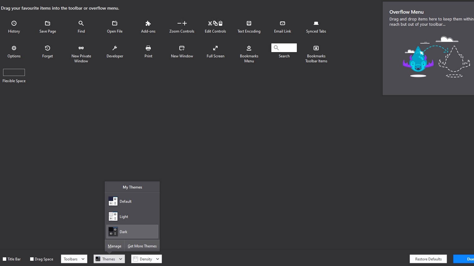
Finally, once you've perfected your dark mode, don’t tuck the option away! Most developers place the option to go dark in a fairly obvious place and allow you to activate it by toggling a switch, but Firefox for desktop is an unusual exception.
To change the browser’s color scheme, you need to open the menu and select ‘Customization’ (so far, so obvious) then use a tiny drop-down menu right at the bottom of the screen, which is otherwise entirely devoted to customizing toolbars. It’s a shame, because Firefox was one of the first browsers to feature a proper dark mode, and it’s a good-looking one (if you can find it).


Cat is TechRadar's Homes Editor specializing in kitchen appliances and smart home technology. She's been a tech journalist for 15 years, having worked on print magazines including PC Plus and PC Format, and is a Speciality Coffee Association (SCA) certified barista. Whether you want to invest in some smart lights or pick up a new espresso machine, she's the right person to help.