Why I think Apple Maps could help solve the Safari redesign in iOS 15
Maps could be the key

Since Apple announced a wide-range of updates at WWDC in June, from iOS 15 to macOS 12 Monterey, the one big feature that has stuck out to many users has been Safari.
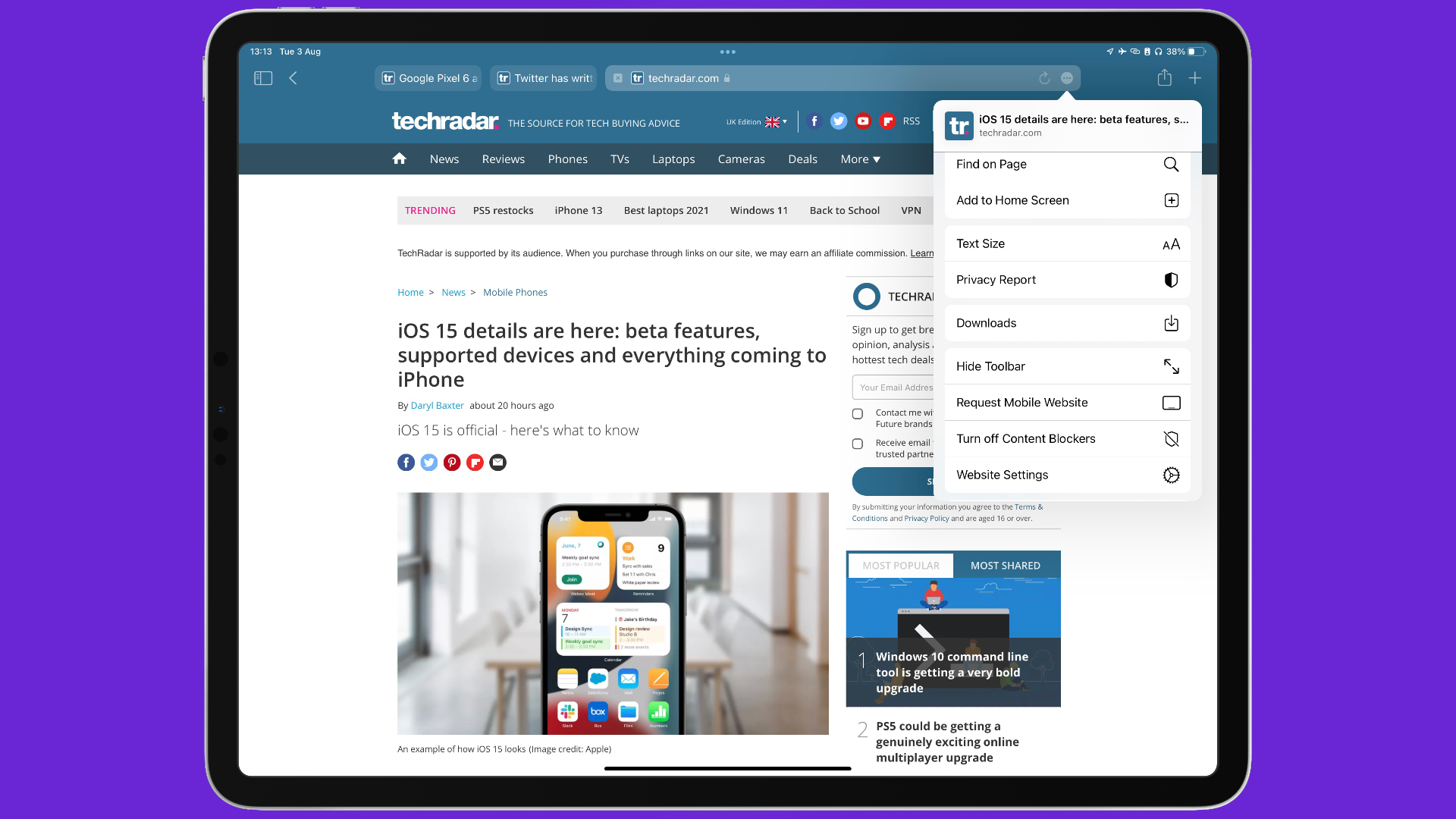
After years of seeing incremental updates, this year saw a huge redesign where tabs are beside the address bar, while being able to group them so you can go back to them when needed.
However, there’s a difference between an idea that sounds good, and when it’s used in the real world. The same seems to be occurring here, where testers have expressed their frustrations, to the point where Apple are constantly improving Safari’s new design further in the latest beta releases.
Looking at Apple’s other apps, it seems as though the company is missing a trick that could make everyone happy, thanks to a blogger who pointed this out.
- Our pick of the best iPhone deals in August 2021
- We spoke to the creator of Fitness Totals for iOS
- Everything we know about the iPhone 13 so far
A Safari Expedition
It may surprise you to know, but Safari was not the first browser from Apple for macOS. It began with Internet Explorer back in 1996, when Apple was on the ropes. It wasn’t until 2003 that Safari was unveiled, developed under huge secrecy by the company, which would allow users to use the web how Apple wanted to, with a great design, great security, and front-facing features that could work well in-tandem with Mac OS X at the time.
Fast forward to the present, and Safari is in its fourteenth version, alongside being available for iOS, iPadOS, and up to a point, watchOS.
While the web browser was available on Windows for a certain number of years, it only started to be a prevalent force once it appeared on the iPhone back in 2007. A web browser that was made for desktop browsing, compared to what other mobile PC browsers offered back then on Windows Mobile and Nokia E73 devices, was revolutionary.
Get daily insight, inspiration and deals in your inbox
Sign up for breaking news, reviews, opinion, top tech deals, and more.

As times changed, competitors such as Opera and Firefox offered features that extended the function of a web browser further with VPN and messaging apps built in. But across the board, web browsers are at a point where we can play Xbox games on them, on our iPads or Chromebooks.
Which brings us to WWDC this year and Apple’s redesign of Safari. Many videos are still on the developer site that showcase the new tab function that stays alongside the address bar. However, as the public betas for Apple’s software became available, more users would start to use Safari through their daily lives, and certain annoyances would become much louder.
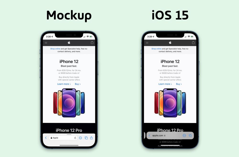
Especially on iOS, the address bar has moved to the bottom instead, making it easier for your thumb to type in a new website when needed. Alongside this, reload, share, add to favorites have all been relegated to a ‘more’ menu, increasing the amount of presses compared to iOS 14.
While recent beta versions have been trying to meet halfway with what came before and to what Safari is meant to be for iOS 15 and macOS 12 Monterey, there’s still progress to be made.
If you enable the standard tab bar design in iPadOS 15 beta 4 (left), you actually *lose* a few vertical pixels compared to iPadOS 14.In return, you get tabs that are *much* harder to parse at a glance. Just look at the active tab.So I ask: why is this redesign necessary? 🤔 pic.twitter.com/1WGpOKD9jTJuly 29, 2021
Some have been very vocal on how this design is a step too far from Apple - that it wasn’t needed, that it looks as though it was created in a week, like a task from The Apprentice.
However, this is why test versions of software exist.
Beta is beta for a reason
Safari is an app that’s used by Apple gadget owners almost-daily - if it’s something that’s been created by Apple, most will use it because of the brand name alone. However, a design as major as the one in recent betas does have a danger of making users switch to an alternative web browser.
If software makers don’t try out new ways that shock users and give them a new way of interacting with an app, then it renders a beta period pointless.
But the Apple community are an enthusiastic group, and can offer their own ideas for what future versions of software could be capable of. Which is why I refer to Matt Birchler’s fantastic idea for having Safari taking inspiration from the Maps app as an example here.

The user interface of Maps allows you to bring up more options by simply swiping upwards, allowing you to view favorite locations and Editor Picks for certain locations. Matt has expanded on this by showing how this gesture in Safari could be used to intuitively display your bookmarks and tabs open on your other Apple devices, without having to press another button, or try to press a link on a web page while the address bar was in the way.
It’s something so simple but from his images, it could work incredibly well. It does bring into question the design languages between the teams of Maps and Safari, but if there was some cohesion between the apps, it could benefit a casual user if they saw the same user interface in Safari as well, seeing familiarity between the two.

However, we are still in beta season. As past releases in recent years have gone, we usually see beta releases go up to eight or nine versions before we see a final release. We are most likely going to see even more refinements to Safari soon. But with beta 4 still fresh in many user’s minds, there’s still a possibility we are yet to see the final version of Safari that satisfies everyone with a new design.
For me, I have every faith that this design is the right path, and will be refined to a version that everyone will be looking forward to using once iOS 15 is released to the public.

Daryl had been freelancing for 3 years before joining TechRadar, now reporting on everything software-related. In his spare time, he's written a book, 'The Making of Tomb Raider'. His second book, '50 Years of Boss Fights', came out in 2024, with a third book coming in 2026. He also has a newsletter called 'Springboard'. He's usually found playing games old and new on his Steam Deck, Nintendo Switch, and MacBook Pro. If you have a story about an updated app, one that's about to launch, or just anything Software-related, drop him a line.