Why now is the time for Apple to bring Android-like features to iPhones
Opinion: Android fans are going to have something to say...

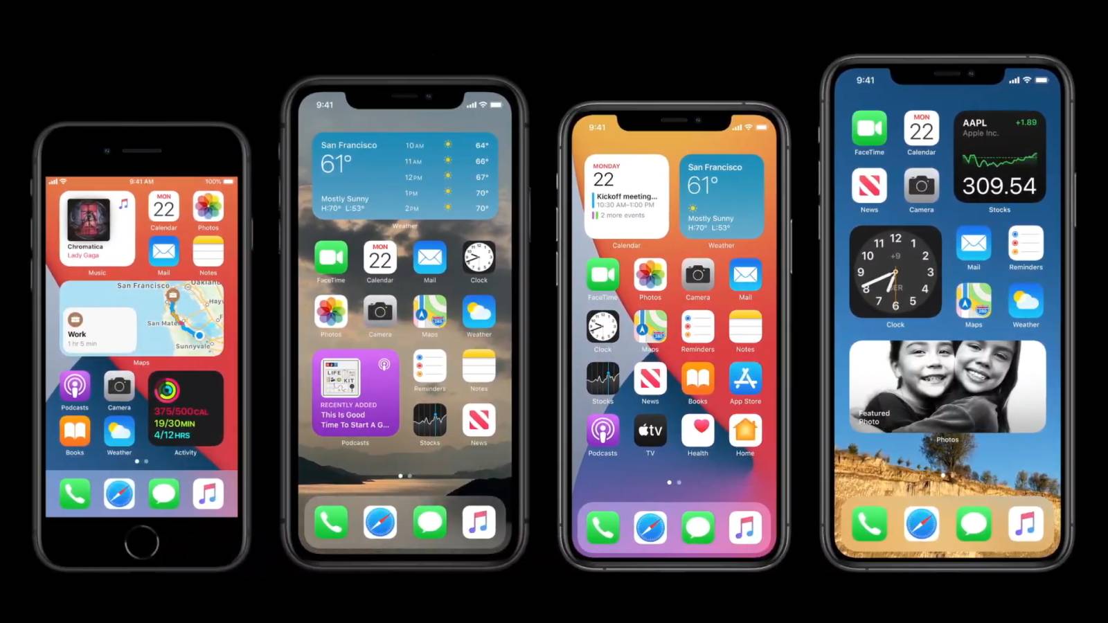
Apple's launch of iOS 14 might seem like it's just a few new additions to the home screen, but for anyone who's been following the ongoing 'iPhone vs Android' debate, this is huge.
Adding widgets, a picture-in-picture mode, and the ability to delete entire home screens might not seem particularly groundbreaking, but it's actually a big change in terms of the way people are used to using their iPhones - and it represents a (necessary) change for Apple.
- iOS 14 release date, beta, features and supported iPhones
- iPadOS 14 release date, features and compatibility details
- watchOS 7 release date, features and supported Apple Watches
If you go back to the early days of smartphones at the turn of the last decade, the iPhone home screen was a simple grid of apps with limited scope for users to change things too much, where Android catered to the user who wanted to customize their experience fully.
If you wanted to be negative about it, the iPhone layout was boring and Android overly complex.
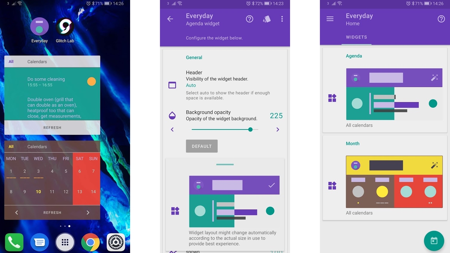
With iOS 14 though, Apple is removing one of the obstacles it put in the part of users who wanted to customize their iPhone experience. Yes, there are still plenty of barriers in place to stop you tinkering with your iPhone too much, but by allowing widgets in the app grid... well, iOS is now looking an awful lot like Android did a few years ago.
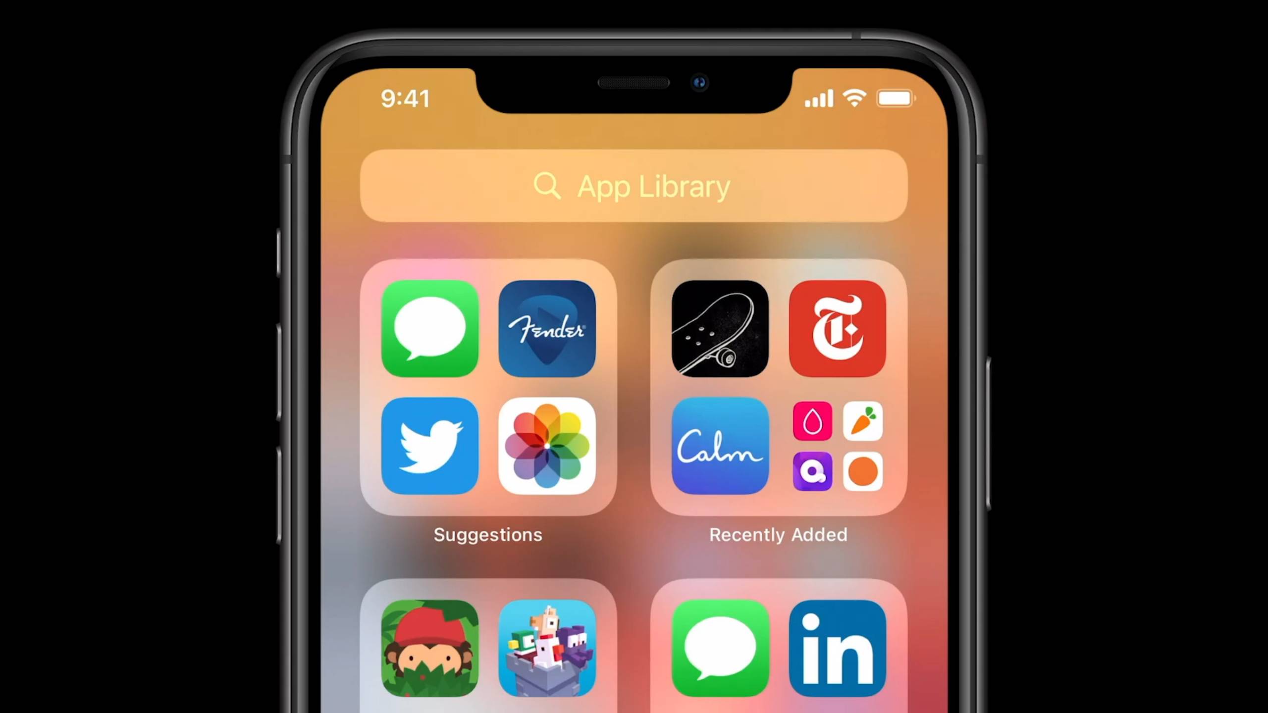
Where once you had a wall of app squares, now you've got widgets mixed in with the apps - and you can even delete whole home screens and still find all your apps in the Library at the end of all the screens... you know, a little like the app drawer that Android phones have used for years.
Apple clearly believes that the world is only now looking for more from its smartphones - that streamlined simplicity is no longer enough. That richer, more detailed information can’t be contained to one side of the home screen (where previously all the widgets used to live); that users want to do more.
Get daily insight, inspiration and deals in your inbox
Sign up for breaking news, reviews, opinion, top tech deals, and more.
By embedding widgets of customizable size and detail into the app grid, Apple is adopting one of the fundamental features that has made Android such fun to play with - and you have to wonder why it took so long.
Even things like the new App Clips, small, under-10MB versions of the apps that you can access quickly in specific scenarios are similar (if not quite identical) to Google’s Instant Apps - it's impossible to look at the new version of iOS and not see a path already trodden.
Does being first matter?

While Android users may be crowing about Apple only now including features they've had on their phones for a long time, Apple will argue that now the time is right to offer users more customization options.
Apple has built its smartphone reputation on bringing in features at a time it thinks is right. It claimed that it held off launching a smartphone with an OLED display - something Samsung had been offering for years - until the technology was capable of delivering what it wanted to offer users.
Its Live Photos feature, when launched in 2015, felt very similar to the HTC Zoe functionality that never took off on handsets like the HTC One M8. But, rather than being a complicated separate app, Live Photos still exist prominently within the camera app, and are a nice touch that users seem to appreciate.
Apple could easily say that these additions are just the culmination of larger screens, more power and a maturing smartphone audience, and that it's mimicking the powerful features its users love on the iPad and Mac.
(Actually, I still can’t see picture-in-picture video playback ever being a useful feature on a smartphone. Samsung tried to do it all the way back in 2012 on the Galaxy S3, and it was too much clutter on the home screen. FaceTime video chat while browsing - that I can get on board with. But it feels like the ability to watch a movie or sports game while doing something else on the phone will just overload users’ brains).
A necessary dice roll
Like any brand that changes a familiar system, Apple is gambling by shuffling the home screen layout options. Sure, there’s no obligation to use these widgets - they’re still going to live to the left of the home screen by default, so if users so wish, the grids are going to be just like they always were.

But Apple’s reputation for simplicity is under threat here - the distinction between widgets on one side and apps on the other is something many users are perfectly happy with, and drip-feeding them changes is likely why it's taken Apple so long to follow Android's lead.
And to all the Android users who are posting astonished reactions on Twitter that Apple has launched something that offers so many features they've been used to for years - this is a good thing. When Apple makes a big deal about new features, the non-enthusiast smartphone user will suddenly become aware of them.
As when Apple embraced wireless charging, and suddenly wireless pads were far more widely available, developers will suddenly be energized to come up with smarter and more useful widgets for both platforms.
Android smartphone manufacturers may also be prompted to get more creative with user interfaces to offer something extra to those users who crave more, rather than inexorably drifting towards a standard grid layout.
In essence, Apple has just paid Android the biggest compliment it could - now let's see where this takes the smartphone world.

Gareth has been part of the consumer technology world in a career spanning three decades. He started life as a staff writer on the fledgling TechRadar, and has grew with the site (primarily as phones, tablets and wearables editor) until becoming Global Editor in Chief in 2018. Gareth has written over 4,000 articles for TechRadar, has contributed expert insight to a number of other publications, chaired panels on zeitgeist technologies, presented at the Gadget Show Live as well as representing the brand on TV and radio for multiple channels including Sky, BBC, ITV and Al-Jazeera. Passionate about fitness, he can bore anyone rigid about stress management, sleep tracking, heart rate variance as well as bemoaning something about the latest iPhone, Galaxy or OLED TV.