New Google logo: 5 reasons the change makes sense
Here's why the Google logo font changed today
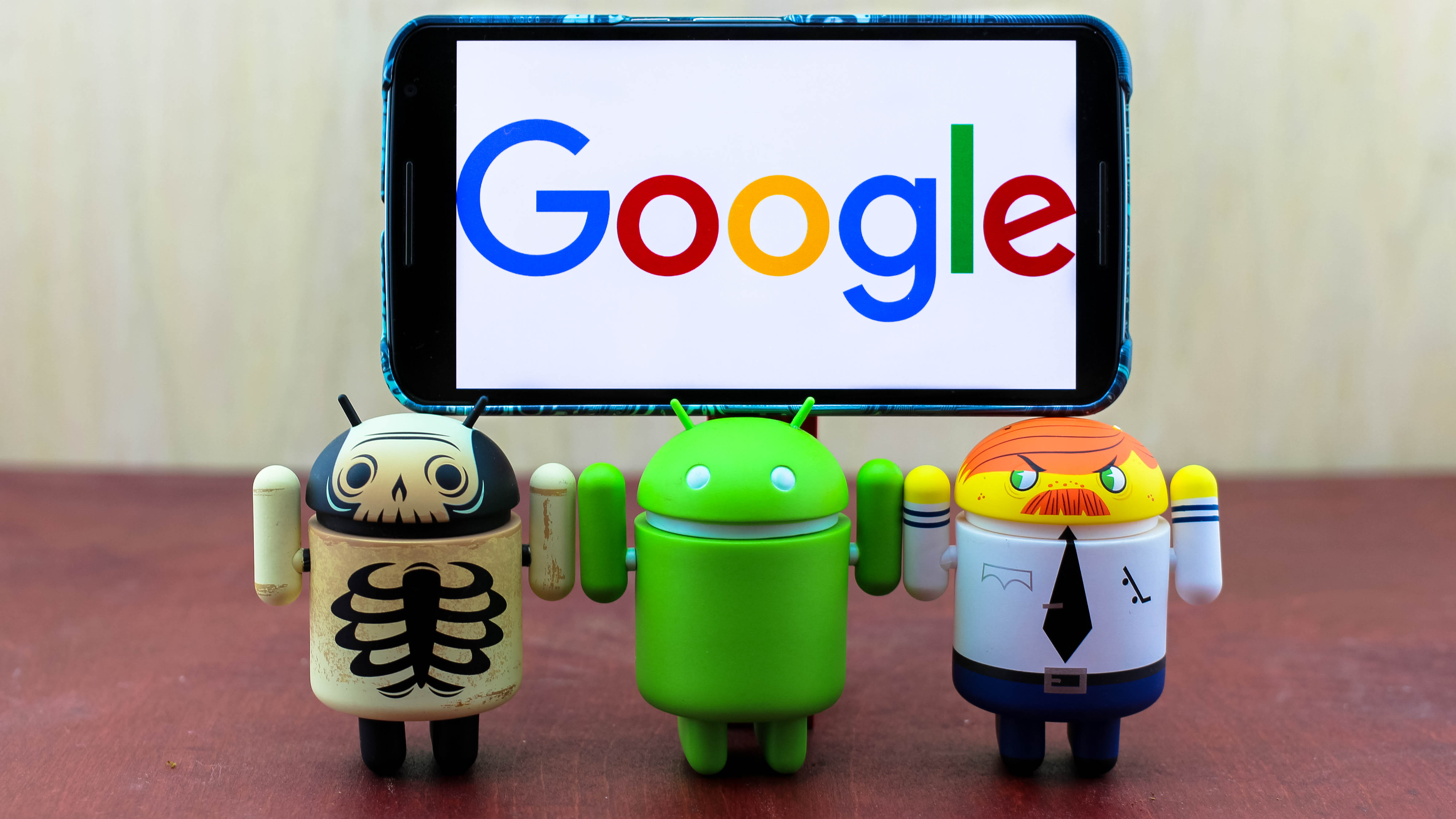
The new Google logo that was announced today reflects the fact that the search engine giant is going through a number of dramatic changes.
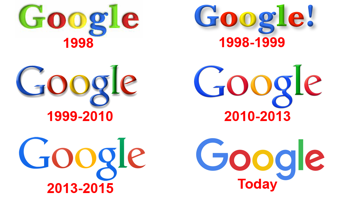
At first, the new font was a little unsettling. It's the most dramatic reshaping of the Google logo since 1999, when its six letters ended in a very Yahoo-like exclamation point.
But, as the day wore, on the new logo began to make more sense. That's important because it's the first thing everyone sees when trying to answer all of their burning questions.
Here are the reasons the new Google logo makes sense, even if it look does like a childish drawing.
1. The new Google logo. Simplified.
It's no coincidence that the new Google logo comes at a time when the Mountain View company is being restructured into Alphabet, the tech firm's new conglomerate.
Founders Larry Page and Sergey Brin have pulled several divisions and projects from Google, Inc., and made them subsidiaries of Alphabet instead.
Reflects a slimmer Google portfolio.
Get daily insight, inspiration and deals in your inbox
Sign up for breaking news, reviews, opinion, top tech deals, and more.
The result is a slimmer Google portfolio, one with more focus on Search, Android, Chrome, Maps and YouTube. It's now separated from Fiber, Calico and Google Life Sciences.
The new logo is as simple as ABC123. It easy to draw and easy to see and, has less style, but more substance, as I'll explain.
2. Cross-platform logo
Google is everywhere, according to the company's head of user experience, Tamar Yehoshua. That didn't used to be the case 17 years ago when everyone was glued to a desktop PC.
The search engine is now integrated into some of the best phones, tablets, TVs, smartwatches and cars, in addition to computers. Its new looks fits on "even on the tiniest screens," wrote Yehoshua.
It's brand is further simplified when Google's microphone logo pops up, with a colorful mic icon, or when animated dots bounce around any time it's thinking.
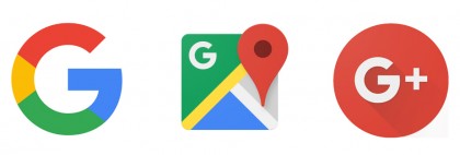
The single-letter favorite icon has also changed to multi-colored logo in the browser tab. Even with limited space, Google is working its colorful branding into every corner.
3. Material Design to a whole new level
Google has been pushing its geometry-focused Material Design language since Google IO 2014 and Android 5.0 Lollipop launch a year ago, and the new logo fully realizes that.
It's flat, nothing special, and gets its six-character point across with simple strokes, just like the rest of Google's interface of polymer paper elements.
What's more, Google has already refreshed the logos of many of its products and services today. Maps, Translate and News have the white insignia in the corner of their respective logos, and Google+ is donning the new G, despite its depreciation.
4. Non-threatening
Google is on doing the most meaningful work in tech right now, according to its advocates, or building a self-aware SkyNet bent, according to its critics.
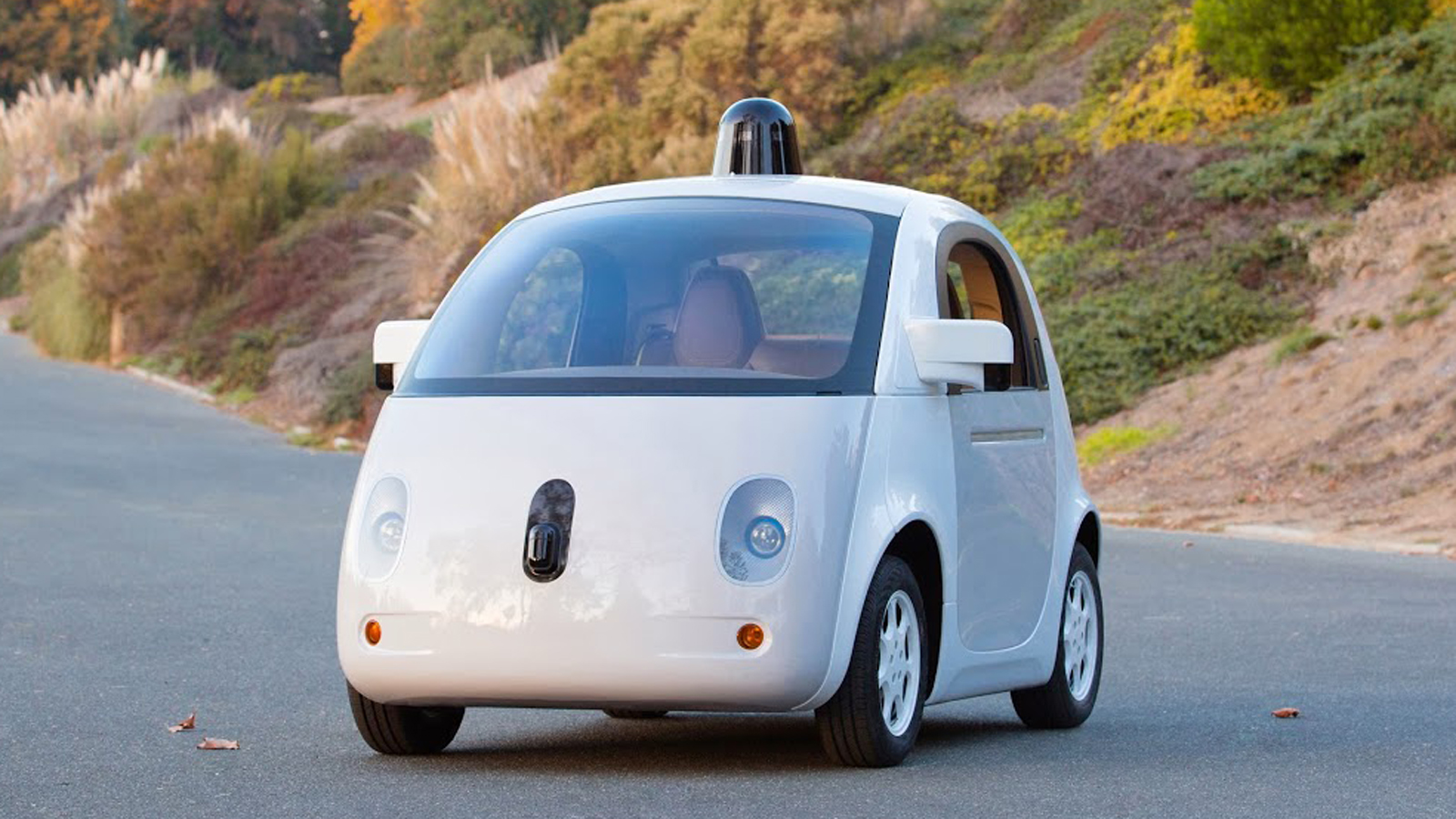
How could something so friendly ever produce a Terminator?
That childish new logo, with bright colors, really contrasts with that dark and menacing analysis that alarmists have of the robot-making company. How could something so friendly ever produce a Terminator?
The self-driving Google car takes the same approach, replacing Google's old autonomous vehicles with really cute prototypes that resemble a cartoon koala bear. Completely non-threatening.
5. The new logo bytes less
Gone along with the serifed typeface are the large file sizes associated with older logo. There's now a special variant that's 305 bytes instead of 14,000 bytes.
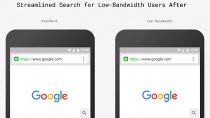
Reaching the next billion people.
That may seem like a small change, when we measure our mobile bandwidth in gigabytes, but not everyone around the world has the same data plan at affordable rates.
Reaching the next billion people, especially in India and China, in something the company spent a lot of time on at Google IO 2015. It's clear that the new logo is part of that plan.
