YouTube debuts new logo and a redesign — here's what's changed
Google's video platform changes up its look

From music to live TV, YouTube has come a long way in the twelve years since it launched.
And as Google's streaming platform continues to grow past being a place to watch endless cat videos, the service is announcing significant aesthetic changes and new features are on the way.
Starting today, YouTube is rolling out changes to its user interface, along with a new logo designed to keep the 'tube brand legible across both desktop and mobile.
On the mobile side, YouTube will now support vertical video, giving viewers a full-screen view without having to turn their devices sideways or deal with giant black bars on the side.

Additionally, tabs for navigation and perusing content have also been re-arranged to make finding your favorite videos easier.
For those who enjoy YouTube on desktop, the ability to control the playback speed of your video is also coming to mobile — a boon for those who may want to crunch an hour-long lecture video into a 30-minute crash course.
Speaking of desktop, the non-mobile version of YouTube is also getting a Material Design makeover for an overall cleaner, smoother look.
Get daily insight, inspiration and deals in your inbox
Sign up for breaking news, reviews, opinion, top tech deals, and more.
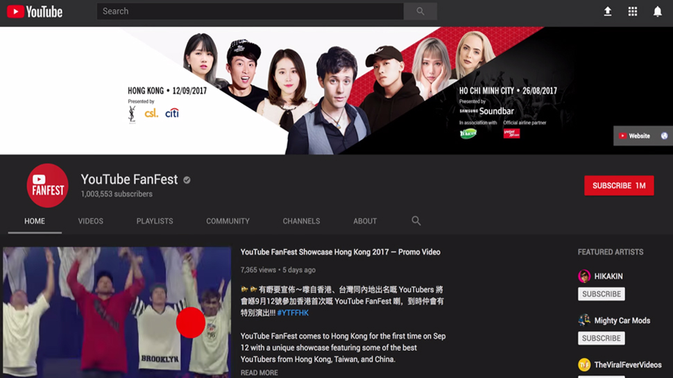
One way overdue bonus of this new design is the "Dark Theme," which turns the stark white background of the desktop site a dark shade of grey.
While YouTube claims this creates a more "cinematic" experience, we just appreciate being able to cut down eyestrain from the searing white light whenever a friend sends us a must-see YouTube link late at night.
You can see exactly how YouTube will change for mobile and desktop (to include a peek at Dark Theme in action) in the video below:
