Apex Legends Mobile has learned a great lesson from Call of Duty Mobile
But also has a stumble
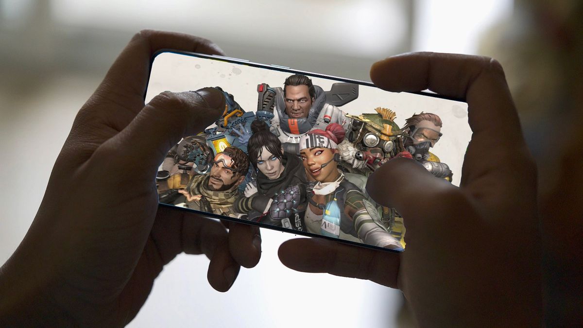
I'm enjoying my time with the newly-launched Apex Legends Mobile, a fact that's partly thanks to my appreciation for big online mobile games like this, and partly because I spent a good year obsessed with the console version.
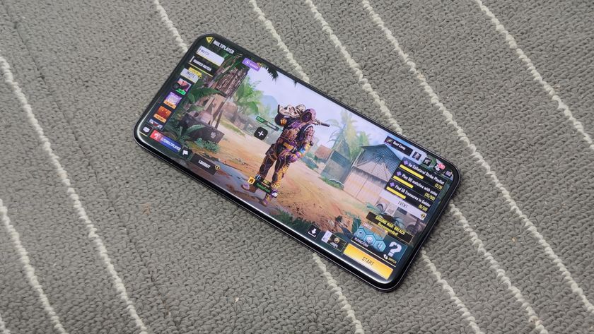
But I particularly like it because it's learned one key thing from mobile gaming juggernaut Call of Duty Mobile, which has a feature that's so useful that it's now the basis I use to judge other similar mobile games.
I'm talking about one small aspect of the control scheme - and while Apex Legends Mobile doesn't have the most intuitive controls of any of its rivals, there's one small thing it does really well.
The single-button approach
Mobile phones are a little fiddlier to use to control games than a typical console controller, as the buttons are all on the screen, so you basically have to rely on your thumbs to do most of the action (unless you've got very nimble fingers).
Since shooter games like Apex and CoD have the same key functions, all mobile shooters ended up having a near-identical control scheme. You could swipe around on the right half of the screen to look around and on the left half to move around; tap on a button on the left side to aim your gun, tap on the right to shoot.
This scheme worked, with PUBG Mobile being a key example of it in action, but it makes the myriad other functions a little more fiddly. If you wanted to duck or stand up, lay down, use a healing item, change weapons, equip a grenade or anything else, you had to move your hands - this meant you couldn't do them while aiming and firing. Plus, if you wanted to move or look around while aiming, you had a tough time ahead of you.
Call of Duty simplified this in a small but key way - when you press the shoot button, you automatically aim too. This cuts out the slight amount of time that it took to press the two separate buttons, which in a frantic shooter game can mean the difference between winning and losing.
Get daily insight, inspiration and deals in your inbox
Sign up for breaking news, reviews, opinion, top tech deals, and more.
With this small feature, CoD became my go-to mobile game when I wanted this kind of gameplay - the entire gameplay felt just that little bit smoother and more intuitive, and it was hard to play PUBG after that.
Thankfully, Apex Legends Mobile copies this feature, and it makes the gameplay feel just as frantic and fast-paced as for the non-mobile version.
But while Apex is super fun, partly because of this feature, it does stumble at another thing that's afflicted mobile shooters, that Call of Duty was much better at - and that's the rest of the controls.
Too many buttons
While Call of Duty Mobile was inspired by the main-line Call of Duty games, Apex Legends Mobile is a direct port of the console and PC game, meaning it needs to be more faithful to the existing controls and features. The base game has loads of nuanced tricks, including for things like sliding and using Ultimate abilities, that don't fit well on a small mobile screen.
The touch controls section of the screen is cluttered, with loads of different icons for different things, and it makes it harder to remember what does what. Which button do I press to slide down a hill? Can I remember to press the 'duck' button instead of the 'reload' one? Lots of the time I end up mashing the wrong icon, or having to remember which did what.

The Ping system is a key example. On console and PC, this is a great way to easily point out features to a team-mate - you can ping distant enemies, useful loot items in boxes, areas to attack or defend. However with fiddly touch controls on mobile, I always struggle to know what the ping button will do - and sometimes things are pinged when I don't even mean them to be.
The same can be said about picking up objects - sometimes you'll pick them up automatically, sometimes you won't, sometimes you can't pick up items at all even if you need them and have storage space, and I can't work out a rhyme or reason why.
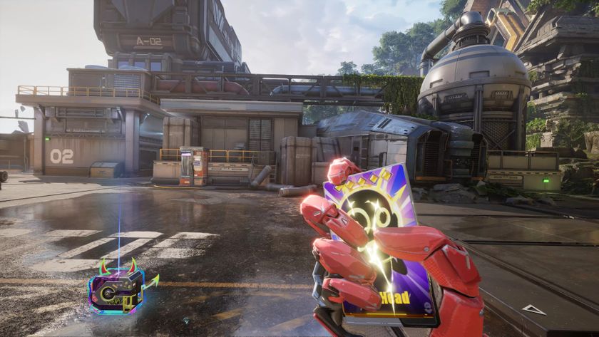
A great example is for the boxes that drop when players get killed - these let you pick up whatever gear they were carrying, which is often the best way to upgrade your own weapons and restock on ammo. In Apex Mobile, sometimes you automatically collect everything in the box that's applicable to you just by moving near, but sometimes you need to press a tiny button on the display to start the process - and sometimes you need to individually pick out which items you want, and this latter option is really time-consuming.
Bear in mind, I'm not some newbie playing their first mobile game - I've played loads, as it's literally part of my job. Apex Mobile can be a little convoluted, then.
Apex Legends is far from the first mobile game to face the 'too-many-controls' problem, and I faced it recently with PUBG: New State, which put me off playing the thing. Thankfully the easy shooting controls make up for the confusion, but I feel some really easy tweaks would make the game much more fun to play.
That's not to say this is a bad game - in fact, I'm having a lot of fun, and it's one of the better mobile shooters I've played (and I've played many). But since I know I'm going to be spending hours playing the game, I'd love for it to make a little more sense.

Tom Bedford joined TechRadar in early 2019 as a staff writer, and left the team as deputy phones editor in late 2022 to work for entertainment site (and TR sister-site) What To Watch. He continues to contribute on a freelance basis for several sections including phones, audio and fitness.
