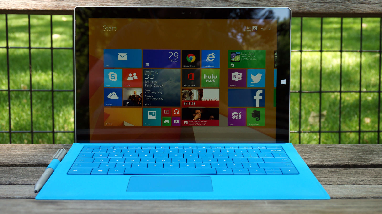
TechRadar Verdict
Not without its drawbacks, this is the brightest shining example of not only Microsoft's vision of a laptop-free future, but the entire laptop-tablet hybrid category.
Pros
- +
Sharp display and design
- +
Huge Type Cover upgrade
- +
Can truly do both
Cons
- -
OK battery life
- -
Runs hot at times
- -
Type Cover still optional
Why you can trust TechRadar
Knock it for the Windows 8 launch. Lay into it for how it debuted the original Xbox One. But, when it comes to the Surface Pro 3, don't pull out the torches and pitchforks just yet – Microsoft is onto something here.
Over the past few years, the Redmond, Wash. Windows maker has proved to be one of the bolder technology companies, for better or worse. Microsoft clearly isn't scared of falling on its face in the hope of landing on what in the world tech users want next in this turbulent industry, and the Surface Pro 3 is – well, it just might be an exception.
The company has hammered away at what it considers is a problem with tablets for years. Since the launch of the Surface Pro, Microsoft has sought after the ultimate mobile computing device, one that could usurp the laptop with a tablet-first approach.
All five versions of the Surface Pro 3 are available now in the US, UK and Australia. They are: 64GB / Intel Core i3 ($799); 128GB / Core i3 ($899); 128GB / Core i5 ($999), 256GB / Core-i5 ($1,299), 256GB / Core i7 ($1,549) and 512GB / Core i7 ($1,949).
It's also available in many more countries, including 25 new markets for the first time.
The Surface Pro 3 is closer than Microsoft has ever been to making good on its mobile computing vision. After over a week with the slate, I'd go so far as to say that the Pro 3 is closer than any laptop-tablet hybrid released yet.
Microsoft was so sure of itself that not only did it directly compare the Pro 3 to Apple's iPad Air and 13-inch MacBook Air, it gave members of the press pre-release Surface Pro 3 units during an announcement event in New York. Sure, the units have bugs as of this review, but who cares?
"I forced the giving away of the device, just so you're aware," Surface team lead Panos Panay told me just after the reveal. "I said, 'You know what? I want the product in people's hands.' 'But the bugs are still there. They're not all done until June 20, until it's on market.' I don't care. The purity of the device is still true, and on June 20 there will be more drops."
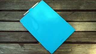
One look at the thing might explain Panay's eagerness to get the Surface Pro 3. It's no iPad Air, that's for sure, but the iPad Air isn't packing a 12-inch display.
Recent developments
Going on three years now, the Surface Pro 3 is by no means obsolete, though it is much harder to come by. That’s because, back in February, the Surface Pro 3 was actually removed from the Microsoft Store online.
The silver lining is that there’s plenty to look forward to from Microsoft in the near future. Seemingly a follow-up to the gone-but-not-forgotten Windows RT, long-time tipster Mary Jo Foley of ZDNet has suggested that a lightweight Windows 10 Cloud is in the works.
Set to take on Google’s Chromebook line, Windows 10 Cloud is expected to be revealed at the #MicrosoftEDU event on May 2 in New York City. We can’t say for certain what we’ll see on that day, but as Microsoft teased on our invite, we can safely anticipate to “Learn what’s next.”
Design
Yes, Microsoft bumped the Surface Pro touchscreen from a tiny 10.6 inches to a far roomier 12 inches. In the process, the pixel count has been upped from 1920 x 1080 to 2160 x 1440 The result is a modest boost in pixels per inch – 207 ppi to 216 ppi – given the increase in screen real estate.
More important is Microsoft's interesting choice in aspect ratio. Rather than sticking with the Pro 2's 16:9 or glomming onto the iPad's 4:3, the firm went with a 3:2 aspect ratio. The company claims that, with this aspect ratio, this 12-inch screen can actually display more content than the MacBook Air's 13.3-inch panel at 16:10. The move was also made to make the tablet feel more like your average notepad when held in portrait orientation.
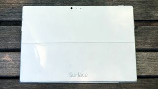
Wrapped in a bright, silver-colored magnesium shell that's cool and smooth to the touch, the Surface Pro 3 feels premium in every regard. The tablet keeps the trapezoidal shape of its predecessors, but manages to come in both thinner and lighter than before. Plus, the tablet's upper half is beset by vents on its edges to better dissipate heat pushed out by its fan.
Microsoft also moved the Windows home button to the device's left side of its silky smooth – though, rather thick – glass bezel. This way, it appears on the bottom of the slate while held upright, calling out, 'Hey, hold it this way now.' While it's no doubt the lightest Surface Pro yet, I'm not sure whether I could hold onto it for an entire subway ride home.
Adorning both sides of the Pro 3 are 5MP cameras capable of 1080p video recording. While stills on either shooter won't blow you away, the front-facing lens should do just fine for Skype and the weekly video meeting over VPN.
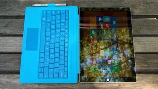
This Surface isn't without its sidekick(s)
A tablet wouldn't be much of a laptop replacement without a keyboard, and the Surface Pro keyboard was in desperate need of a boost. Luckily, Microsoft sent the Type Cover back to the drawing board, and what came back is the best version yet. From keys with deeper travel and stronger feedback to a wider glass trackpad that actually clicks, nothing was off the table.
But the most important improvement is the brand new double hinge. Equipped with a strong magnet that latches onto the Pro 3's lower bezel, the Type Cover can now rest with just a portion of it touching your lap or desk. This proved to make writing on my lap much more stable than with previous Surface devices. (Plus, the plush cover comes in five colors: red, blue, cyan, black and purple.)
Tucked beside the Type Cover is also the newly improved Surface Pen. Microsoft made a point of calling its stylus that, because the firm wants it to be seen as and feel like the writing instrument we've all grown up with. With an aluminum finish and a useful clicker up top, the Surface Pen is weighted to better feel like a pen. Using Bluetooth and powered by N-trig, the stylus tracks closer to its physical position than ever before, thanks to some major improvements to the Surface screen.
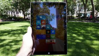
The new Surface Pro 3 unarguably has the look and feel of a premium product, so it only deserves to be stacked up against the most luxuriously built tablet and laptop around.
Adobe launched major updates to two of its classic design applications in March. Called Touch Workspace, the apps are available now free of charge to existing Creative Cloud subscribers and Surface Pro 3 owners with the latest versions of Adobe Illustrator CC 2014 and Adobe Photoshop CC 2014 installed. The apps feature a streamlined design user interface that makes it more responsive to fingertips, while optimizing a number of new or existing software tools with touch interaction in mind.
First reviewed: May 2014
Gabe Carey has also contributed to this review
Joe Osborne is the Senior Technology Editor at Insider Inc. His role is to leads the technology coverage team for the Business Insider Shopping team, facilitating expert reviews, comprehensive buying guides, snap deals news and more. Previously, Joe was TechRadar's US computing editor, leading reviews of everything from gaming PCs to internal components and accessories. In his spare time, Joe is a renowned Dungeons and Dragons dungeon master – and arguably the nicest man in tech.
