Early Verdict
A neat watch from Pebble, but we expected more of an upgrade. If you're into notifications and some simple apps you'll enjoy this watch, and especially the price, but ultimately it feels like a very minor refresh of the first Pebble.
Pros
- +
Low price
- +
Excellent battery
- +
Fun interface
Cons
- -
Too simplistic
- -
No GPS
- -
Plastic design
Why you can trust TechRadar
We've had the Pebble 2 in our testing labs for a few days, but we're not quite ready to bring you the full review just yet - stay tuned as we'll give you the full rundown of this updated classic smartwatch shortly!
The Pebble 2 doesn't add much from the original Pebble watch at all - if you're an owner of the first model, you probably won't get much here.
The key differences are in the size, where it's lighter and thinner than the original, and on the rear where the heart rate monitor now resides.
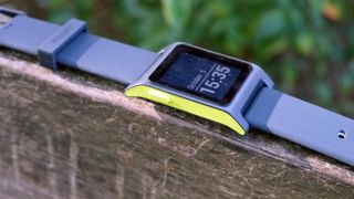
The new Pebble 2 also comes with a faster processor inside too, making it a littler snappier when prodding the buttons around, but at first glance you'll really struggle to tell this is an all-new model.
Pebble 2 price and release date
The Pebble 2 is available to order now, with the Pebble 2 with heart rate costing £99.99 / $129.99 - and if you want to shed the pulse tracker on the rear, then you're only going to have to pay £79.99 / $99.99.
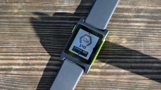
The watch is also water resistant, so isn't too bad for swimming or just generally larking about in the shower - you can even get the old Pebble Classic for the same cost as the new Pebble 2 without heart rate… perhaps not worth it.
Design and screen
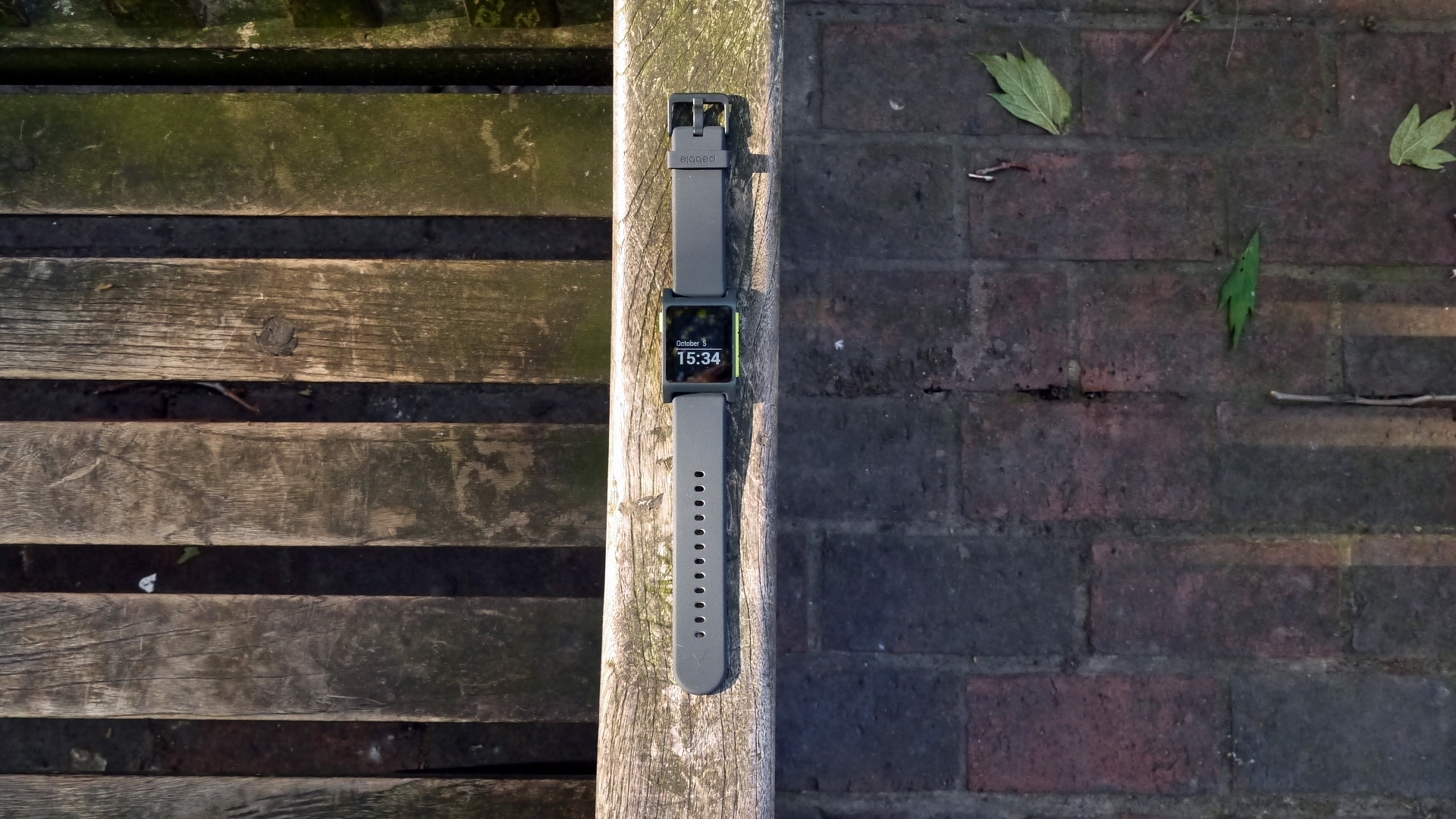
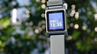
The Pebble 2 has a very familiar feel to it, with the same 1.25-inch e-ink screen that made the first model so famous back once more (OK, it's actually 1.26-inch on the first Pebble, but let's not split hairs.
The display is clear and readable in bright sunlight thanks to its reflective nature, and the backlight is clear and bright, although you have to tap the screen to light it up rather than just tilting your wrist like on other watches.
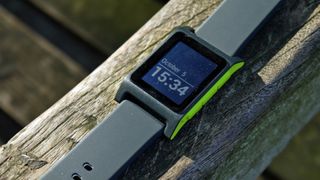
However, it's not high resolution and the lack of color grates in 2016 - it's easy to read, but it certainly doesn't feel premium.
This is useful for the cinema, where the Apple Watch will glow like a beacon multiple times when you're watching Ghostbusters for the eighth time.
The buttons on the side still feel very plastic and cheap - you aren't paying a huge amount of this smartwatch, but then again it still feels like it's not quite living up to the price tag.
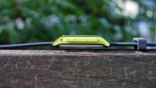
The return button in the top left is OK to find, but the three buttons on the right-hand side are a bit grouped together and hard to differentiate under the thumb, without a solid give.
We had the gray and luminous watch on test, and we liked the attractive colour combo - it looks great and sporty.
It's impressive that Pebble has made the Pebble 2 thinner than the original, given there's a heart rate monitor on the back - combined with the same long battery life, those are two of the main things this smartwatch has going for it.

So, what does the Pebble 2 actually offer in today's smartwatch-powered world? Well, it's got all the normal capabilities you'd associate with a wrist extension of your phone, namely notifications and the ability to track your workouts.
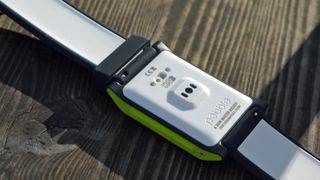
The latter isn't that impressive given the lack of GPS onboard, although for the cost you wouldn't really expect it.
Interface
The interface is clean and crisp on the e-ink screen - and after a while it does start to make sense. The Pebble Health elements, above the main watchface, live above and your timeline, which is mostly populated by the calendar, is below.
A press on the central button will take you to the pseudo app drawer, where you can check the weather, catch up on notifications, control music or start a workout.
It's all simple and easy to remember after you've played with it for a while, but it doesn't feel overly intuitive from the outset.
Some things still need a bit of work as well, with elements like the music player requiring a double tap to pause (and this can be hard to remember to do as it's not a natural movement) and the weather app is just a bit simple.
But then again, that's now what this cheap smartwatch is about - it's designed to have a mega-long battery that will go days and days without needing a charge, and giving you updates discreetly without costing the world.
The eight-bit style graphics straddle the line between charming and childish, with the animations helping it err slightly on the former.
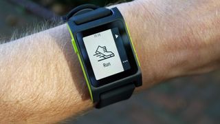
But make no mistake: this is no dress watch, and you'll need to upgrade to the steel versions if you want to pretend that this is a viable alternative to jewellery and not a proud proclamation of geek status.
Early verdict
It's hard to understand why Pebble is only offering minor updates with the Pebble 2 - the heart rate monitor is a welcome addition, and the new Pebble timeline interface works much better than the UI that debuted on the first watch years ago.
But this is an uninspiring update at first glance, with the Pebble Health, notifications and general operation seeming rather rudimentary.
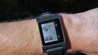
Maybe that's the kind of person this watch is aimed at, someone who likes the idea of a smartwatch for notifications, sleep-tracking and not having to drag their phone out of their pocket to switch tracks.
But in a world where the Samsung Gear S3 and Apple Watch 2 are sucking up the plaudits, we expected more from Pebble, despite the brilliantly low cost.
Perhaps more will reveal itself during testing, but right now this seems like a very minor update that is a bit much to be badged as a full sequel.

Gareth has been part of the consumer technology world in a career spanning three decades. He started life as a staff writer on the fledgling TechRadar, and has grew with the site (primarily as phones, tablets and wearables editor) until becoming Global Editor in Chief in 2018. Gareth has written over 4,000 articles for TechRadar, has contributed expert insight to a number of other publications, chaired panels on zeitgeist technologies, presented at the Gadget Show Live as well as representing the brand on TV and radio for multiple channels including Sky, BBC, ITV and Al-Jazeera. Passionate about fitness, he can bore anyone rigid about stress management, sleep tracking, heart rate variance as well as bemoaning something about the latest iPhone, Galaxy or OLED TV.
What is a hands on review?
Hands on reviews' are a journalist's first impressions of a piece of kit based on spending some time with it. It may be just a few moments, or a few hours. The important thing is we have been able to play with it ourselves and can give you some sense of what it's like to use, even if it's only an embryonic view. For more information, see TechRadar's Reviews Guarantee.
I tried Copilot Vision, and it could change how you use Windows forever
I took the rear-windowless Polestar 4 on a three-day road trip – here’s why ditching the back glass was a good (and bad) idea
This mini PC has a 7-inch display that can apparently run Windows and an AMD Ryzen 9 CPU, but there's even better options to be had
