I hope Samsung doesn't copy the worst iPhone 14 Pro feature
Samsung's always-on screen is better than Apple's

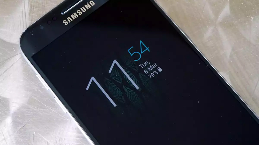
The first time I saw an always-on display was on a Samsung Galaxy S7. The phone was the pinnacle of Samsung’s glossy new metal-and-glass design, and the always-on display provided a sleek, useful effect that made the phone seem alive even while it was asleep.
Samsung is a leader in display-based features like the always-on display. Originally this was a simple clock, or a line of text, floating against a completely black background – now it’s a bit more robust. Made possible by Samsung’s AMOLED displays, the useful feature never made it to Apple’s iPhone until the most recent iPhone 14 Pro. On that phone, it’s a mess, as I’ll explain below.

Unfortunately, instead of sticking with its clean design and simple look, which works well, the latest beta update for Samsung’s One UI interface enables an always-on display that looks very much like Apple’s iOS 16 design. The One UI is included on all the best Samsung phones. While it’s certain that Samsung will provide numerous options, if the display defaults to an unreadable jumble that resembles the iPhone, it will turn people off enough that they will simply turn the feature off.
The killer feature for an always-on screen
Having an object always on display is a constant power drain, but Samsung’s OLED technology can completely deactivate a black pixel, reducing the power required. A clock, or maybe a simple drawing, can be shown without hitting the battery more than an extra 10% over the course of a day.
The always-on display doesn’t look like much, but it’s helpful. At night, I can read my phone as a bedside clock without needing to wake the screen. I can also … okay, really all I care about is the clock. Frankly, there are other uses for the always-on display, but the night clock is enough for me. I haven’t owned a bedside clock in years.
Apple didn't adopt the always-on feature, even when it started using OLED displays on its best iPhone devices. If you want to check the time on your iPhone at night, you need to turn on the screen and blast your sleepy face with light.
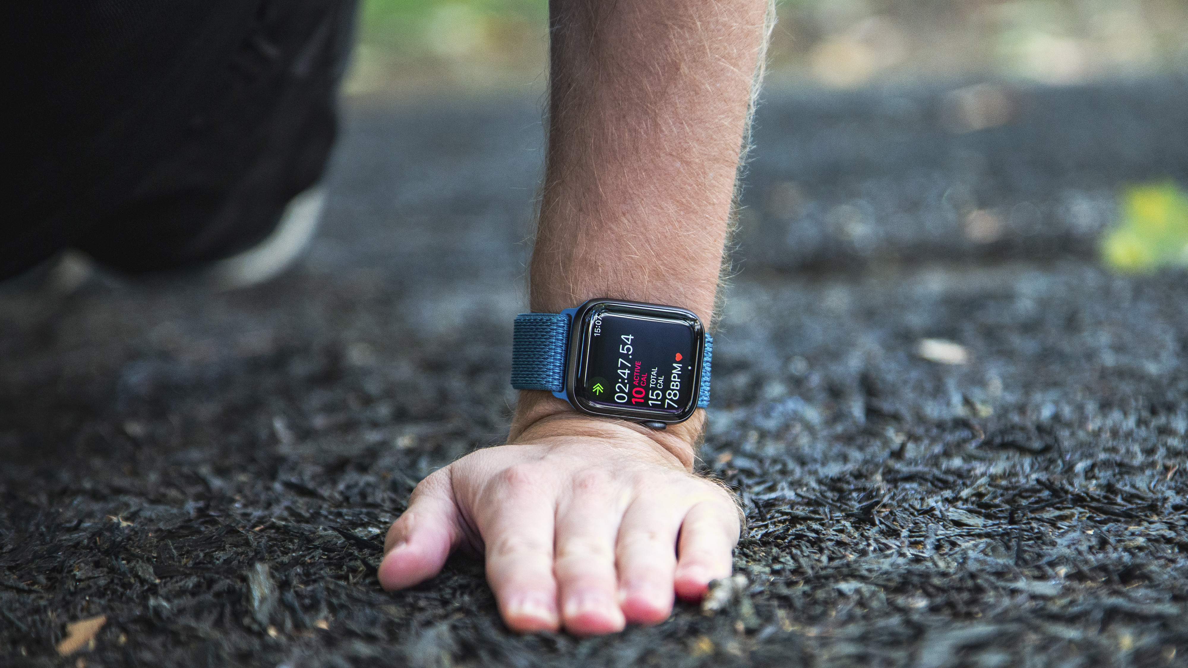
Along came the Apple Watch...
For the Apple Watch 4, Apple developed a display technology called LTPO (low-temperature Polycrystalline oxide) that can refresh itself at 1Hz per second instead of at 60Hz or more. This means the display uses a fraction of the power since every time a device refreshes the screen it drains more.
Phone makers started licensing the technology or copying the idea, but Apple never implemented it in a smartphone until the iPhone 14 Pro and iPhone 14 Pro Max.

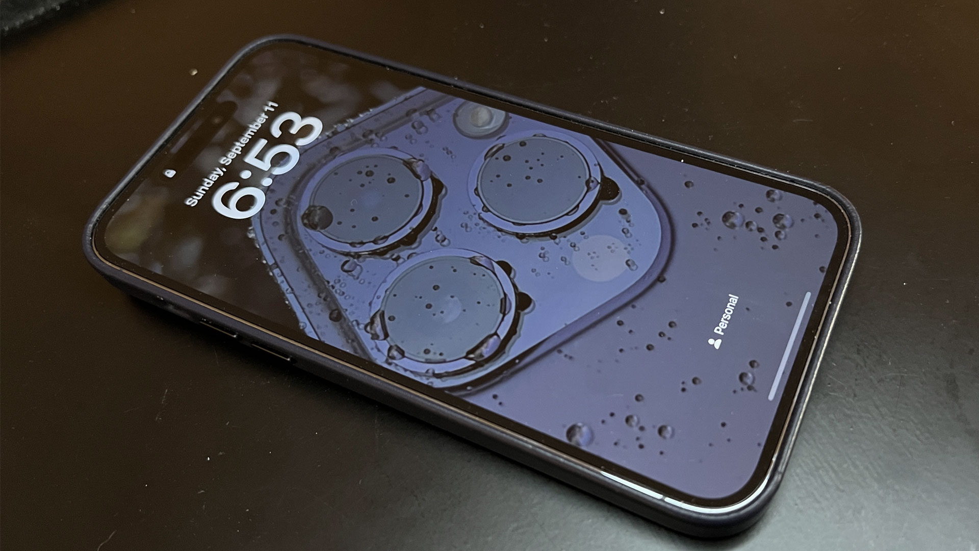
The iPhone 14 Pro's always-on screen is very different from the original Samsung concept. Samsung’s screen was a minimalist design that would be useful while drawing far less power. Apple just dims your existing lock screen, but it looks almost exactly the same as when the phone is bright and active.
You might be fooled into thinking this is a technological advance since it's more colorful, uses new display tech, and isn’t available on cheaper phones. Nope, it’s just a bad solution to an easy problem. Sure, it’s a technical marvel that Apple can slow down the screen and dim the brightness to the point where it draws negligible power, but that doesn’t mean this is the best solution.
Black and white is easier to read in the dark
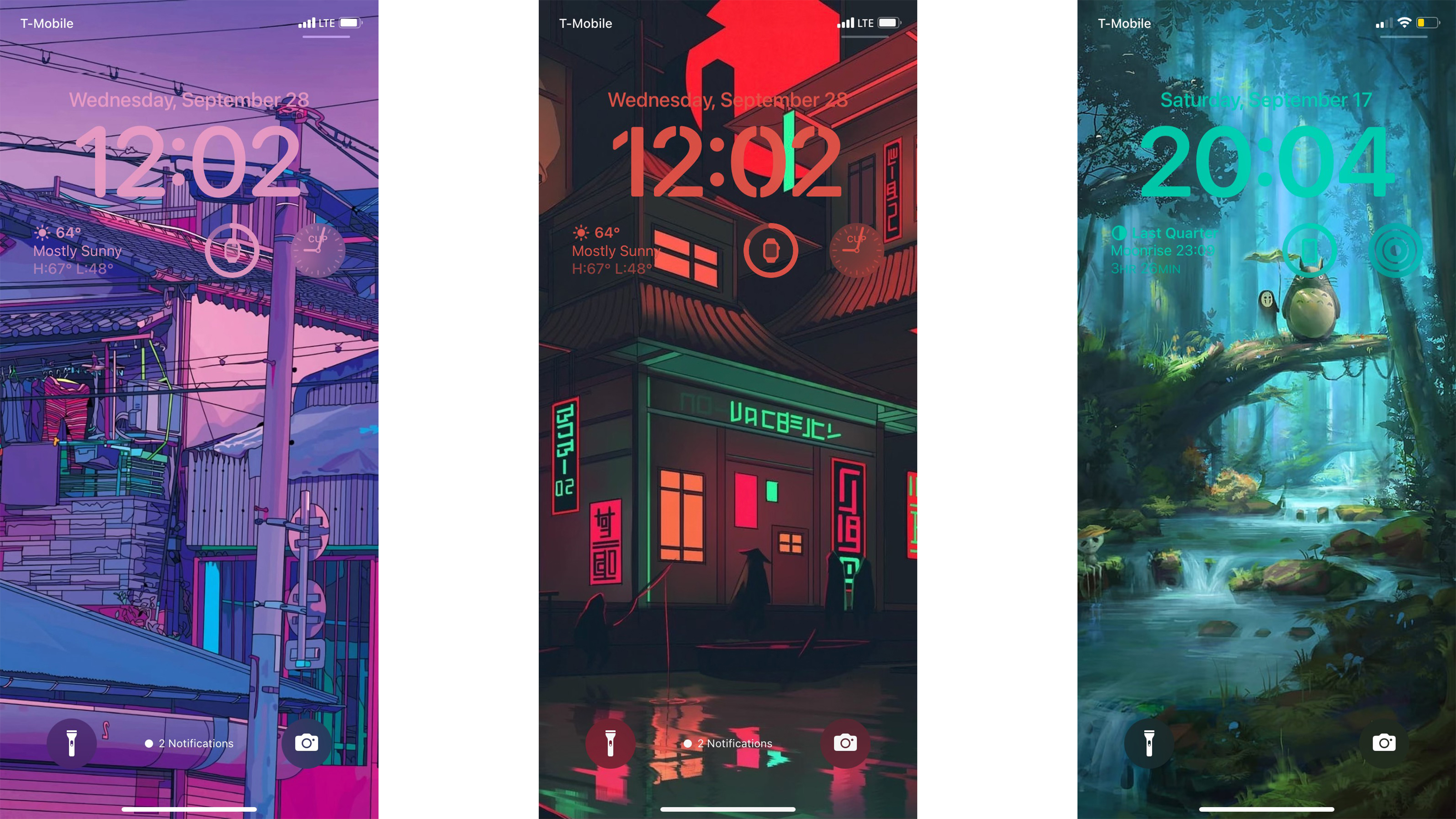
Apple’s lock screen is not easy to read. The new iOS 16 suggests colors that 'match' your chosen wallpaper, but this makes the widgets and clock blend in with the background. You can also pick your own color, so I chose a stark black for ultra-visibility against the light blue bubbly wallpaper.
My kid is more creative, and his always-on lock screen is even more useless. He likes to spend time clipping images from his favorite anime, then he matches his fonts and colors to blend in. When the image fades as the screen powers low, almost nothing is visible except the blur of color.

Sadly, when the phone fades to its always-on mode, even my black clock and widgets fade away to a very light grey. Apple actually changes the color of the widgets and clock text as the phone switches modes. Now my lock screen is hardly visible. The clock is illegible. The widgets are useless.
I glance over at my work phone, a Samsung Galaxy Z Flip 4. The tiny external display is always on, and it shows a clock. It’s a crystal clear white circle over a black background. I can read it across the room with my eyes half-closed.
Get daily insight, inspiration and deals in your inbox
Sign up for breaking news, reviews, opinion, top tech deals, and more.

Phil Berne is a preeminent voice in consumer electronics reviews, starting more than 20 years ago at eTown.com. Phil has written for Engadget, The Verge, PC Mag, Digital Trends, Slashgear, TechRadar, AndroidCentral, and was Editor-in-Chief of the sadly-defunct infoSync. Phil holds an entirely useful M.A. in Cultural Theory from Carnegie Mellon University. He sang in numerous college a cappella groups.
Phil did a stint at Samsung Mobile, leading reviews for the PR team and writing crisis communications until he left in 2017. He worked at an Apple Store near Boston, MA, at the height of iPod popularity. Phil is certified in Google AI Essentials. He has a High School English teaching license (and years of teaching experience) and is a Red Cross certified Lifeguard. His passion is the democratizing power of mobile technology. Before AI came along he was totally sure the next big thing would be something we wear on our faces.