I tried the world’s best smart TV, and I’m going back to streaming with my Apple TV
Why I like apples over oranges

There are many factors that make up your home theater experience. Of course, there’s the hardware that you use, be it one of the best TVs, perhaps combined with one of the best soundbars, and maybe one of the best streaming devices.
However, while it can often be overlooked, the home screen of the TV that you interact with to find great movies and series on the best streaming services plays a really important role in your viewing experience too.
It might be what separates you from finding something great to watch or just wasting some time. For these exact reasons, it needs to be intuitive, easy to navigate and simple to use.
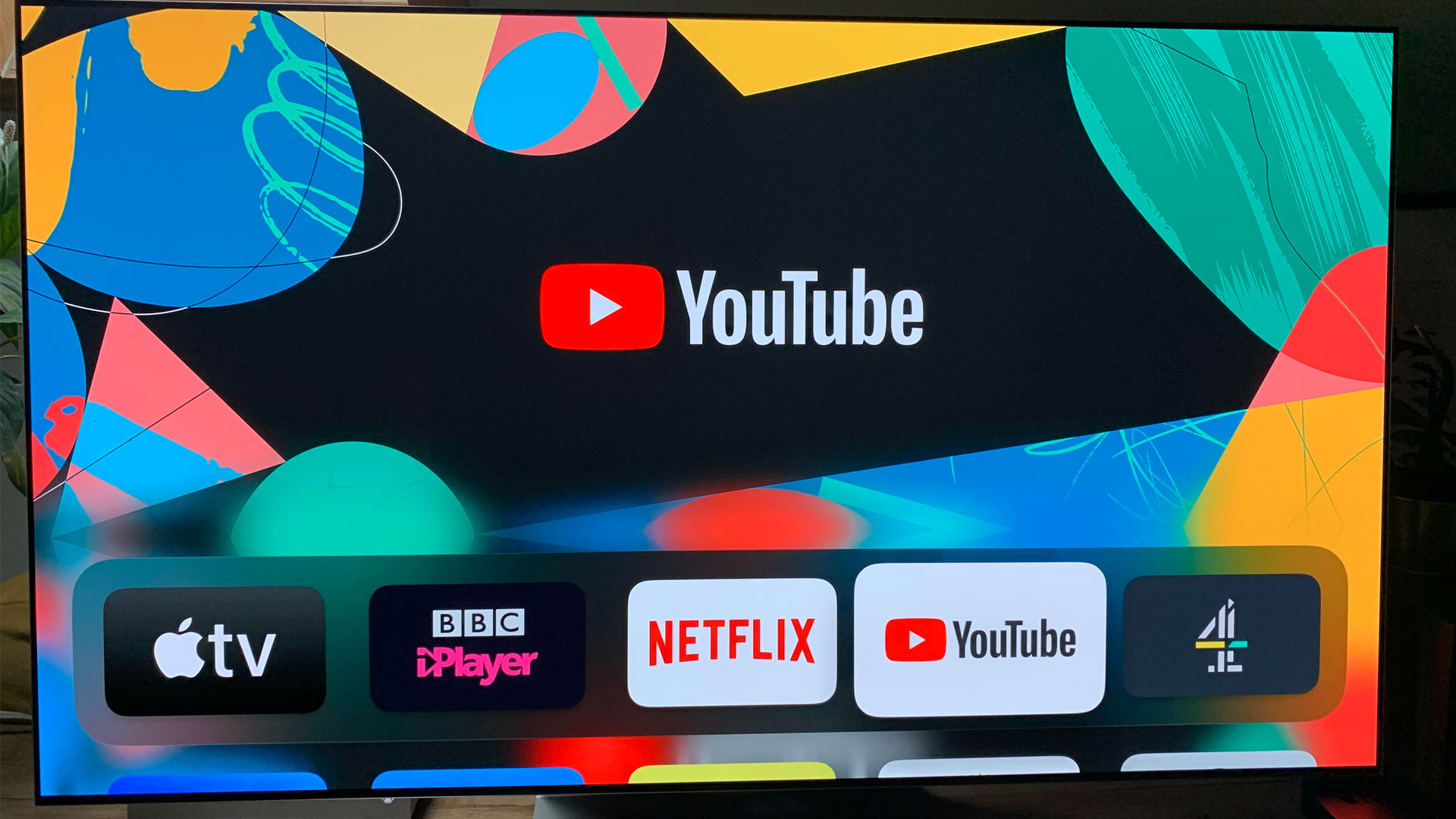
It’s worth me pointing out at the onset that I’m a big fan of Apple’s products. The company’s (usually) accessible design, attention to detail, and focus on making a smooth experience has always made it a winner for me. I’ve owned an Apple TV since 2015 and even though the Apple TV 4K has since been released, I'm still happy with my original device to this day.
So when I had the opportunity to spend some time with one of the best TVs in the world (review coming soon) – the LG G3 OLED – I thought that might change. It has a new smart TV system designed to be much easier to use, after all. But despite the G3's perfect picture quality, exceptional features and slick build, there was one aspect of its design that bugged me. The home screen.
Clean home screen, tidy mind
Hear me out. Just like your real-life home, your digital displays have an impact on how you focus. If you’re spending more time then you should be looking for a particular settings option, then that will start to take its toll after a while.
The psychology behind the design of a display screen is an important factor worth considering, especially given that it appears to be a deciding reason in why I continue to be drawn back to the Apple TV.
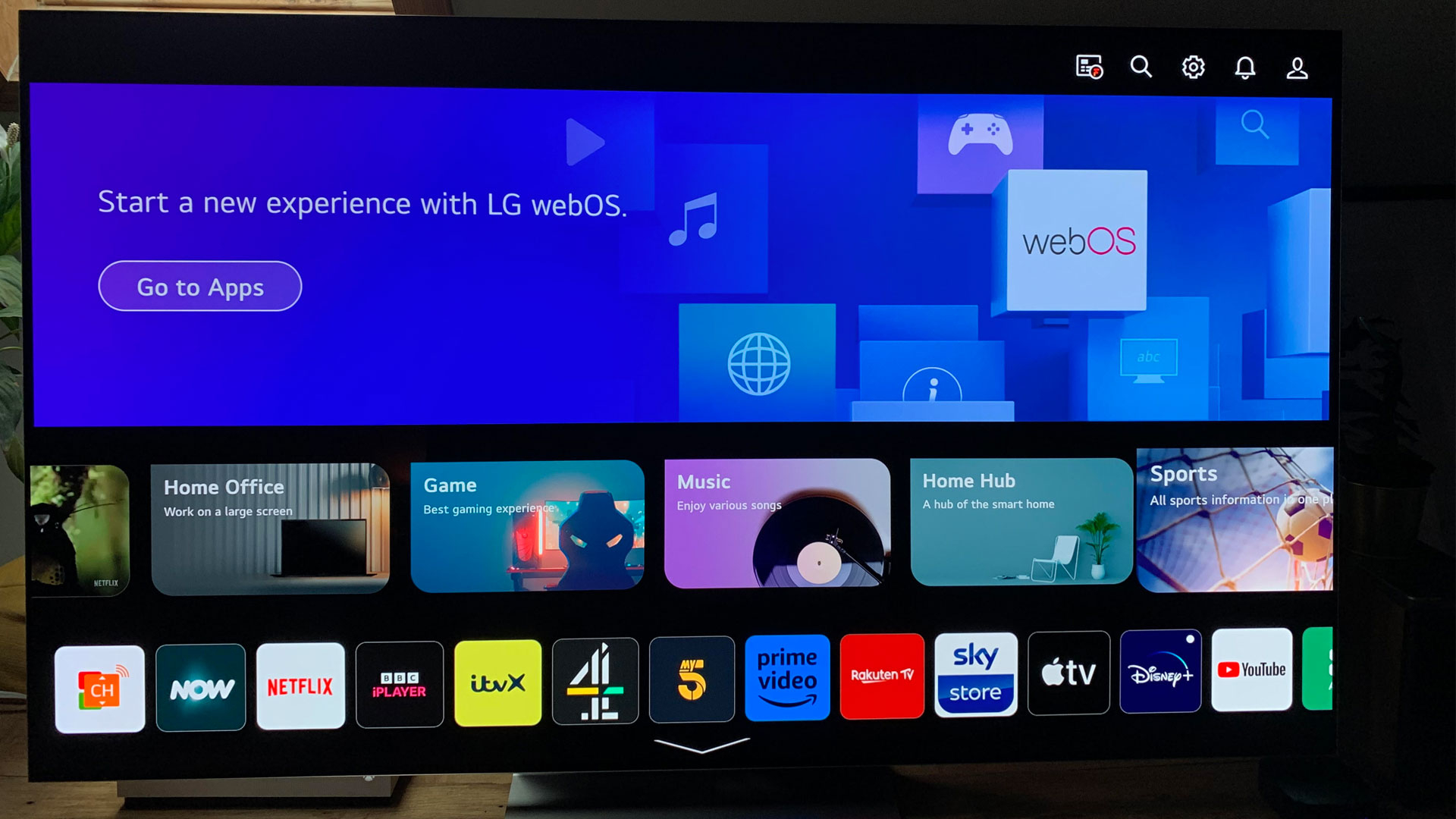
Firstly, let’s discuss the home screen of the LG G3. The TV’s user interface is not inherently flawed – in fact, it’s quite good. It boasts ease of navigation, good contrast and large text.
However, when compared to the Apple TV, it falls just short of the finesse I’ve grown accustomed to because of the slightly clunky formatting. Half of the home screen is taken up a large display to navigate to your apps, which are then displayed directly below in three different views.

Ease of use
There's the visual design of a smart TV menu's interface and then there's the experience. This is determined by how easily you can navigate the TV's menu and features to access the apps you want. While LG's webOS 23 in the G3 (and LG C3, in fact) is an upgrade from its predecessors, there are some features that I found were a little cumbersome.
For instance, when I'm with family and friends in front of the TV and I stumble upon an intriguing video to share while on my iPhone, I often choose to use AirPlay to throw it directly onto the TV screen. There are multiple ways to connect an iPhone to your TV, including through certain smart TV models – with the Apple TV, it's so easy. It's always ready to receive AirPlay signals, so I just choose it I'm away.
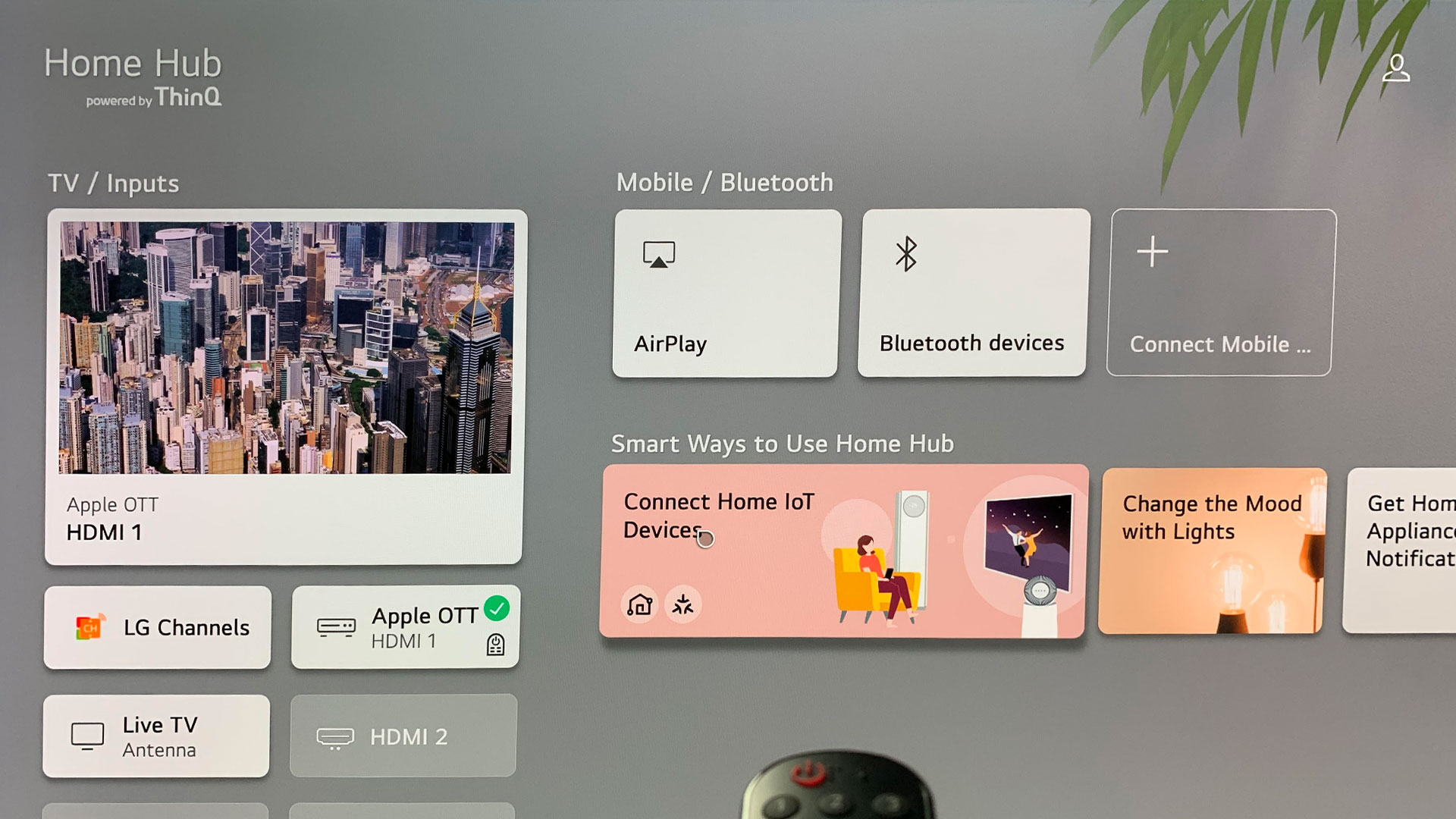
However, if you're looking to set up AirPlay on the LG G3 OLED TV, the wireless connection needs to be initiated on your TV first. You have to head over to LG’s 'Home Hub' in order to activate the AirPlay tile, clicking on it then launches the AirPlay set up. From here, you then have to follow the on screen steps on your device to connect the two.
Although I’m undoubtedly impressed with LG’s G3 OLED TV and its next generation image quality, the fact that AirPlay is hidden away had me switching back over to my Apple TV for a couple of days when wishing to throw something from my phone up onto the big screen. Now that it's all set up I can use it freely though. I will point out that I still seem to get better connection to the AppleTV but maybe this is just my network.
I'll admit this is a small detail, but it's the little niggles that add up into making a new bit of software feel like it's not actually worth using, steering us back towards what we know.

Big bulky remote
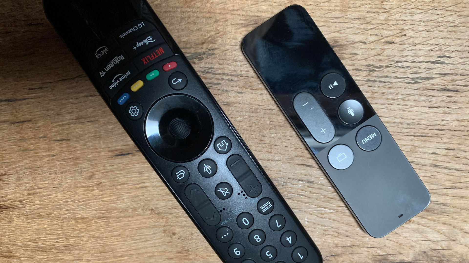
Next, let's discuss the remote. Initially, I was captivated by the LG remote's move-and-point interaction, which allowed me to use the keyboard to search for content and settings swiftly without relying solely on the voice search activation option. The voice assistant on the LG, to be fair, also functions quite well, apart from the occasional irritating voice prompts that have a tendency to sound sped up.
However, over time, I grew frustrated with the remote’s tendency to be somewhat finicky when it came to accurately selecting options without accidentally falling off onto the next thing. Although adjusting the sensitivity and tinkering with the options provided some improvement, it wasn't enough to steer me away from my beloved Apple remote and it's swipey touch panel. I can use that with total accuracy every time.
The Apple TV's remote has a compact size, is stripped back completely to a few necessary buttons and is able to be charged through a Lightning cable. The remote's touchpad in replace of a directional pad to navigate up, down and left to right is also a highlight for me. The absence of thumb fatigue after countless scrolling sessions in search of something to watch for the night is another feature that has truly won me over.

Smart TV data harvesting
It's no secret that companies tend to gather data from us, and our level of comfort with sharing that information varies among individuals. While Apple is in no way shape or form exempt from collecting data from us, recent trials have shown that privacy is a matter that they are taking serious efforts to address.
Admittedly, on the LG G3, you can minimize the analytics related to your viewing habits by opting out of data sharing in the settings. However, despite this option, I still found myself more at ease logging in and consuming content through my Apple TV. There is a certain sense of comfort and trust I feel with Apple's approach – one of the reasons its products, including the Apple TV 4K, are priced higher than the competition is that Apple doesn't sell personal data to advertisers in the same way, and you can opt out of data collection within apps more completely.
Smart TV data collection is a big part of why TVs have become more and more affordable – make no mistake that what you watch is used to target you with ads. I prefer Apple's more private sandbox.
Final thoughts
If, like me, you cherish the user experience provided by Apple TV's home screen and remote, and prioritize your privacy to some extent, you may find yourself reluctant to discard your Apple TV immediately after upgrading to a smart TV like the LG G3 OLED.
Instead, if you have the option and it's available to you, I would recommend keeping your favourite streaming device connected, especially if it's an Apple TV, and continuing to use it alongside your smart TV.
Not only is the Apple TV home screen less cluttered in many cases, but it also has a more engaging interface, which makes it easier to use in my opinion. This is where Apple's expertise in user interface design shines through, and even the subtle differences have a significant impact on my overall experience.
Get daily insight, inspiration and deals in your inbox
Sign up for breaking news, reviews, opinion, top tech deals, and more.

Amelia became the Senior Editor for Home Entertainment at TechRadar in the UK in April 2023. With a background of more than eight years in tech and finance publishing, she's now leading our coverage to bring you a fresh perspective on everything to do with TV and audio. When she's not tinkering with the latest gadgets and gizmos in the ever-evolving world of home entertainment, you’ll find her watching movies, taking pictures and travelling.