I was wrong about Garmin Forerunner 265’s AMOLED Screen
It looks and feels like a true follow-up, not a carbon copy

The Garmin Forerunner 265 and 965 arrived last month, and we were skeptical, to say the least. Apart from the new AMOLED screen, on paper the watches looked just like their predecessors, the Garmin Forerunner 955 and 255, which are less than a year old and some of the best Garmin watches ever made. The last time the Forerunner line was upgraded, it took three years. How can Garmin justify bringing out a new set of models so soon?
At first, we were impressed with the screen and the redesigned chassis of the watches (especially the redesigned ‘run’ action button on the Forerunner 265 with a larger footprint) but questioned whether this was enough of a change to merit a new model.
After using the 265 for a few weeks – don’t forget to check out the full review next week – I can say that yes, the Garmin 265 is good enough to stand on its own two feet.
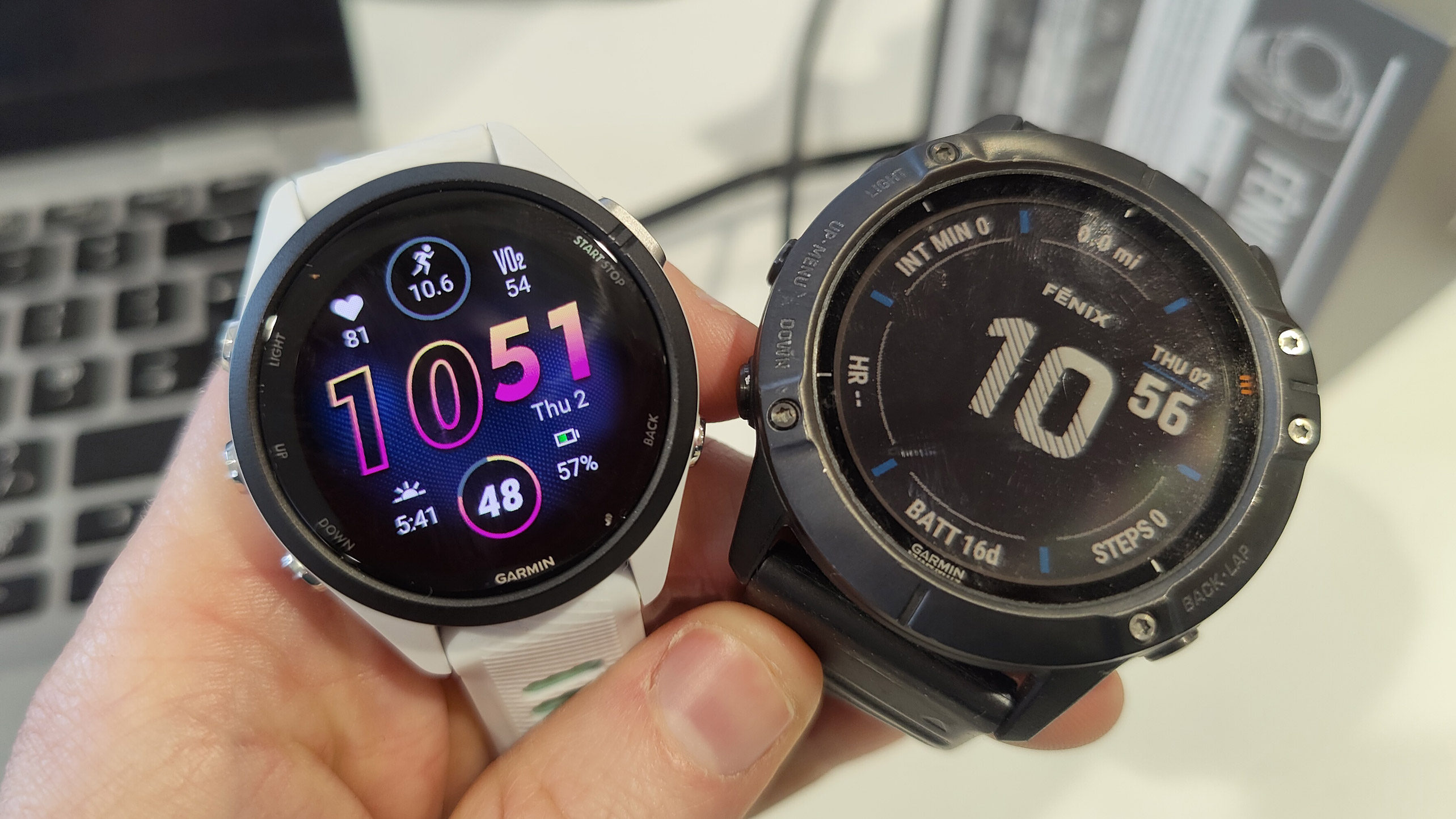
The Garmin Forerunner 265’s screen is a long, long way from the old Forerunner’s memory-in-pixel display. The MIP display struck a balance between being wonderfully easy on the eyes while also being clearly visible during dark nights. The old-fashioned dull-colored digital watch aesthetic was a refreshing antidote to lots of other “true” smartwatches out there.
I was concerned the eye-popping brightness of the new screen would be overstimulating in comparison to the old-style Garmin watches.

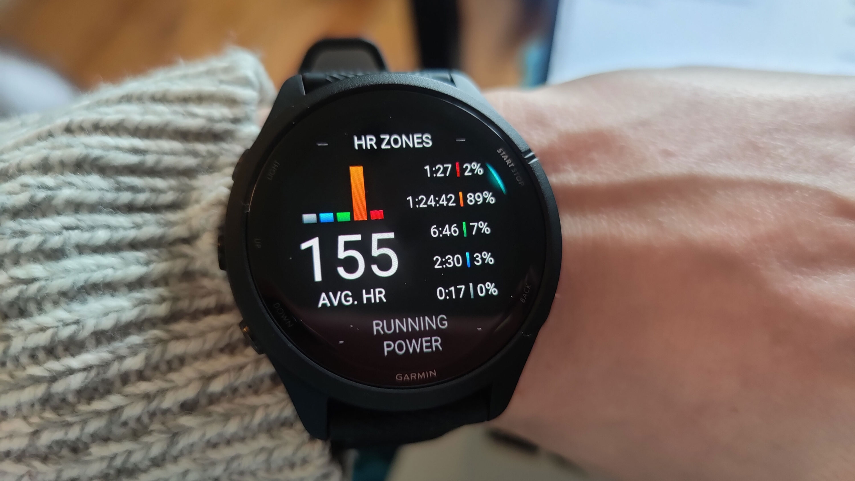
Fortunately, it hasn’t been a negative change at all. I’ve handled the Garmin Epix series, which is the Fenix line with a similar screen upgrade, and the Forerunner’s screen only enhances the presentation of my data during and after my workouts.
The color sings, but more than looking pretty, great care and attention to detail has been taken when incorporating that color into the workout UX, and the heat maps of heart rate data in particular.
The Training Readiness score I still think could have been added to the 255 as a software upgrade, but it does make this feel almost like a new watch. I get a morning update with my sleep and Readiness scores, a recommended workout for the day, weather information, and a small piece of advice. That could be a “you got this!” general message of perseverance, or a notification to take it slow based on poor recovery.
It sounds like a simple feature, but like a daily TV show, it worms its way into my life so that when I’m not wearing a watch with the feature, I miss it. The otherwise-similar Garmin Forerunner 255 doesn’t have it, so it is missing a core feature you end up using every day.
Combined with the bright colors and the redesigned chassis, I think I might have been a bit too harsh on the ‘65 series: while the innards are identical, the changes are more substantial than, oh I don’t know, your average annual update to the best Apple Watch. However, it's still far too similar to the Forerunner 255 for those that own last year's watch to consider upgrading.
Get daily insight, inspiration and deals in your inbox
Sign up for breaking news, reviews, opinion, top tech deals, and more.

Matt is TechRadar's expert on all things fitness, wellness and wearable tech.
A former staffer at Men's Health, he holds a Master's Degree in journalism from Cardiff and has written for brands like Runner's World, Women's Health, Men's Fitness, LiveScience and Fit&Well on everything fitness tech, exercise, nutrition and mental wellbeing.
Matt's a keen runner, ex-kickboxer, not averse to the odd yoga flow, and insists everyone should stretch every morning. When he’s not training or writing about health and fitness, he can be found reading doorstop-thick fantasy books with lots of fictional maps in them.