Nvidia RTX Remix is cool but disregards what made old games good
‘Art direction’ isn’t a real thing, right?

Alright, listen. RTX Remix is a genuinely cool bit of tech wizardry, and it undeniably has the potential to revitalize the modding scene for a ton of old games. I’m already trying to work out how I can possibly afford an RTX 4090; my plans may or may not involve selling a kidney.
As a long-time Elder Scrolls fan, I won’t lie: seeing Morrowind lovingly re-rendered with RTX Remix did excite me a little. I’m already imagining what a Remixed Fallout: New Vegas would look like, and it’s making me less depressed about the current state of the Fallout franchise. I can hear Marty Robbins singing ‘Big Iron’ already.
But there’s something about the whole thing that sets off the tiny ‘something’s wrong here’ alarm in the back of my head. About halfway through my second viewing of the Portal RTX trailer, it hit me: sure, this looks better, but it doesn’t look how it’s supposed to look.
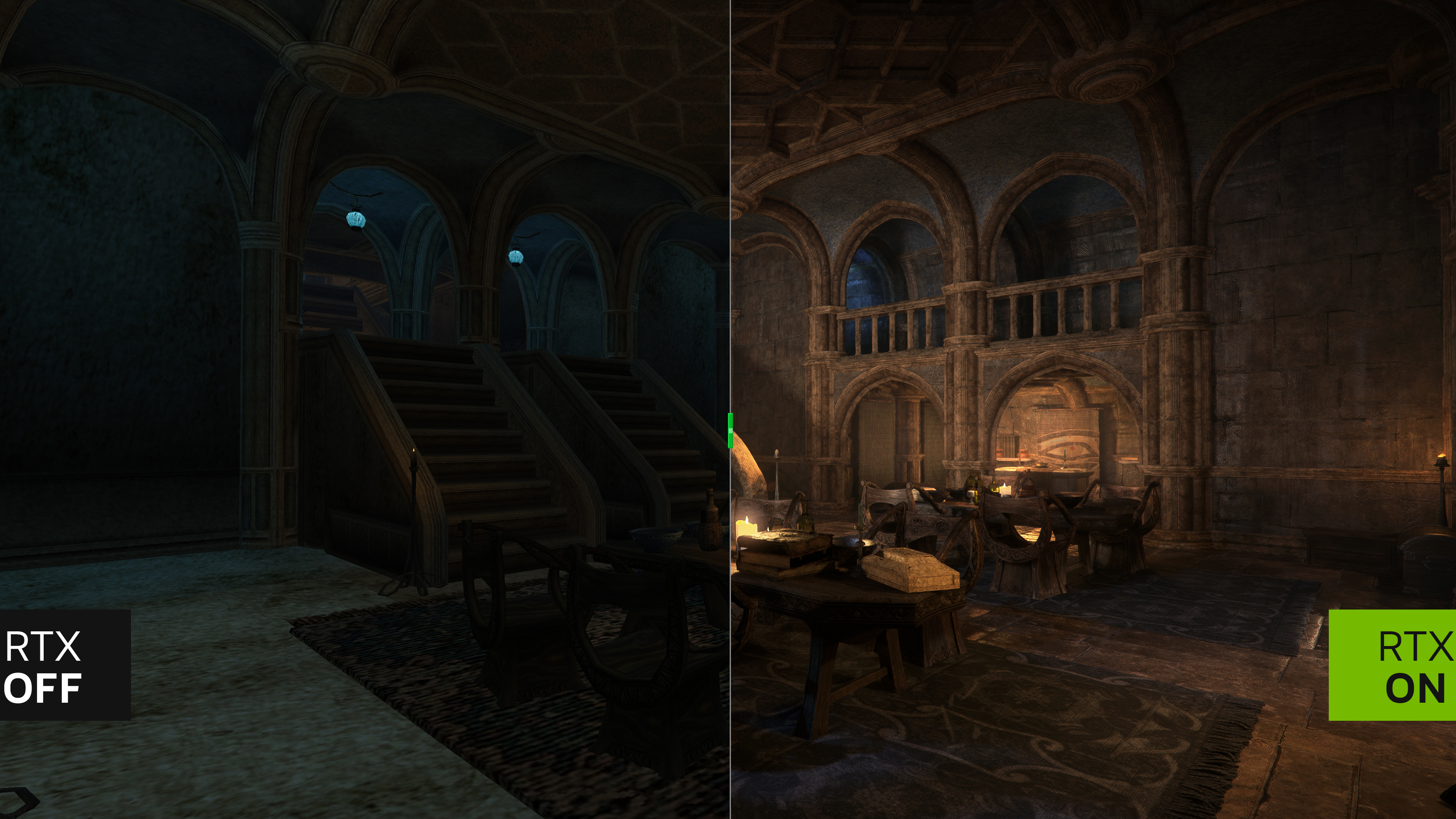
I’m making a note here: huge success
Games are universally bound by the technological hardware capabilities of their time, and a big part of game design involves figuring out how to create a game that looks good within the confines of those capabilities. Today, many triple-A games are edging closer and closer to genuine realism; a few short years ago, that simply wasn’t possible.
So, developers were generally given the choice of two paths: heavy stylization, such as using pixel art or cel-shading, or trying to create as realistic a world as possible with the tools available. The former method tends to age better (provided that the original style was, you know, good), while the latter is a bit more nebulous.
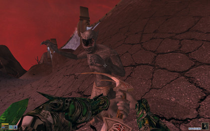
Take TES: Morrowind, for example. While Bethesda clearly wasn’t going for hyper-realism in its game about elves and giant clockwork golems, the game does try to create at least a reasonable facsimile of a live-action fantasy world that could run on 2002 hardware. In a post-Fellowship of the Ring world, it made sense. The problem is that today, Morrowind looks like shit.
Ray-traced role-playing
That might sound cruel, but anyone who has played Morrowind will likely agree; while the game’s story and worldbuilding have stood the test of time, its graphics just… haven’t. The textures are flat, the overworld’s color palette is frequently bland, and the character faces are frankly haunting.
Sign up for breaking news, reviews, opinion, top tech deals, and more.
It’s in games like Morrowind where I do agree that RTX Remix can shine. There’s already a gigantic modding effort to recreate the game in the Skyrim engine - titled ‘Skywind’ - and it looks great. Modders are a determined and phenomenally creative lot, as evidenced by huge projects like Skywind and Fallout: London. Giving them a tool as powerful as Remix makes me excited for what modders could create in the future.
But Portal with RTX? No, I’m not excited about that one. For starters, it’s an official project - this might seem like an odd thing to pick at, but if it’s made in-house by a bunch of paid developers, it’s not a mod. It’s an expansion. Portal’s shiny new reflective surfaces and reactive lighting weren’t produced out of a love for the game and a desire to expand it, the way most mods are. It was created to sell overpriced graphics cards.
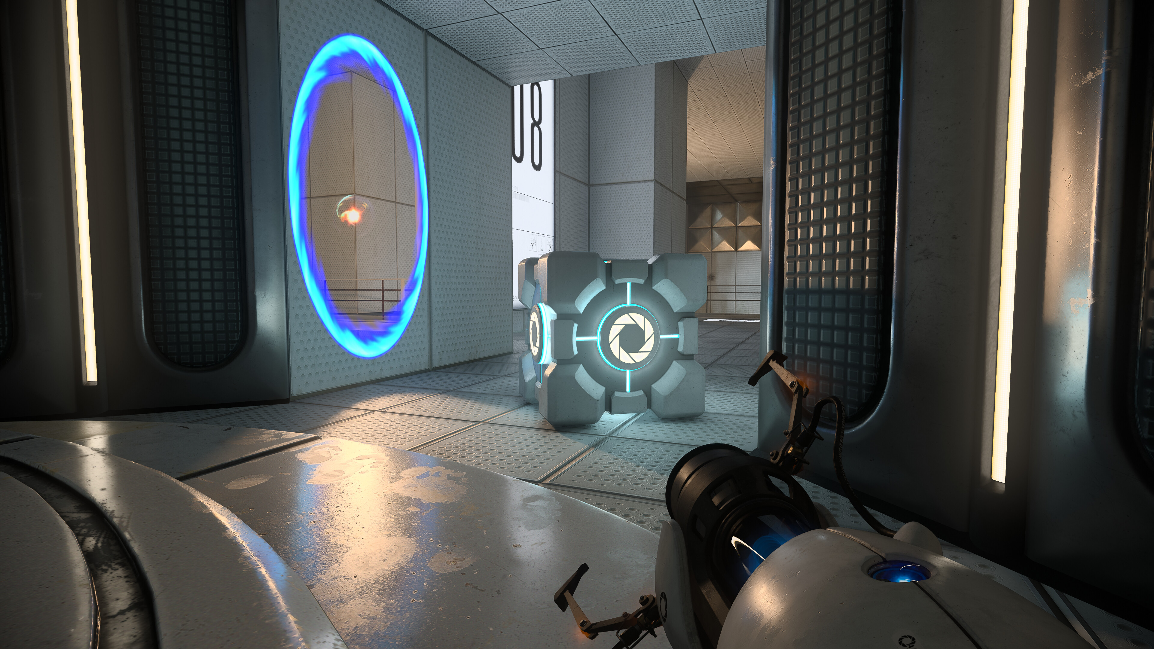
That’s a cynical view, sure, and one that falters a bit when you consider that Portal’s newly Remixed environments do actually look great. The thing is, Portal already looked great. It’s one of the rare games that aim for realism and manages to make it timeless, through a combination of smart design choices and excellent art direction.
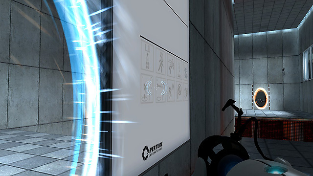
The simple tiled walls, the harsh lighting, the polished white bodies of the sentry turrets, and the portal gun itself - this all comes together to produce a still-engaging rendition of an inescapable, sterile laboratory complex, feeding effectively into the game’s minimalist but still intriguing plot.
Portal 2, another stone-cold masterpiece, took things further with the benefits of more powerful technology; less mechanical animations for characters like the hyper-animated Wheatley, more detailed environments as the Aperture Science Labs fell into disrepair and overgrowth, and wacky physics effects for gravity-warping paint. But the original Portal still holds up, using the capabilities of 2007 hardware to excellent effect.
We do what we must because we can
My fear here is that we’re going to see a wave of Remixed classics with little regard for the original style of the games in question. Some of these - like Morrowind - will be good, a way to graphically update old games to better realize the vision the developers originally had but couldn’t create due to hardware limitations.
Some - like Portal - will be unnecessary redesigns of games that already looked good, created merely because they could be rather than because they were needed. I’ll be very interested to see Portal’s player counts on Steam once the RTX 4000 cards arrive; I’d put money on very few people actually going back to replay it with RTX.
Another big problem with Remixing games like this is that it throws any intentional design decisions related to lighting straight out of the window. Environmental lighting has long been a vital part of building a game’s visuals, after all.
Light can be used to subtly illuminate an object or path, telling the player where to go or what to do without the need for a glowing, immersion-breaking HUD icon. Lighting draws the eye, putting a character (sometimes literally) in the spotlight during an important moment. It’s an oft-unmentioned element of game design that RTX Remix threatens to override.
The light fantastic
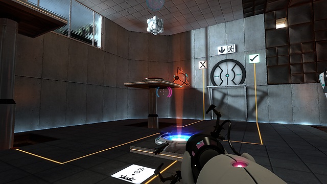
Take Portal, for example. Valve is no stranger to using lighting to direct the player; the exit door (or another item of importance) in many of the test rooms is deliberately positioned so that the room’s light sources fall upon it. I reinstalled the game to reacquaint myself with it before writing this article, and noticed that this design choice is visible in multiple screenshots just on the Steam store page.
This sort of thing is more common than most realize in games; when footage of The Last Of Us Part 1 remake was revealed, there was some discussion on Twitter about how the remake’s more ‘realistic’ lighting actually damaged the original game’s careful art direction and by extension the way the player was guided through the world.
Watching Yong’s review for Last of Us “Part 1” showing this tiny moment of Joel kicking open a door. The original kick is impactful with screen shake and a bursting open sound effect. In “PART 1” you hear a gentle doorknob turning sound and have no screen shake. Very immersive.🤭 pic.twitter.com/EwWx4vDigRAugust 31, 2022
The tweet above is about someone complaining about a door-kicking sound effect, so feel free to ignore that part. But take a look at the lighting in the scene when the door is opened; in the original PS4 remaster, bright orange sunlight hits the wall opposite an adjoining alley, so you immediately know there’s a route leading that way, even though you can’t actually see the other alley yet.
In the gritty realism of the remake, this lighting cue is essentially abandoned; the alley is sparsely lit, and the addition of a little bloom when Joel kicks open the door - again, an effect added to promote realism as you move from a dark environment to a brighter one - further muddies the scene.
This door-bullying moment is part of a chase sequence, so the player knowing where to go is key. If you lose sight of your quarry, lighting is one of the factors used to keep you on track. It’s worth noting that the Part 1 remake doesn’t appear to use ray-traced lighting, but this is a good example of how important lighting can be as a game mechanic.
Remix and match
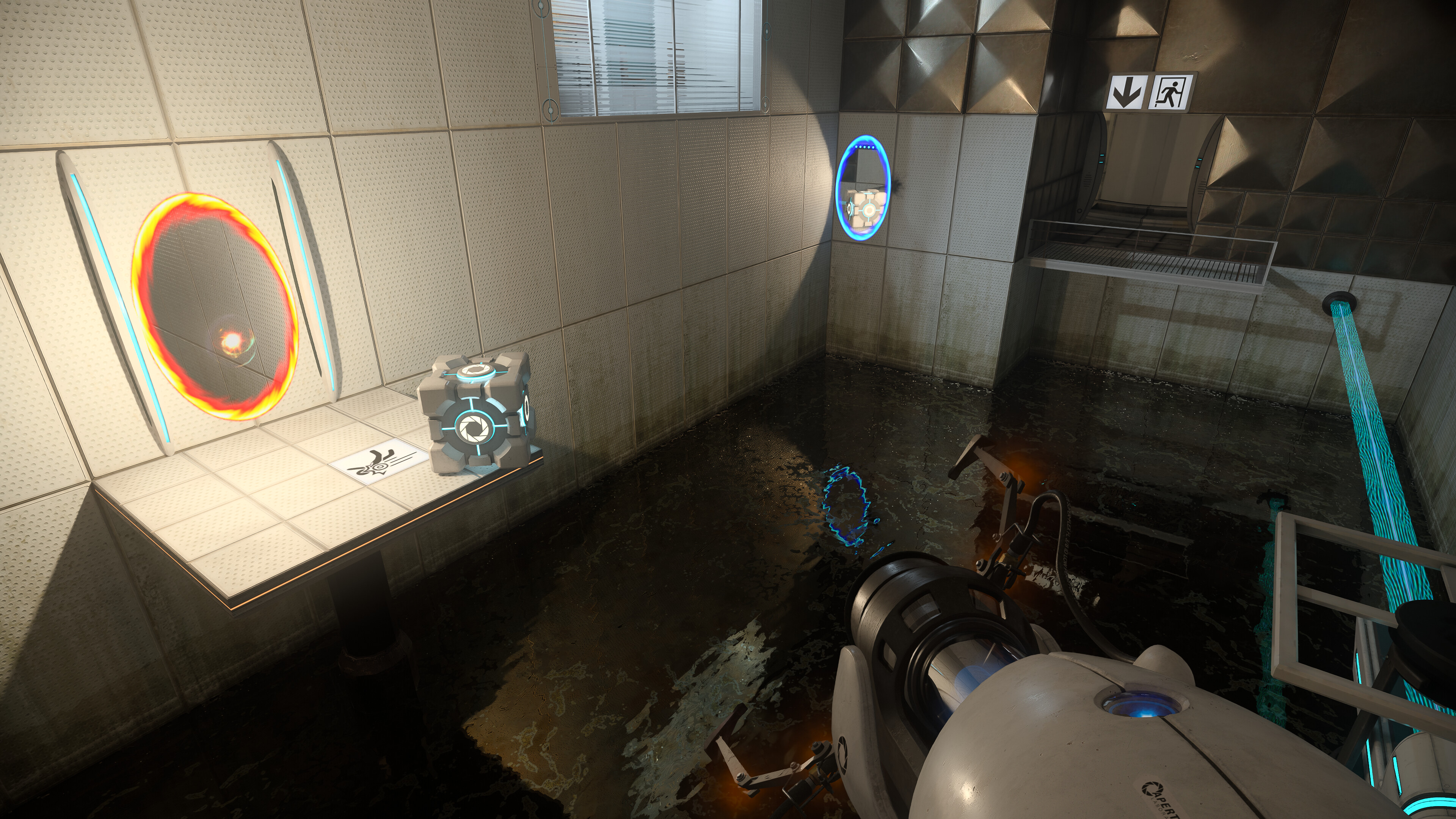
This is what I’m worried about seeing. Sure, the original Portal wasn’t a game that struggled massively with player direction, thanks to its self-contained puzzle rooms and generally clean aesthetics. But there are plenty of games in which a developer will have painstakingly placed fixed light sources for gameplay purposes, only for RTX Remix to come along and ruin everything.
My last point - and one that I’m aware might come across as a bit petty - is that Portal RTX is really just a waste of time. Seeing dynamic shadows or slightly more realistic water textures isn’t going to bring back the same feeling of mystery and intrigue Portal held when I first played it on my dad’s struggling desktop PC all those years ago.
Yes, I get the need to showcase Remix’s capabilities for the big RTX 4090 reveal livestream, but was doing it to a whole game really necessary? The Morrowind clip was more than sufficient to generate excitement, especially since a lot of newer Elder Scrolls fans will have bounced off the older games due to their janky graphics.
In short: RTX Remix is an exciting bit of tech for modders, but we really don’t need soulless corporate remakes of already-great games that have been fed through the ray tracing grinder to remove any sense of deliberate art direction. Not every game has to look real. Hell, I play games to escape from real life, not be reminded of it.
Put cool RTX tech in the hands of modders by all means, but this is my plea to big developers: your games don’t need the Remix treatment, and you don’t need to devote time to remakes when the original titles are still out there for people to play. Put those funky ray-traced reflections in a new game instead. Oh, and Nvidia? I’ve watched your GeForce Beyond presentation three times now, and I still don’t really know why Remix has to be part of an ‘Omniverse’, or what an ‘Omniverse’ actually is.

Christian is TechRadar’s UK-based Computing Editor. He came to us from Maximum PC magazine, where he fell in love with computer hardware and building PCs. He was a regular fixture amongst our freelance review team before making the jump to TechRadar, and can usually be found drooling over the latest high-end graphics card or gaming laptop before looking at his bank account balance and crying.
Christian is a keen campaigner for LGBTQ+ rights and the owner of a charming rescue dog named Lucy, having adopted her after he beat cancer in 2021. She keeps him fit and healthy through a combination of face-licking and long walks, and only occasionally barks at him to demand treats when he’s trying to work from home.