Samsung won't do what it takes to beat the iPhone
Only One UI thing in the way
Sign up for breaking news, reviews, opinion, top tech deals, and more.
You are now subscribed
Your newsletter sign-up was successful
Join the club
Get full access to premium articles, exclusive features and a growing list of member rewards.
A few months before I was recruited to work for Samsung as an internal phone reviewer, I tweeted “One day I’m going to get a job at Samsung and work my way up until I fire everyone involved with TouchWiz.” TouchWiz was Samsung’s user interface for the touchscreen feature phones that came before the Android-based Galaxy devices. It was horrendous.
That was in 2010. Today, twelve years later, TouchWiz has been replaced by Samsung’s latest interface concept: One UI. One UI 5 is just starting to roll out to Samsung’s newest devices. It runs on Android 13, replacing not only Google’s look but also the gesture navigation Google prefers. Underneath, you’ll find Android, but what you see is all Samsung.
Samsung, you’ve fixed everything else
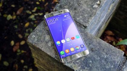
Samsung phones were once rightly criticized for subpar designs and cheap, plastic materials. With the glass and metal Galaxy S6, the company made a dramatic turnaround and fixed all of the design mistakes it had made before. After years of being criticized for cheap plastic phones, it seemed the company finally listened.
Article continues belowThe nearly-flawless Galaxy S22 Ultra is a direct descendant of that phone, with its slightly curved display and its premium metal and glass finish. That phone is polished, smooth, and refined, with only the tiniest gaps between the edges.
In other words, the design has gotten as good as it's going to get, and people still aren't buying enough of the best Samsung phones to give Samsung a definitive win over the best iPhones. The phone features are as far ahead as can be. Samsung needs to finally admit why it isn’t beating the iPhone, and the only aspect left to improve is the interface.
It has heard this criticism for a decade or more, and Samsung has tried to fix everything except the most obvious problem that every critic screams about. It’s time to stop ignoring the real failure and give up on One UI.
TouchWiz didn’t die, it grew stronger
By the time I’d left Samsung in 2017, TouchWiz was gone, but I take no credit for its demise. If you read phone reviews from the TouchWiz period, you’ll see the interface was roundly despised by everyone, not just me.
Sign up for breaking news, reviews, opinion, top tech deals, and more.
It was silly, bright, and colorful when phones were first trying out serious features. It made the phone feel sluggish and bogged down. It doubled up on services, making it hard to decide which one to choose or if any were worthwhile.
Overall, it was just an ugly mess that seemed to make phones harder to use, while the iPhone showed the world how to harness serious power in a device that seems simple.
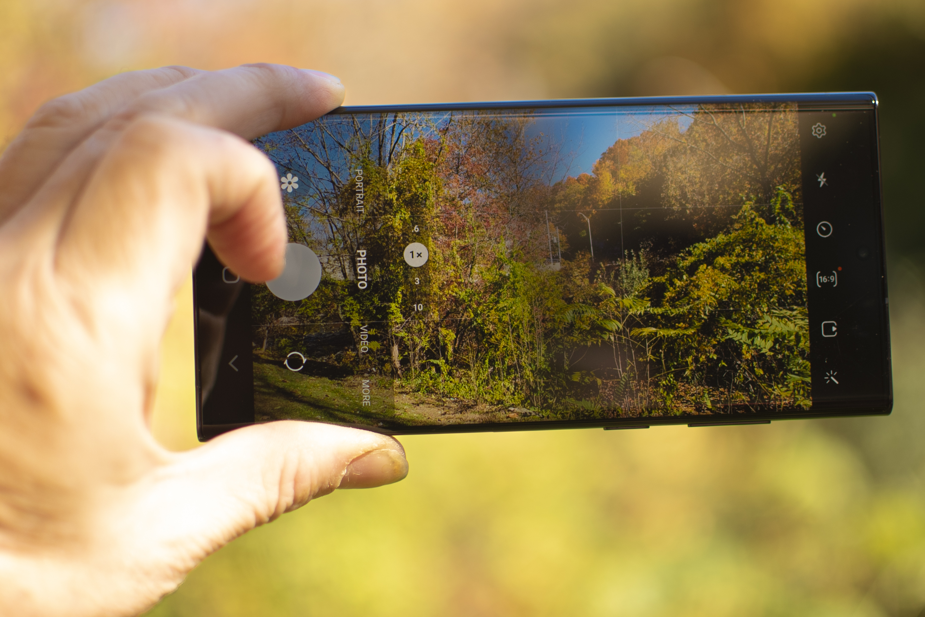
The same arguments folks made against TouchWiz apply to Samsung’s One UI. Don’t get me wrong, One UI is surely feature packed. It is unique in its design, not simply a rehash of Google’s own concept. Samsung has been working diligently on One UI since its inception, and the work shows in constant refinement and polish.
The problem is that nobody is buying a Samsung phone because of One UI. One UI is still not worthwhile, and it isn’t helping Samsung beat Apple.
Google and Samsung work better together
I’m not someone who argues that all Android phones should use a pure version of Android. In fact, I find the idea of a purity label on an open-source OS to be puerile. There has never been a “pure” or “clean” version of Android that would be satisfying on a modern smartphone.
Every phone maker, including Google, modifies the OS to suit its needs. The interface Google designed is just that, the Google interface, not the purest Android you can find. The question is not whether it is clean or dirty. It’s enough to ask whether the interface is good.
The basic Android interface is not enough for Samsung, but when Samsung messes with Android, things go awry. Samsung phones have a reputation for slowing down over time. If someone complains about a Samsung phone, I give them the hard news that a factory reset can breathe new life into a Galaxy S22 Ultra. Now go erase your phone.
Try as it might, Samsung has never proven itself adept at software design. It can accomplish amazing technical feats with camera lenses and cellular antennae, but it cannot design an interface that shows simplicity and restraint.
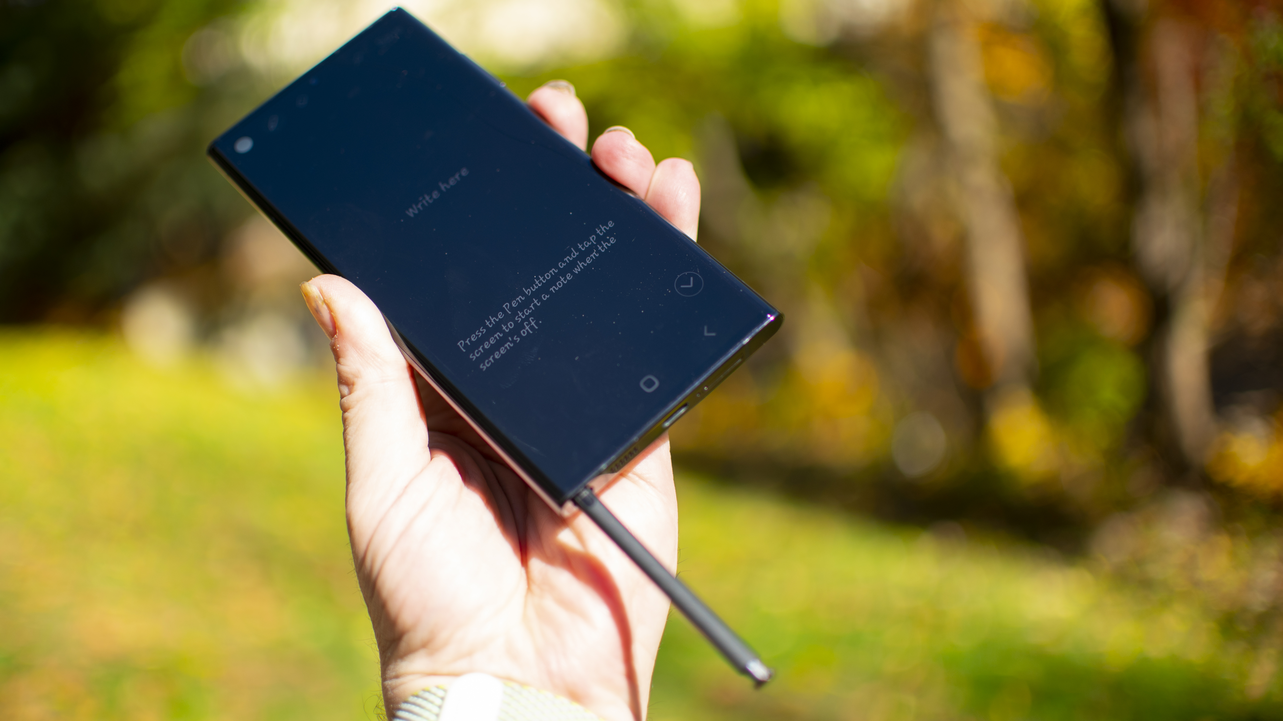
I recommend Samsung phones easily – for the cameras, the display, the stylus, and the magical folding glass. Please, forgive the interface, it knows not what it does.
For a long time, the basic Google interface on Nexus and later Pixel phones was very barebones and technical. Too many features were hidden behind long-list menus or complicated finger-press techniques. It was not ready for a mainstream audience, which is why Pixel phones were never very popular, and never topped a list of best phones. Not until recently.
We should see the Bennifer of Android
I’m not saying that Samsung should give in and accept Google’s interface concept; quite the opposite. I’m saying that Google should give in. In the same way that Google caved and worked directly with Samsung to create Wear OS to go with the best Android wearables, Google must cave to Samsung and work together on the next Android.
Why hasn’t this happened already? The two companies should be the closest of allies, in the way that Microsoft and Intel were so close they earned the portmanteau “WIntel” like a romantic couple. Where is the “Googsung” relationship? Why aren’t the companies inseparable in their Android identity?
This would solve some outstanding problems for both companies. Google Pixel phones have exciting software features but are usually criticized for lacking hardware substance compared to competitors. A closer relationship with Samsung would force Google to bake more innovative concepts directly into Android, which might open up Pixel phones for new concepts.
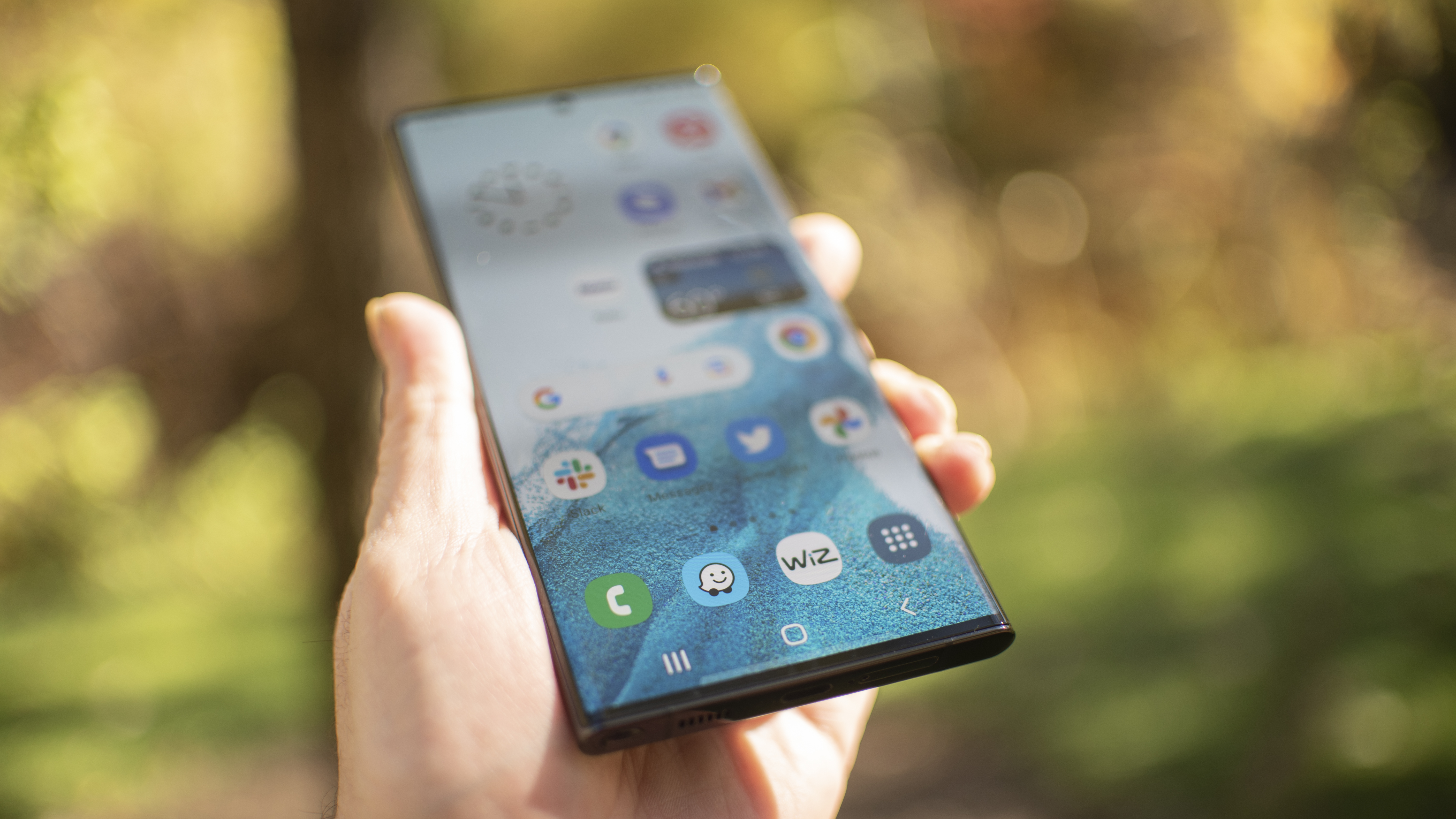
For instance, Samsung has already done the software work on folding phones. Google is rumored to be cooking up a Pixel Fold device. There are basic folding features that make up Android, mostly having to do with resizing windows and keeping text boxes intact. Samsung has already pushed folding behavior much further. The two companies should be working together, not competing in this highly limited market space.
Samsung phones have exciting features, but tend to lose focus and offer too much, confounding the user. A partnership with Google would force the company to reign itself in and think of other device makers in a way it hasn’t before. This change in perspective could break Samsung out of its narcissistic bubble of indulging every whim.
I want more than just a Galaxy Nexus 2
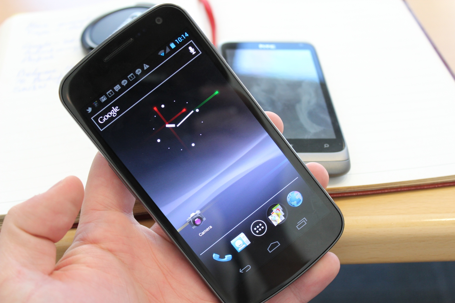
Maybe this is just nostalgia. The last phone I purchased before I was recruited by Samsung was a Google Nexus S, a phone that Google made with my once and future employer. While I was there, the Galaxy Nexus phone bowled over critics with superior performance and none of Samsung’s baggage.
We’ve seen the best hardware that a closer Google and Samsung relationship can create and it was legendary. Now it’s time for the two to come together to make Android the Apple iPhone competitor that both companies need it to be.

Starting more than 20 years ago at eTown.com. Philip Berne has written for Engadget, The Verge, PC Mag, Digital Trends, Slashgear, TechRadar, AndroidCentral, and was Editor-in-Chief of the sadly-defunct infoSync. Phil holds an entirely useful M.A. in Cultural Theory from Carnegie Mellon University. He sang in numerous college a cappella groups.
Phil did a stint at Samsung Mobile, leading reviews for the PR team and writing crisis communications until he left in 2017. He worked at an Apple Store near Boston, MA, at the height of iPod popularity. Phil is certified in Google AI Essentials. His passion is the democratizing power of mobile technology. Before AI came along he was totally sure the next big thing would be something we wear on our faces.
 Become a TechRadar Insider


