Have you ever half-heartedly scrolled through your phone only to suddenly realize you don’t remember when or why you opened the app in the first place? Minimalist Phone claims to solve this while helping improve mindfulness and focus.
Developer QQ42 labs have said that due to the colorful attention-grabbing look of apps, our brains learn that opening the colorful app leads to “stimulation” so we eventually open them up without conscious thought or purpose.
The paid-for Android-only app strips back your phone's interface to prevent you from idly flicking through your apps and provides tools to stop you from doom-scrolling, like setting in-app time reminders to specify how long you would like to spend on a specific app, notification filters, hiding and even blocking apps for up to 30 days.

My Minimal experience
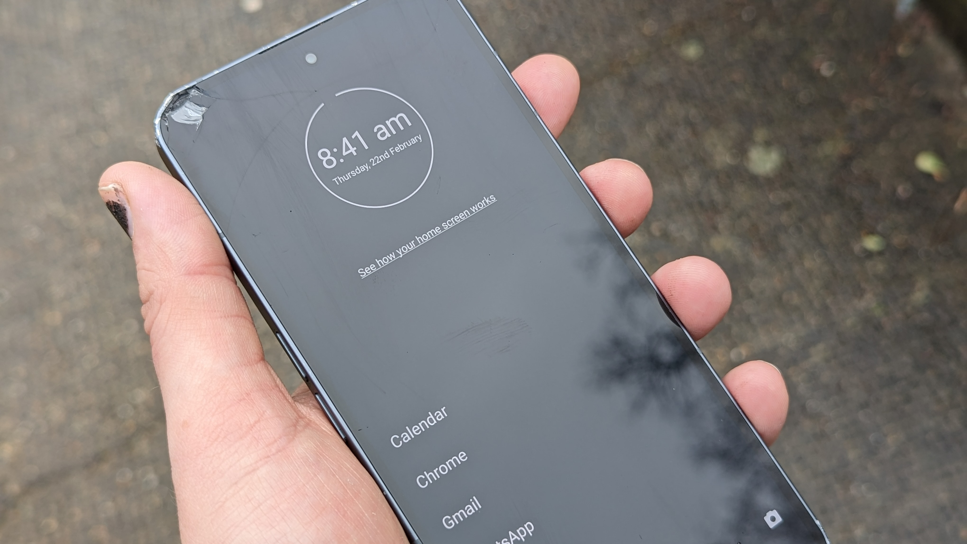
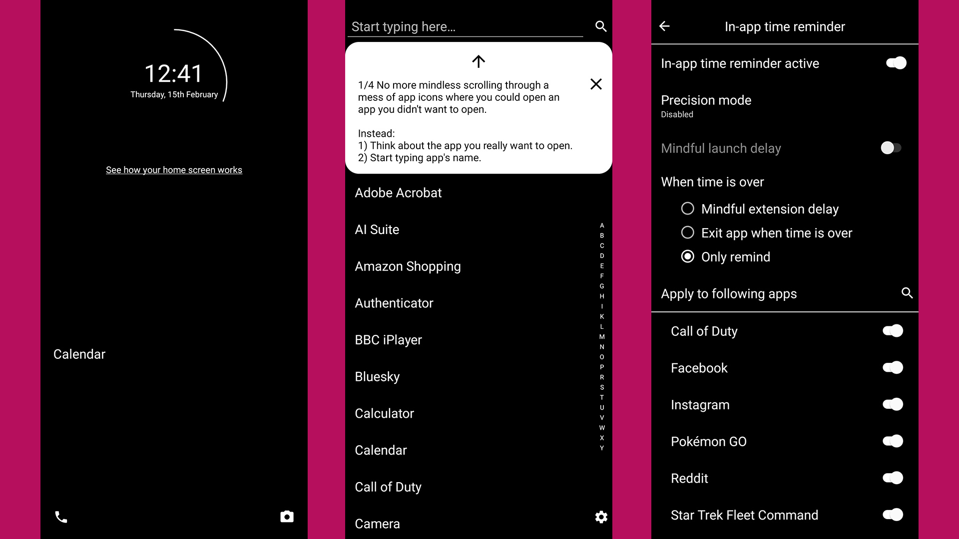
After signing up for the trial, I changed my default home app to Minimalist Phone. My phone was reduced to a simple, black screen displaying just the date and time at the top of the screen that can tapped on to see alarms and times.
In true minimal style, this is surrounded by a simple circle to indicate how much battery was remaining, which is visually clearer but not as accurate as a percentage.
The phone icon was on the bottom left of the screen and the camera icon was on the right, keeping both key functions at hand. The only other element was the word Calendar in the lower half of the screen which was part of a favorites list that I hadn’t yet populated.
At first, this was weirdly disorientating having my notification bar, apps, and widgets disappear but the app did provide some small pop-ups explaining how the new layout works. The app essentially changes the UI of a phone to a set of stark menus to help reduce screen time by providing less stimulation, but that's only part of its function.
I could swipe up to search online and swipe down to see notifications showing that they are still present but hidden (when not filtered). All my apps were still present and appeared in a text-only list format when I swiped left. Within my app list, I can hold press only any app to bring up options like blocking the app.
Getting around
To navigate you can either scroll through the app list or search it directly which takes a little more time. While it did simplify my phone, it made me realize how often I quickly navigate to apps just from either color or logos. The loss of these made the first couple of days of using Minimal phone slow and frustrating but a helpful learning experience as it made me think about what apps I wanted to open and exactly why I needed to rather than just reflexively open apps I don’t need.
One of the first things I did was place games in the hidden folder, which took them from the app list, but they remained accessible in the settings menu which made opening them require extra effort, creating layers between me and the app that meant by the time I got to it I realized I didn’t need that app in the first place.
The look of the app can be edited slightly allowing you to change the font, size, and color theme if you want something slightly more interesting than just black or white. There are also no wallpapers, but there is a monochrome mode that requires setup on a PC.
In-app tools

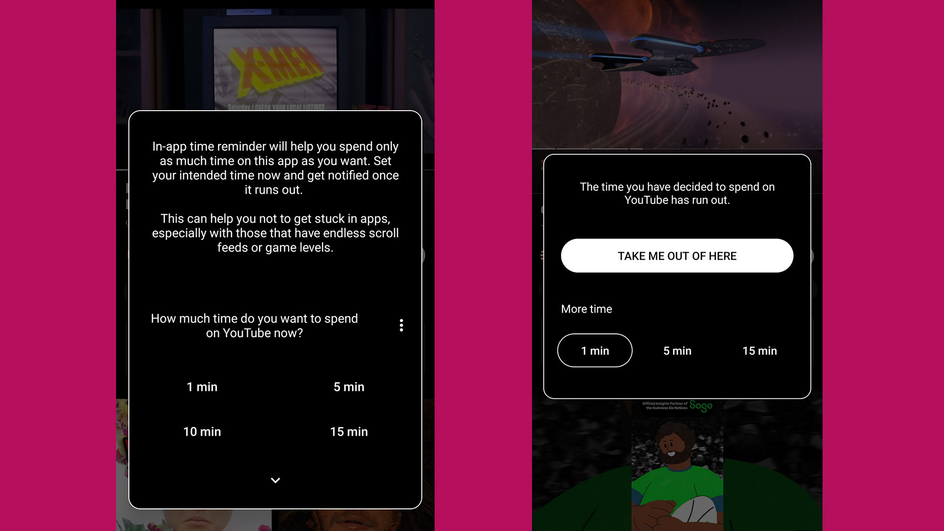
The In-app time reminder allows you to set how long you would like to spend on a specific app and has pret timers for one, five, ten, and fifteen-minute increments. Once set, it can provide a notification or automatically exit the app when the time is up. This is a good idea but relies on the user sticking to the allotted time and not just adding 5 more minutes.
Get daily insight, inspiration and deals in your inbox
Sign up for breaking news, reviews, opinion, top tech deals, and more.
Mindful Extension Delay is a feature that delays an app opening pop-up and shows a timer asking if you are sure you want to open the app. I liked this idea and it worked when I was just messing about with my phone but became annoying when I needed to do something important.
After about a day, I got used to navigating my phone again and soon didn’t find myself randomly scrolling through apps with no purpose, I started opening apps with a specific goal in mind.
Another helpful tool was the Notification Filter as I often feel like my phone is buzzing with too many irrelevant notifications. The filter helped me minimize distractions and the app allows you to set up filters for specific apps, which is something I use normally anyway.
Now I will admit I’m not the most organized person and I rely on notifications and my calendar to keep my life running relatively smoothly, despite how annoying they can be. While the initial reduction in notifications seemed good at first, I soon started forgetting meetings and appointments.
Honestly, I wasn’t a fan of the app, Minimalist Phone made using my phone a slower and more difficult experience. Unless I specifically looked for them I would miss important notifications and lose track of conversations. I sometimes became frustrated with using my phone. If I wanted to quickly google something, I would instead just pick up my laptop or tablet which defeats the point of Minimalist Phone.
That’s not to say I think the app doesn’t work or is a bad idea. It made me think harder about if I wanted to open an app and be more aware of how much time I spent with some apps, particularly games or social media. An unexpected benefit of using Minimalist Phone was my battery seemed to last longer. This is likely due to the menus being simple and lacking colors or animations, I was also using my phone less which both added up to prolong the battery.
The price of Minimalism
The app is downloadable from the Google Play Store and currently has over 1 million downloads. It costs $4.99 / £4.99 / AUS$7.99 per month, and a 12-month subscription is currently $21.43 / £19.99 / AUS$29.99 for 12 months. While a one-time purchase costs around $29.99 / £29.99 / AUS$47. However, you can try a free 7-day trial which requires signing up for a subscription to continue, which can be canceled before the first payment.
QQ42 labs faced criticism asking why the app isn’t free which they address on its website saying that Minimalist Phone doesn’t rely on advertising or selling user data to generate revenue and therefore requires a paywall to fund continued development.
They have also responded directly, pointing out that the app has several features to reduce screen time - such as in-app time reminder, app blocking and hiding, notification filter, and a monochrome mode that make it more than a launcher.
Minimal organization, maximum effort
I wish I could say that after using the Minimalist Phone app I felt calmer, more productive, and more focused but it just made me want to use my phone less, which is technically the point.
Usually, when I’m idly messing about with my phone, I suddenly remember to update my apps, check my emails or my bank balance, and catch up on any messages. But with Minimalist Phone, I stopped doing this once apps were “out of sight, out of mind” which made it very easy to lose track of things. It also made me feel like a technophobic grandpa as navigating to apps took longer.
However, I don’t think there's anything wrong with the app or even the idea of being more mindful of our screen time but I just think I’m not the right person for this method. While notifications can be annoying they can be a tool to help me remember to do something. I found it to be a hindrance whenever I had limited time that I didn’t want to have impacted by making navigating my phone less effective.
I appreciate what it’s trying to do and it could work well for people who genuinely spend too much time on their phones and want to break the habit. I’d recommend trying out the app on the seven-day trial to see if it's right for you. Nevertheless, it’s not for someone who relies on their phone to help keep them organized and remind them of what they need to do.
The Minimalist Phone app is more for those who want to consume less content on their phone and prefer their apps and notifications on a diet. It's lean and serene but not my scene.
You may also like
- I tried to replace my work computer with Samsung DeX, but it needs to solve some problems before I'll ditch the laptop
- I've kept a diary for 12 years, and I forgot about Apple's Journal app after using it for just a week
- Can't afford a Samsung Galaxy S24? Then the Xiaomi Redmi Note 13 Pro and Pro Plus may just be the next flagship challengers for you
James Ide was a writer for TechRadar specializing in phones and tablets, having previously worked at The Daily Mirror since 2016, covering news and reviews.
James loves messing with the latest tech, especially phones due to their incredibly rapid pace of development.
When not surrounded by various devices and/or tinkering with gadgets while putting them through their paces, James has a love of handheld consoles.
He is almost the textbook definition of a geek, who loves sci-fi, comics, games and of course, all things tech. If you think you have a story for him or just want to challenge him at Smash Bros, get in touch.