iOS 18 gives the Apple Weather app two cool upgrades, but I still miss Dark Sky
The Weather app is improving, but the forecast is mixed

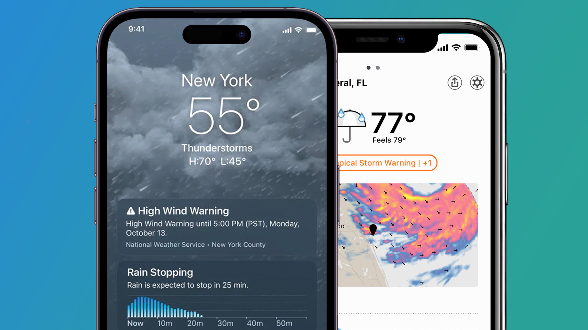
It's been almost two years since Apple's Weather app absorbed the popular Dark Sky app that Apple acquired in 2020. And now iOS 18 is promising to bring a couple of Weather upgrades that will improve the app, if not fill the Dark Sky-shaped hole in my life.
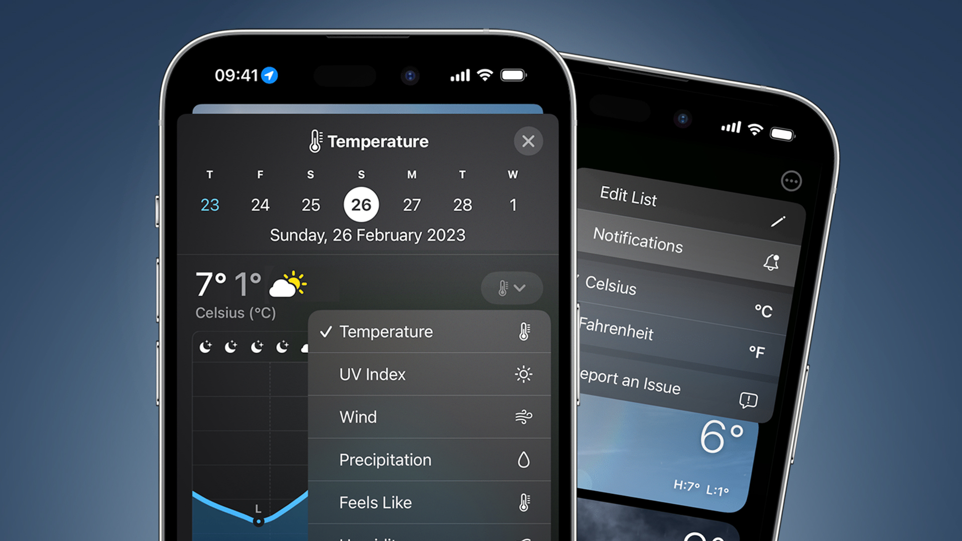
As spotted by 9to5Mac, there are two new features coming to Apple's Weather app in iOS 18. The first is a design tweak that'll put the day's 'feels like' temperature right underneath the actual temperature.
As 'feels like' is a more useful guide when you're deciding whether to wear an extra layer, that's certainly a handy bit of glanceable info. Apparently, this 'feels like' temperature will also only appear when it's different from the actual temperature, to avoid the app giving you repeated info.
The other change is the integration of your Home and Work locations with the Weather app. If you have these locations specified in your iPhone's Contacts app, they'll now automatically be pulled into the Weather app and added to your list of locations, which you can quickly swipe between in the app's homepage.
Of course, if you only have a short commute, the weather's unlikely to drastically differ between those two locations, but it could still be a handy way to quickly check for localized downpours. These two features will also apparently be coming to the weather app in iPadOS 18 and macOS Sequoia.
Some small upgrades are coming to the Weather app then, but probably not the ones that Dark Sky fans like me were hoping for...
Information overload

One of the main reasons I loved Dark Sky, aside from its accuracy, was its simplicity – as a UK resident, my main weather aim is to avoid random rain showers, and it was perfect for that.
Get daily insight, inspiration and deals in your inbox
Sign up for breaking news, reviews, opinion, top tech deals, and more.
Unlike some Weather app users, I don't have many complaints about its accuracy – as Apple explains in its guide to the app, it uses data from national weather services, just like most weather apps.
But the app's user interface is cluttered and not particularly user-friendly, so I was hoping to see this overhauled in iOS 18. It'd be great, for example, to have an editable home-screen where you can prioritize the data that's most important to you (and hide the ones you don't need).
That would very much be in the spirit of iOS 18, which is bring advanced homescreen customization to the iPhone for the first time. Right now, I still blankly look at the Weather app for a few seconds wondering where to find the info I need, despite having used it for over a year.
When it comes to getting more in-depth weather predictions (for example, seeing the fog potential for photography trips), I now default to Windy – its entire interface is a full-screen radar map with different filters, which is much simpler than Weather.
So while the Weather app's incoming tweaks sound handy, I'm still hoping for a bigger design overhaul in future – even if it'll never replace the simple brilliance of the Dark Sky app it swallowed up.
You might also like

Mark is TechRadar's Senior news editor. Having worked in tech journalism for a ludicrous 17 years, Mark is now attempting to break the world record for the number of camera bags hoarded by one person. He was previously Cameras Editor at both TechRadar and Trusted Reviews, Acting editor on Stuff.tv, as well as Features editor and Reviews editor on Stuff magazine. As a freelancer, he's contributed to titles including The Sunday Times, FourFourTwo and Arena. And in a former life, he also won The Daily Telegraph's Young Sportswriter of the Year. But that was before he discovered the strange joys of getting up at 4am for a photo shoot in London's Square Mile.