iOS 18 might break the iPhone's iconic app grid, and it's a change no one asked for
A DIY home screen?

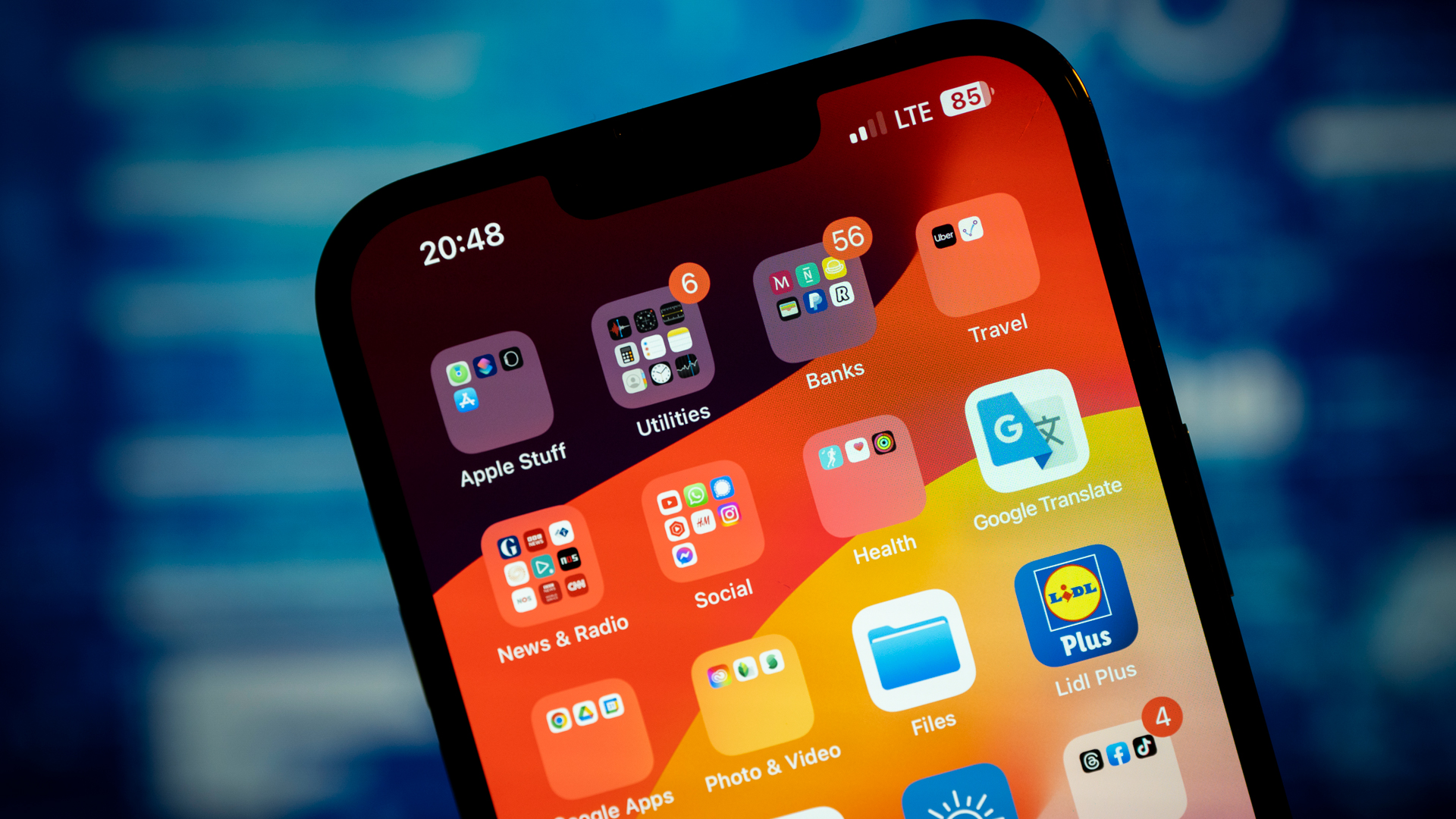
The iPhone and iOS are not messy. Throughout their nearly 20-year life they've embodied precision and consistency, with no design element left to chance. There's never a detail unexplained or unaccounted for; and one thing you absolutely will not find, on either the phone itself or in its operating system, is wasted space.
This is why I'm concerned that iOS 18 might introduce, for lack of a better word, intentional sloppiness.
According to fresh rumors from Apple soothsayer Mark Gurman of Bloomberg, the anticipated update to iOS, which we expect Apple to unveil in June at WWDC 2024, will remove the shackles of rigid conformity and allow iPhone owners to move app icons wherever they like – and even introduce blank spaces.
This is not the first time that Apple has messed with one of the core living spaces on your best iPhone. Two years ago, Apple redesigned the lock screen, calling it an "Act of love." It was a good update because it introduced information, innovation, and flexibility to the first thing you see when you pick up your iPhone, but without breaking the mold that makes the iPhone display special.
Apple's fantastic lift subject from background adds a sense of drama to even the most mundane family portrait by allowing you to pop a head or two on top of the iPhone's clock readout. I also appreciated the introduction of customizable widgets, a feature found on the best Android phones, and which took far too long to arrive on iOS.
Intentional sloppiness
These rumored iOS 18 changes don't appear to offer any of those benefits. They're more or less about choice, though I'd argue that with customizable widgets on your iOS 17 home screen you already have more than enough customization options.
If you'd rather not look at a gridded wall of icons, or even some kind of calming organization, you could with the rumored iOS 18 introduce vast swaths of blank space. Maybe you'll place just a few apps at the bottom of the screen (just above the dock), a few at the top, and one random floater in the middle. It's something you can do right now with, say, the Samsung Galaxy S24. I just tried it on a Samsung Galaxy S23 Ultra, but I don't really like the look of it.

You know who else might not like it? Jony Ive. That's right, the genius industrial designer responsible for most of Apple's iconic product designs (iPod, iPhone, iMac, iPad, original Apple Pencil – okay, they can't all be winners), might not have much use for Apple all but discarding the iconic iPhone grid.
Ive might have been a little obsessed with grids. Back in 2013. Daring Fireball's John Gruber noticed that you could overlay Apple's then-new Ive-designed iOS 7 app icons on top of some Apple hardware products, including the Apple TV, the trashcan Mac Pro, and the bottom of the Mac mini. The visuals he provided were uncanny. Ive never admitted as much, but considering his affinity for uniformity and clean design, such an approach wouldn't be surprising. Even if it was coincidental (it wasn't), Apple's secret sauce was, for decades, Ive's eye.
No space is good space
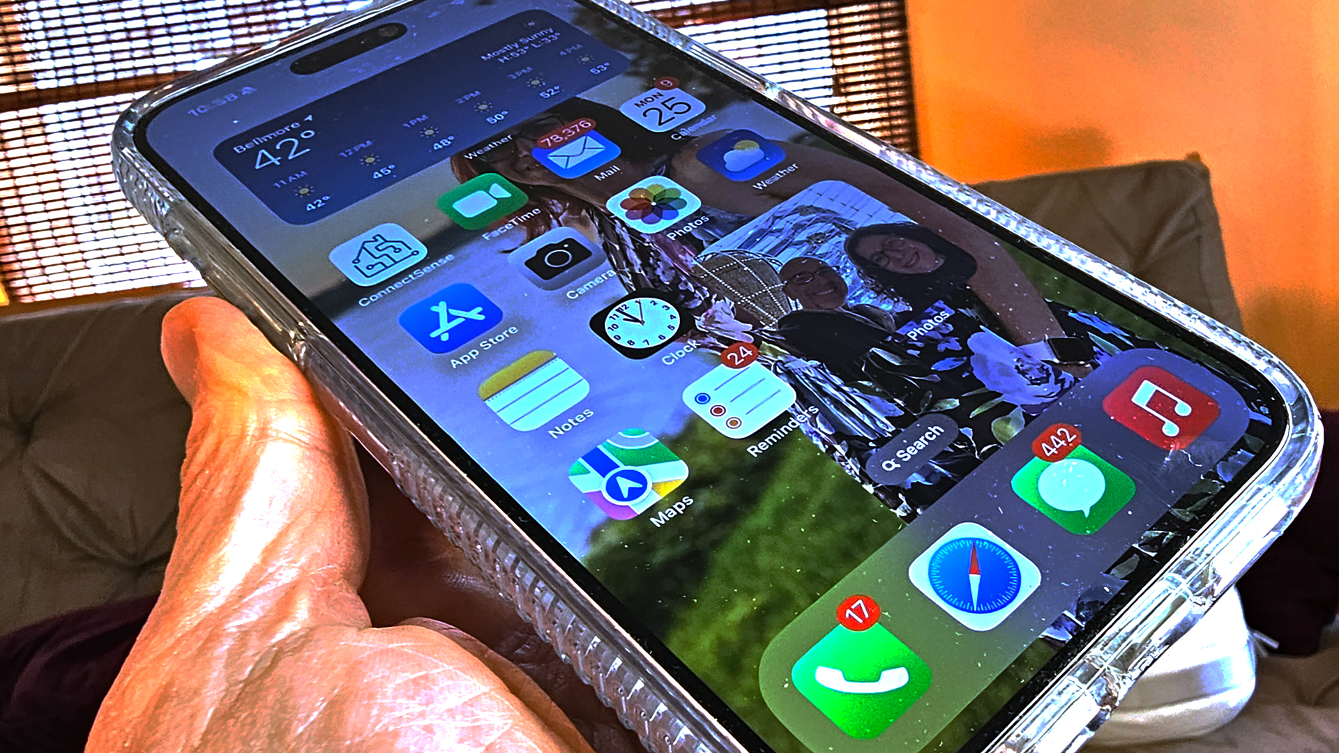
There's little doubt that the reason why the iPhone's apps are not tossed about willy-nilly on the home screen (nor any other page on the device) is because of Ive's strict adherence to the grid aesthetic. It's not just about elements living on a grid; it's about them filling dead space. If you grab one app icon from an app page and move it to another screen, it never leaves space behind. Instead, the surrounding apps snap to attention, and march in to fill the gap. The iPhone is the king of cleaning up after itself, at least when it comes to app placement.
Ives' obsession with eliminating dead space might have been informed by the late Steve Job's take on unnecessary space or air in any Apple product. Apple's cofounder and former CEO reportedly once threw an iPod prototype into an aquarium to show his designers that there was still too much space, and too much air, in the device; while the music player didn't float, it did release telltale air bubbles.
Unnecessary space was technology's enemy, and Jobs and Ive worked in tandem to eliminate it, along with any disorganization that might have resulted from it.

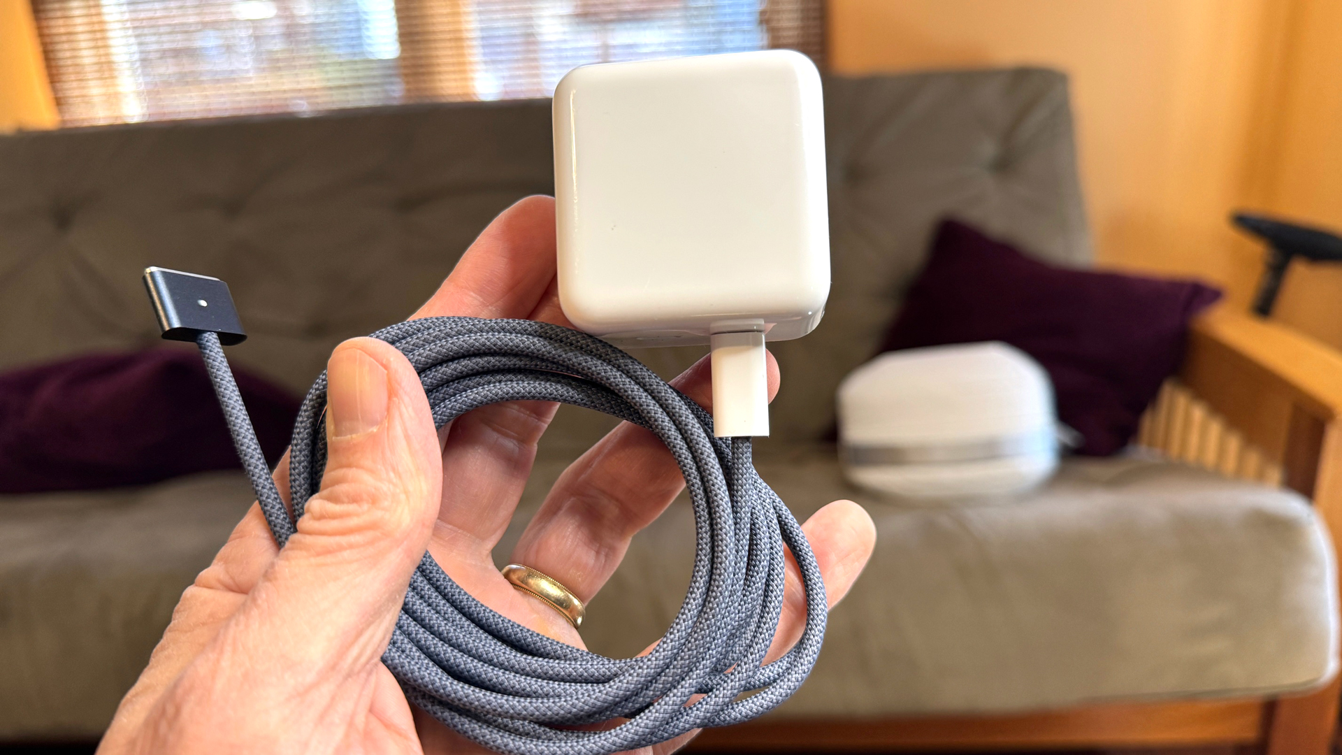
Ive left Apple in 2019, and reportedly ended his consulting relationship with the company in 2022. Since then, whatever influence Ive has had on the Apple aesthetic is likely diminishing. If I had to find one example, it would be the MacBook Air M3 Midnight's lovely woven grey MagSafe power cord, which somehow terminates in plastic white on the side where it plugs into a white power adapter. That, to me, is messy, and very un-Ive-like.
To be fair, there's no confirmation from Apple that it plans to offer iPhone owners almost unlimited home-screen control in iOS 18, but I could see it happening.
Customization is not a bad thing; but for everyone who's cheering that Apple is catching up to where Android has been for years, I'd suggest that this is a retrograde change that, while possibly bringing the iPhone more into alignment with its Android competitors, will make it somewhat less than what we expect from the best of iOS and Apple.
I also think Jony Ive would hate it.
You might also like
- iOS 18: rumored features, predicted release date, and everything we ...
- iOS 18 tipped to get a visual redesign this year – with macOS ...
- iOS 18 could be the 'biggest' software update in iPhone history ...
- iOS 18 tipped to be an 'ambitious' upgrade – 5 ways it could change ...
- iOS 18 may debut Apple's generative AI to boost Siri
Get daily insight, inspiration and deals in your inbox
Sign up for breaking news, reviews, opinion, top tech deals, and more.

A 38-year industry veteran and award-winning journalist, Lance has covered technology since PCs were the size of suitcases and “on line” meant “waiting.” He’s a former Lifewire Editor-in-Chief, Mashable Editor-in-Chief, and, before that, Editor in Chief of PCMag.com and Senior Vice President of Content for Ziff Davis, Inc. He also wrote a popular, weekly tech column for Medium called The Upgrade.
Lance Ulanoff makes frequent appearances on national, international, and local news programs including Live with Kelly and Mark, the Today Show, Good Morning America, CNBC, CNN, and the BBC.