6 things the Dynamic Island on the iPhone 15 needs to do
Features we'd like to see on Apple's second-gen iPhone cutout
Editor's note: The iPhone 15 has now been announced with Dynamic Island. Follow our Apple event 2023 live blog for the very latest.
Apple's September 12 'Wonderlust' event looks set to play host to the hotly anticipated iPhone 15 family; a quartet of phones that – unlike last year's iPhone 14 series – are expected to share one of line's most recent and intriguing additions: the Dynamic Island.
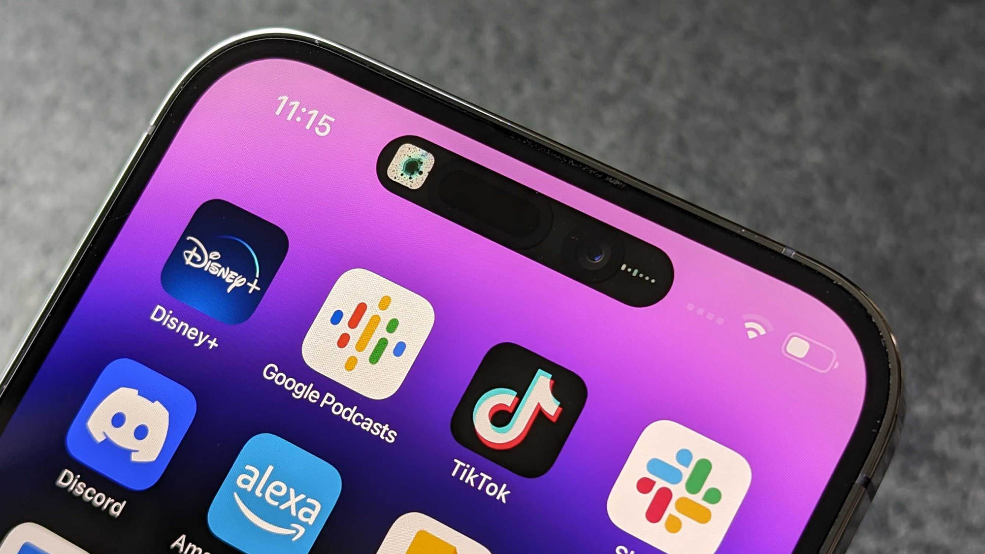
The Island, a blend of hardware and software that replaced older iPhones' distinctive notch, made its debut on 2022's iPhone 14 Pro and iPhone 14 Pro Max. While it shifts the front camera and Face ID sensors down into their own discreet area of the display – free from the bezel, it's the software dressing that enshrouds these components that really brings things to life.
At launch, Apple gave the Dynamic Island its own dedicated showreel, designed to highlight the key out-of-box features it added to the existing iPhone experience.
Since then, however, it feels as though things have gotten a little stale. Most excitement post-launch has revolved around third-party app developers adding Dynamic Island support into their existing apps, while there are also a handful who've joined the fray explicitly to develop new experiences with the Dynamic Island in mind.
As for Apple itself, based on what we know from iOS 17 ahead of its full release, there's not a whole lot of new functionality coming to the Island, it would seem. Aside from a few tweaks to how AirDrop, SharePlay and the Clock app appear, it doesn't seem as though Apple thinks the most unique additional to the iPhone in years, needs much tweaking one generation on.
That's where we differ though, Apple. Having used an iPhone 14 Pro Max for months and having combed the interwebs for the opinions of other Dynamic Island appreciators, there seem to be a number of functions that either already exist but aren't currently first-party features and should be, or ideas that beg the question "why doesn't it (the Dynamic Island) do this already?"
Get daily insight, inspiration and deals in your inbox
Sign up for breaking news, reviews, opinion, top tech deals, and more.
Here's a shortlist of some key features Apple could and should add to the Dynamic Island's repetoire in order to make it a little more... well, dynamic.
1. Clipboard
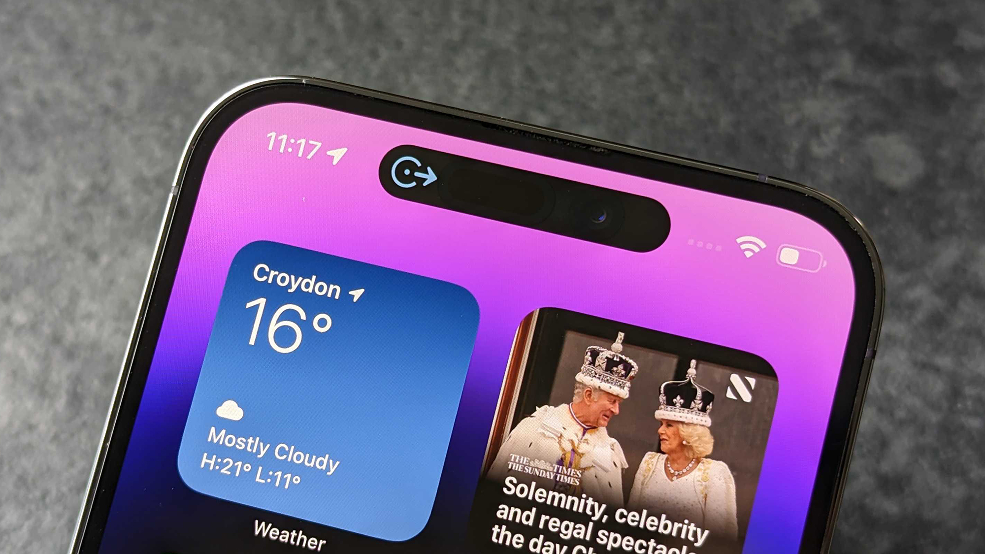
As long as iOS (once iPhone OS) has allowed users to cut and paste text, the iPhone has technically had a clipboard. Cross-device support was added back in 2016, with iOS 10's newfound Universal Clipboard letting you cut or copy and paste between your iCloud-logged in devices too.
Despite its presence, though, the clipboard on the iPhone has always been an ephemeral void that's served to temporarily hold text (and more recently images) while you move between apps and messages, looking for additional places to share your copy or content.
What if the Dynamic Island became the new home for the clipboard on iPhone, though? It could still maintain its ephemerality – clearing every time you restart your device or after a set amount of time, perhaps – but could be made into a space that the user can actually see and interact with, without needing to immediately share.
Like a holding pen, the clipboard could be accessed by long-pressing on the Dynamic Island when iOS detects there's a text box or a folder present to paste your copy and content into. And when you're done with it for the moment, tapping outside of this window folds the clipboard pocket dimension back up as it slots back into the Dynamic Island like a letter entering a mail slot.
2. Notifications
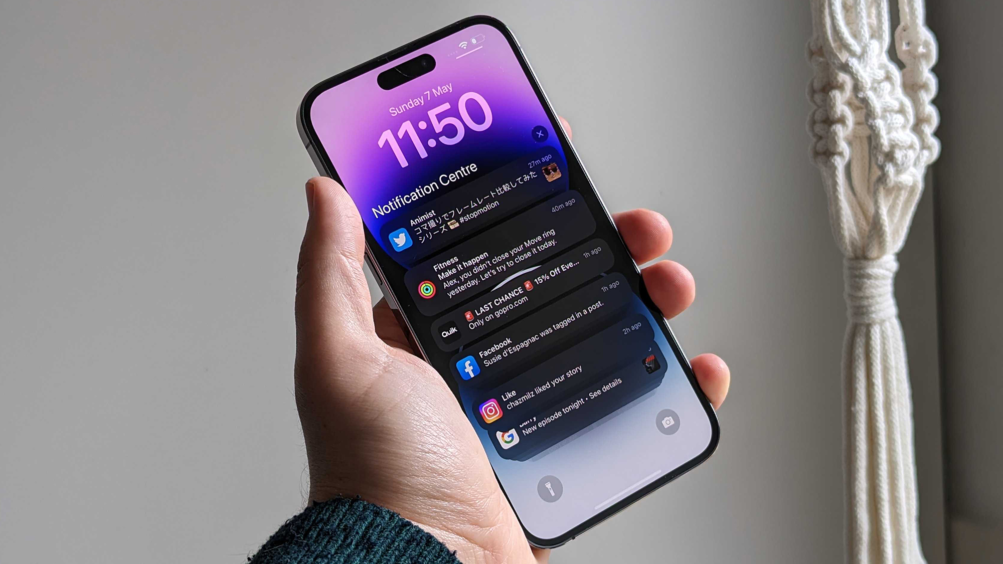
Ever since Apple switched from a home button-laden iPhone to the all-screen design, which debuted on the iPhone X, iOS had to reconfigure itself to slot Notifications Center behind a swipe down from the top-left of the screen, while Control Center was shunted to the top-right.
With the Dynamic Island likely to hang around until Apple figures out how to send the camera and the Face ID sensors under-display (without compromising quality), it actually feels like a pretty sensible place to rehouse where notifications live.
This change could make accessing both the Notifications and Control Centers more predictable and reliable, as well as reducing the risk of accidentally summoning Spotlight Search instead.
3. AirDrop
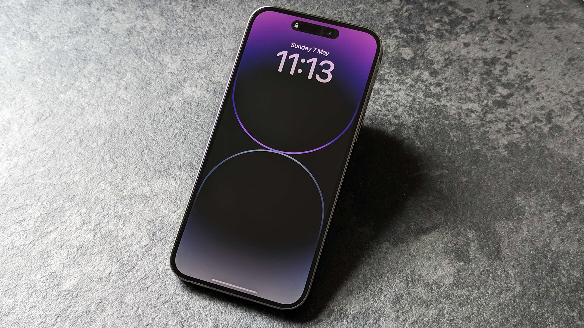
AirDrop does look as though it's getting easier to use with iOS 17, especially when it comes to slinging out those stylish new Contact Posters. However, the Dynamic Island could serve as an ever-present slot through which you could send AirDrop content, meaning you don't need to bring up the share menu, but simply slide media up to the slot in the top of your screen to initiate the AirDrop search process.
4. Multitasking
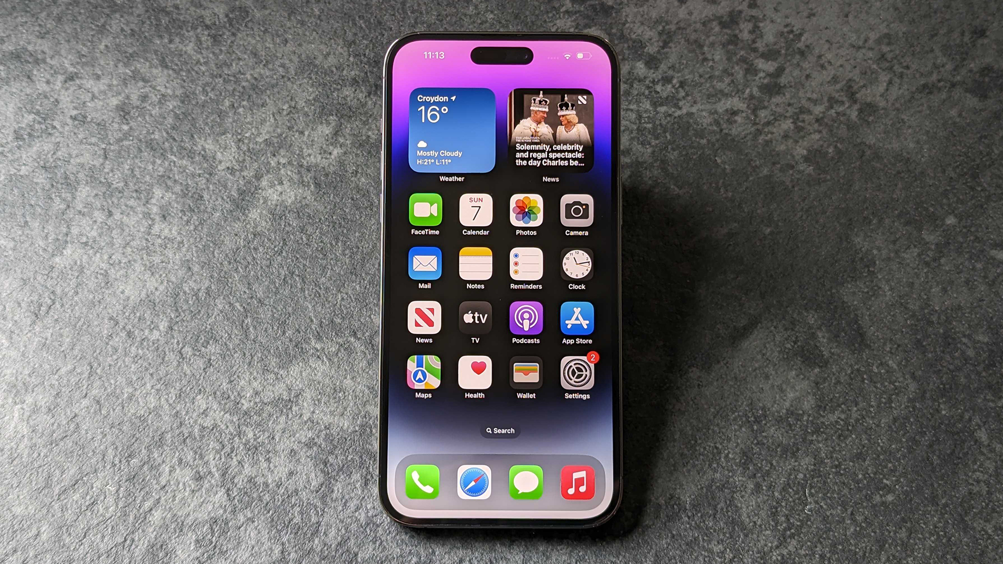
The iPad, like most Android phones, has been able to pull off split-screen multitasking for several years now, but – in Apple's eyes, at least – the iPhone's screen is just too small a canvas to let two apps coexist. Well, perhaps the Dynamic Island could change that.
Apple already grants quick access to experiences like the timer and calculator from Control Center, but imagine being able to throw almost any app into the Dynamic Island where it can exist, floating over the top of whatever main app you already have open, on-screen.
Imagine having a calculator at hand while working on a Numbers, Excel or Google Sheets document, or running Translate while a foreign language video plays, or being able to view your Twitch chat while streaming Genshin Impact.
5. Tap-for-time
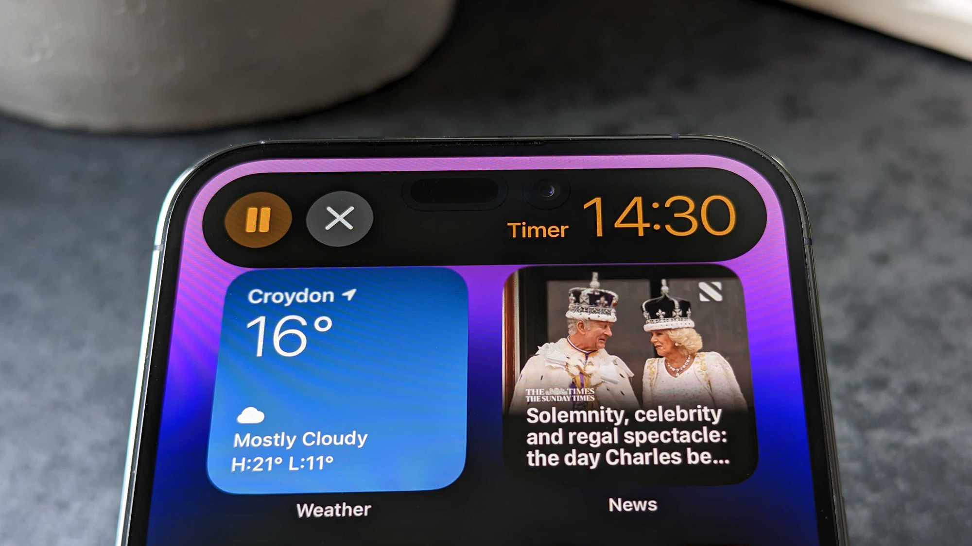
At present, when watching full-screen video on an iPhone, one of the easiest ways to check the time (or your notifications) is to swipe down the Notifications Center from the top-left of the screen, but that immediately stops whatever content is playing on-screen and obscures it from view, taking you out of the moment.
Adding a single-tap gesture to the Dynamic Island while watching full-screen video (or when gaming) that brings up a small clock (and perhaps a notification count) momentarily, would help serve this same purpose while better maintaining immersion in your media.
6. Context-aware tools
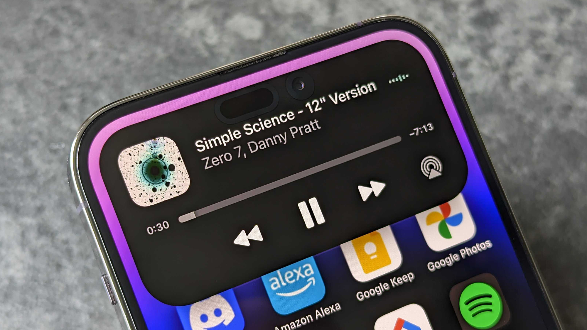
While comparisons between the Dynamic Island and the ill-fated Touch Bar from 2021's MacBook Pro will likely be met with trepidation, the context-aware flexibility of the Touch Bar – serving up tools specific to whatever application was open – is a trait that the Dynamic Island could easily embrace.
Imagine a persistent home for the main tools of your favorite apps: font controls when writing in Notes, pop-out media controls when watching Netflix, YouTube or Spotify, the ability to turn your FaceTime call into a Group FaceTime call with suggested contacts only a couple of taps away.
More iPhone 15 stories
Hubs
- iPhone 15: everything we know
- iPhone 15 Plus: everything we know so far
- iPhone 15 Pro: everything we know so far
- iPhone 15 Pro Max: everything we know so far
- iPhone 15 Ultra: everything we know so far
- iPhone 15 pre-orders: here's what to expect
- iPhone 15 deals: here's what to expect
Comparisons
- iPhone 15 vs iPhone 14: how will Apple's next vanilla model stack up?
- iPhone 14 Pro vs iPhone 15: the rumored key differences
- iPhone 15 Pro vs iPhone 14 Pro: the rumored key differences
- iPhone 14 Pro Max vs iPhone 15: the rumored key differences
- iPhone 14 Pro Max vs iPhone 15 Pro Max: the rumored key differences
- iPhone 15 vs Samsung Galaxy S23: the rumored key differences
- iPhone 15 vs iPhone 15 Pro: the rumored key differences
- iPhone 15 vs iPhone 15 Pro Max: the rumored key differences
- iPhone 15 Pro vs iPhone 15 Pro Max: the rumored key differences

Alex joined as TechRadar's Senior Phones Editor in June 2022, but brings over a decade's worth of experience to the role, with an expertise in smartphones, tablets and wearables. He's covered keynotes hosted by the biggest brands and attended the launches for some of the most influential mobile products of the last few years. His experience was amassed at some of the most reputable consumer technology publications out there, including GSMArena, TechAdvisor and Trusted Reviews.