Hate the new iOS 18 Photos app? Try these fixes to make it more like the old version
Hidden customizations are your friend

The launch of iOS 18 has been mostly well-received by iPhone fans, but the most controversial change has been Apple's redesign of the Photos app.
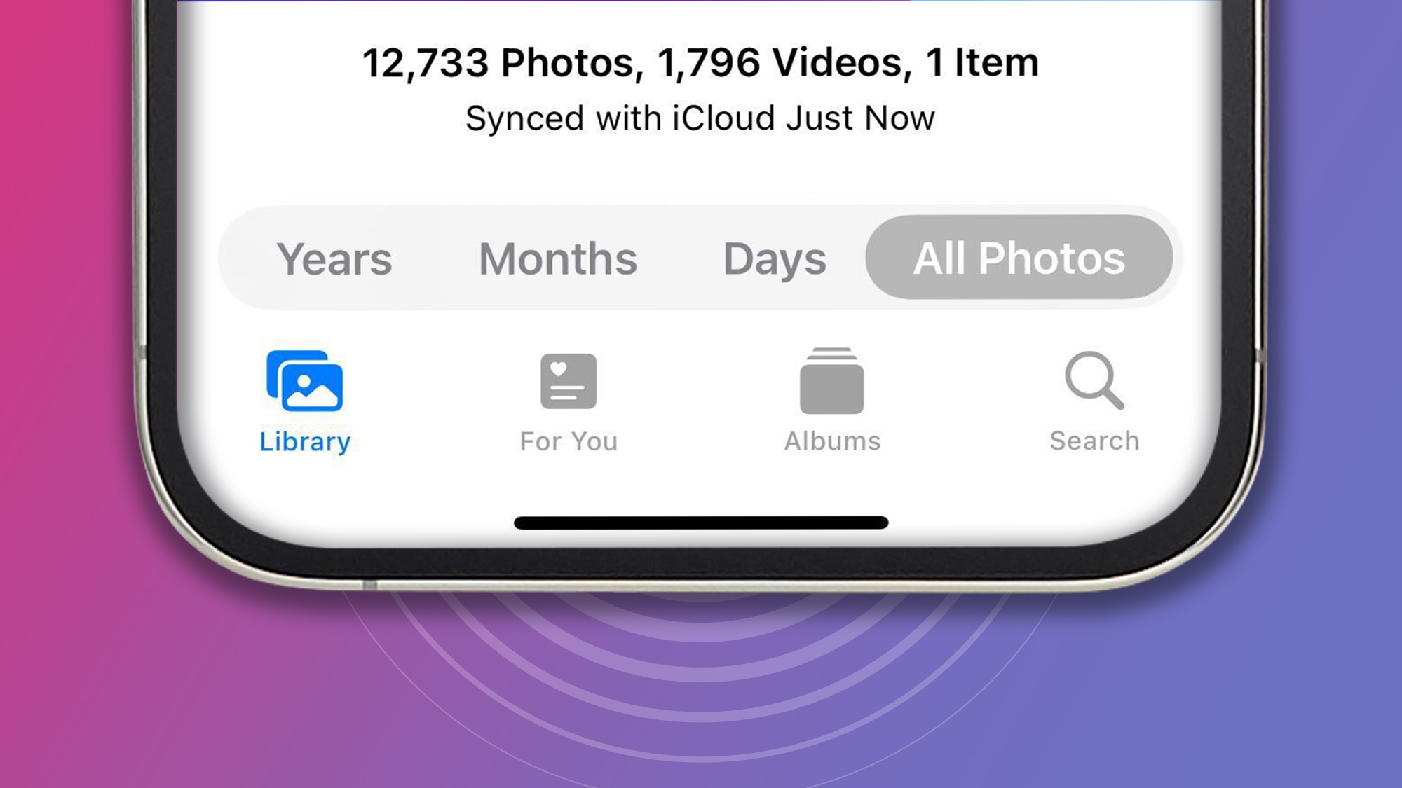
Across the TechRadar office and multiple Reddit threads, many fans have been fuming about the many changes – with the most disliked one being Apple's decision to ditch the tabbed navigation bar that used to live at the base of the app's screen.
Instead, Apple has embraced a scrolling design that, for many, makes the app feel slower and more laborious to use. Fortunately, it has also hidden two handy customizations that can help you restore the app to something similar to the previous tab experience.
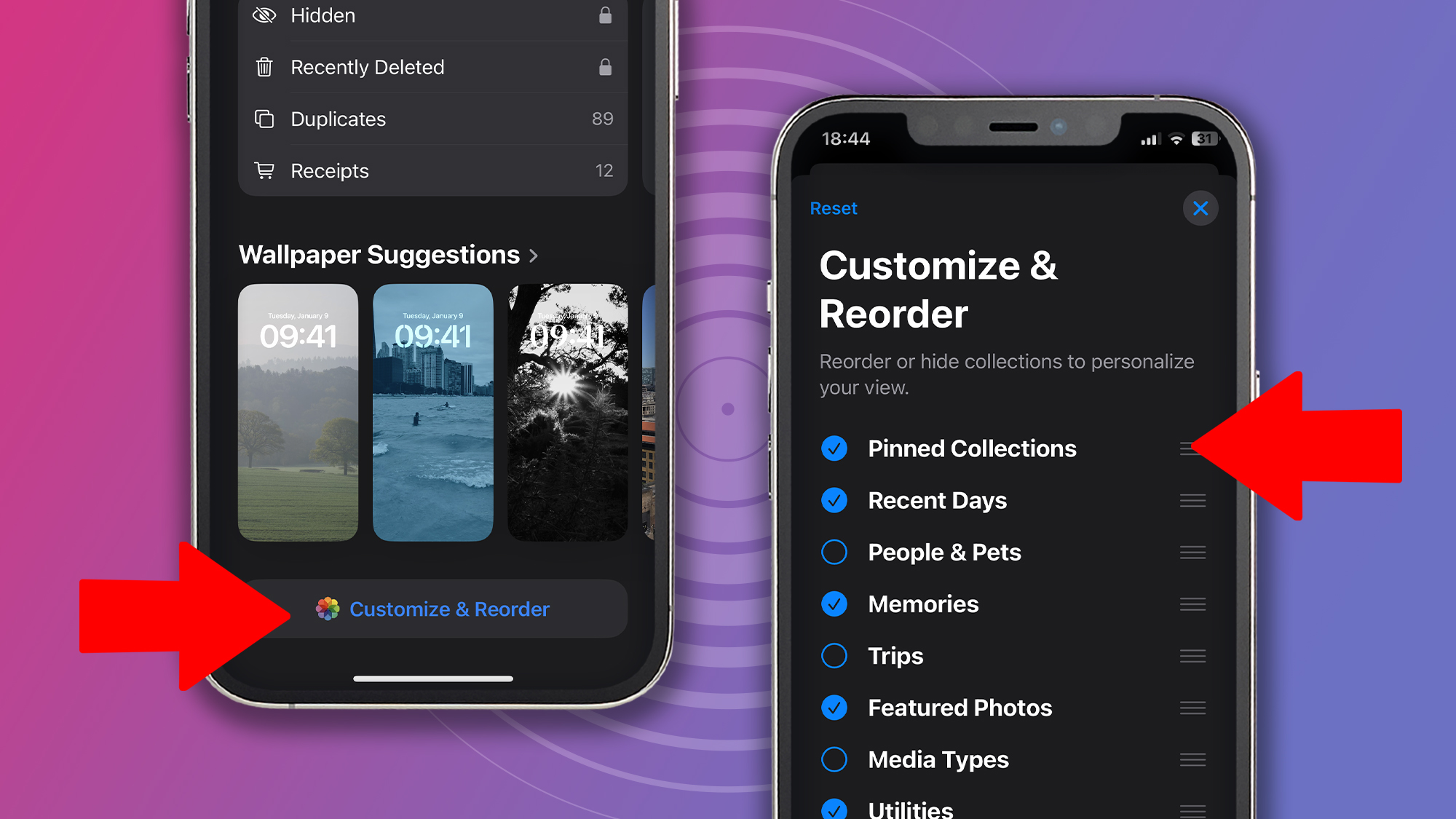
The first is the ability to change the order of the app's long list of photo collections. To do that, scroll to the bottom of the app and tap 'Customize & Reorder'. This lets you move your preferred collections, such as 'Albums' and 'Recent Days, ' further up the page.

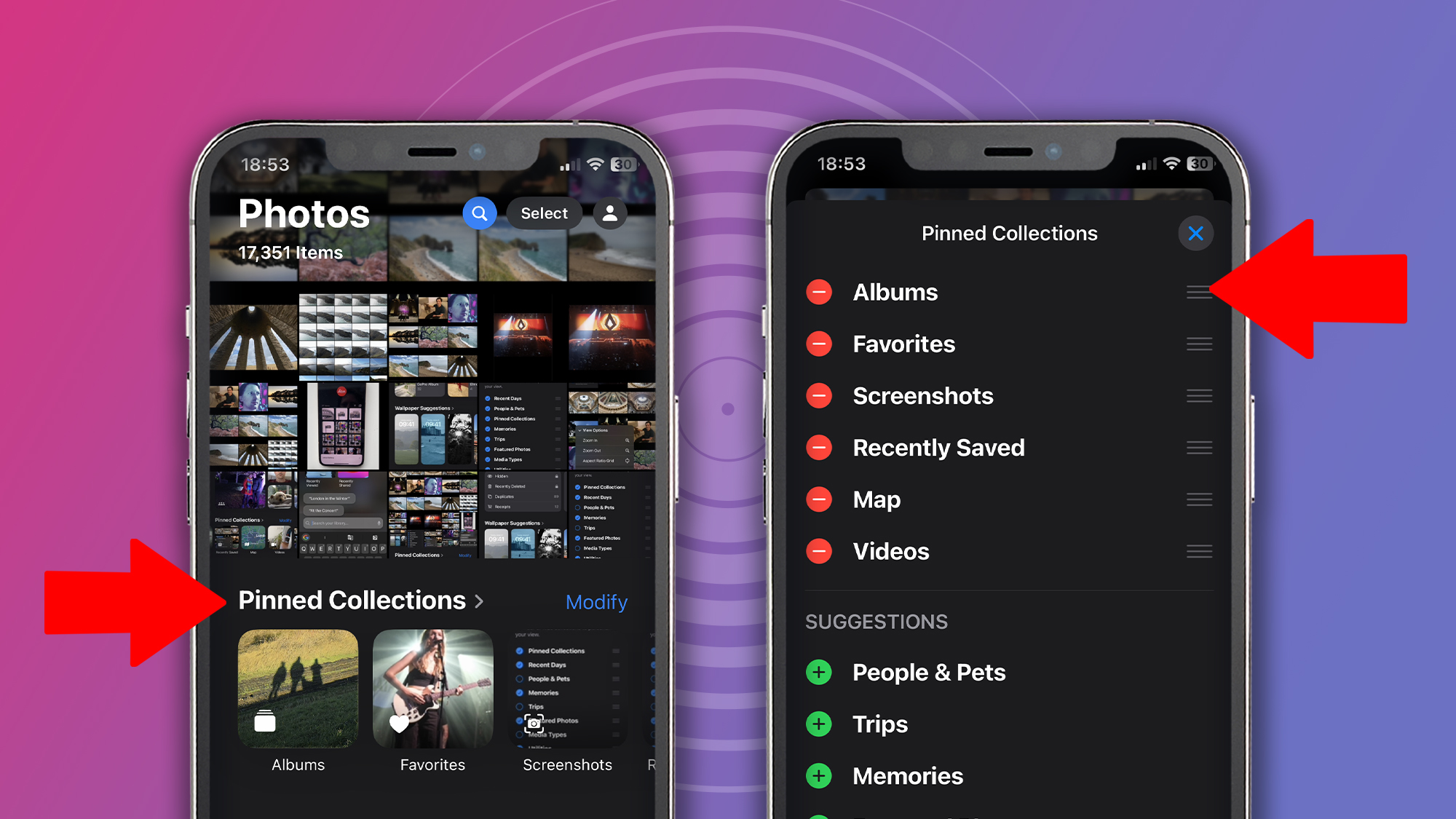
If you want something closer to the old navigation bar, the key one to move to the top (so it sits just below your Photos feed when you open the app) is 'Pinned Collections.'
As the name suggests, this is a bar of shortcuts to your preferred photo sets. To change the order of these, tap 'Modify,' and you can move some of the old nav bar favorites, like 'Albums,' into one-tap territory again without needing to scroll.

If your photo feed is overrun with screenshots, you can also remove them and restrict them to a Screenshots folder in Pinned Collections. To do this, scroll upwards on the Photos app's home screen until the menu bar appears at the bottom of the screen. Now tap the up-down arrows button, hit 'View Options,' and then uncheck Screenshots.
Get daily insight, inspiration and deals in your inbox
Sign up for breaking news, reviews, opinion, top tech deals, and more.
While you may still need to relearn some muscle memory, these tweaks should at least make the Photos app less confusing and overwhelming than it first appears.
RIP nav bar

It's fair to say that the new Photos app has traded some old-school simplicity for a more modern look, and that's divided opinion. However, the undoubted plus side is that this approach comes with greater customization.
These options are somewhat buried or hidden in the UI – so while many have been dismayed and aghast upon opening the new Photos app, there are, fortunately, ways to restore a more familiar experience.
That's not to say there aren't legitimate grievances with Apple's new app. One is that video playback appears to have taken a step backwards, with the scrub bar losing its thumbnail previews and requiring a tap to play videos full screen. Another is that the app feels slightly cluttered, with so many automated collections competing for your attention – although you can again remove the ones you don't want using the 'Customize and Reorder' menu.
While some iPhone owners are holding off from updating to iOS 18 in order to keep their comfortably familiar Photos app, they may soon be tempted to take the plunge when Apple Intelligence features finally start rolling out – which Apple confirmed today will happen next month in the US, and in December for the UK and Australia.
You might also like...

Mark is TechRadar's Senior news editor. Having worked in tech journalism for a ludicrous 17 years, Mark is now attempting to break the world record for the number of camera bags hoarded by one person. He was previously Cameras Editor at both TechRadar and Trusted Reviews, Acting editor on Stuff.tv, as well as Features editor and Reviews editor on Stuff magazine. As a freelancer, he's contributed to titles including The Sunday Times, FourFourTwo and Arena. And in a former life, he also won The Daily Telegraph's Young Sportswriter of the Year. But that was before he discovered the strange joys of getting up at 4am for a photo shoot in London's Square Mile.