OpenAI is getting a makeover - new visual rebrand for ChatGPT maker even includes its own custom font
OpenAI gets a more cohesive branding strategy

- OpenAI gets a fresh new look, centered around its own OpenAI Sans font
- Rebrand has apparently been a work-in-progress for more than a year
- However ChatGPT was barely used for the redesign
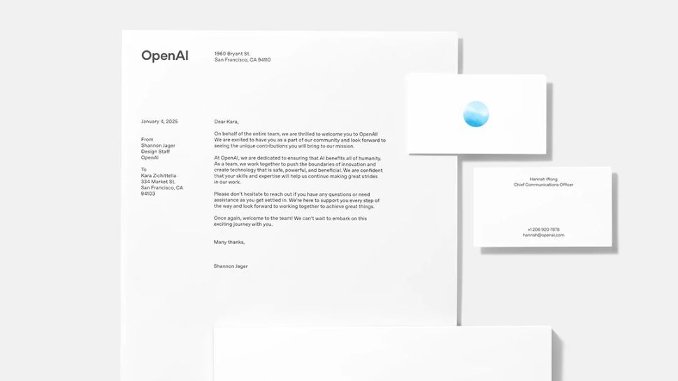
Ten years after the company was founded, OpenAI has revealed a total rebrand with updated logos and fonts .
Its update includes a fresh brand identity with a new typeface, wordmark, symbol and color palette, but there have been no drastic changes to keep everything familiar.
The Al research and deployment company has issued full guidance to the updates online to keep partners, resellers, customers, developers, consultants, publishers, and any other third parties in the loop.
OpenAI reveals subtle rebrand
Speaking with Wallpaper, OpenAI stated the rebrand was driven by the need for a unified and cohesive identity. Head of Design Veit Moeller and Design Director Shannon Jager admitted that, until now, OpenAI has presented itself haphazardly by using an inconsistent range of fonts, marks and colours.
Moeller disclosed the rebrand has been in the works for more than a year, and was initiated by CEO Sam Altman who wanted a “more organic and more human” look.
Apart from launching its own OpenAI Sans font, the company has also updated its stock imagery with photos from established photographers and abstract graphics rendered by its very own Sora model.
ChatGPT has gained huge traction in the years since its first public preview launch. Despite OpenAI’s intention for it to be a research experiment, it gained a million users within the first five days. By the end of 2024, it had more than 300 million active weekly users.
Are you a pro? Subscribe to our newsletter
Sign up to the TechRadar Pro newsletter to get all the top news, opinion, features and guidance your business needs to succeed!
Addressing the elephant in the room, the designers confirmed a company sentiment that, “technology should amplify, not replace, the depth of human creativity,” adding the updated imagery evokes memory and that the typography carries tone. They were designed by an in-house team rather than getting influence from a third-party agency, the pair confirmed.
Finally, the so-called ‘blossom’ logo, which resembles a flower blossom and is made up of three intertwined triangles, is set to be used more sparingly, with the ‘OpenAI’ wordmark getting more use instead.
And for creatives worried about the threat that AI poses to their livelihoods, the designers confirmed that the redesign process was mostly handled in traditional ways, though ChatGPT was used to inform calculations for different type weights.
You might also like
- OpenAI reveals its most powerful tool yet, designed for "deep research"
- Check out the best AI tools and best AI writers
- We’ve listed all of the best logo makers
With several years’ experience freelancing in tech and automotive circles, Craig’s specific interests lie in technology that is designed to better our lives, including AI and ML, productivity aids, and smart fitness. He is also passionate about cars and the decarbonisation of personal transportation. As an avid bargain-hunter, you can be sure that any deal Craig finds is top value!
You must confirm your public display name before commenting
Please logout and then login again, you will then be prompted to enter your display name.
Most Popular


