TechRadar Verdict
A good online multi-platform service that works well with some interesting features. Definitely worth a look if you’re in the market for a simple design tool to create anything from posters to social media posts.
Pros
- +
Easy to use
- +
Many useful tools
- +
Works on any device
Cons
- -
Not as full featured as a dedicated app
- -
Easy to not notice that some features aren’t free
- -
The webpage can end up using a significant amount of power
Why you can trust TechRadar
Update: This is for an older version. For the latest, see our Adobe Express (2024) review
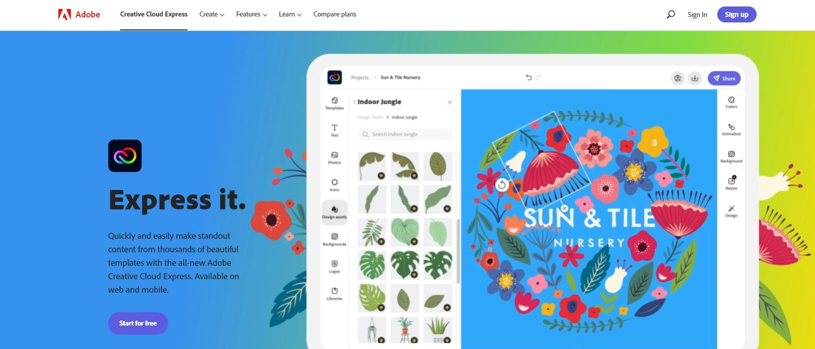
Creative Cloud Express is a revamped version of Adobe Spark, which itself was a merger of three Adobe properties only a year ago. Back then the transition wasn’t fully finalised, but now this service is designed to work on your desktop via a web browser, or your phone or tablet through a dedicated app, allowing you to create designs on your computer, mobile or tablet, and all for free (well, mostly for free). Let’s take a closer look at it.
Getting started
Although this service is part of Adobe, you don’t actually need a Creative Cloud account and therefore don’t need to fork out a monthly subscription in order to use it- well there’s a proviso to this (more on that later). But you do need to login somehow which can be done using your Above ID, Google, Facebook or Apple accounts, or just your email if you prefer. Teachers and students have a separate login option.
You’ll be given a multiple choice question about what you want to use Creative Cloud Express for, and a query about your design experience, and you’re good to go.
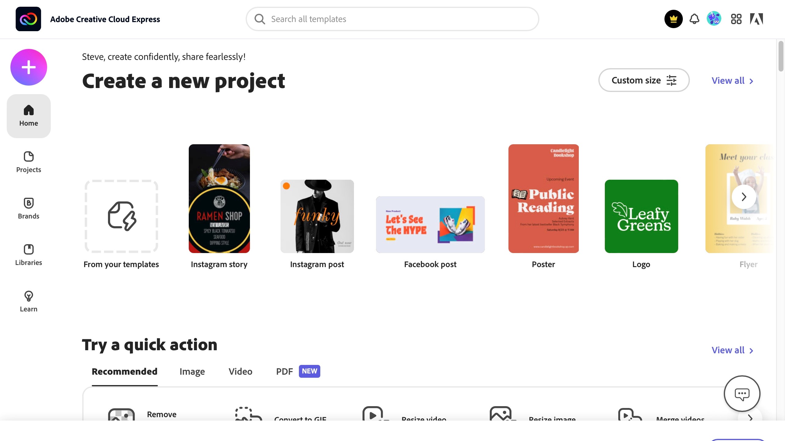
The design process is based around templates for specific needs, like an Instagram story or post, a YouTube thumbnail, a flyer, even a resume or menu. Clicking on ‘show all’ lets you see all available categories, and how many templates are available in each. The wealth of options of beyond impressive. You’ll notice that free and premium samples are mixed together, but there’s a welcome filter option that can effortlessly separate them for you. You also have the option of starting from scratch, but a template often helps speed up the process. As your familiarity with this service grows, you’ll be able to save your own templates as well.
Select one you like to make it your own…
Customisation
Your editing space is well organised: to the left are all the objects you can add to your creation, be it the same templates you explored earlier, text tools, access to Adobe Stock photos, thousands of black and white icons, backgrounds, etc., and on the right you’ve got access to pre-defined colour palettes, tools to animate your design, various layouts, and design options.
The central part of the page is dedicated to a preview of your work. This layout differs when working with the mobile/tablet app, but all the features appear to be the same.
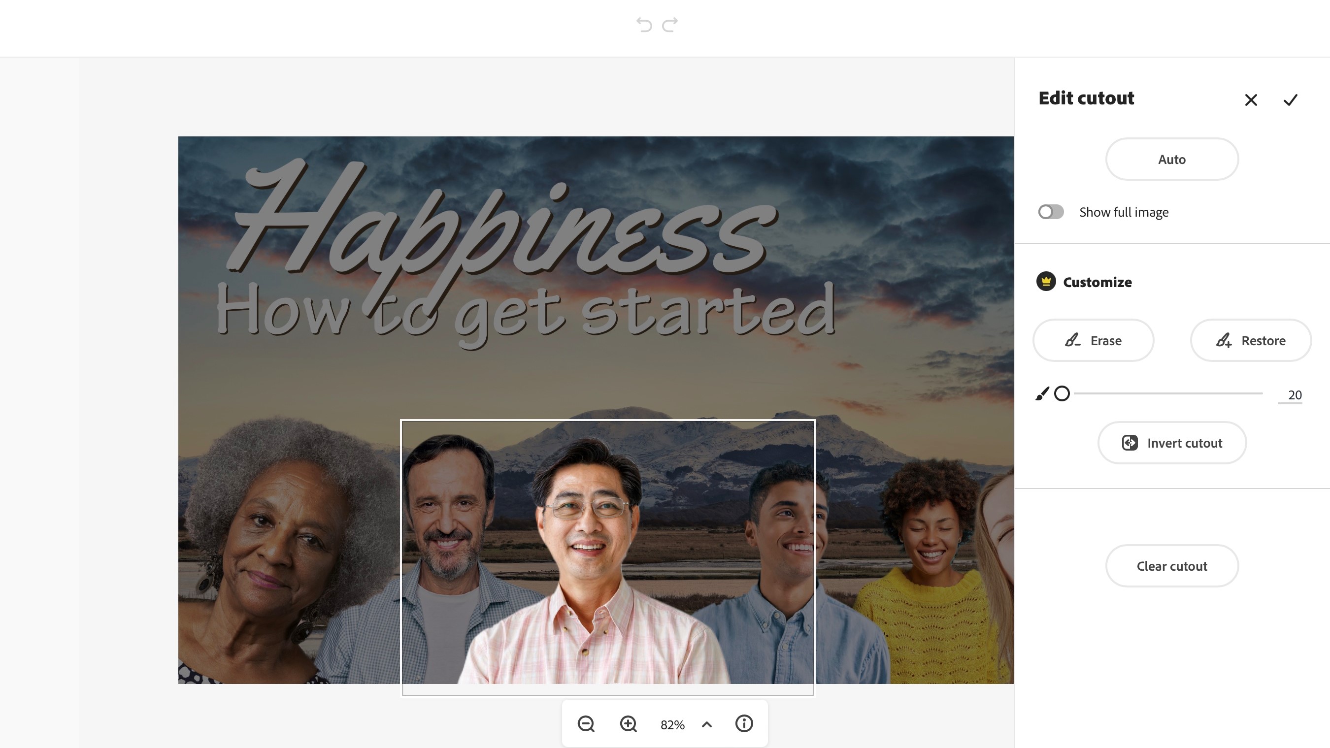
Click on an object on your canvas and the right side of the page is replaced with an ‘edit image’ sidebar. From there you have a cool feature: being able to automatically remove the photo’s background. It works a lot of the time, but not always.
This is also where you get to alter the item’s opacity, crop it or mask it with a shape, or even apply some effects to it, such as blur, colour filters, and image enhancements. Select a text field and that sidebar shows you various text editing tools instead. It hasn’t got all the bells and whistles more advanced Adobe services or software packages have, but there’s enough there to get you designing nice looking projects in little time.
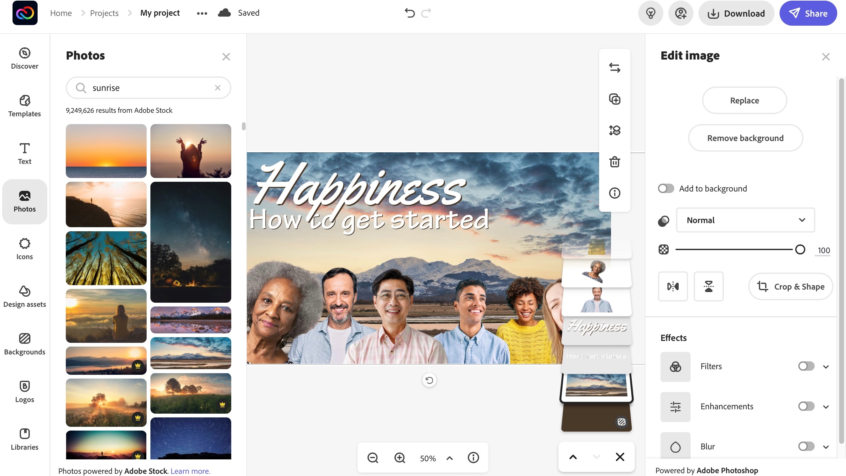
The whole editing concept works with layers, making it easy to overlap objects and move them around. There’s a small display of all your layers stacked on top of each other, lower right of your canvas. From there, you can select one and easily drag it above or below another, in a manner that is very visual and effective.
It all looks great, but there’s a catch to that ‘free’ monicker.
Free as in limited
The catch is, not all features are actually available to you. This was already hinted at when browsing through templates, and you could filter out the paid for samples from the free ones. But this goes further. You might notice it when playing around with the automatic background remover: as mentioned above, it’s not perfect, and in order to fine tune the results, you have access to tools to add or remove areas… except those are deemed to be ‘premium’ features.
Another cool tool which is restricted to the premium area, is the ability to ‘resize’ a project. What Adobe mean by that is being able to automatically alter the dimensions of your project so it fits where it’s destined to be shared: if you were working on an Instagram Story, one click of a button and all your objects would be rearranged to fit a Facebook post instead, for instance. This is a very nice time saving feature that comes at a price.
Essentially, if you find a small golden crown icon on a tool, object, shape or photo, etc., it belongs to the premium side of things.
Premium is a subscription which would cost you $10 per month, or $100 per year (paid in advance). Although those additional tools can be useful, it is possible to design something with everything else that’s free without really needing those feature - it would just take a little more time, and you’d have to forgo some of the nicer templates, photos and objects.
Seamless device hopping
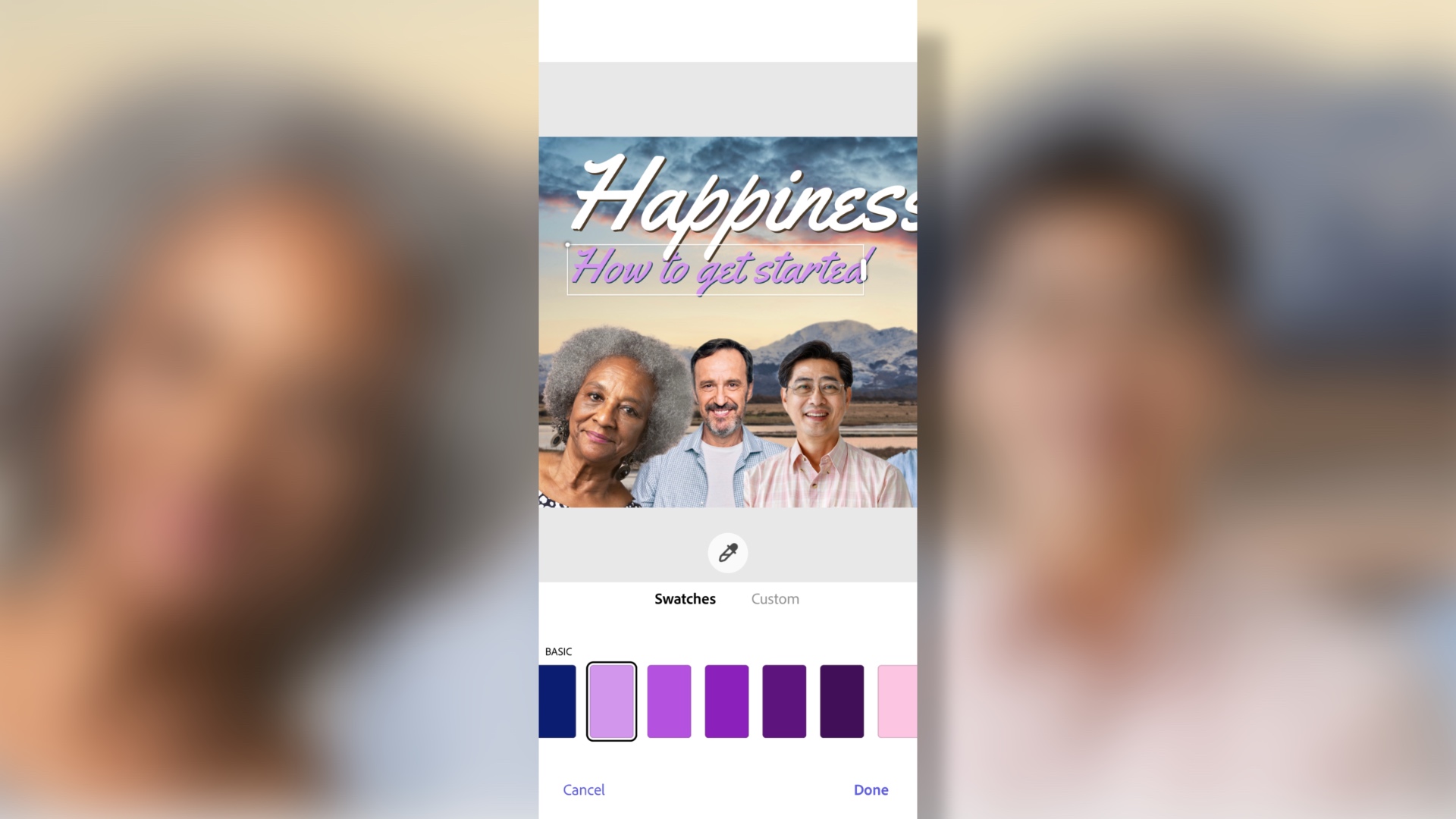
One feature we really liked it the seamless compatibility between your devices: as long as you’re logged into the same account on all your machines, you can start work on your computer, carry on on your tablet, and keep tweaking it on your phone. Everything is saved online, making it really easy for you to work on whichever device you prefer, wherever you are.
Download
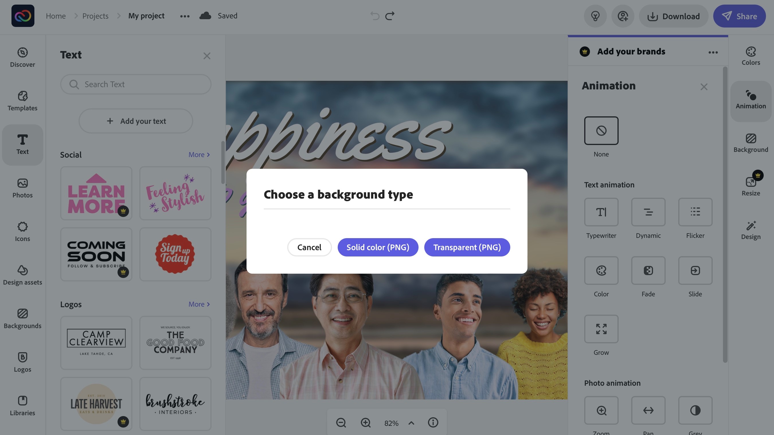
Getting your finished work is quick and painless: you’re given three format options, either PNG, JPG or PDF, and the PNG format also lets you save a file with a transparent background. Choose your preferred one and within seconds, it’s on your computer.
Final verdict
Adobe’s Creative Cloud Express is a much improved experience compared to Spark, even though some features have been lost (like video). However, by focusing on design, be it for print or the web, and making sure the tools work on whichever device you’re working on, Adobe have created a very nice service which is smooth and powerful whether you’re using a computer, tablet or phone.
We've also featured the best logo maker and designer as well as the best website builder
Steve has been writing about technology since 2003. Starting with Digital Creative Arts, he's since added his tech expertise at titles such as iCreate, MacFormat, MacWorld, MacLife, and TechRadar. His focus is on the creative arts, like website builders, image manipulation, and filmmaking software, but he hasn’t shied away from more business-oriented software either. He uses many of the apps he writes about in his personal and professional life. Steve loves how computers have enabled everyone to delve into creative possibilities, and is always delighted to share his knowledge, expertise, and experience with readers.
