TechRadar Verdict
A software-based web design tool which is fast, stable and flexible, but lacks features many have come to expect in such a software package.
Pros
- +
Part of Creative Cloud
- +
Fast and stable
- +
Great design flexibility
- +
Great extensibility with widgets
Cons
- -
Not designed for complex sites
- -
Lacks from important features
- -
Hasn’t been updated in a while
- -
Tech support will expire at end of March 2020
Why you can trust TechRadar
Editorial note: Muse is an app which Adobe designed to offer a simpler web design building experience, but before we delve too deeply into it, you need to know that Muse is being discontinued and although the software will continue to function as long as it remains compatible with your computer’s operating system, Adobe will no longer offer technical support for it after the 26th of March 2020.
Adobe have a large series of applications linked to their Creative Cloud service, and one of the great things of this subscription service is, if you’re familiar with one app, you’ll feel comfortable that you know where all the tool should be located in another.
They have an app for pretty much every conceivable creative need, and if you’re thinking of designing a website, you’ll likely consider their Dreamweaver app.
- Want to try Adobe Muse? Check out the website here
But this is a massive piece of software which you need to dedicate a good amount of time to to get proficient with it. On the other side of the scale, we have web builders, like Adobe’s Spark, which do most of the heavy lifting for you. Isn’t there something in between? Enter Muse, a software package that runs on both Mac and Windows.
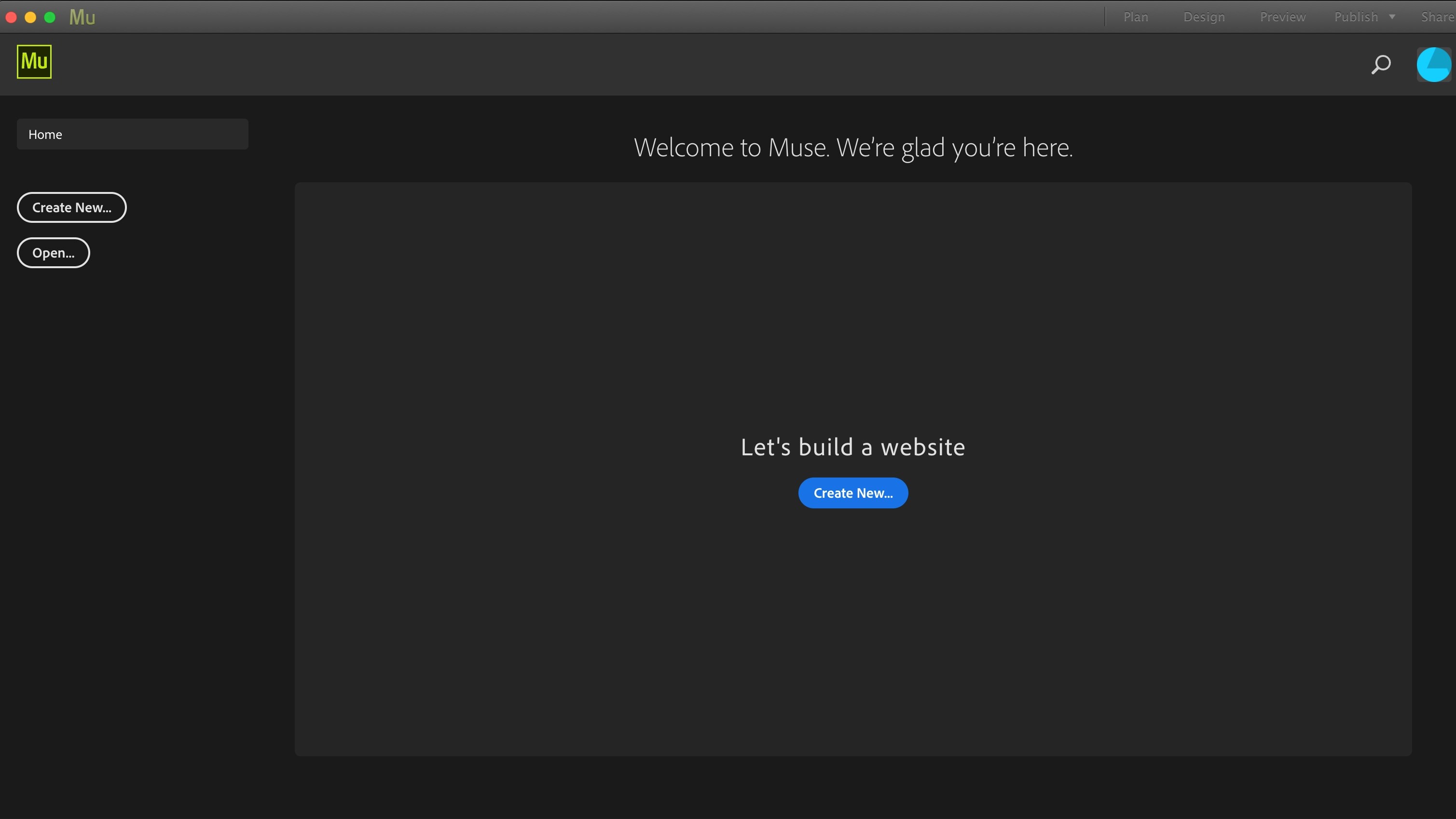
Getting started
When you create a new site, Muse offers you a flexible layout by default (this is one that alters its layout depending on which device your page is viewed on), but if you prefer a fixed layout, it’s only a drop down menu away. However it’s worth noting that a flexible page design is increasingly becoming the norm when it comes to web design, so your page is easily readable no matter which device your visitors are using - hence the reason its the default option.
There are three main sections to the interface: Plan, Design and Preview.
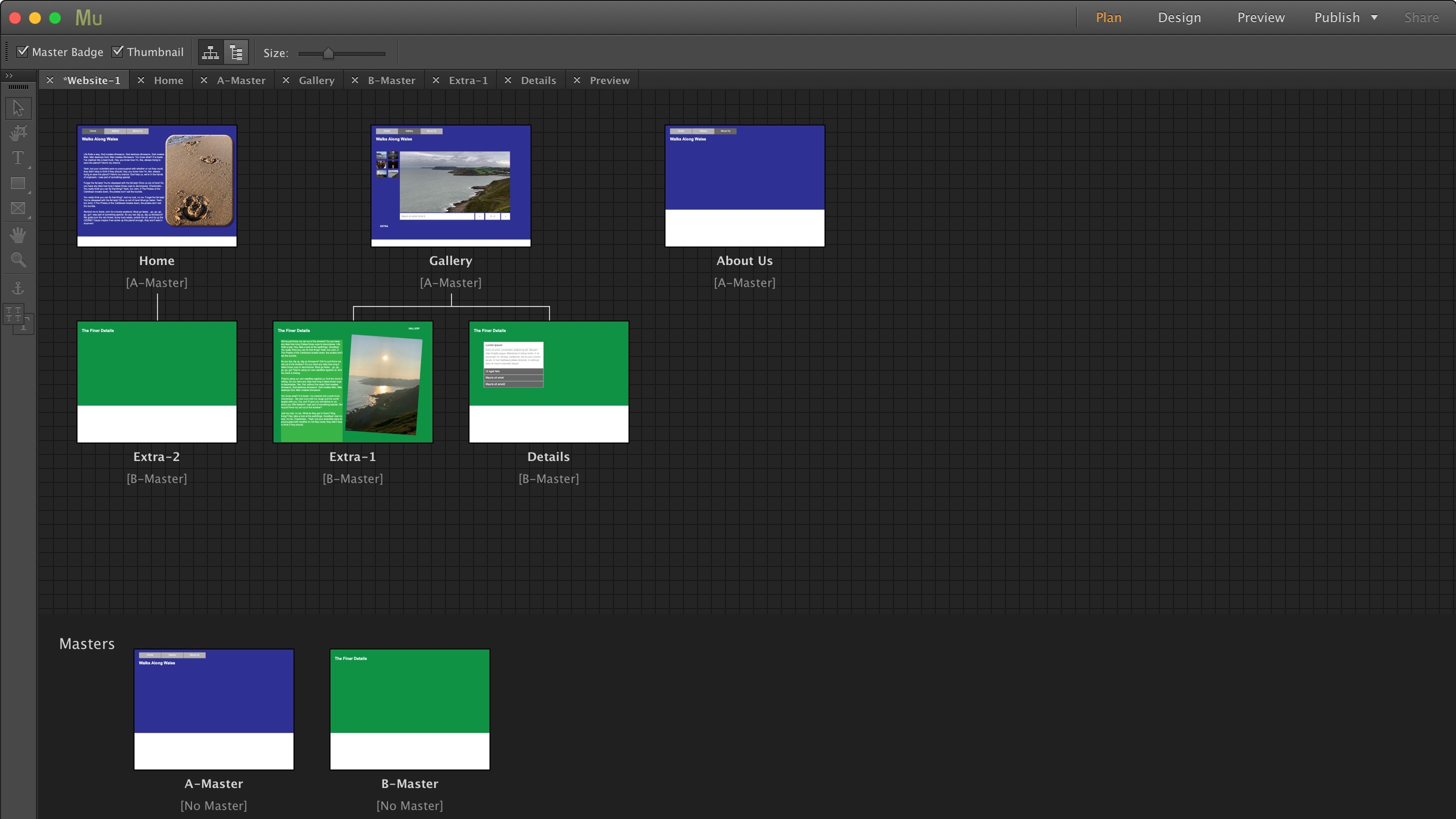
Plan
Plan is where you preview your website. Create new pages and subpages, and set up Master pages.
Master pages are quite useful since you can use them to set a specific look to your site which can be automatically transferred over to all connected pages. That way, if you want to make a design change, you only have to alter one page, rather than potentially dozens.
You’re also able to create multiple Master pages, creating different looks depending on which section of the website you might be visiting.
In order to apply a specific Master page onto a newly created page, just drag the Master onto it. It’s really as simple as that (if you only have one master page, it’s applied automatically for you).
The interface feels very fluid and easy to understand - you can drag pages around with ease. The Plan section is a great way to get a good overview of the site you’re creating while giving you the flexibility to make changes quickly and easily.
Design
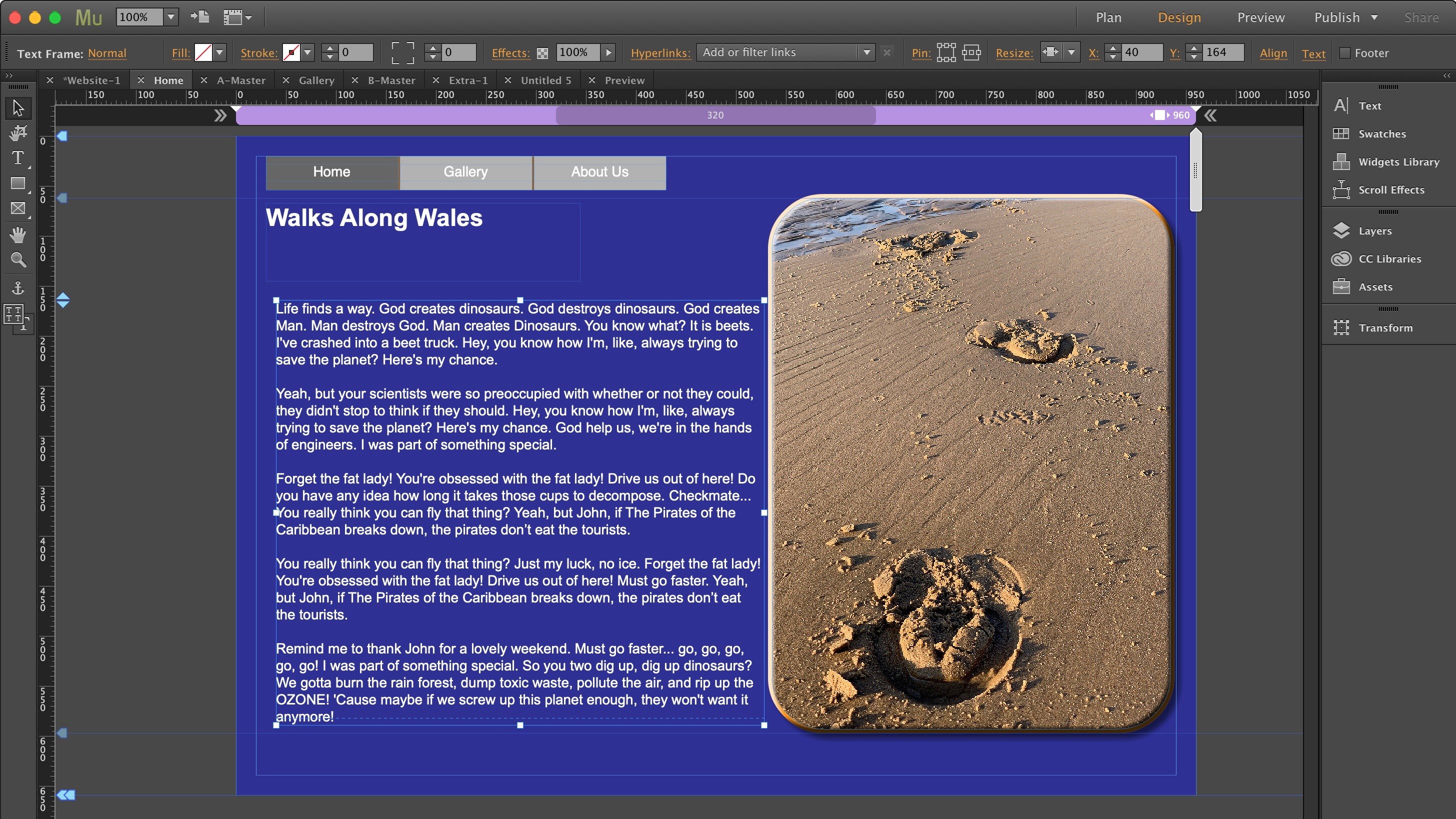
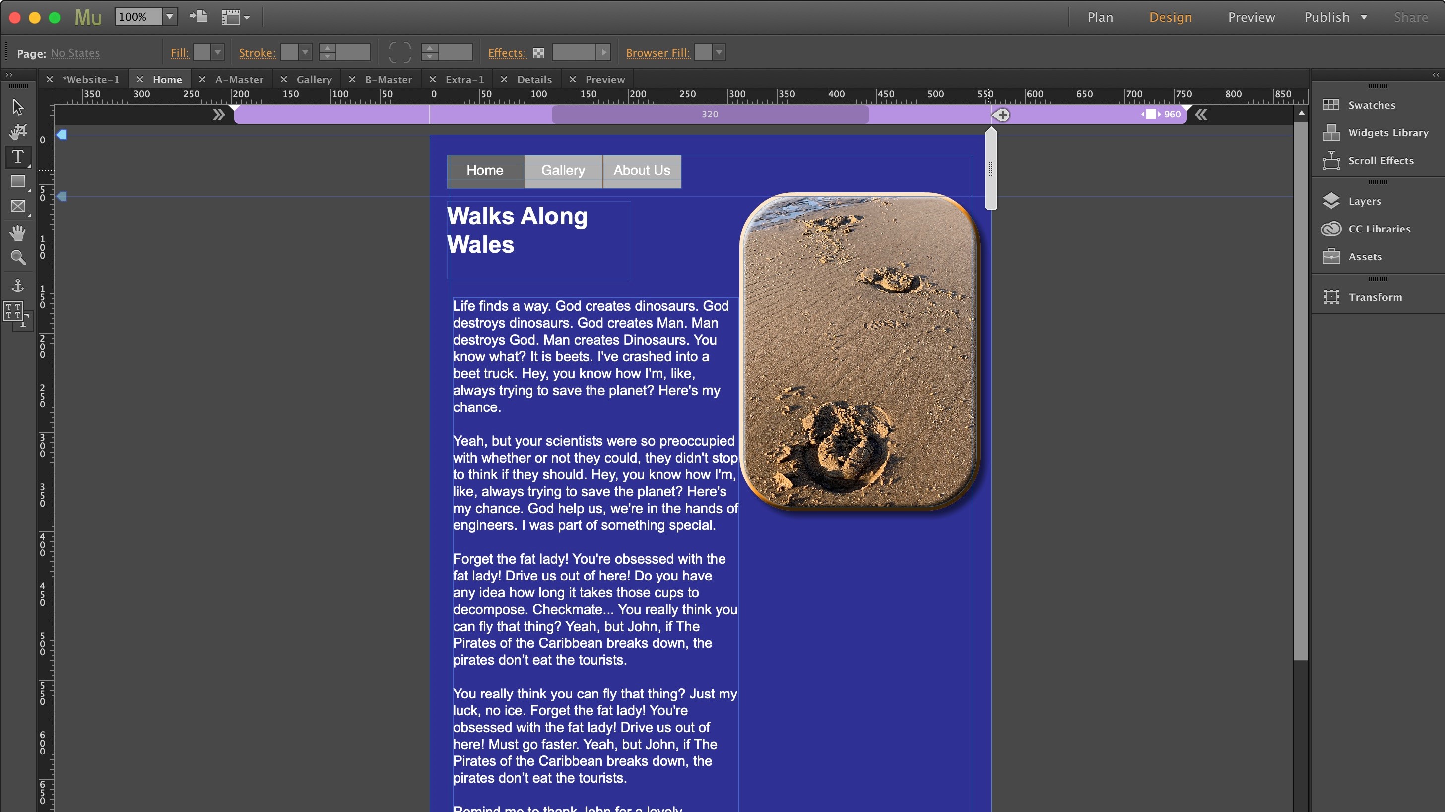
The Design section is where you’ll be spending most of your time. If you’re familiar with Adobe’s products, you’ll recognise this section’s interface pretty quickly. You’ll find a toolbar on the left, a control bar at the top and panels on the right.
You access the Design section by double-clicking a page’s thumbnail in the Plan section. All pages open in tabs, making it easy to switch between pages as you build your site.
Unlike most online web services, you’ll notice you have pixel perfect precision of your design: you can place a text box, button, photo, what have you, anywhere, exactly where you want it to be when the page is at its maximum width, even using the arrow keys to nudge the item precisely, one pixel at a time.
There’s a handle to the right which you can use to reduce the page’s width and hence see how its content would be displayed on a smaller screen. Everything is resized and moves slightly to accommodate until you reach a width of 320 pixels.
This is a default limit - you can alter it, in either direction - should you wish to, through the ‘Breakout Properties’ window.
Widgets
The panels on the right contain a lot of useful tools - this is where you can alter your text, apply colours, work with layers, etc.
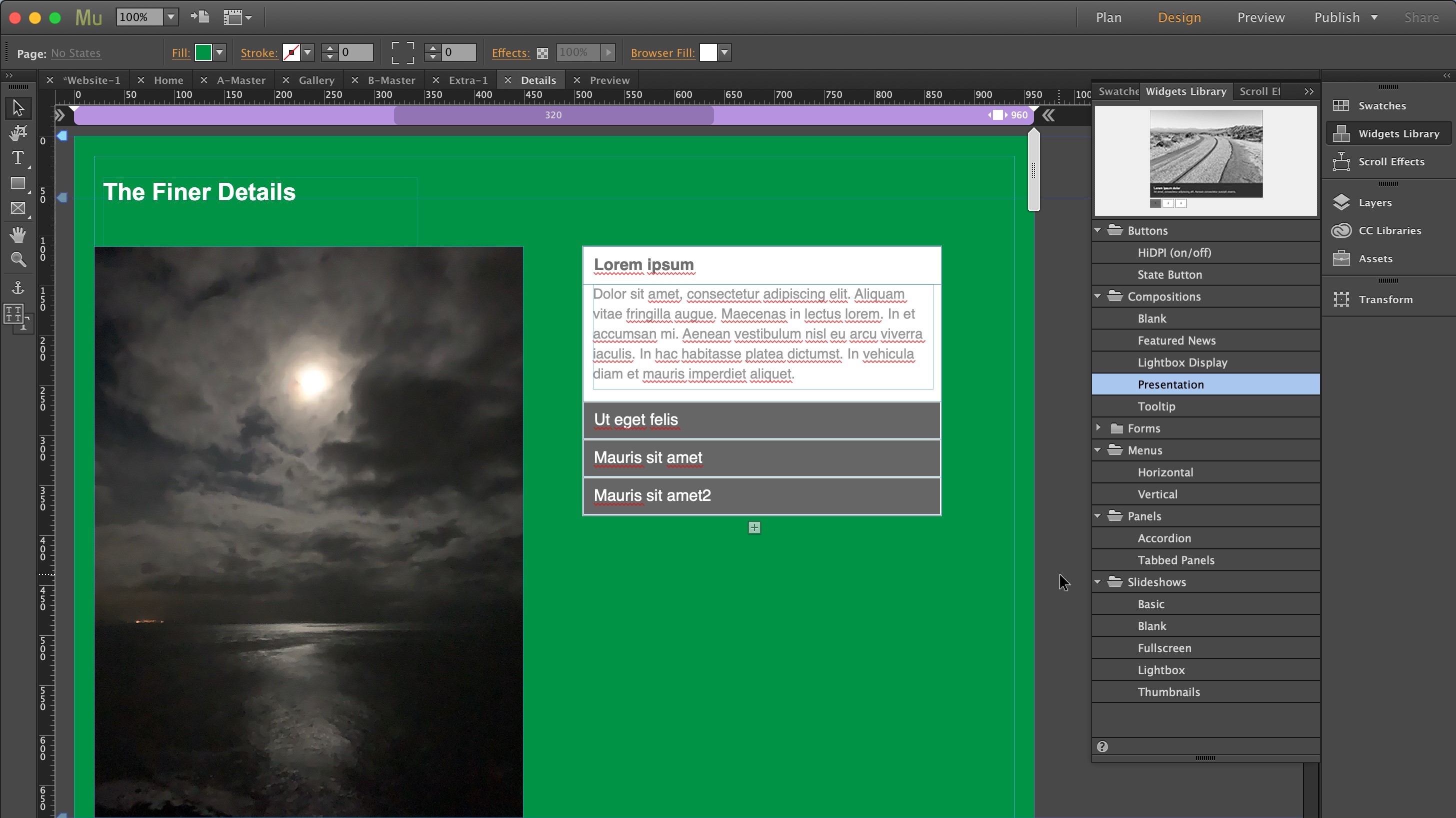
One of the most useful sections from a page layout point of view is the ‘Widgets Library’.
You can use that section to add a navigation menu (which automatically adds new connections when you create a new top-level page), or insert a slideshow, information panels - either collapsible ones or with tabbed sections. The whole process is remarkably easy: just scroll through the available options, see a tiny preview at the top of that tool’s window (more often than not that preview is so small as to be practically useless), and then drag the widget you want onto your page.
Once there, you can simply move it and/or resize it to suit your needs.
Muse can actually be as simple or as complex as you need it to be.
Anything you use is also fully customisable. You don’t have to rely on ready-made buttons, you can simply create your own, even customising the button’s state (normal, rollover, mouse down and active) as you see fit.
It’s worth noting that Muse isn’t an image editing program: you can resize a photo, but you can’t alter its look. It’s best to use a dedicated app for that, like Photoshop for instance.
Toolbar
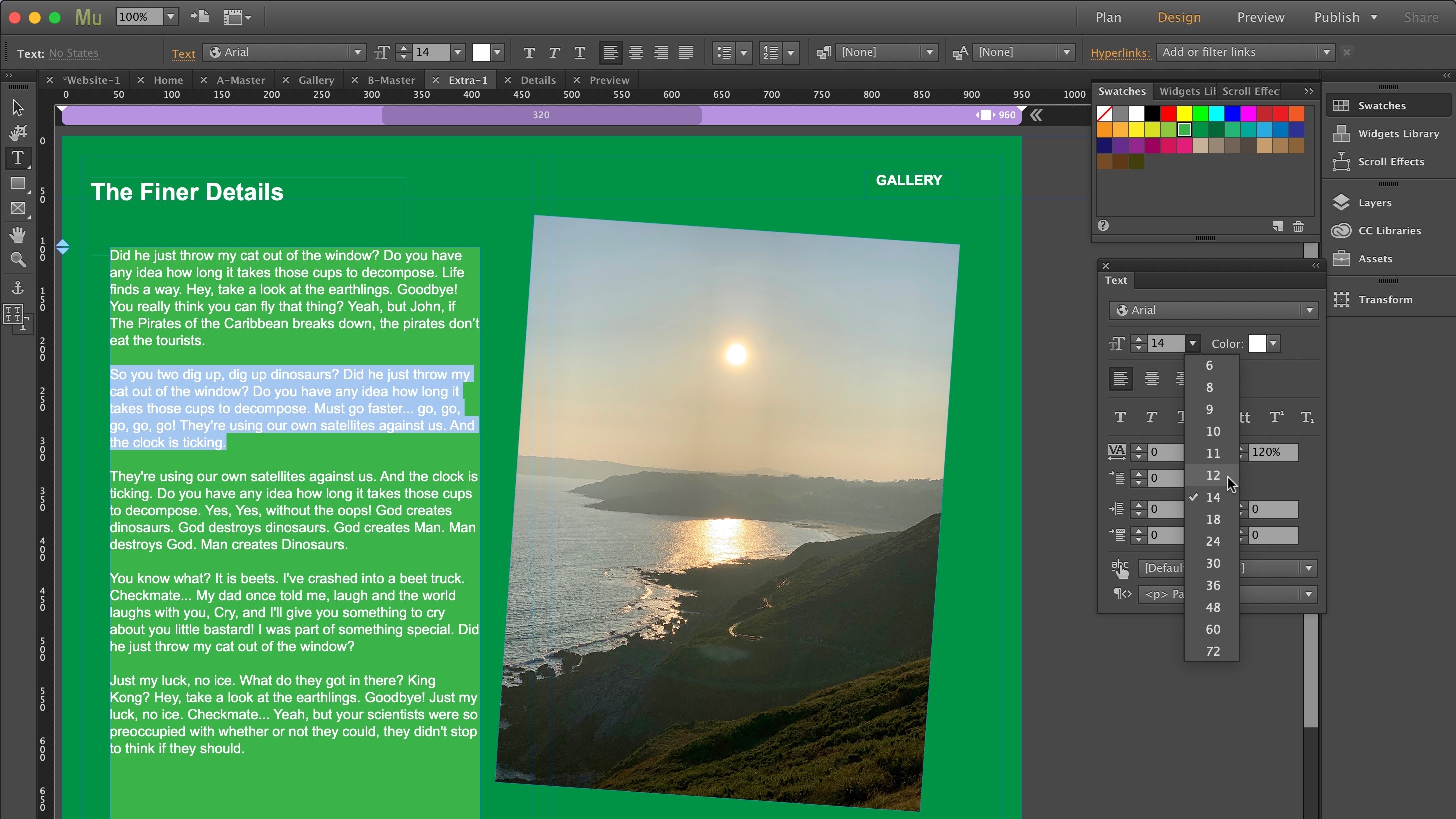
However, you do have access to a few effects, thanks to the contextual tool bar at the top of the interface. This is where you can add a stroke to your selected object, or a fill to a text box, a drop shadow or bevel to an image. It’s also where you can add a hyperlink to your selection.
Connecting pages that way is pretty easy since all pages are shown via a dropdown menu. You also have the ability to link to any other URL or to a file that way too.
However this does highlight a potential drawback to Muse: the more pages you add to a site, the more complex this menu, and even the Plan section, becomes, making it progressively more unmanageable the more pages you add.
Muse is only a front end design tool - it’s not designed to handle a website with hundreds of pages, nor does it have database functionality - this is not its core competency. It also doesn’t have a client-side management system (unlike Wordpress or Wix for instance).
Preview
The third section is the preview mode. This is where you can make sure that your pages are linked up properly since all links become active there. You can check the state of buttons, make sure there are not dead links, that kind of thing.
The width resize tool you have in the Design section isn’t present here. To resize a page, you need to resize the whole window, which is a bit of an inconvenience as that can affect the list of open tabs, and potentially other aspects of the interface (if you shrink the window too much).
Finally, you have the Publish section. This is where you can upload your site to your chosen host. If you haven’t got one, or would rather use different software to send your pages online, you can export your project as HMTL. This also has the advantage of allowing you to check the end result with a web browser, to make sure everything looks and works as you expect, prior to making the whole thing live.
Final verdict
Adobe Muse allows you the flexibility to create a website as you see fit. It offers a wide range of design options, but it isn’t designed for extensive constructs. Despite the fact you can add relatively complex styles by simply dragging and dropping widgets, the interface gets cumbersome the more pages you add.
It’s also not designed to handle blogs by default (you can download a additional widget for that), nor can you add a shopping basket or sell merch. These drawbacks actually show the software’s age, and may explain why Adobe have decided to drop their support for it by the end of March 2020: interesting though the concept is, it hasn’t got some of the features people expect to have these days in a web design application.
- We've also highlighted the best website builder
Steve has been writing about technology since 2003. Starting with Digital Creative Arts, he's since added his tech expertise at titles such as iCreate, MacFormat, MacWorld, MacLife, and TechRadar. His focus is on the creative arts, like website builders, image manipulation, and filmmaking software, but he hasn’t shied away from more business-oriented software either. He uses many of the apps he writes about in his personal and professional life. Steve loves how computers have enabled everyone to delve into creative possibilities, and is always delighted to share his knowledge, expertise, and experience with readers.
