TechRadar Verdict
A very basic video editor with some interesting ideas, but very limited options.
Pros
- +
Free and multi-platform
- +
Syncs with your Creative Cloud account
- +
Can carry on edit in Premiere Pro
- +
Easy to use
Cons
- -
Limited options
- -
No traditional video editing interface
- -
Caters for just your most basic needs
- -
The Automatic editing option is dreadful
Why you can trust TechRadar
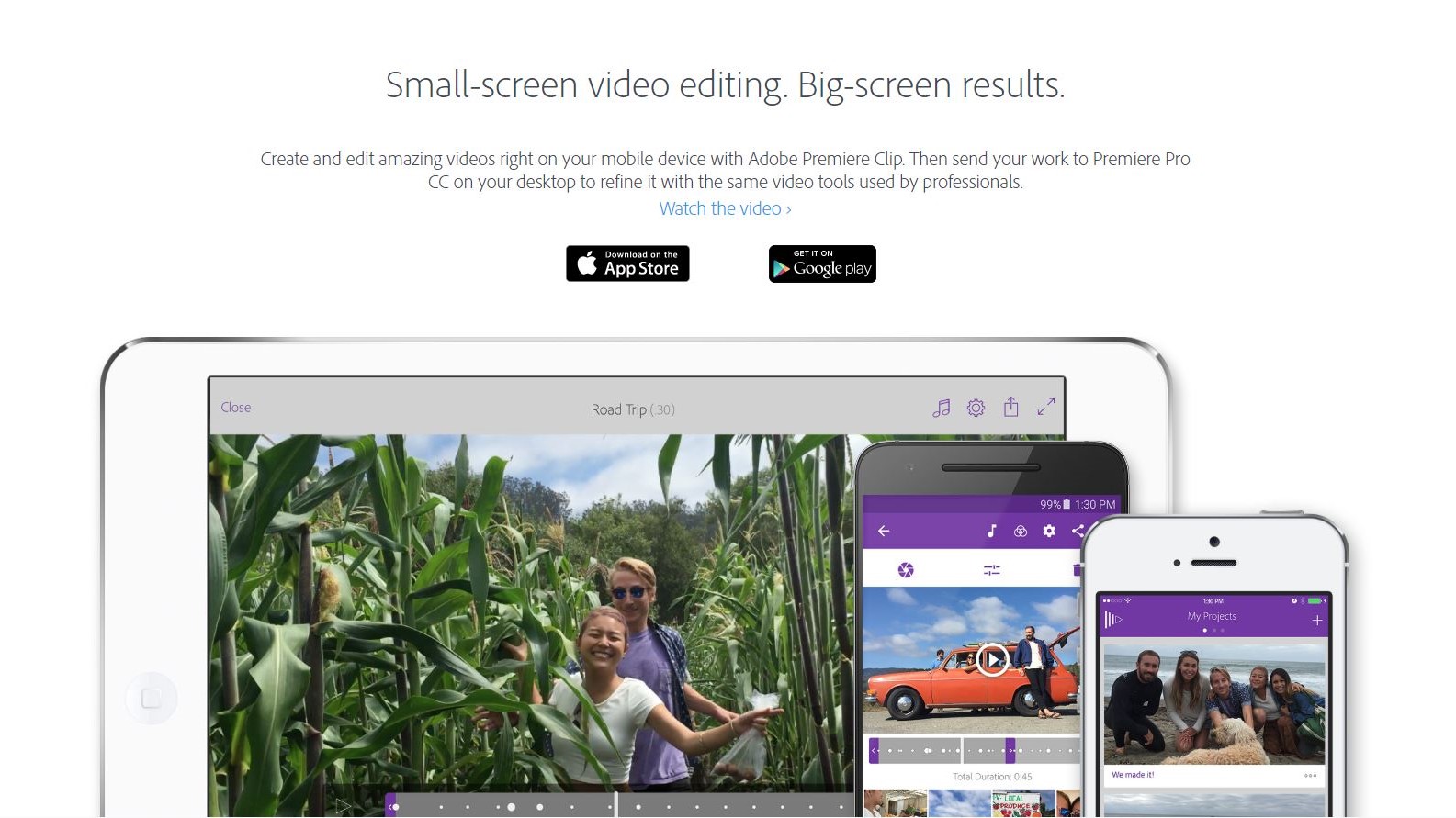
Adobe has come up with a free video editing app for iOS and Android called Premiere Clip. As you’d expect from a phone and tablet app, its design is very simple. Before you can use it, you have to log into your Adobe Creative Cloud account. This allows you to sync your projects across your devices, so you could start your edit on a phone, continue on a tablet and finish it off on your computer, in Adobe Premiere Pro.
Interface and editing
Once you’ve selected a few clips you’d like to work with - which you can grab either by capturing footage straight from within the app itself, or by browsing through your device’s camera roll, Adobe Lightroom, Creative Cloud, or Dropbox, Premiere Clip offers you two options: Automatic or Freeform.
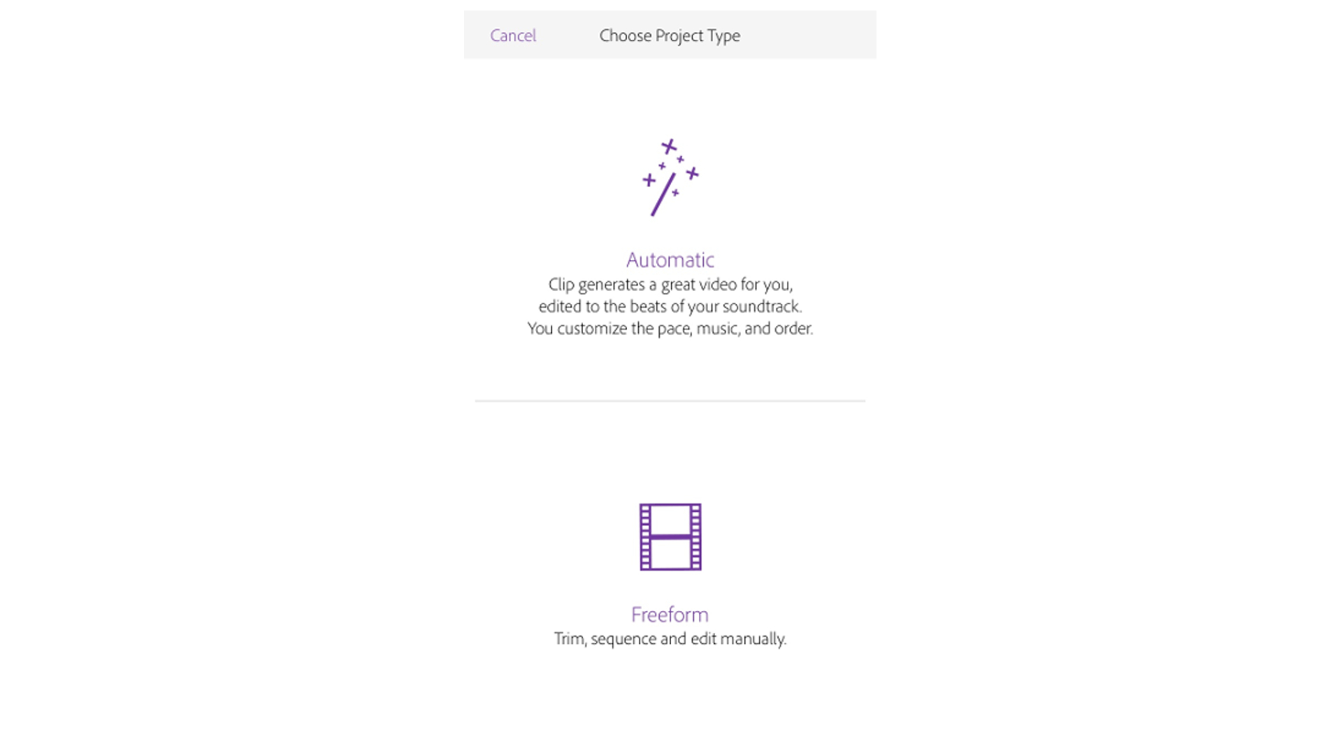
Automatic will build an edit for you by cutting your selected clips in time to a piece of music (you can choose from 10 royalty-free options built-in, or get access to your own music library). Although this may seem like a nice idea to get something done quickly, the end results have regularly been poor: Premiere Clip appears to cut your footage randomly. A long clip will be cut into short sections, and therefore often making no sense whatsoever. Thankfully, you can easily transform an Automatic project into a Freeform one, which is where all of Premiere Clip’s features become available.
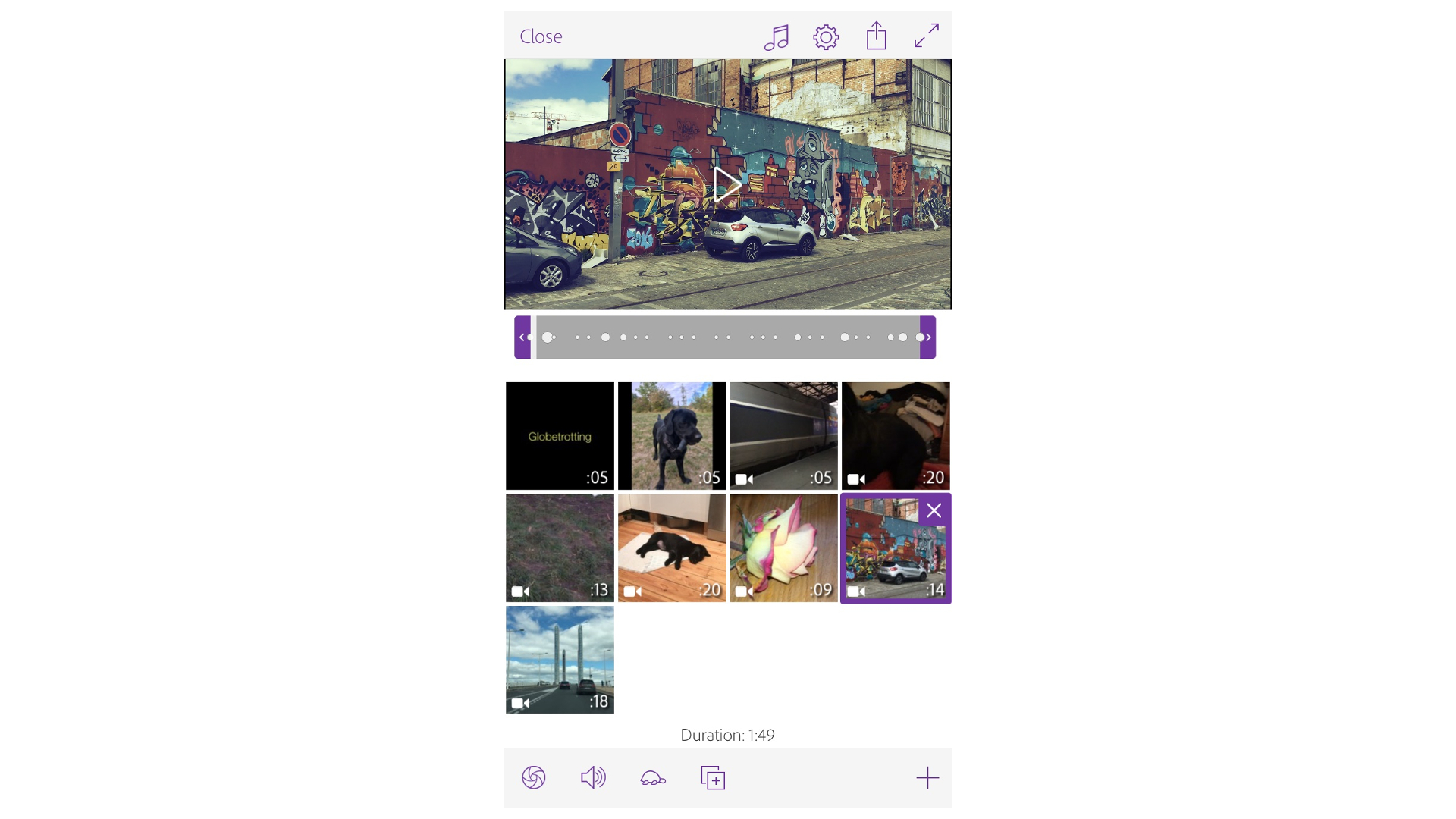
All the clips you chose are added in the order they were shot, but it’s pretty easy to move them around: just tap and drag them to another location.
There is no traditional timeline: each clip is represented by a square thumbnail and are displayed left to right, top to bottom. If you’re used to editing, you may not appreciate the fact that you have no visual representation of the length of your project: each clip is shown as exactly the same size, whether it’s two seconds in length or twenty-five.
Editing is however quite straightforward: tap on a clip for it to appear in the large preview section above, with an audio waveform directly beneath it. That waveform has handles. Drag them inward to trim your clip. You can also split the clip at the playhead should you need different parts of the same footage.
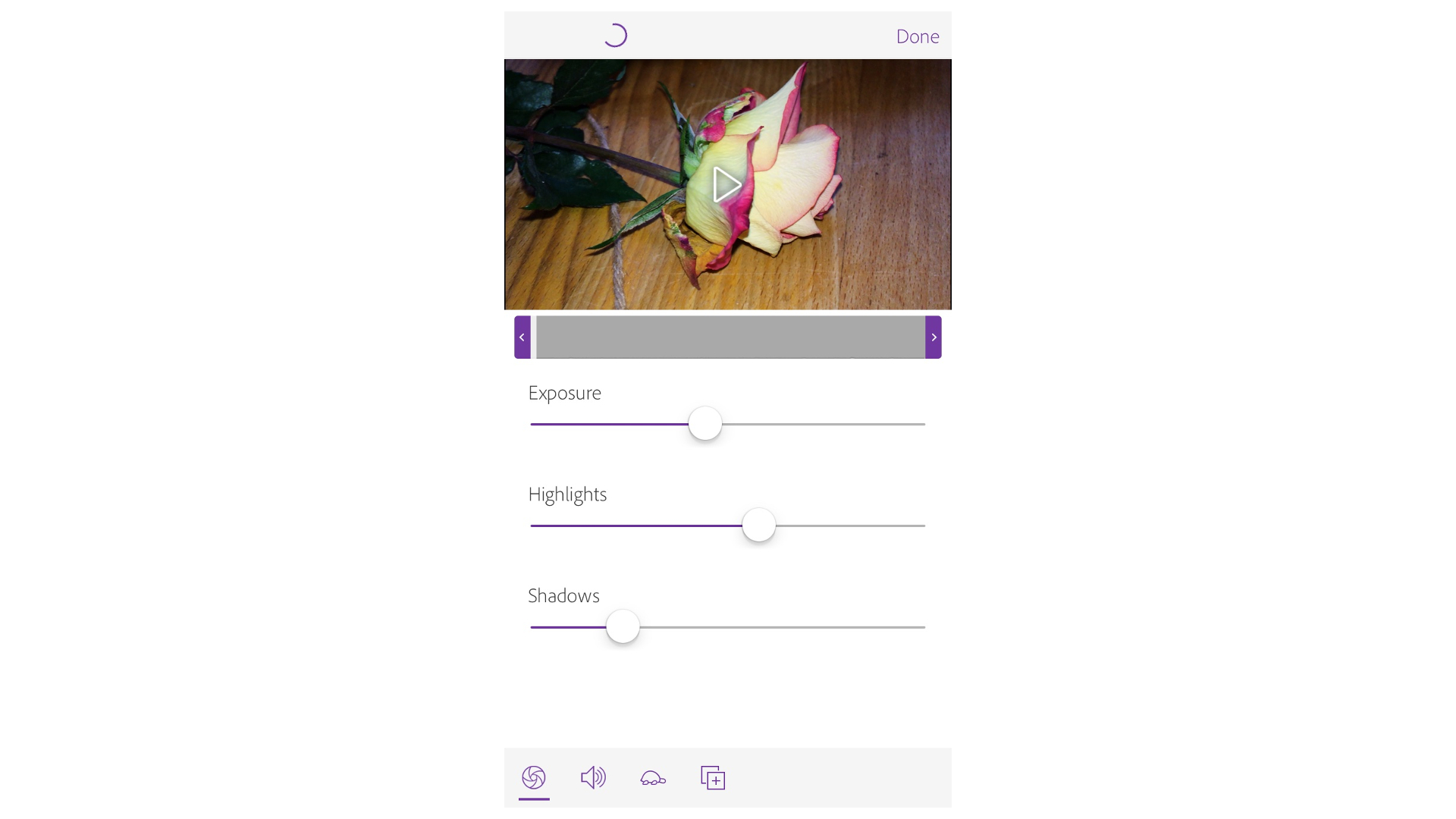
You can use this method to create a short film in minutes, but should you also need to do a little image correction here and there, Premiere Clip has you covered. It’s easy to alter a selected clip’s exposure, highlights and shadows with three handy sliders. You can even alter those properties as the clip is playing. If you need to slow down your clip, you can easily do that too - but you don’t have an option to speed your footage up for some reason.
You also have basic controls over your audio: you can remove it altogether, lower or raise the volume, and make it fade in or out with a couple of handy buttons. Smart Volume - which is on by default - is a clever and automatic way to make sure the clip’s volume remains consistent throughout.
Titles and effects
Titles are available, but it’s not possible to place them over a clip: hardly surprising since this app only offers you one layer to work on, so the titles you add can only be on a coloured background. Not only that but you get no animation with them either, nor a choice of fonts. It’s just coloured text on a coloured background and that’s it. You can customise those colours though.
By default a title’s length is five seconds, but you can stretch that to ten if you want to, or even duplicate it and put it side by side to increase its duration even further.
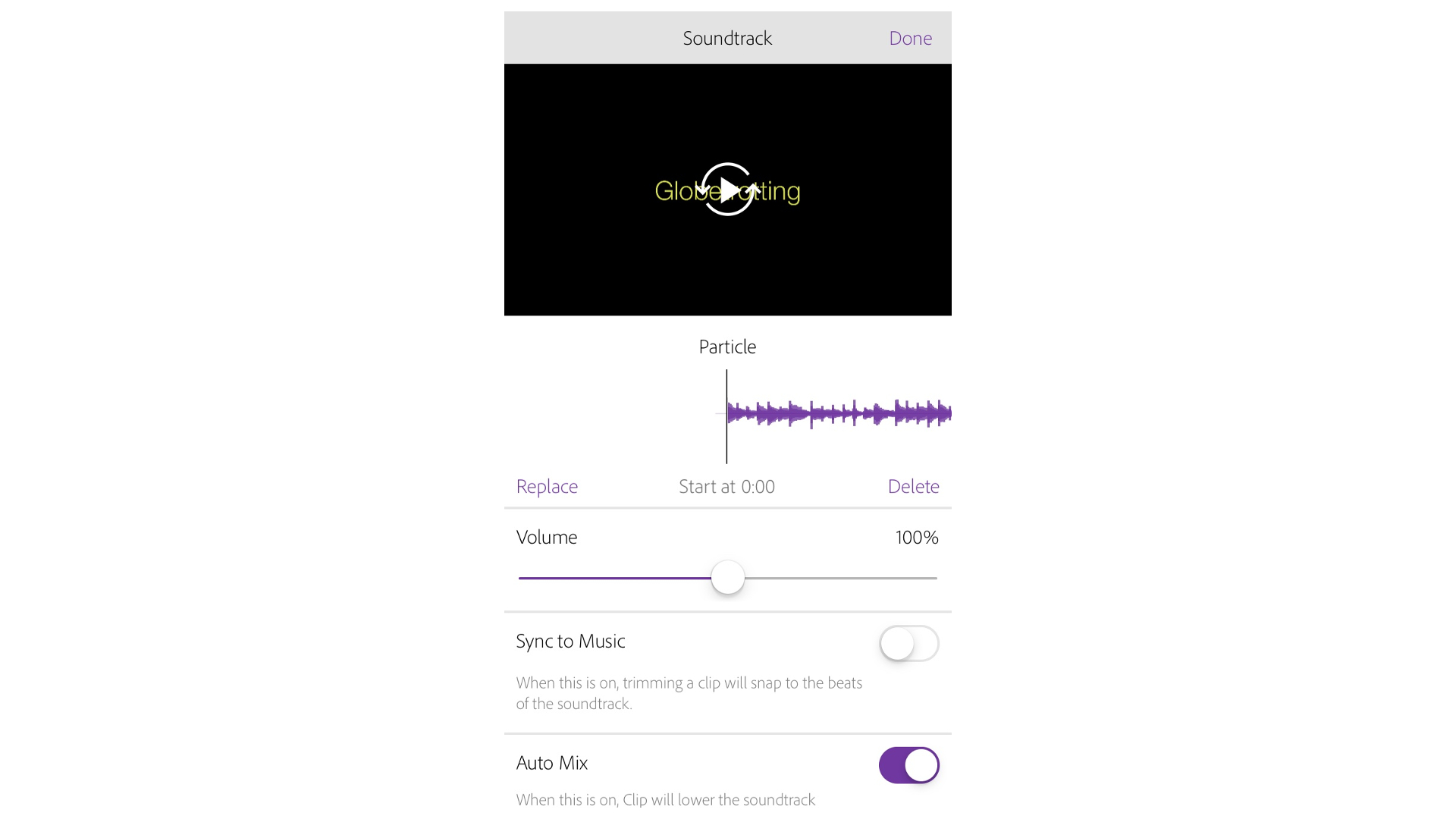
Top right of the interface are a couple of features that affect your project as a whole. The first one is the ability to add a musical score. The most interesting option there is “Sync to Music”. With this turned on, you can trim your footage in time to the selected tune. To make this easier, dots appear over your clip’s waveform, and as you move the In or Out handles inward, they snap to those dots. You are therefore effortlessly editing to the beat of the song.
Another useful option is “Auto Mix” which is a form of automatic ducking: with it turned on, the music will automatically lower when the app detects a clip’s audio.
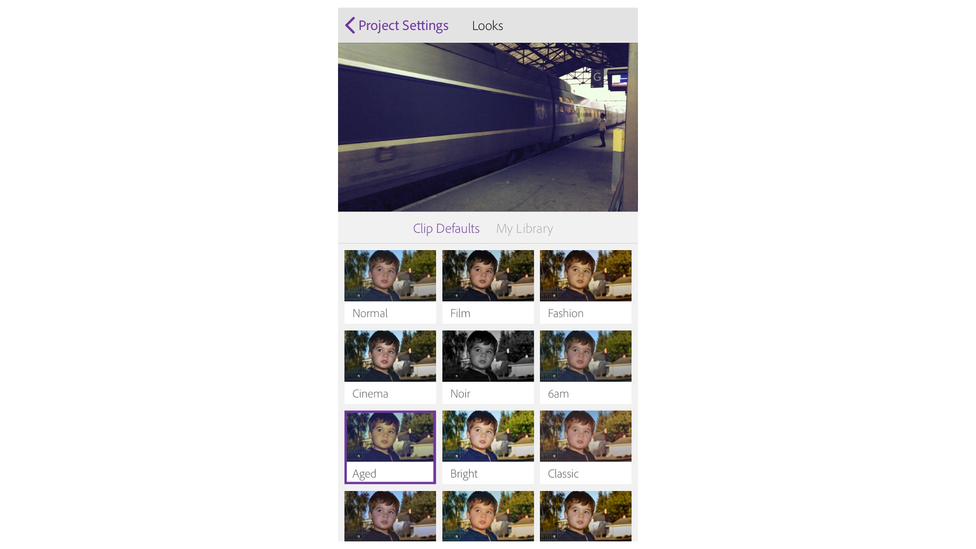
The other global feature is called “Look”. You can apply a filter to all of your clips in order to give them a consistent look. Although you have a choice of thirty such filters, and can even import your own, it would’ve been nice to have the option to apply a filter to specific clips rather than all of them.
Nestled in those options is “Photo Motion”. It’s selected by default and zooms and pans across a photo if you’ve added some to your project. You have no control over the pan, and disappointedly such zoom is constrained inside the original dimension of your photo; i.e., a portrait shot will not be zoomed to fill the whole screen.
Once you’ve done as much work as you can in Premiere Clip, it’s time to export your work. You can save your project to your device’s camera roll, or upload it online as a finished product, either to Creative Cloud, YouTube or even Twitter. If you choose “Publish and Share” your work can be sent to the Premiere Clip Gallery, a public space where people can see what others have created with this app (you can choose to make this upload private if you prefer). And of course there’s the option to send your editable project to your copy of Premiere Pro via your Creative Cloud account.
Final verdict
Adobe Premiere Clip is free, so that’s a big plus, and the fact you can connect to your Creative Cloud account and sync your project to your various devices is a big plus. The app has serious limitations though, and you should definitely try it out for yourself to see if you can work around those limits or if you need a more powerful video editing app for your mobile device.
- Also check out the best video editing software
Steve has been writing about technology since 2003. Starting with Digital Creative Arts, he's since added his tech expertise at titles such as iCreate, MacFormat, MacWorld, MacLife, and TechRadar. His focus is on the creative arts, like website builders, image manipulation, and filmmaking software, but he hasn’t shied away from more business-oriented software either. He uses many of the apps he writes about in his personal and professional life. Steve loves how computers have enabled everyone to delve into creative possibilities, and is always delighted to share his knowledge, expertise, and experience with readers.
