TechRadar Verdict
Grab yourself the 30-day trial and give it a go. Maybe you won’t mind the software’s way of doing things as much as we did. It does offer numerous customisable options, and is pretty much full featured, at an amazing price… but why oh why does everything have to feel so antiquated and cumbersome?
Pros
- +
Native Windows Software
- +
Can alter most aspects of your building
- +
Numerous options
Cons
- -
Windows only
- -
Interface feels very antiquated
- -
Overly cumbersome interface
Why you can trust TechRadar
Ashampoo Home Design has been around for a very long time, and we’re now onto version 9. The software is still Windows only, but is now only compatible with versions 10 and 11 of that operating system, and it won’t run on any ARM processor. Apart from that, if your computer runs that OS, it will run Home Design. We loaded up the latest version to see how it compares to the best interior home design software we've tested out.
Ashampoo Home Design 9: Pricing & plans
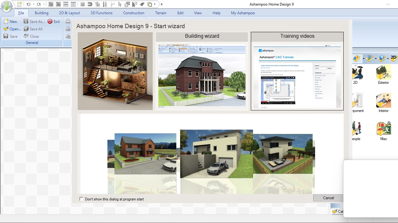
- No subscription but a very affordable price to purchase the software, which is made even cheaper by great deals. You also have a very cheap way to upgrade from an earlier version, and a generous 30-day trial… it’s all wins here.
The price of Home Design is actually hard to believe. It’s old school, so there’s no subscription options, which is already a very good thing: how many more subscriptions can you actually, truly manage?
So instead, Ashampoo offers its product for an upfront fee of $50 for the full version, with no in-app purchases. But if that still sounds like too much, check their site, as there are often some incredible deals. For instance, as of this writing, you can get this package for 60% off: only $20, which is ridiculously good value.
Now obviously the main problem with purchasing a version outright, is that you don’t get access to the latest and greatest features when they’ll be released in the future, but even here Ashampoo has a great deal for you: you can upgrade to 9 from an older version for only $15.
And if none of that tempts you, you can download a copy and use it free for 30 days to check out if it suits your needs.
You can check out Ashampoo Home Design 9 by clicking here.
Ashampoo Home Design 9: Getting Started
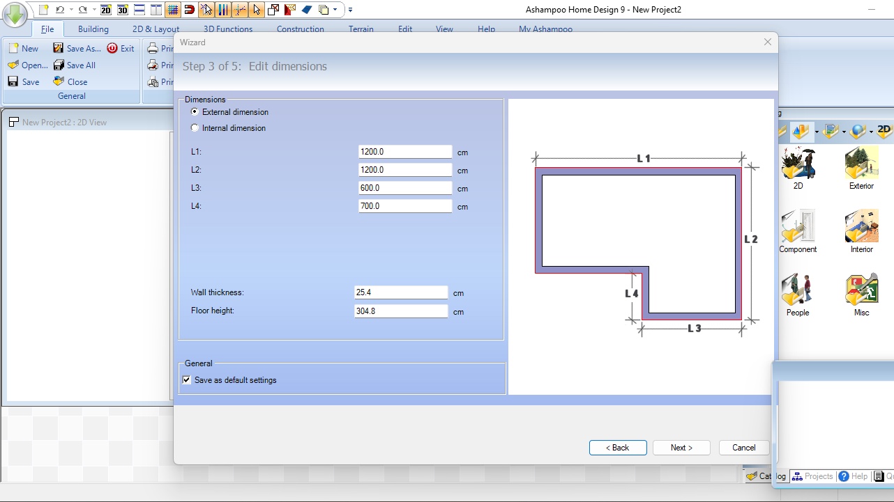
- An old style command bar that takes up way too much space, coupled with a handy Wizard that lets you hit the ground running by creating the basic structure for you. So, some positive, some negative.
Alright, let’s start with a disappointing downside. We hadn’t actually looked at this software for years, and since then, it has received multiple major revisions, with many features improved, and now ones added… except the interface hasn’t been on the schedule to be refreshed during that time.
Sign up to the TechRadar Pro newsletter to get all the top news, opinion, features and guidance your business needs to succeed!
The look of the software felt old then, and it really does feel antiquated now, with commands placed at the top, but displayed on multiple layers which you can’t collapse so the entire system takes up much too much of your valuable real estate. Still, if they haven’t changed it by now, it must work for them, so it is what it is.
When you launch the software, you’re presented with a welcome screen from which you can launch the ‘Start Wizard’ (you can also find that command in the ‘Building’ menu). This feature helps you design the basics of a house quickly by doing a lot of the initial work for you. You even get to switch between imperial and metric measurements - even though the antiquated imperial is selected by default.
The Wizard creates the basic shape of your building, along with the number of floors you need, and the type of roof you require. Anything else (doors, windows, internal walls, etc), is left for a later stage. When you’re done with the Wizard, you’re left to your own devices in the main interface.
Ashampoo Home Design 9: Interface
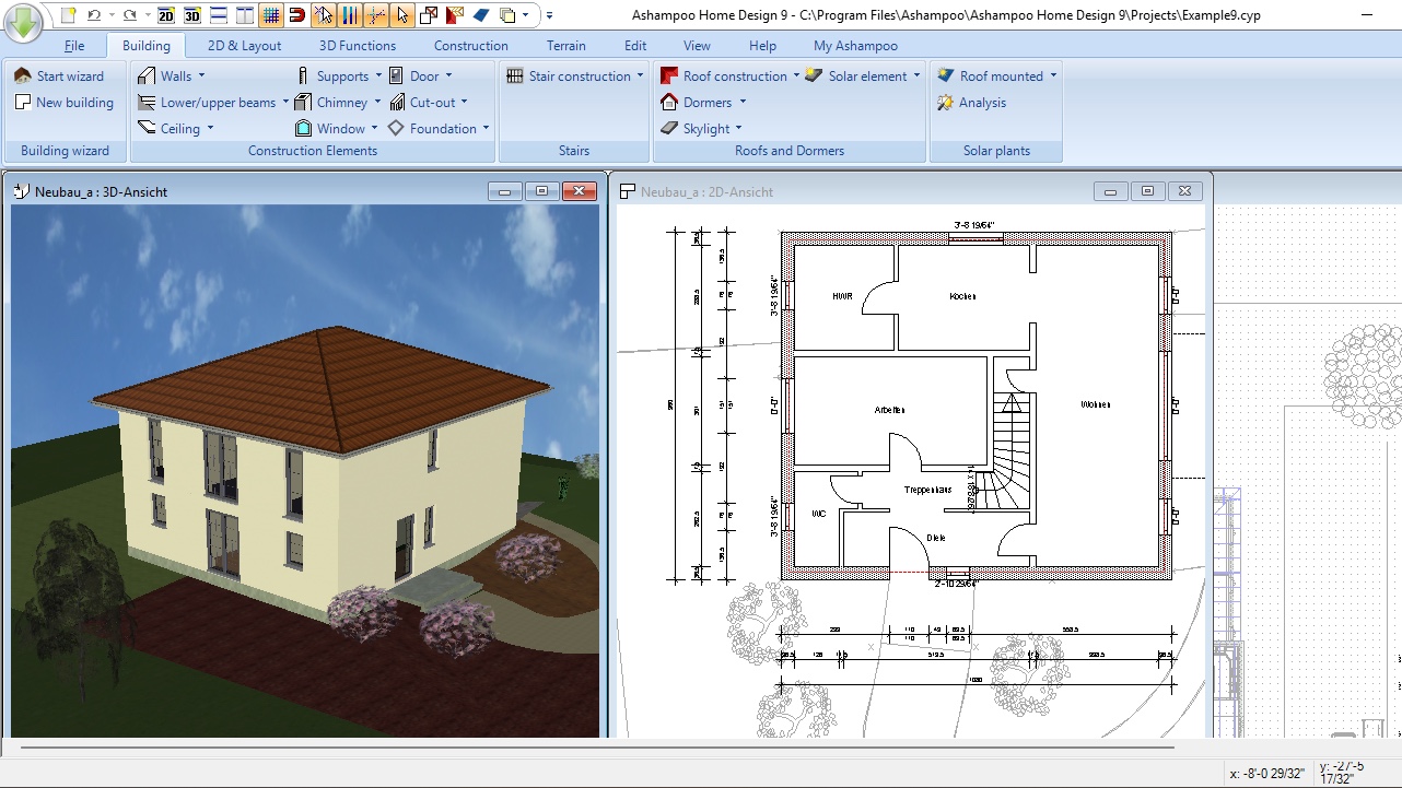
- The interface feels needlessly convoluted and unnecessarily cramped. I might’ve been peak design 10 or more years ago, but we should’ve all moved on since.
The main interface feels as cumbersome as the software’s overly large menu system, and this is primarily due to its window management system. You have the ability to see your project both as a 2D top-down plan, and a 3D virtual reality environment. Those two are presented as floating windows… except not really.
Those windows are actually restrained within the confines on the remaining interface. It feels surprisingly frustrating, as you’re constantly battling for space between these two views, both of which are essential when designing with Home Design. You end up with them being overlapping, or squished together side by side. It’s not really ideal, especially if you work on a large project. Why couldn’t they be dockable for instance, with an easy way to switch between the two?
But again, it’s been like this for years, so it feels there’s little point in complaining about it again, and we just have to resign ourselves to constantly having to move and resize windows as we work - not ideal.
Ashampoo Home Design 9: Home Design
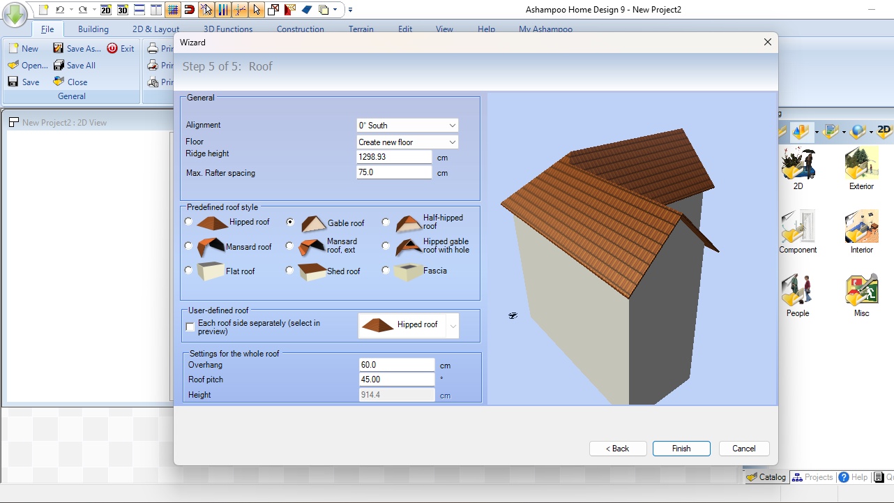
- Many options, numerous customisation possibilities, a lot of versatility. All that is good. But it’s the way you get to do all this, which feels overly cumbersome, and that’s a real shame.
On the plus side, the experience of navigating through your project and building your home felt much better and more fluid than we remembered. It’s easy to add walls, windows, doors, and any other objects to your project, but everything feels like it takes far longer to do things with Home Design than it does with competing products. For instance, resizing a door and changing its position can be done in just a click and drag… elsewhere. Here you need to click on a button to reveal a floating window with a numerical field which you need to adjust, and hit the ‘Return’ key to see the effect of your change, which means you’re likely forced to repeat the process if you’re not happy with that outcome. It works of course, but it feels convoluted.
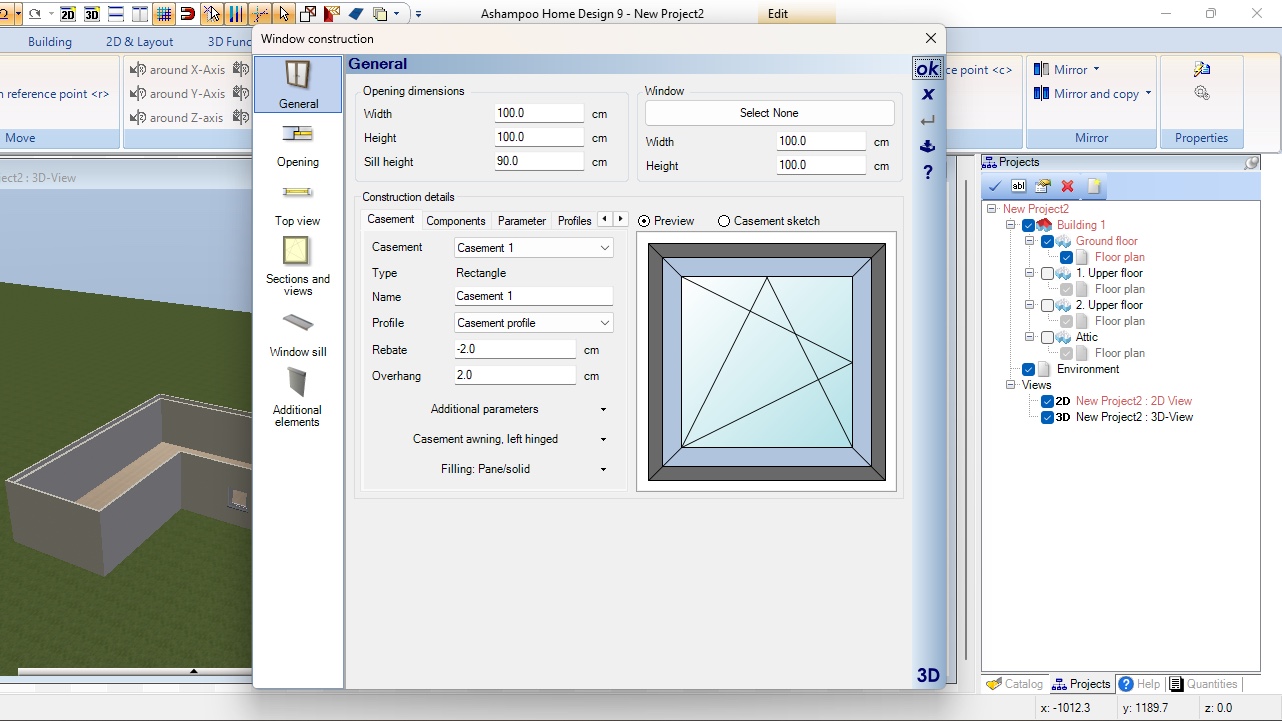
Despite this, you do have a ton of options at your disposal, such as different types of walls, various windows, doors and roofs, and of course a plethora of furniture. Take windows for instance, double-click on one to reveal all of its parameters, including various ways for it to open, how it looks on the 2D plan, the thickness of the window sill, and more. You have access to a huge amount of information and customisation. It’s just all very ‘change values in a field’ rather than the more ‘do it all through various mouse gestures’ we’ve grown accustomed to in recent years.
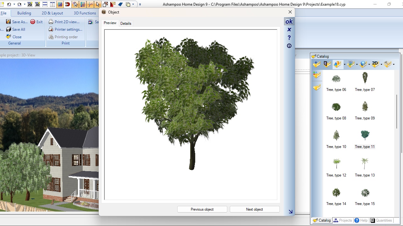
The catalog of available items used to populate and decorate your project is… alright. You get to drill through a series of icons until you find the object you’re looking for. Puzzlingly enough, we couldn’t find a search field to help us get to a particular category or type of object faster, which was… quaint. However you can double-click on any of them to see a large preview of the 3D object you’re interested in, and to add it to your project, just drag and drop it.
It is possible to resize objects of course, but don’t expect it to be a simple click and drag matter. Instead you need to double-click on it to review its changeable parameters located in various editable fields, just like for the window example we mentioned earlier.
Yes Home Design has improved, but it seems its developers don’t believe in keeping up with the competition. Yes it is very powerful, and incredibly affordable which are very big pluses, but its way of working lead to frustration for us. Which is a shame. Or maybe it’s just that we’ve been too spoilt with far easier ways of doing the same thing offered by its competition.
Should I buy Ashampoo Home Design 9?
Buy it if...
You’re looking for a Windows-only, very affordable home design software package, and don’t mind the antiquated interface, or often cumbersome way of doing things.
Don't buy it if...
You’re after software that is modern and fresh, which allows you to do things easily and intuitively without too much repetition… oh and you don’t own a Windows machine.
Need help on your next creative project? Check out our round-ups of the best landscape design software and the best architecture software
Steve has been writing about technology since 2003. Starting with Digital Creative Arts, he's since added his tech expertise at titles such as iCreate, MacFormat, MacWorld, MacLife, and TechRadar. His focus is on the creative arts, like website builders, image manipulation, and filmmaking software, but he hasn’t shied away from more business-oriented software either. He uses many of the apps he writes about in his personal and professional life. Steve loves how computers have enabled everyone to delve into creative possibilities, and is always delighted to share his knowledge, expertise, and experience with readers.
You must confirm your public display name before commenting
Please logout and then login again, you will then be prompted to enter your display name.
