Why you can trust TechRadar
The Google TV interface is designed to be fairly easy to navigate without resorting to the mouse; there are eight categories down the side with thumbnail icons in each:
Bookmarks (which can be apps or web pages you've marked with the star button on the keyboard), Applications and Spotlight (the apps section has local apps like the Gallery and Logitech Media Player plus a selection of the options in Spotlight, like CNBC, Napster and the custom interface to Amazon's video-on-demand service).
Joining them is Most visited pages (which includes individual pages inside apps – which at this stage are only custom websites rather than actual Android or Flash apps), Queue (a nice interface for exploring and subscribing to podcasts, as well as videos you've marked to watch later), the What's On TV guide for your set-top box TV (if it's one of the selected services Google TV supports), plus direct links to Netflix and the Amazon video on demand service.
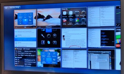
You can edit the category menu to add or remove apps; confusingly the Add menu lets you add items that are already on the menu instead of greying them out until you've removed them as well as some specific apps like YouTube and Twitter.
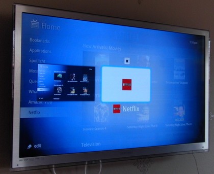
We like that you can remove any of the built-in categories if you don't use them, because there are only ten slots on the menu. Any of the menu items can be what Google TV calls a custom 'shelf'; a folder you can put more items into if you want to organise things.
Although almost everything in Google TV is actually a web page in varying levels of disguise, the Chrome browser isn't one of the top-level menu entries unless you put it there yourself; it's on the list in Applications.
That's because Google expects you to search for web and TV content (and pressing the Search button is also the fastest way to type in a URL; something that makes more sense if you're already an Android user). How well this works depends both on what you're looking for and what you've got connected.
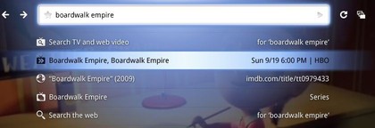
With selected set-top boxes you can find future programs (as well as what's playing now, what you've got recorded and what's online) and set the DVR for them; that's a great experience that's far easier than navigating through an EPG, even if you're getting a list of which episodes you can pay for or watch free online and it's where the Google expertise really shines. You can even type in a channel name instead of remembering the number for it.
But with any other TV service you still get current and future TV shows along with the other results, if you ask Google TV to record something it changes the channel then and there – and tells you to use your own DVR to do it.
Switching between TV and online content is fairly seamless, but navigating between different areas of online content gets confusing.
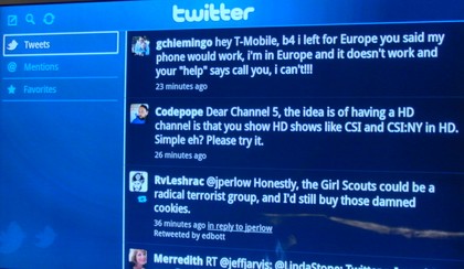
All of the content apps we opened seemed to open in the same Chrome tab, so we couldn't easily have the Twitter app and a YouTube video ready to switch between – choosing Back or Home and picking another app opened it in the same tab and in some cases the video we'd abandoned started playing again before the new app loaded.
Opening a new tab from the menu button gave us a Google home page – but closed the original tab with the previous app in. Occasionally we'd jump back to a different app rather than the Home screen and it all felt rather unpredictable.
Another interface issue is the picture in picture command; calling it DualView is a bit of a misnomer because it's a much smaller thumbnail (and while you can now move it if it's obscuring something vital in the main screen and resize it, it's not immediately obvious how to do either).
Plus DualView only works with TV; you can't have an Amazon video in the thumbnail while you check Twitter – or indeed Twitter in the thumbnail while you watch a match.
Current page: Google TV: Interface
Prev Page Google TV: Getting started Next Page Google TV: Online contentMary (Twitter, Google+, website) started her career at Future Publishing, saw the AOL meltdown first hand the first time around when she ran the AOL UK computing channel, and she's been a freelance tech writer for over a decade. She's used every version of Windows and Office released, and every smartphone too, but she's still looking for the perfect tablet. Yes, she really does have USB earrings.
