Why you can trust TechRadar

Installation is simple and quick, with all available channels tuning in within four minutes in our test, and the TU-T2 had no trouble holding those frequencies.
The TU-T2's interface is well laid out, though ease of use is promoted over good looks. The remote's menu button brings up a window that plays the current TV channel alongside a simple list of options, which include settings, the EPG, and a channel list.
Delve into the settings and you can choose between 576p, 720p, 1080i and 1080p resolutions over HDMI, output Dolby Digital sound via HDMI, set an audio delay to avoid lip-sync issues (up to 250ms), and set the transparency of the on-screen menus.
That latter feature is important because it lends the interface a more involving feel; the EPG then floats over whatever channel you're watching. It's actually quite a basic EPG – information is shown for eight channels, but only across two hours – however, it works really well.

Fastext buttons then help push you through the schedules in two, or 24-hour, chunks. Around a third of the EPG's real estate is used up by a programme synopsis, which is perhaps too much, but it does lend the EPG an airy feel.
It also takes the guesswork out of high definition; synopsis' for all programmes on the HD channels let you know whether the broadcast is in HD (everything on BBC HD channel) or upscaled HD (most programmes on ITV 1 HD).
A similar approach is in use on the EPG, which displays a 'HD' logo next to anything that's broadcast in hi-def... again, there's alarmingly few in the ITV 1 HD schedules. A genre (sports, movie, entertainment) is rather pointlessly provided for anything you choose on the EPG, though it also indicates if subtitles are provided.
That EPG, which is lightning quick and downloads programme information instantly for the whole eight days ahead, can also dish out reminders at the touch of a button.
Meanwhile, a dedicated channel list, which can't be set to be transparent (instead a small window plays the current TV channel – a floating list over a full-screen picture would have been better), is where channels can be locked, deleted, or added to favourites. It's necessary to first call-up the channel list using a dedicated button before it's possible to browse favourites, killing any convenience such a list is supposed to create.
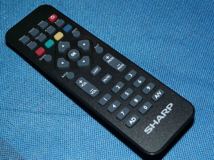
Overall though, Sharp's EPG and user interface are joined-up, good looking, fast and easy to use – the perfect combination. They're helped by a responsive remote control, and though it's comfortable to hold, it's too small and is marred by tiny buttons – even the all-important volume and channel changers are fiddly.
Current page: Sharp TU-T2: Value and ease of use
Prev Page Sharp TU-T2: Performance Next Page Sharp TU-T2: VerdictJamie is a freelance tech, travel and space journalist based in the UK. He’s been writing regularly for Techradar since it was launched in 2008 and also writes regularly for Forbes, The Telegraph, the South China Morning Post, Sky & Telescope and the Sky At Night magazine as well as other Future titles T3, Digital Camera World, All About Space and Space.com. He also edits two of his own websites, TravGear.com and WhenIsTheNextEclipse.com that reflect his obsession with travel gear and solar eclipse travel. He is the author of A Stargazing Program For Beginners (Springer, 2015),

